Product – UX/UI, Iconography, M365
The new UI for enterprise AI
Evolving business apps and agents through form and function
For decades, enterprise software was built for buying committees, not for the people who actually use it. ROI trumped usability. Lists, forms, and tables dominated the experience—powerful on paper, but frustrating in practice. That tradeoff left users behind. Today, expectations have changed. Work and life are intertwined. People move fluidly between consumer and business apps—on their phones and their desktops—and they expect the same ease, beauty, and delight from the tools they use at work as they do from a fitness app or a finance dashboard. ROI starts with simplicity: deliver tools that feel effortless and elegant.
Meeting those expectations means rethinking what enterprise tools do—and how they feel. Microsoft’s mission is to help every person and organization achieve more, and that starts with experiences that feel as smooth as the apps people love. For individuals, Microsoft 365 powers productivity across familiar tools like Outlook, Teams, and PowerPoint. For enterprises, the needs are broader: Dynamics 365 brings clarity to core business functions, Power Platform empowers anyone to build solutions without deep code, and Copilot Studio provides the platform for creating custom AI agents that connect across M365 and beyond. Together, these tools set the stage for an AI-first era—where apps don’t just complete tasks; they orchestrate workflows, end to end. That shift demands a design language that signals intelligence and connection across every experience.
Human-Centered Simplicity: Form Through Identity
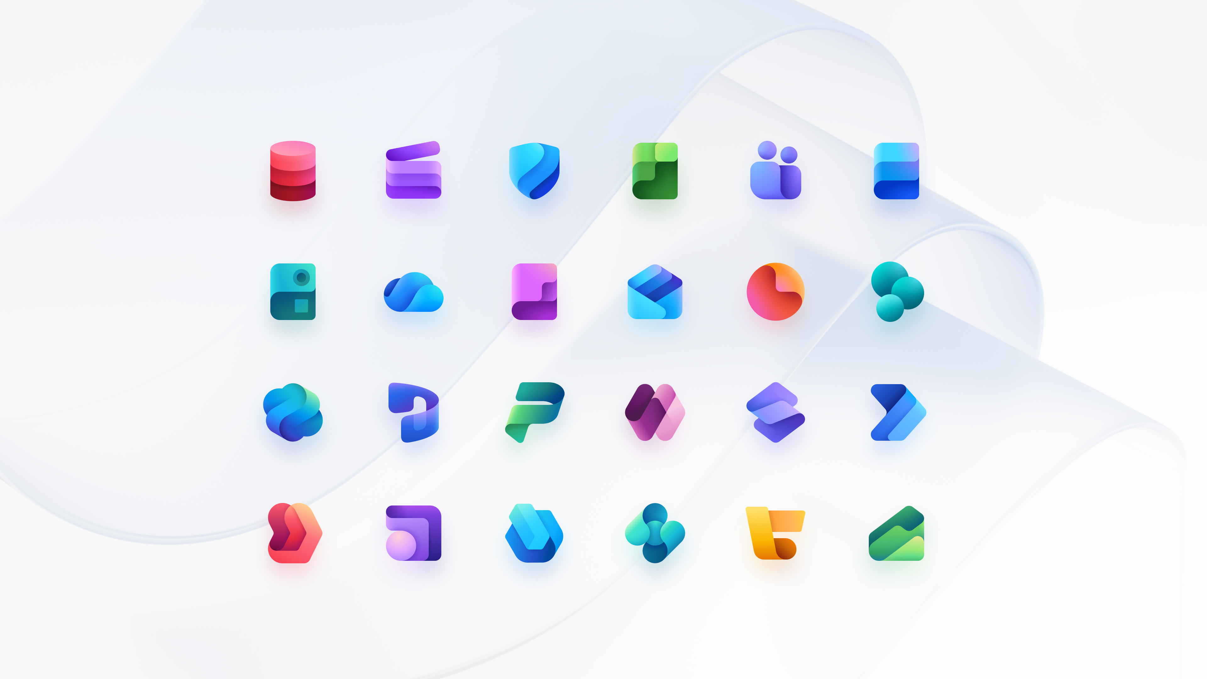
Icons are more than decoration—they’re gateways to identity and intent. They reduce cognitive load and create emotional connections. Inspired by recent updates to Microsoft 365, we’re rolling out refreshed icons across business apps and agents, designed to feel familiar alongside Word, Outlook, Teams, or M365 Copilot. Matthieu James, our lead icon designer, explains that “our updated icons combine simplicity with subtle sophistication: clean shapes, vibrant gradients, depth, and highlights that suggest adaptability and intelligence. Consistent with the M365 icon family, they help users feel at home and trust that our apps work seamlessly with Microsoft tools they already know.”
Function Through Interoperability
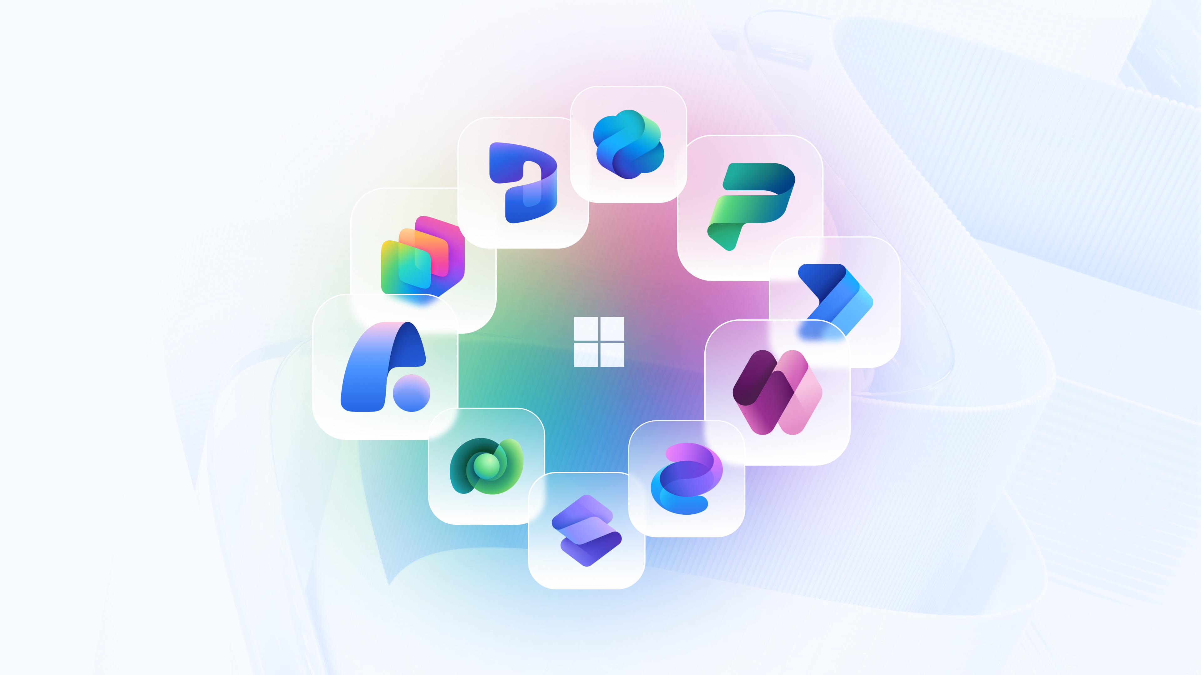
Design is how things work. Users expect to move fluidly between guided automation and creative problem-solving. They might move from Outlook to Dynamics 365 Sales, and then chat with a Sales agent in M365 Copilot—all without losing context. Interoperability is intelligence. And for us, that means creating a unified design strategy for agent UX with consistent visual identity, shared patterns, and common principles for autonomy, oversight, and trust. We’re designing a world where people aren’t just switching between apps—they’re moving through one intelligent, agentic system.
Refreshing and Futureproofing
We’re evolving fast, without compromising craft. Refreshing our visual identity will ensure confidence as users navigate through an AI-infused world. Implementing intuitive patterns that scale across business apps and agents, as well as Microsoft 365 Copilot, raises the bar for enterprise experiences. With more than 56 million makers on Power Platform and over 100 million users across Microsoft 365, the opportunity is massive: deliver experiences that load quickly, predictably, and intelligently over vast datasets while automating entire business processes so organizations can focus on strategic outcomes. Copilot Studio is a catalyst for this convergence, where natural language meets structured orchestration, and maker and agent experiences stay coherent across surfaces.
Building Adaptive, Intelligent Systems
As we move from siloed disciplines into living experiences, we’re rethinking roles and resourcing. Giving designers, researchers, and content creators space to relearn and reskill for an AI-first world. This is important because we’re customer zero. Our internal adoption validates the vision—with tens of thousands of people at Microsoft first using these experiences—proving that seamless integration across all our business apps and agents can indeed transform work at scale. For customers, this means everything becomes easy to operate and more delightful to use.
Enterprise software should never trade usability for ROI. The next standard is clear: Fast. Intelligent. Beautiful. A unified identity, connected patterns, and agent-first design—all grounded in the basics of user feedback and intent. These experiences need to feel effortless, powerful, and importantly, human-first. That’s the bar. And it’s the experience our customers deserve.
Read more
To stay in the know with Microsoft Design, follow us on Twitter and Instagram, or join our Windows or Office Insider program. And if you are interested in working with us at Microsoft, head over to aka.ms/DesignCareers.
From incubation to impact: Microsoft 365 Companion apps
How scrappy prototypes became polished apps—shipped on the taskbar, grounded in Fluent, and refined by research.
When AI joins the team: Three principles for responsible agent design
A practical guide to build agents that stay differentiated, intent-aligned, and bias-resistant
The new Microsoft 365 Copilot mobile experience
How we redesigned the Microsoft 365 Copilot mobile app to create a workspace built around conversation, dialogue, and discovery.
