Science in the system: From pixels to text
First, there was written language. Shortly after came type, a way of optimizing written communication through the reuse of identical characters. Typesetting might have been used as far back as 2000 BCE: there’s evidence that ancient Mesopotamians used a form of typesetting to stamp cuneiform impressions on bricks.
The point is that humanity has a long history of caring a lot about the appearance of our written communication.
In my previous article, I wrote about the challenges of turning square pixels into curving, irregular shapes and how anti-aliasing can help. In this article, we take a look at techniques for rendering text.
The challenges of rendering text
At the intersection of art and necessity exists typography, the design and use of typefaces to produce written language. Typefaces balance beauty with practicality; they represent familiar characters in a way that’s instantly recognizable, while adding their own unique style. These stylistic features frequently manifest as elegant slants and subtle curves or bold strokes.
Which in no way resemble our humble onscreen building block, the pixel.
In the past, typefaces were generally designed with print media in mind, where the output is at 1200 DPI or higher: enough resolution to smoothly and sharply realize the details of a typeface. On the other hand, a typical computer screen has a DPI of 72–96— dramatically lower than print. As a result, onscreen text looked jagged and misshapen compared to its print counterpart.
Anti-aliasing can get rid of blocky, jagged edges, but it also has a softening effect that might not be that noticeable when applied to an animated 3D scene (such as in a game), but can make text look blurry and unreadable.
We need text to look smooth, but also razor sharp.
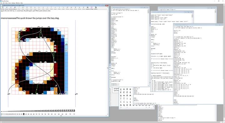
There’s an additional challenge to rendering text. To render a TrueType font, we take its outline — a pristine collection of mathematical formulae that describe it — and map it to pixels at the desired resolution.
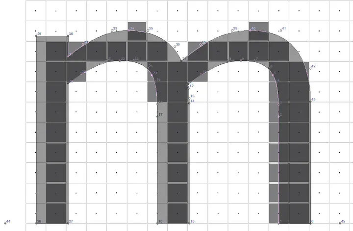
Just figuring out how to translate a typeface’s outline to physical pixels can be difficult. Algorithms that work fine for scaling an image have trouble when applied to fonts. For example, take this outline for a lowercase “m.”

The next image shows how, when we use a typical rasterization algorithm to turn this outline into pixels, we end up with a suboptimal character. For example, see how the rightmost stem is twice as wide as the other stems.
Hinting
The TrueType font standard lets font developers provide “hints” about how the font should be drawn at specific resolutions. These hints can dramatically improve the font’s appearance on the screen:
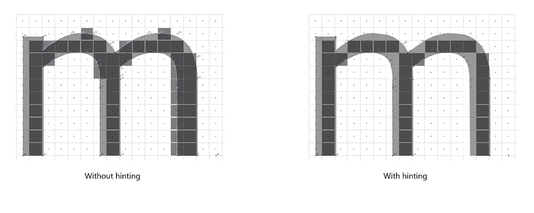
Hinting is generally a manual process: a font hinter manual specifies the hints for each character in a font for a variety of resolutions. (Some type rendering technologies use an auto-hinting system, but I’ll save that for another article.)
ClearType and anti-aliasing
Even with the best font-hinting, we’re still left with problematic jagged edges. ClearType is Microsoft’s font anti-aliasing technology that smooths edges while preserving sharpness.
ClearType takes advantage of the physical characteristics of an LCD monitor to increase the horizontal resolution. Understanding how it works requires understanding how LCD monitors work.
Take a single white pixel displayed on an LCD monitor.

If you were to magnify the image, you’d see that the pixel is made up of three separate subpixels: a red subpixel, a green subpixel, and a blue subpixel.
ClearType uses a model of the human visual system to choose the brightness values of the red, green, and blue sub-pixels so that letters on the computer screen appear smooth, not jagged, yet the edges remain sharp. By taking advantage of these sub-pixels, it effectively triples the horizontal resolution of the display.
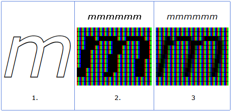
- This is how the lowercase “m” looks in the original typeface outline.
- This is a close-up of the “m” when rendered on screen without ClearType. Notice how the “m” has hard, jagged edges in its stems.
- This is a close-up of the “m” when rendered on screen with ClearType. Notice how the jagged edges are more subtle and the letter is rendered more smoothly.
At first, Windows only used ClearType to enhance the horizontal resolution of type. Today, it uses ClearType to enhance the horizontal resolution and conventional anti-aliasing to smooth vertical edges. The combination of the two techniques produces smooth, sharp text.
Although these technologies reduce the need for hinting, they can be used in combination with hinting to further enhance the appearance of type.
Special thanks to Greg Hitchcock and Rob McKaughan, two experts in typography that took the time to give me a crash course on the history of font rendering and an overview of our current technologies. They’ve given me enough information to write an entire series on typography… so stay tuned.
References
- ClearType Overview (Microsoft Typography)
- All Your Pixels Are Belong To Us (Kevin Larsen on resolution)
- Bill Hill on how ClearType works (Channel9 video)
- Backwards compatibility of TrueType instructions with Microsoft ClearType (docs.microsoft.com)
- Font hinting (typotheque.com)
Other Science in the System articles:
Read more
To stay in the know with Microsoft Design, follow us on Twitter and Instagram, or join our Windows or Office Insider program. And if you are interested in working with us at Microsoft, head over to aka.ms/DesignCareers.