
Introducing Kermit: A typeface for kids
Using design to empower children by making reading easier, improving comprehension, and helping dyslexics.
Imagine having never ridden a broom with the chosen one they call Harry Potter, or stumbled through a closet and into the mystical land of Narnia. For kids that discover the magic of reading through books like Harry Potter or The Chronicles of Narnia, reading is a gateway to otherworldly realms where your only limitation is your imagination. But, reading isn’t easy for everyone. It’s estimated that 1 in 10 people have some form of dyslexia, often undiagnosed. Children with dyslexia struggle with simple reading tasks like sounding out words, making it difficult for them to read.
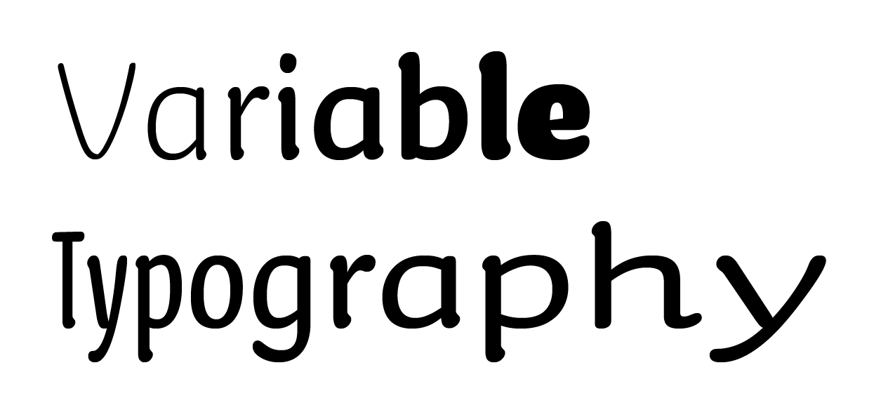
To help young readers of all skill levels, we’re introducing Kermit, a child-friendly typeface created by the type design studio Underware. Kermit is a friendly and approachable font that encourages children of all skill levels to read, even if they are anxious about their abilities. It is a powerful example of just how much design decisions matter: Associating boldness and letter widths with verbal inflections could improve a child’s comprehension, or employing Variable Fonts for animation may help severe dyslexics start their reading journey. Combining science and design creativity can improve a child’s confidence in reading, changing their trajectory in life. Kermit is, therefore, more than just a typeface, it is a platform for exploring new, science-based methods of helping children read.
Learning to read is difficult: the process involves nearly every part of your brain, and you have to train for years to do it effortlessly. For some people, though, reading can be like navigating a confusing highway filled with detours. Children who struggle to read often have low self-esteem and give up, limiting their creative potential and intellectual curiosity. Any help we can give children can be huge – even if it’s simply making words look more friendly.
Designing for early readers
Ever had your mood lifted, your burdens lightened, and your confidence boosted by someone’s encouraging words, or a stranger’s smile? We’ve all experienced that boost and science proves it. Being in a good mood improves our performance on creative cognitive tasks.
For Underware designers Bas Jacobs, Akiem Helmling, and Sami Kortemäki, making Kermit fun and playful was a way to put kids in a good mood, making them interested in reading. Therefore, the design had to be informal and relatable like handwriting.
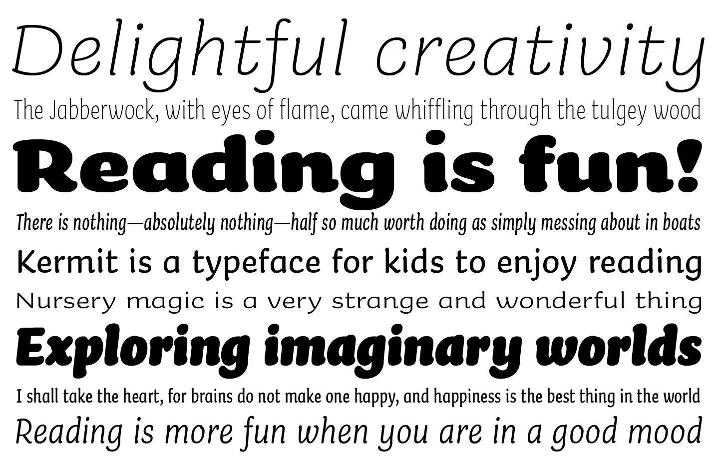
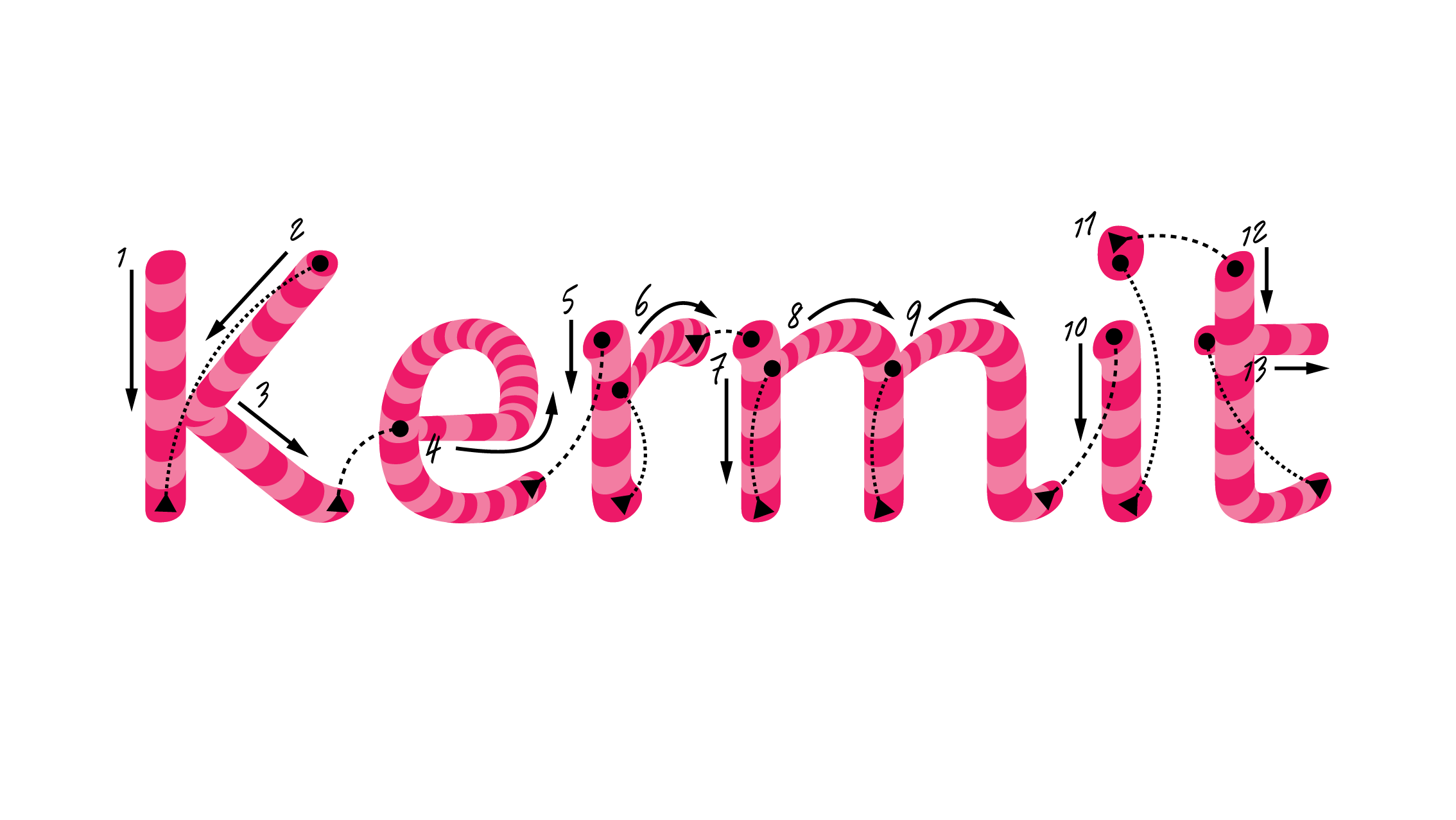
Kermit was designed for children to easily read, making legibility a priority. Underware imbued Kermit with a large x-height, thick strokes, generous spacing, and familiar letter shapes, striking a perfect balance between the informality of handwriting fonts and the structure and readability of classic book typefaces like Garamond or Avenir.
Making Kermit enjoyable—and with support for 426 languages based on Latin, Greek, and Cyrillic alphabets—is good but we wanted to do more by trying new ideas coming out of the scientific community. Take a look at the online specimen site for more details on Kermit’s design.
Showing how to read expressively
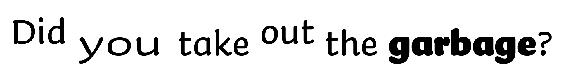
Remember when you were a kid having to clean your room, mow the lawn, or maybe take out the garbage? You probably heard your parent or guardian ask one of the following questions:
Did you take out the garbage?
Did you take out the garbage?
Did you take out the garbage?
All three questions use the same words, yet they have different meanings. When we speak, we inflect our voice to add more meaning. You might make your voice louder, or pronounce a word slowly, or raise your pitch. These inflections are called prosody. Unfortunately, almost all prosody gets lost when we write because we have no notation for it.
Ever had an email misunderstanding because people couldn’t tell you were being ironic? That confusion doesn’t happen as much in conversation because prosody makes the irony clear.
Researcher Ann Bessemans wondered if there was a way to represent prosody in written text. She found that when you represent pitch, volume, and duration typographically, children read out loud more expressively, with correct prosody. She also found that it even worked for children and adults who had hearing impairments. Even better, a preliminary, yet unpublished study is finding that adding prosody to text improves children’s comprehension.
Inspired by the possibility of helping kids read expressively and improve their comprehension, we designed Kermit to represent prosody: employing boldness to represent volume, width to represent duration, and shifts letters vertically to represent pitch. It looks unconventional, but once you get used to it, it’s easy to read text and hear all the nuance that a performer would add.
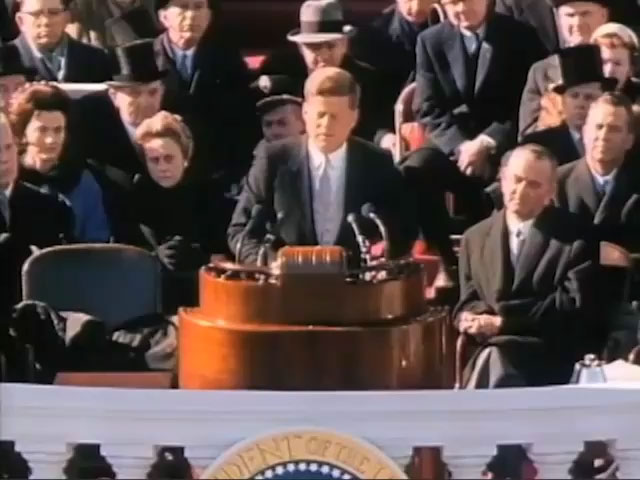
Great oratory is very expressive. When we caption videos such as President John F. Kennedy’s inaugural speech using conventional text, all his passion is lost in translation. Adding prosody to the captions enables you to experience the full power of the performance—even if you have a hearing impairment and can’t hear a single word.
A demonstration of how a speaker’s expressiveness is lost with normal subtitles, but retained with typographic prosody.
While we haven’t implemented automatic prosody yet, Kermit allows us to explore expressive writing to elevate comprehension for children and adults alike.
Helping severe dyslexics
Dyslexia is a very active area of research. Fifty years ago, people thought dyslexics saw letters backwards. Now, it’s primarily seen as a phonological problem in which dyslexics have difficulty with sounds in language. The most successful dyslexia programs to date focus on teaching phonemic awareness (e.g. that the spoken word “cat” has three sounds) and phonics (mapping letters to sounds). This success might make it seem like dyslexia is all about sounds, but it’s not clear yet if phonological problems are dyslexia’s cause.
In 2010, researchers Trichur Vidyasagar and Kristen Pammer suggested a new theory on the cause of dyslexia: dyslexic brains might have issues with visuo-spatial processing. In other words, dyslexic brains may process visual information differently, making the order of letters unclear and reading difficult.
To understand this, let’s take a trip inside your brain. Light enters your eyes and shines on the retina. The retina processes the light, sending neural signals on a long journey from your eyes to the back of your head where your brain processes images, forwarding them through the visual cortex.
This journey takes two parallel paths: the high road and the low road, literally. The high road, or dorsal pathway, physically runs along the top path through your brain, carrying information about where things are, such as the sky is up, pavement is down, or the order of letters on a page. It is the “where” signal.
The low road, or ventral pathway, runs below the high road, carrying information about what objects are, e.g. the blue thing is the sky, the grey thing, pavement, and the two lines leaning against each other with a crossbar is an A. It is the “what” signal.
These two roads meet at a little neural town called the Visual Wordform Area, which combines the “what” and “where” signals to form words—hence the name. This is where we recognize words.
This neural town has a big spotlight in it, controlled partially by signals from the high road. As we read, the spotlight should smoothly move from one letter to the next, focusing our attention on a letter from the low road, identifying it, then moving to the next. If anything goes wrong along the high road—and there are many things that can go wrong—the spotlight will not move smoothly or focus attention as well, disrupting reading.
According to Vidyasagar & Pammer’s theory, dyslexics may have something wrong in their high road, weakening signals about letter locations. That in turn makes it hard to understand the order that letters are coming in on the low road, making it more challenging to recognize words.
This smooth spotlight movement is something we have to learn. Before we learn to read, our eyes and attention unconsciously flit about, painting a picture of our world. The more we read, the more we train our brain to control our spotlight smoothly. But, if a child can’t recognize words due to weak high road signals, they won’t read as much. The neurological systems needed for proficient reading won’t get exercised, but they will get exercised in neurotypical classmates who read more. The dyslexic child gets left behind.
When these systems are underdeveloped, a child may not develop strong phonological associations or smooth visual scanning (remember, our eyes and brains have to be trained to do this; it isn’t natural). The number of potential issues along the high road might explain the variety of dyslexia subtypes.
So, what does all of this have to do with a font?
The high road doesn’t just carry location information; it carries motion signals, too. Adding motion to letters might boost the high road signal, helping dyslexics get control of their spotlight of attention and improve their reading. To help, we created a special version of Kermit that is animated, with letters that draw themselves.
A font that draws itself
How do you create an animated font?
Because Kermit is built as a Variable Font, it is not limited to Light, Regular, or Bold styles. It can produce any level of boldness thanks to Variable Font technology.
But the technology isn’t just for typography. It can vary in color, style, or even change a letter’s shape over time, making the font animated.
The math behind Variable Fonts, called linear interpolation, makes animation awkward because points on the letter’s outline must move in a straight line at a constant speed. Natural-looking animation through curves needs to use a higher order of mathematics.
An animation showing the advantage of HOI interpolation versus linear interpolation. Press play to show the animation or use the slider to control it yourself.
As a workaround, you could move points along many tiny lines so they seem to flow around a curve naturally. That, however, would require designers to draw dozens of versions of each letter like cartoon animators of the 1930’s–1970’s, painstakingly drawing 24 pictures for every second of film.
Luckily, Kermit’s designers had a clever mathematical idea: to combine independent linear parts of a Variable Font to create higher order math. They call it Higher Order Interpolation, or HOI for short. (Fun fact: In the Netherlands, where Underware is based, “Hoi” means “Hi”).
That breakthrough enabled the designers to create smooth animations that accelerate, decelerate, and turn corners with the control of an old school animator, without having to draw thousands of pictures. This makes Kermit’s animation feel like it’s naturally drawing itself with a pen.
An animation showing how Kermit can draw itself smoothly using HOI and variable font technologies. Press play to start the animation or use the slider to control it yourself.
We hope this animation will strengthen the high road signal in dyslexics, helping them better understand letter order and more easily recognize words. That could enable them to spend more time reading and training the neural pathways for reading. We are still testing this idea and will release the animated version only when we can scientifically prove its benefits.
Empowering children
Writing systems, which are over 5,500 years old, are one of humanity’s greatest inventions. Like magic or telepathy, they transmit ideas and creativity across the globe and across generations. It is one of the ways that we express our humanity. Now, it’s time for an upgrade. Time to take advantage of our latest technologies and research to empower more children to read.
In designing a child-centric font for reading, we hope to support children learning to read while also making it more enjoyable, valuable, and accessible for everyone to read. We explore new frontiers with the animated version of Kermit, new methods of research-based expressiveness, and new ways of making reading look fun and easy to all kids, regardless of reading skill.
The power of reading sets a child’s imagination on fire, and no movie or technology can surpass the theater of the mind. Reading gives children agency and, ultimately, confidence. It impacts the trajectory of their lives, from their academic performance across subjects, to future job prospects, to their self-image and whether or not they feel incompetent or capable. Every child deserves the opportunity to thrive, and we are dedicated to trying ideas new and old to help them. We hope that this first release of Kermit is the next step on that journey.
The basic styles of Kermit (Regular, Bold, Italic, and Bold Italic) are available today in Office, with the remaining 38 styles arriving in early May. If you want to try out the font online in the meantime, you can go to the demo site at Kermit-font.com.
Read more
To stay in the know with Microsoft Design, follow us on Twitter and Instagram, or join our Windows or Office Insider program. And if you are interested in working with us at Microsoft, head over to aka.ms/DesignCareers.

Outcomes over output: Designing shared cognition
How we are shaping systems that help people think better, not just type faster.
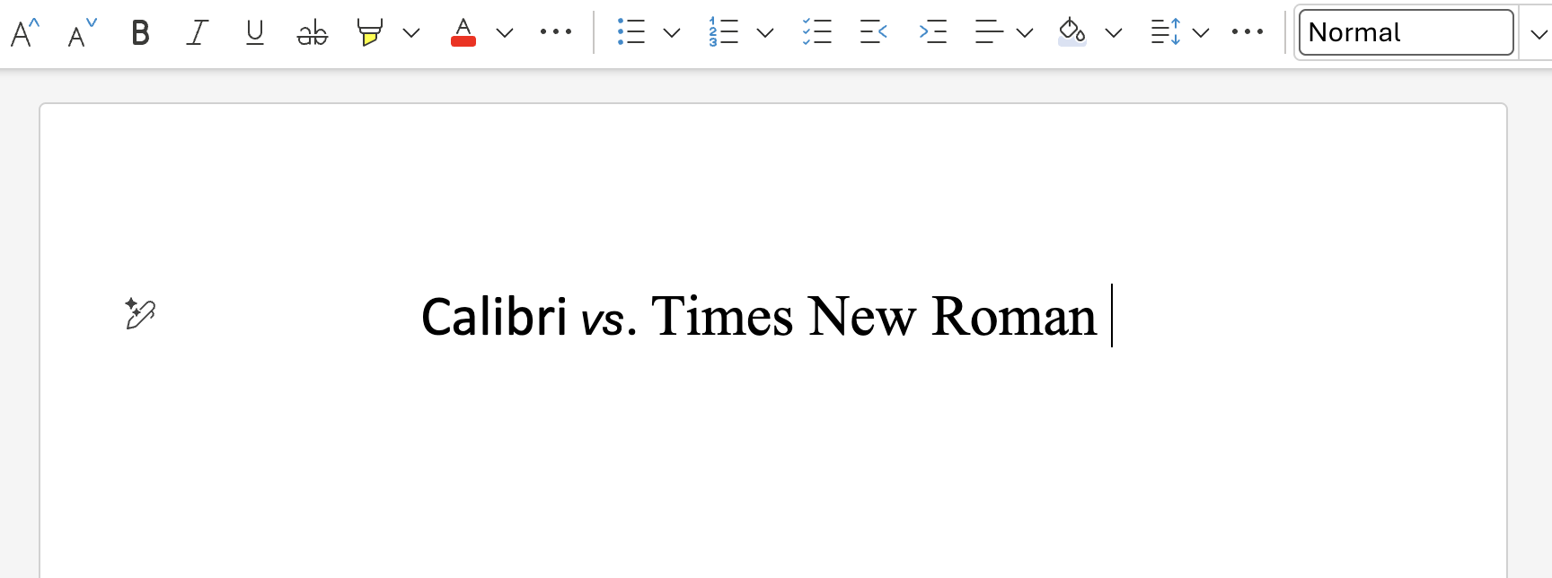
We can all be friends: Times New Roman vs Calibri
Explore how typography decisions really affect readability, accessibility, and brand expression.
Designing loops, not paths
How cybernetic loops are helping us turn “human in the loop” from a catchphrase into a design practice