Product – Design Thinking, UX/UI, Microsoft Edge
Reinventing online shopping on Microsoft Edge
Helping shoppers save time and money with an intelligent browser

With the world in the middle of a pandemic, this holiday shopping season will be unlike what we have seen before. People who would normally visit multiple stores for the festive sales will be moving online. Holiday spending will change and a lot of things will be novel this time around, making it difficult for retailers to prepare like they usually would.
The shift to digital commerce has accelerated ever since online buying became one of the safest ways to purchase everything from groceries to appliances. Retailers are also focusing on their online experience, spreading out deals and re-curating their catalogue (comfy loungewear is possibly featured on more apparel site banners than ever before). While some retailers optimize their design to get people to click “buy” or see feeds of related products, shoppers don’t always have the information they need to make a buying decision they feel great about. And finding that information takes time.
As new shopping behaviors emerge and retailers revamp their selling strategies, we investigated how the browser can play a more active role to help navigate online shopping instead of being the traditionally dormant gateway to websites. Our vision is to empower people to make confident purchase decisions by saving time and money. By automatically applying coupons and surfacing price comparisons in the browser, we are taking our first step towards realizing this vision.
To move fast and help shoppers during the holidays, we embraced a design process that is all about iterating, quick sprinting, being bold, learning fast, and acknowledging that we don’t have all the right answers. If you’re a designer powering through the final design stages before the big shopping season, we hope this read is insightful for you!
An in-browser shopping experience for every kind of customer
Shopping makes up for one of the largest browsing time shares. A web browser is a universal medium for all kinds of shoppers, buying all kinds of things and individual needs will differ. So how do we understand who these people are and figure out what they really need? We started our foundational research by speaking to different people, which helped us build our persona spectrum.

True Blue Shoppers are frequent shoppers who are hyper-aware of prices across retailers and like to be on top of deals. They want to fast-track their research, and in-place surfacing of price comparisons and coupons can help them cut down on multiple research tabs.

Accidental Shoppers are quick to buy and often prone to buyer’s remorse. Auto-opening the most important information at key junctures like checkout makes sure that they don’t miss coupons while buying.

Incidental Shoppers buy when the need arises and invest less time shopping overall. An easily available way to check the lowest price for the product they need will reinforce confidence in their buying decision.
Each persona goes about their buying journey differently. True Blue and Incidental shoppers start off by researching what to buy. Accidental shoppers are not heavy on research and spend less or no time here. Where these journeys collide is at the intent of buying, like on the product detail pages, and in the act of buying when the person has made up their mind and is at checkout. As designers, identifying these common stages in the journey can help us solve for the high-value actions that benefit the largest set of customers.
Two frequent pain points across these stages and across the persona spectrums are comparing prices between retailers and knowing the right offers.
To help with these problems, we came up with a native-to-browser design framework that tailors shopping assistance to prioritize different information depending on the shopper’s stage in their journey. We determine what stage a person is at based on what kind of page they’re on. So, on product detail pages, we show price comparisons first because they share the lowest price for that product across retailers. And on checkout pages, auto-applying coupons stands as the most important action to maximize savings before they commit to buy.

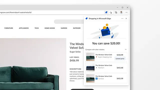
Another challenge we faced was bringing in a go-along UX for shoppers without entirely breaking away from browser interaction paradigms. Browsers have been around for 30 years, and people use them almost every day to visit the web, making most browser actions muscle memory. It’s the evergreen design challenge of introducing something new to a functional experience that works as is. Reinventing or breaking these strong habits can leave someone feeling lost or out of touch.
As you design your experiences, think about relying on a consistent UI paradigm that is both familiar and always available to the user. In our case, the UI framework leverages the URL bar, or address bar, in Edge as a quick one-touch anchor for shopping assistance. The URL bar is where people expect things relevant to the current webpage to show up — and we are extending the same model to surface optimized shopping insights. The design also adapts to the customer’s immediate context when they click on a promotional code field by surfacing a list of coupons as an autofill dropdown. Shoppers can choose to automatically apply the coupon with highest savings. In this case the UI pours out from the address bar to show up very much within the page-frame but still retains the same visual elements and tone for a cohesive overall experience.
Shoppers often worry about how their data is being used — you’re giving me something that seems helpful, but what are you taking? Keeping privacy top of mind while designing shopping experiences and eliminating ambiguity through the UX plays a super important role in making people feel comfortable. Edge never tracks what you’re shopping for. We depend on locally-stored lists of product sites to determine if you’re on a shopping site. Only then will we find coupons for you. The UX also gives people a range of nuanced controls beyond just turning this experience on or off, letting them customize the experience to suit their preferences. For example, the customer can decide if they prefer coupons to automatically appear during checkout or wait until they fetch them.
Setting the right tone
Helping people save time and money is a great opportunity for delight. The UI needs to celebrate and reflect the same joy a shopper feels every time they save something. In designing for Edge, we employed visual feedback, animations, and language to design an emotion a customer can resonate with.
When coupons are applied, we use a celebratory animation and clearly state the amount saved.
However, a great user experience also entails elegantly handling cases where things don’t work out. When the person doesn’t end up finding a coupon that applies to their cart, responding honestly by acknowledging we were unable to help this time and setting the right tone is important in building up and retaining trust. These interactions leave the shopper hopeful the next time they’re buying something. When auto-apply fails, we politely ask them to manually try via the code-box dropdown.

Looking beyond the item in the cart
Being certain about a decision can make for a better buying experience, especially in a time with so much uncertainty around. For both shoppers and retailers hurt economically by the pandemic, this holiday season will be very important in regaining hope. All designers working on retail experiences carry the huge responsibility to really empathize while crafting their UX. The time is now to be receptive, thoughtful, and open.
Ultimately, we hope people spend less time on their devices making purchases and more time enjoying the festivities. As the design community at large thinks about how we can tailor online retail experiences to suit the new normal, we are excited to hear more from you in the comments below!
Read more
To stay in the know with Microsoft Design, follow us on Twitter and Instagram, or join our Windows or Office Insider program. And if you are interested in working with us at Microsoft, head over to aka.ms/DesignCareers.

Design isn’t dying. It’s shifting left.
When the model is the new medium, shaping how it behaves in humanistic ways is design
From incubation to impact: Microsoft 365 Companion apps
How scrappy prototypes became polished apps—shipped on the taskbar, grounded in Fluent, and refined by research.
When AI joins the team: Three principles for responsible agent design
A practical guide to build agents that stay differentiated, intent-aligned, and bias-resistant
