
Reimagining our front door
Using positive psychology to craft delightful sign-in & sign-up experiences
When was the last time you thought deeply about a sign-in screen? Probably never. And that’s kind of the point. The best authentication experiences should feel frictionless, intuitive, and almost forgettable. But crafting that invisible clarity is anything but simple. Behind every seamless sign-in or sign-up (SISU) experience lies enormous complexity, especially when you’re designing for over a billion Microsoft account users each month.
What might seem like “just” a visual SISU refresh is, in fact, a fundamental redesign of how people begin their Microsoft journey. This isn’t just about a more polished user interface (UI); it’s about trust, identity, and the quiet power of human-centered design. We’ve transformed one of our most critical and invisible interactions into something that feels seamless, safe, and above all, human.
Understanding how the human brain works is essential. Research shows that people are largely driven by subconscious impulses and emotions. The first few seconds of an interaction shape their expectations, trust and perception, long before a product’s full value is revealed. A confusing or frustrating sign-in or sign-up experience can lose users before they even begin.

Designing for humans: simplifying complexity
SISU flows play a pivotal role in user retention and satisfaction. Far from being a mere formality, they are gateways in shaping how users perceive our ecosystem, and are foundational, horizontal experiences that span all Microsoft products and services. When designed well, they foster trust and showcase the value of a Microsoft account.
Deep delight in design emerges when functionality, reliability, usability, and emotional appeal are all holistically addressed. It’s not just about beautiful visuals but about minimizing friction at every step of the user’s journey. That means reducing steps to completion, lowering the information cost, and decreasing unnecessary noise.
In rethinking our experiences, we deeply analyzed the pain points our users faced. Inconsistent visuals, cluttered interfaces, context switching, and outdated authentication methods were some aspects that created frustration and confusion. For us to create an experience that felt clear, and cohesive, we had to earn our users’ trust from the very beginning, a process shaped in collaboration with our research design partners.
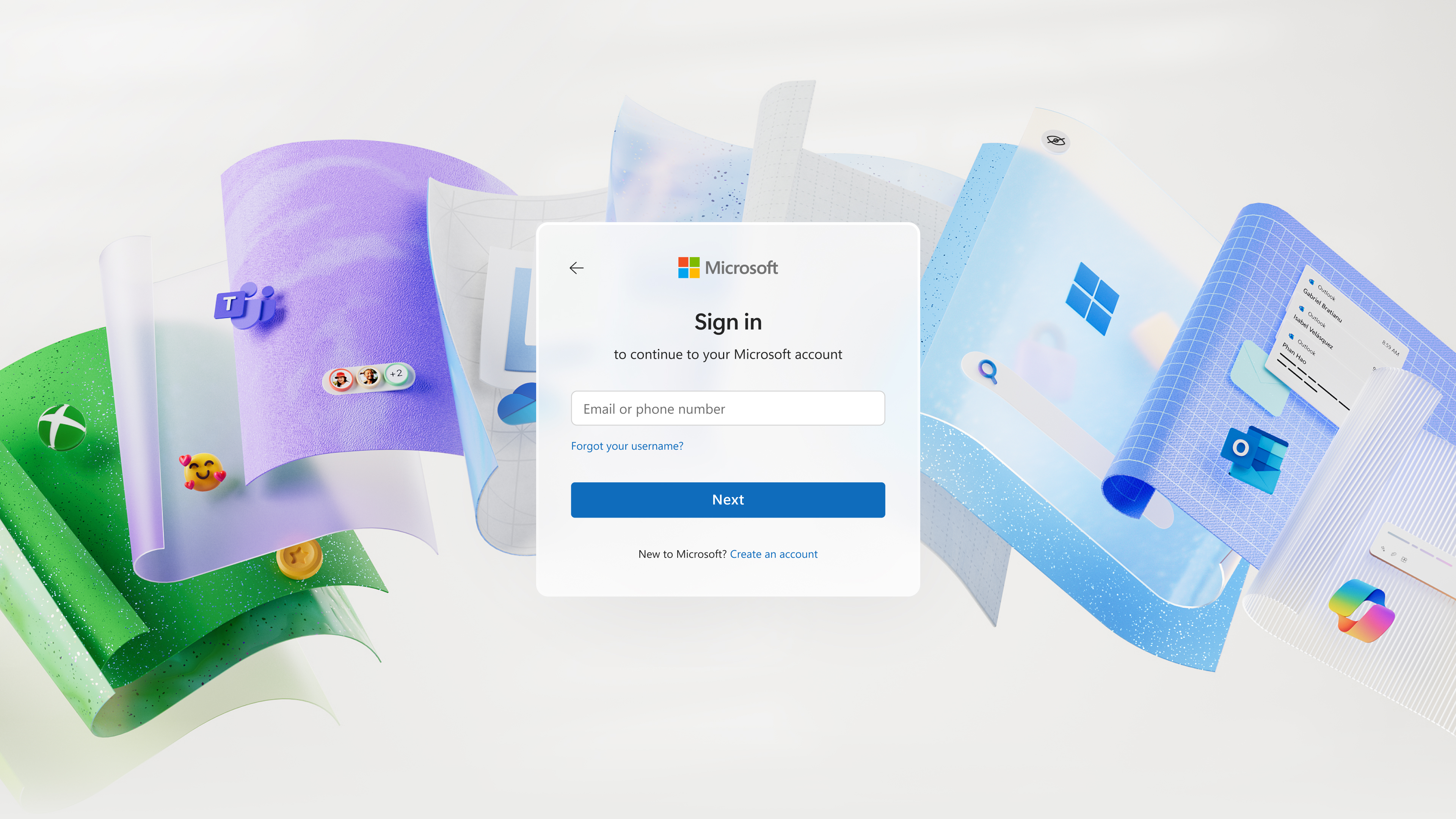
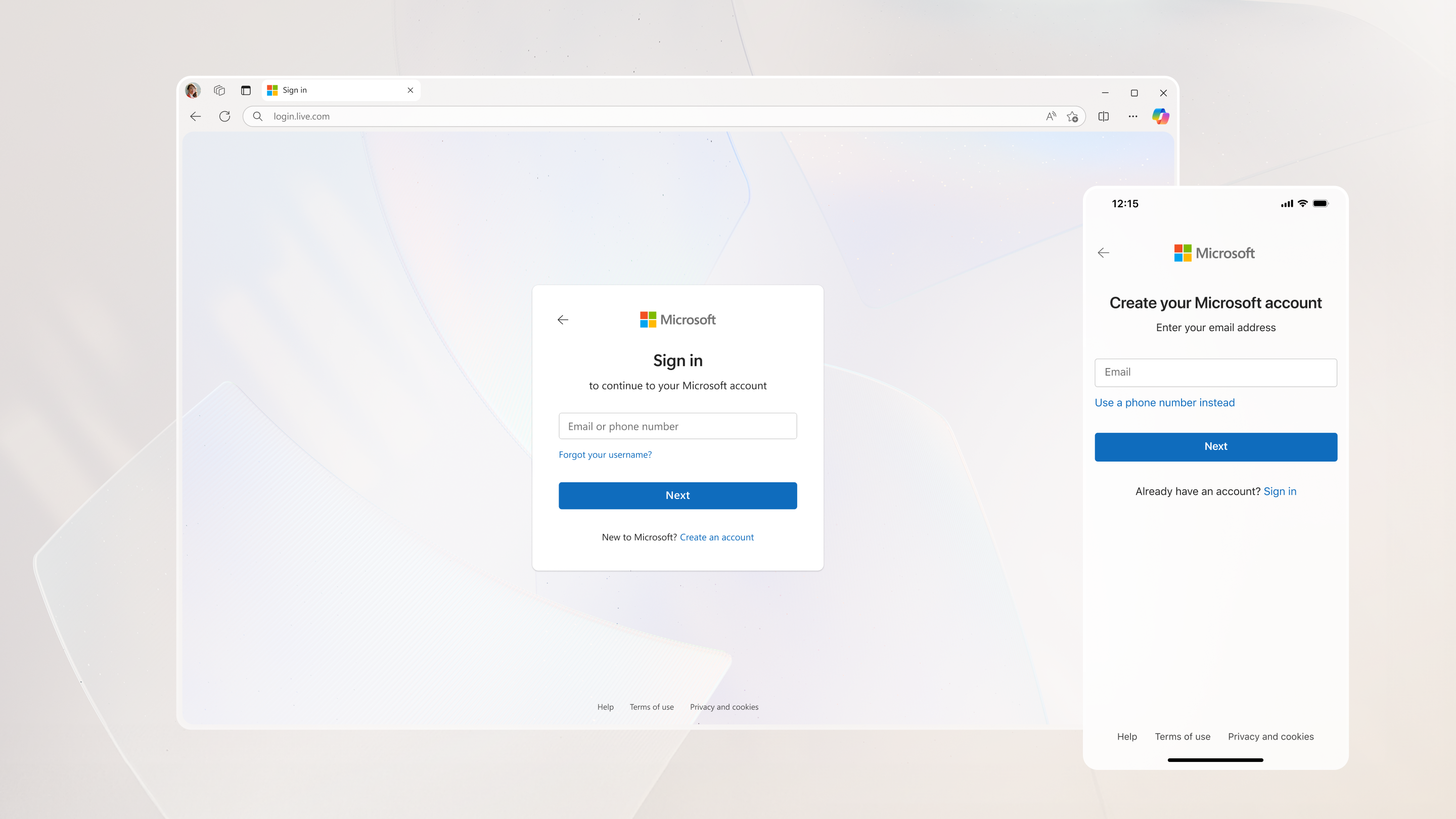
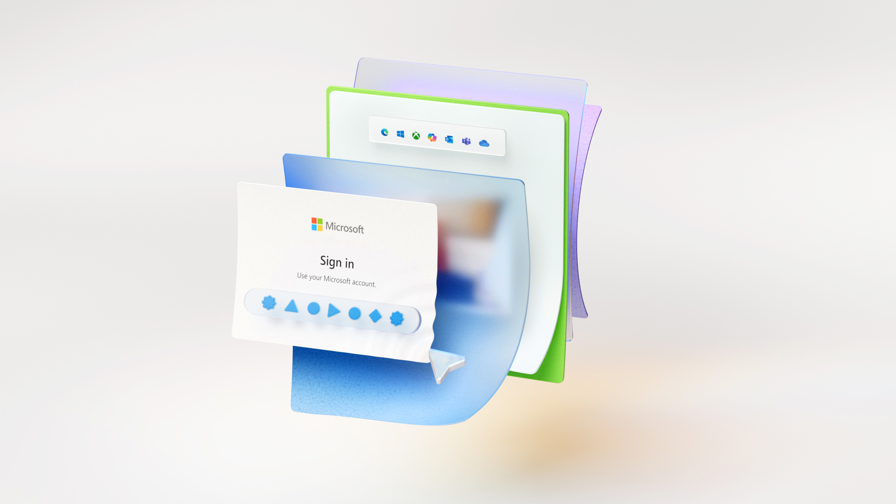
Embracing Fluent 2, Microsoft’s modern design language, brings a cohesive visual and functional experience across devices while improving accessibility for users of all abilities. By removing product logos and custom backgrounds, the interface feels cleaner and less distracting. Consistent navigation simplifies user movement, and collecting essential information during sign-up helps prevent issues down the line. Dead ends and confusing loopbacks have been eliminated, replaced by a streamlined, focused journey.
A major area of improvement has been simplifying long complex flows, such as child account setup. What was once confusing and time-consuming is now intuitive and family friendly. Our human-centered design principles have been applied throughout SISU, ensuring a cohesive, approachable experience across Microsoft services.
Creating a calm, focused experience
Small details make a big impact. Subtle touches, like guiding animations and smooth transitions, along with friendly microcopy crafted with our content design partners, help users feel supported rather than instructed. At its best, onboarding should create a sense of flow, where users move forward effortlessly, without friction or second-guessing. This means reducing decision fatigue and offering just the right guidance at just the right moment. A thoughtful experience doesn’t call attention to itself; it simply works, leaving users feeling confident and ready to engage.
Our redesigned flow is simplified, emotionally engaging, and centered on helping users feel understood and in control. People naturally gravitate toward familiar patterns. With this in mind, we’ve incorporated known conventions to ease cognitive load and foster trust. Features like animated illustrations for new concepts, generously sized input fields, and clear calls to action support muscle memory and create a more intuitive, human experience.
Co-branding also plays a key role in this evolution. The new sign-in flow harmonizes Microsoft’s Fluent design system with the unique visual identities of products like Xbox. This integration of product-specific colors and branding not only reinforces recognition but also brings a sense of personalization and familiarity, whether users are signing into a productivity app or a gaming platform.
Embracing passwordless authentication for a secure future
As part of Microsoft’s Secure Future Initiative (SFI), the SISU experience has been redesigned with passwordless authentication at its core. New sign-ups begin with simple code verification; no passwords are required. Modern methods like passkeys deliver stronger security with less friction.
We’ve streamlined both sign-in and sign-up flows to default to these faster, more secure options. Users can now remove passwords entirely and rely on safer alternatives. Designed to be passwordless by default, the experience makes upgrading to stronger protection easy and intuitive.
We’ve also reimagined account recovery. What once required multiple screens and steps can now be completed with a single click, making the process not just safer, but also simpler and more user-friendly.
The power of meaningful design at Microsoft
Our reimagined sign-in and sign-up flow reflects a core belief-achieving true simplicity requires thoughtful effort and meticulous design. Through a focus on delight, modern interaction patterns, and a human-centered approach, the experience now feels simple, secure, and emotionally engaging.
Understanding human behavior and designing with empathy not only creates better experiences but also builds stronger relationships. Our new SISU journey lays the foundation for long-term trust, deeper engagement, and a more meaningful connection within our Microsoft ecosystem.
Read more
To stay in the know with Microsoft Design, follow us on Twitter and Instagram, or join our Windows or Office Insider program. And if you are interested in working with us at Microsoft, head over to aka.ms/DesignCareers.
From incubation to impact: Microsoft 365 Companion apps
How scrappy prototypes became polished apps—shipped on the taskbar, grounded in Fluent, and refined by research.
When AI joins the team: Three principles for responsible agent design
A practical guide to build agents that stay differentiated, intent-aligned, and bias-resistant
The new Microsoft 365 Copilot mobile experience
How we redesigned the Microsoft 365 Copilot mobile app to create a workspace built around conversation, dialogue, and discovery.