Product – UX/UI, Iconography, M365 Office
Redesigning the Office app icons to embrace a new world of work
Design is becoming the heart and soul of Office. Learn how we evolved our visual identity to reflect the simple, powerful, and intelligent experiences of Office 365.

Whoever said that nothing is more intimidating than the blank page probably never faced a redesign.
The last time we updated the Microsoft Office icons was in 2013, when selfies were new enough to become Oxford Dictionaries’ Word of the Year and emojis were new enough to be considered buzzworthy.
Clearly, a lot has changed since then — including how people get things done.
Over 1 billion people from vastly different industries, geographies, and generations use Office. They work on different platforms and devices and in environments that are faster, more distracting, and more connected than ever before.
To support this changing world of work, Office is transforming into a collaborative suite that lets you work together in real-time from almost any device. We’ve infused our tools with powerful AI: you can get insights from data with less effort, write a paper using your voice, or make your resume using LinkedIn insights. We’ve also added totally new apps to the suite like our AI-powered meetings and chat service, Microsoft Teams. In the end, it’s great design that makes these experiences fluid and seamless.
As a signal to our customers, we’ve evolved our Office icons to reflect these significant product changes. We’re thrilled to share the new icons for Office 365 with you today and tell the story behind their creation.
Carefully crafted designs that honor heritage and welcome the future

From the get-go, we embraced Office’s rich history and used it to inform design decisions. Strong colors have always been at the core of the Office brand, and new icons are a chance to evolve our palette. Color differentiates apps and creates personality, and for the new icons we chose hues that are bolder, lighter and friendlier — a nod to how Office has evolved.
We also used gestalt principles to further emphasize key product changes. Simplicity and harmony are key visual elements that reflect the seamless connectivity and intuitiveness of Office apps. While each icon has a unique and identifiable symbol, there are connections within each app’s symbol and the collective suite.
Flexible visual systems that work across platforms, devices, and generations

Today’s workforce includes five generations using Office on multiple platforms and devices and in environments spanning work, home, and on the go. We wanted a visual language that emotionally resonates across generations, works across platforms and devices, and echoes the kinetic nature of productivity today.
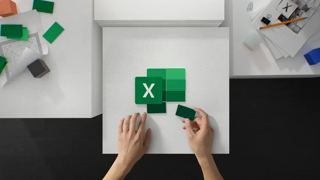
Our design solution was to decouple the letter and the symbol in the icons, essentially creating two panels (one for the letter and one for the symbol) that we can pair or separate. This allows us to maintain familiarity while still emphasizing simplicity inside the app.
Separating these into two panels also adds depth, which sparks opportunities in 3D contexts. Through this flexible system, we keep tradition alive while gently pushing the envelope.
Human-centered designs that emphasize content and reflect the speed of modern life

We all know modern life is faster and more connected: we’re living in it. Office supports this by making it fast and easy to express ideas, collaborate with others, and stay focused and in the flow. It’s why Office apps compose together, enabling users to open PowerPoint or Excel beside conversations in Teams or Outlook.
To reflect this in the icons, we removed a visual boundary: the traditional tool formatting. Whereas prior Office icons had a document outline for Microsoft Word and a spreadsheet outline for Excel, we now show lines of text for Word and individual cells for Excel. By focusing on the content rather than any specific format, these icons embody the collaborative nature of the apps they represent.

Similarly, we’ve changed the letter-to-symbol ratio. Traditionally, the letter occupied two-thirds of the icon, and the symbol took up one-third. We’ve changed this ratio to now emphasize the symbol because while the letter represents the tool itself, the symbol speaks more to people’s creations.
Being part of the design community
Our new icons will begin rolling out across platforms in the coming months, starting with mobile and web. They are the result of many iterations, a lot of research and testing, and plenty of late nights and weekends. They’re also part of an ongoing journey. As designers, we love the creative community’s ability to inspire each other and create momentum, so don’t hesitate to leave a comment below.
Read more
To stay in the know with Microsoft Design, follow us on Twitter and Instagram, or join our Windows or Office Insider program. And if you are interested in working with us at Microsoft, head over to aka.ms/DesignCareers.

Design isn’t dying. It’s shifting left.
When the model is the new medium, shaping how it behaves in humanistic ways is design

From incubation to impact: Microsoft 365 Companion apps
How scrappy prototypes became polished apps—shipped on the taskbar, grounded in Fluent, and refined by research.

When AI joins the team: Three principles for responsible agent design
A practical guide to build agents that stay differentiated, intent-aligned, and bias-resistant
