
Product – Design Thinking, UX/UI, M365, Windows
– The estimated reading time is 5 min.
From incubation to impact: Microsoft 365 Companion apps
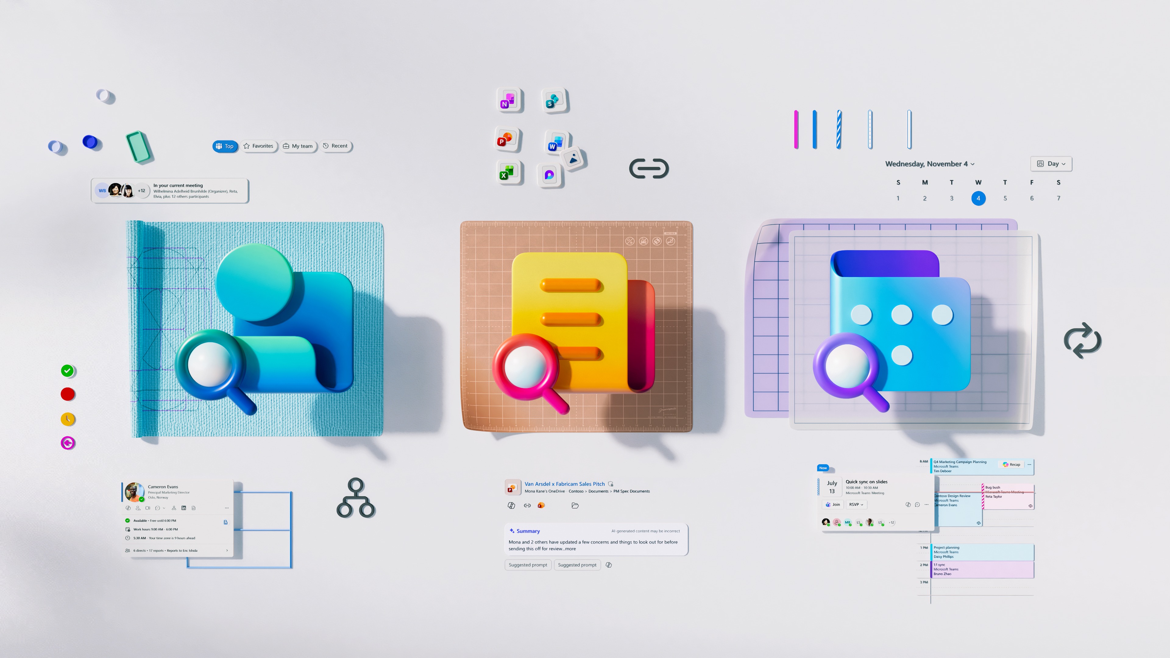
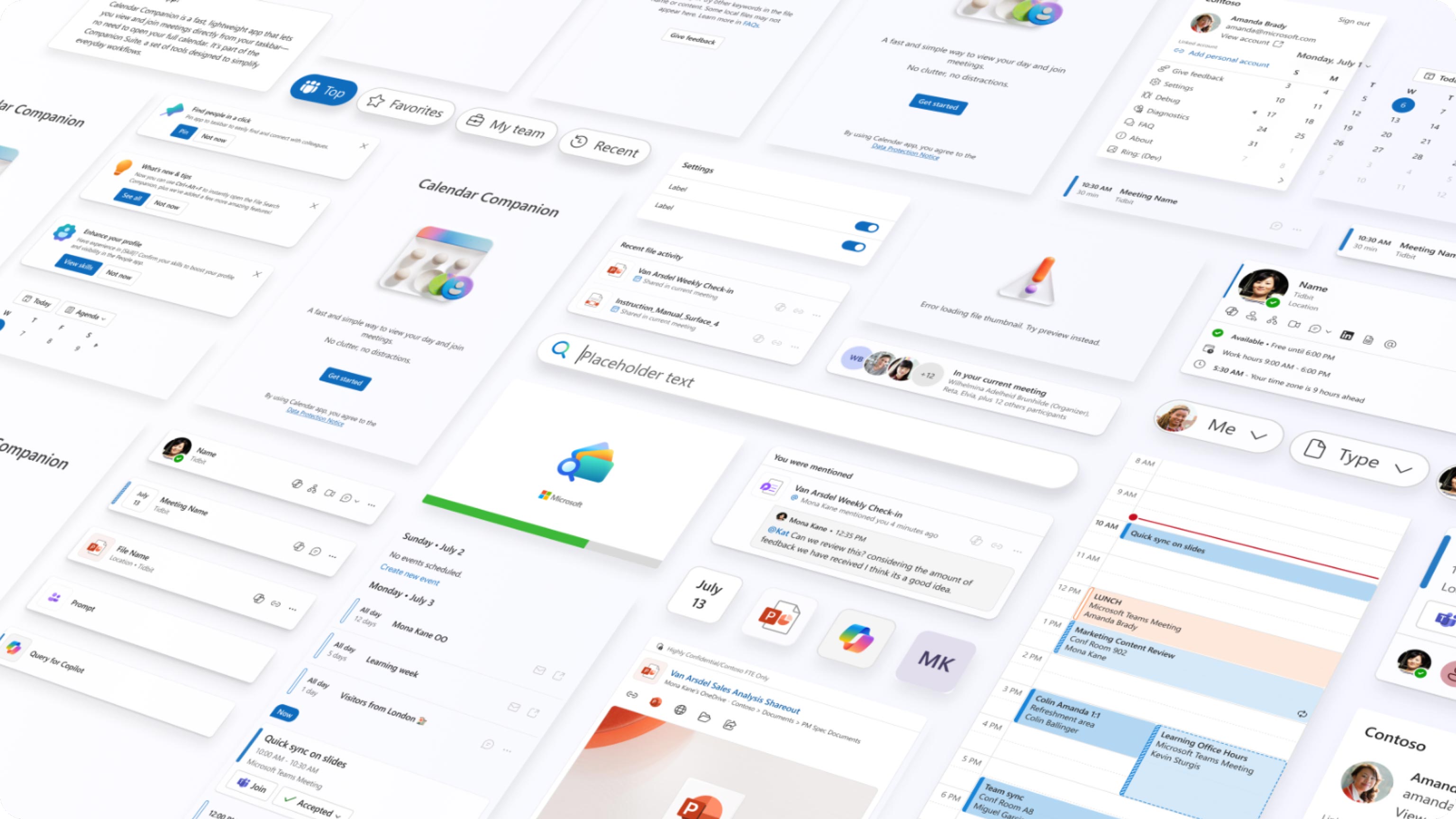
When we set out to create the Microsoft 365 Companion apps—People, Files, and Calendar—we were trying to solve a basic problem: searching for people, finding files, and managing meetings often felt harder than they should. By pulling them out of the usual workflow, we could zero in on what matters. “We knew this data was being accessed billions of times a day, and yet there was nothing in the system that was purpose‑built to these micro‑tasks,” says Ian Todd, Partner PM Manager. That led us to build experiences that put data—and AI insights—at the center, making each interaction lightweight and focused.
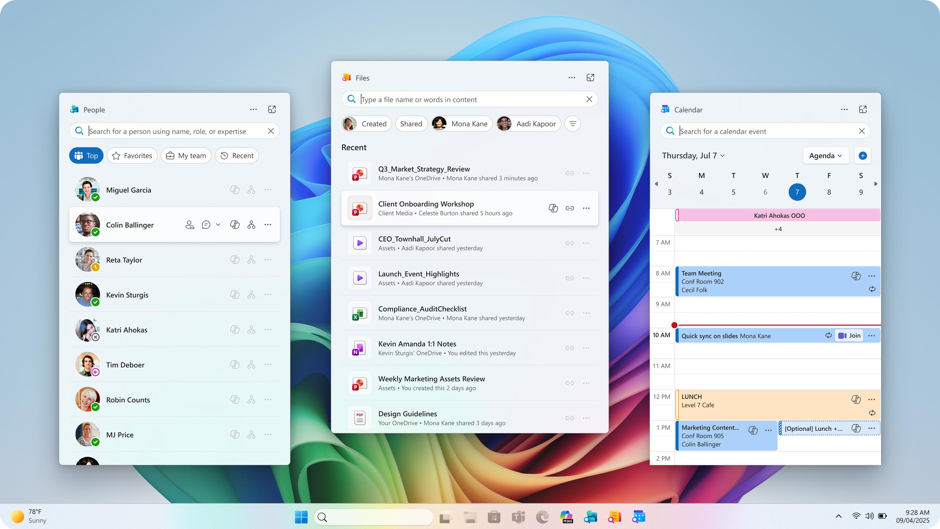
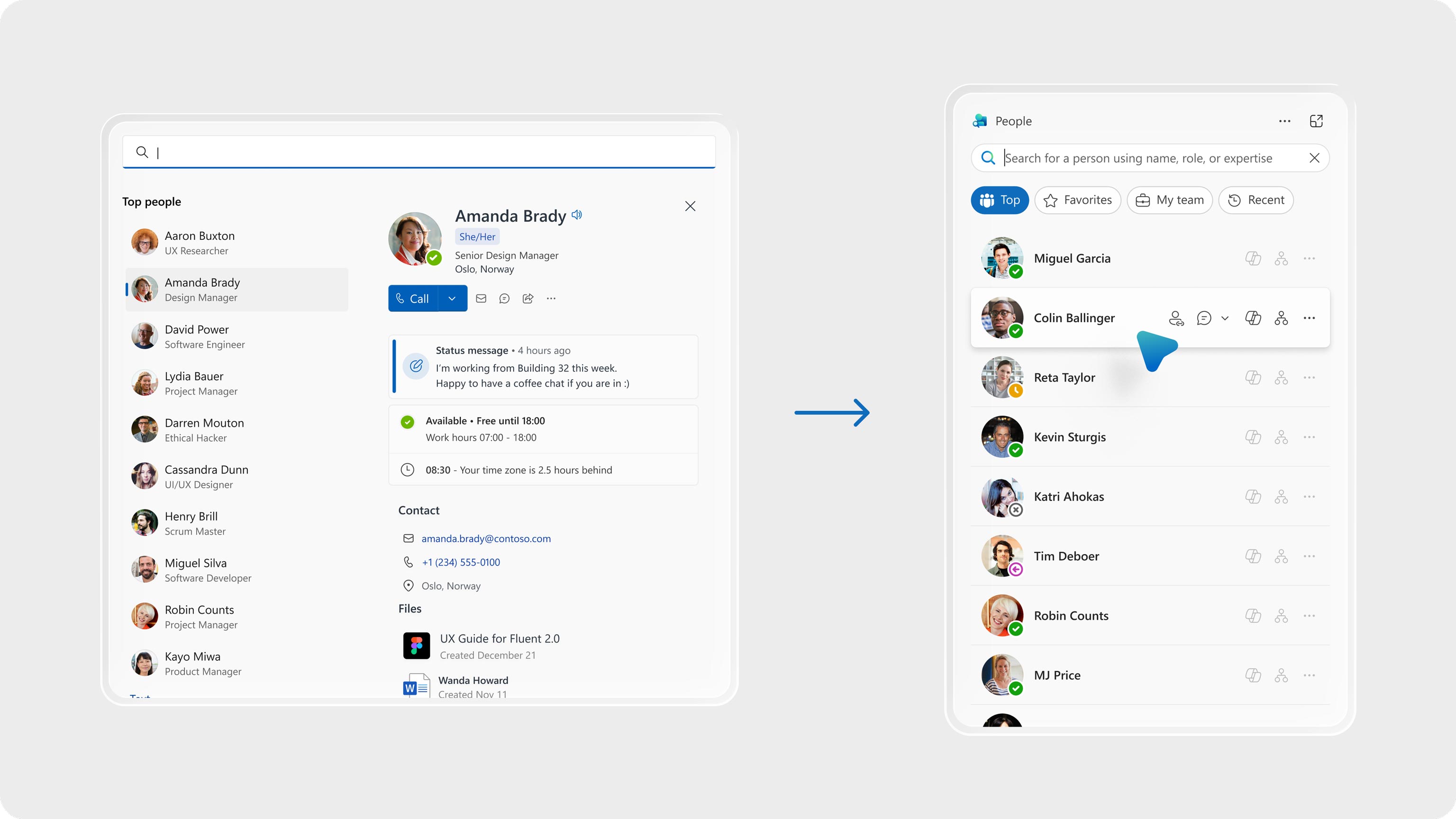
Companions are the shortest path to the things we use every day: people, files, and events. That clarity shaped our first big decision: bring the experience to where work begins. Placing Companions on the Windows 11 taskbar was a commitment to speed and familiarity. We leaned into the taskbar’s visual language—clean lines, restrained color, typography that favors clarity over flourish. Each icon signals its job—Files’ folder motif, People’s silhouette, Calendar’s grid—reducing cognitive load.
But familiarity alone isn’t enough. The apps had to feel modern, adaptive, and deeply integrated with Microsoft 365. We built on Fluent principles: motion that feels natural, surfaces that respond with warmth, and controls that prioritize accessibility. Every component was refined for consistency. The result is a suite that feels cohesive without being monotonous, with shared DNA, nuanced layouts, and clear hierarchies.
Incubation and validation: make to think, build to learn
We began with an incubation philosophy: prototyping as a thinking tool—make to think. Instead of waiting for perfect specs, we built rough prototypes and obsessed over our own usage. Internal dogfooding was our first filter—proving and disproving hypotheses in real scenarios. Each experiment surfaced the moments worth investing in: a shortcut that shaved seconds, a prompt that simplified a complex task, a micro‑interaction that eased an edge case.
“Make to think” is a tried‑and‑true practice. “It’s about understanding something best by building it, not just writing ideas on a whiteboard,” explains Jon Harris, Corporate Vice President, Microsoft 365 Core Design. “When you make something real, even a prototype, you immediately see what is working and what’s not.” That real‑time insight is what turns uncertainty into clarity, especially when the product’s intelligence only reveals itself in use, with real data and real context.
Once we saw promising signals in our own workflows, we reached out to a key set of M365 customers. Their feedback helped us check assumptions and see how the apps performed outside our bubble. Only when real usage and clear benefits appeared did we go wide. Polish came from seeing real value in real habits—not from arbitrary deadlines.
Craft and polish: earning the right to refine
Speed was how we found where craft mattered most. “By making early you move faster because you learn faster; and you make it better because you feel what needs to be refined,” says Harris. He compares it to a soft‑close drawer: the finish matters, but the way it closes is what brings craft to life. “If you don’t prototype that behavior early, it becomes a rush at the end and it’s hard to re‑architect,” he says.
Early on, we practiced low-ego design: don’t polish what you might discard. Once the core value was clear and validated, we pivoted from velocity to finish. That’s when deep craft kicked in—refining every detail, amplifying with Fluent, and tuning for speed and performance. Design and engineering paired closely, ensuring that polish served the promise of bringing core entities to your fingertips at lightning speed. We didn’t treat Fluent as a coat of paint; we treated it as a set of principles and tokens we could compose into a system tailored to Companions’ job.
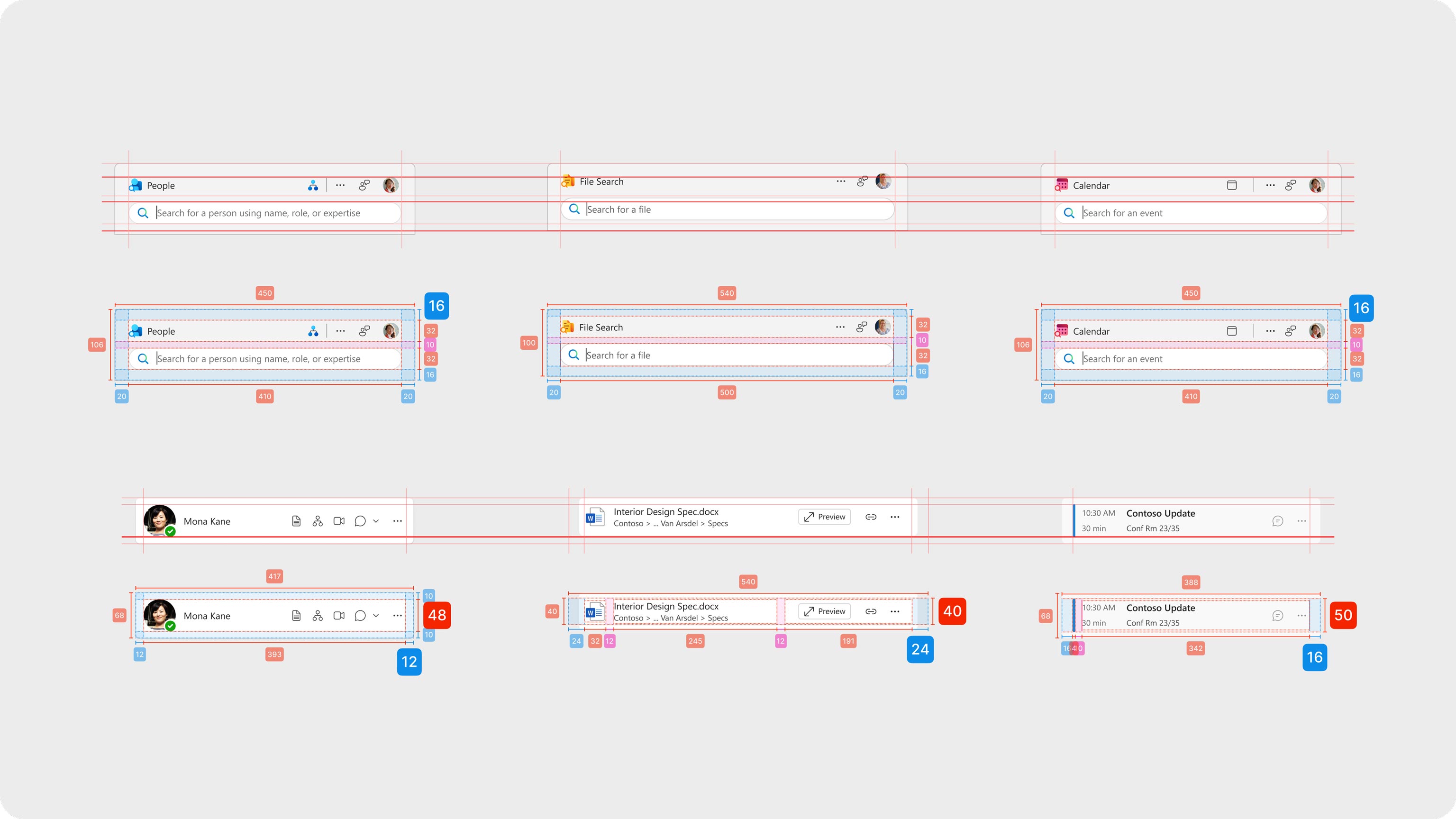
This wasn’t a designer only exercise. Engineers were in the room from the beginning, pairing with design on feasibility spikes and performance budgets so we could ship what we sketched. Fluent tokens kept decisions clean from Figma to code. Content design did its job where it matters most and is easiest to overlook: instructional copy that starts with a verb, first-run experience language that reads like a colleague not a banner, prompts that invite rather than intimidate.
Research threaded through everything. We used interviews and telemetry to map where time goes in a workday— how a quick calendar check can turn into a multi‑minute detour, or a file search can pull people into the wrong app. Those observations shaped onboarding: the first minute with Companions had to feel less like learning and more like recognition. “Users need instant clarity on what this is and why it matters—not a feature list, but a clear benefit that connects to their workflow,” explains Sarai Prado Terán, UX Researcher.
Integrating Copilot opened new possibilities. AI could transform how people find information and get work done, but we weren’t just adding an AI button; we were bringing AI in to deepen the value we’d already uncovered. Our north star: get users the data and insights they need—deep and fast. Make‑to‑think helped us test prompt framings and UI affordances, keeping what reduced friction and cutting what added complexity.
Human-centered design: solving real needs
This process—make to think, validate, then craft—reflects a commitment to human-centered design at Microsoft. By obsessing over real needs and pain points, we earned the right to polish only what truly mattered. Companions honor familiar patterns while introducing subtle innovations that make work feel effortless. They show how design can bridge complexity and clarity, turning powerful technology into something approachable.