
Fluid forms, vibrant colors
How a subtle refresh of our Microsoft 365 icons signals deeper change.
When it comes to outsized impact, it’s hard to debate the almighty icon. No bigger than a postage stamp, these tiny symbols are gateways to entire experiences, distilling complex ideas, product abilities, and brand identities into a single, memorable image. By evoking emotion, sparking curiosity, and giving intuitive guidance, they make technology more accessible and approachable.
Today, as we roll out refreshed icons for Microsoft 365 apps, small but significant design changes are a reflection and a signal. As a reflection, they encapsulate how AI is shifting the discipline of design and the nature of product development. As a symbol, they embody an ethos rooted in connection, coherence, and fluid collaboration. While these principles guided previous redesigns, their meaning has shifted—connection today isn’t about visual consistency so much as the seamless flow of human intent across every Microsoft 365 canvas.
A design journey from UI to UX
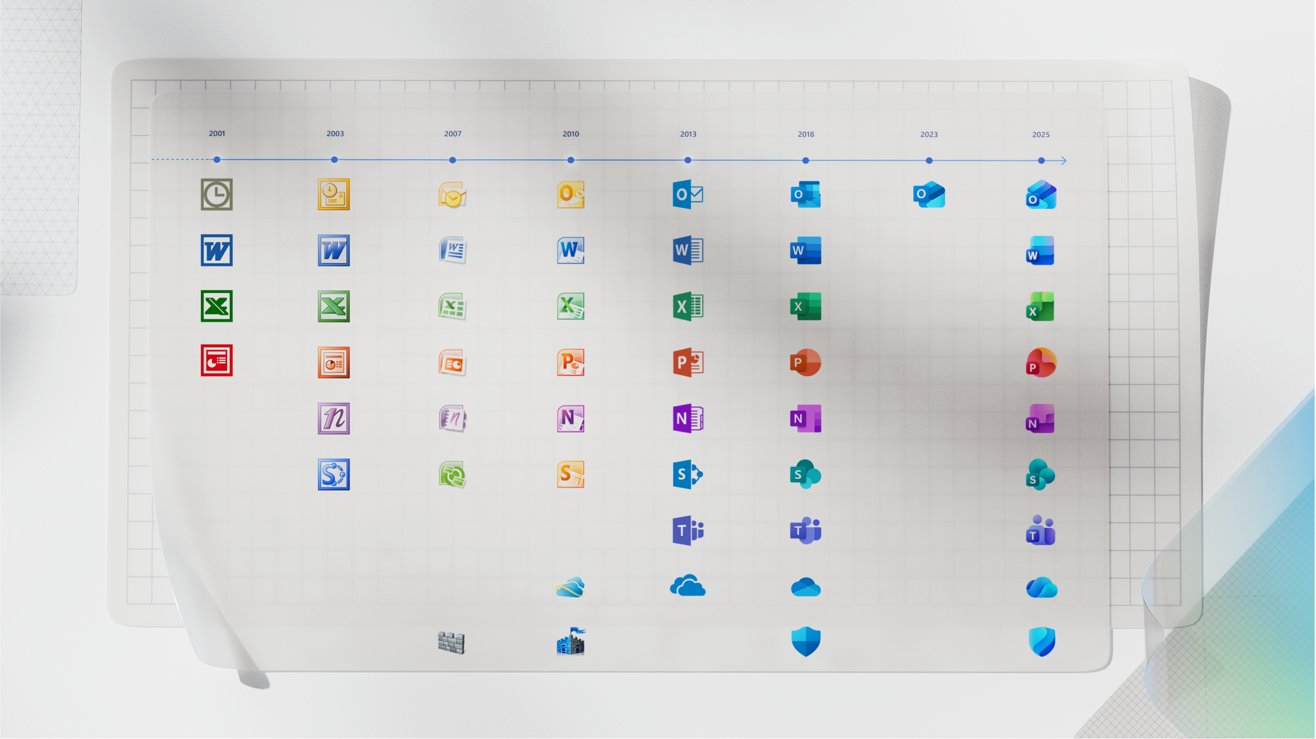
The core 10 Office apps were last updated in 2018 and the way we described what the designs represented is almost identical to language used today: connection, coherence, seamless collaboration, fluid transitions. At the time, that referenced interface design. We were signaling a connected look and feel across platforms and devices with fluid visual transitions between apps and animations. It was the early days of apps that composed together and truly collaborative experiences.
Today, effortless collaboration means both human-to-human and human-to-AI, with contextually intelligent experiences that understand and anticipate the nuances of your work, the data you’re referencing, and the goals you’re pursuing. Connection and coherence are about Copilot’s ability to understand your intent so you can seamlessly traverse the entirety of the Microsoft 365 ecosystem to achieve your goal. That’s the paradigm shift; Microsoft 365 has always empowered productivity but the driving force of the UX was often app features or the tools themselves. Today, the driving force is the outcome you desire.
With that paradigm shift come significant changes to the UX discipline itself and how we approach product making. Longer cycles of heads-down development used to be followed by a big reveal of big changes. Today, with model capabilities rapidly emerging and our learning as UX practitioners rapidly advancing—including becoming more technical as a discipline—product evolution is happening in continuous waves. Research shows changes to iconography are almost always received as a signal for product changes and in an era of ongoing, smaller shifts, the icons should reflect that. As such, we embraced the idea of “evolution, not revolution” throughout our design process.
New shapes, colors, and metaphors
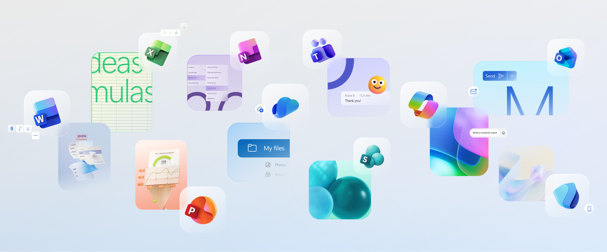
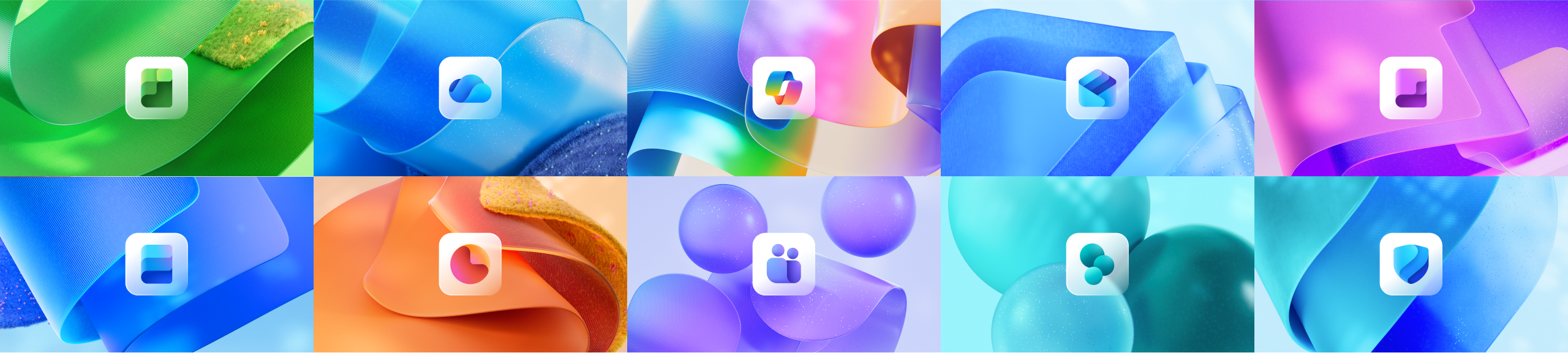
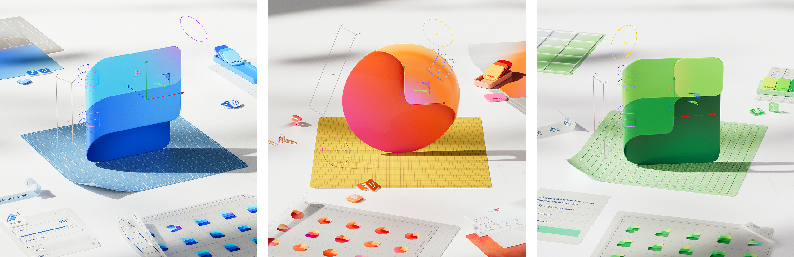
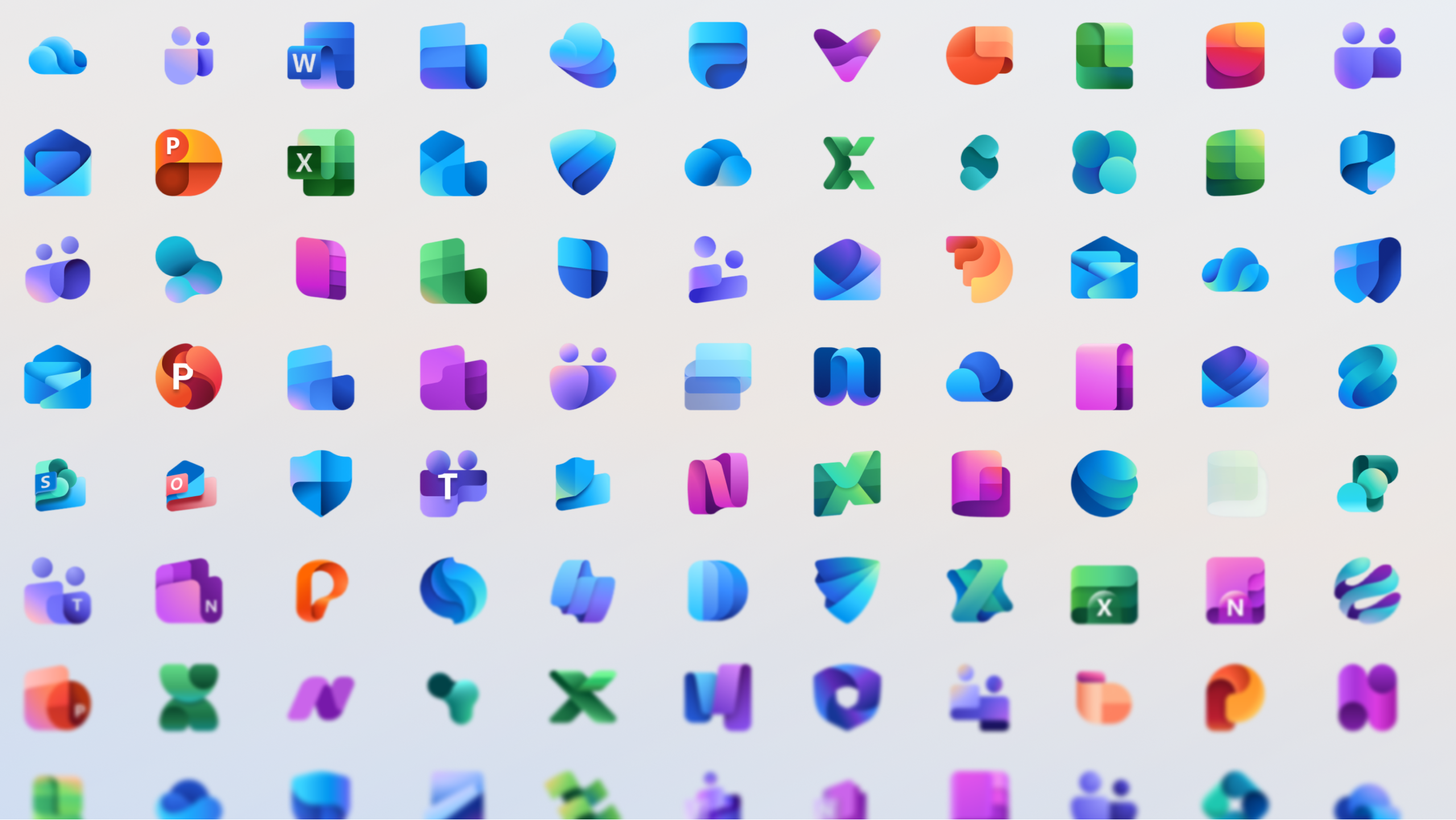
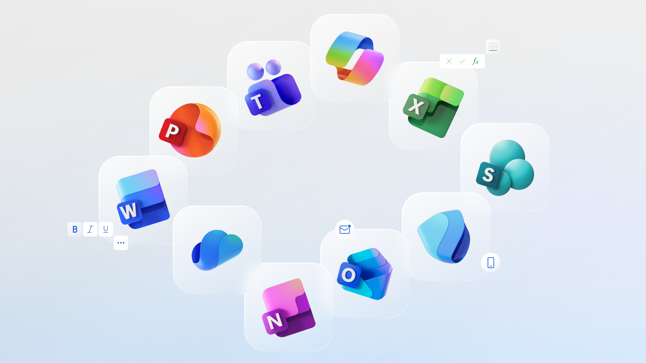
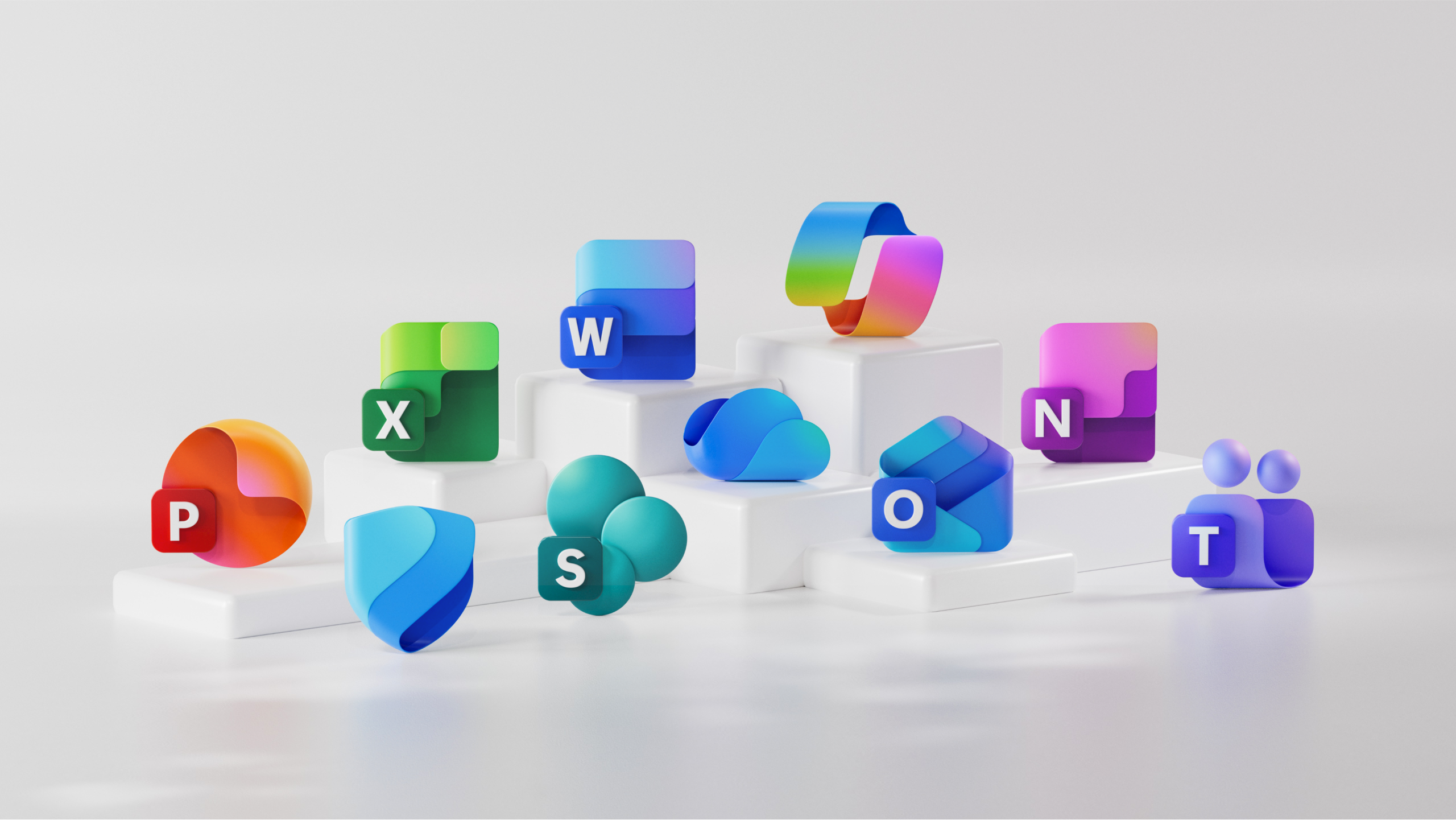
The new icons emanate a sense of fluidity and play, while also being simpler, more intuitive, and highly accessible. Their metaphor, shape, color, and letter have been redefined to create a cohesive, discoverable, and navigable system, crafted with gradients and gestures woven into Microsoft’s AI expression and experiences.
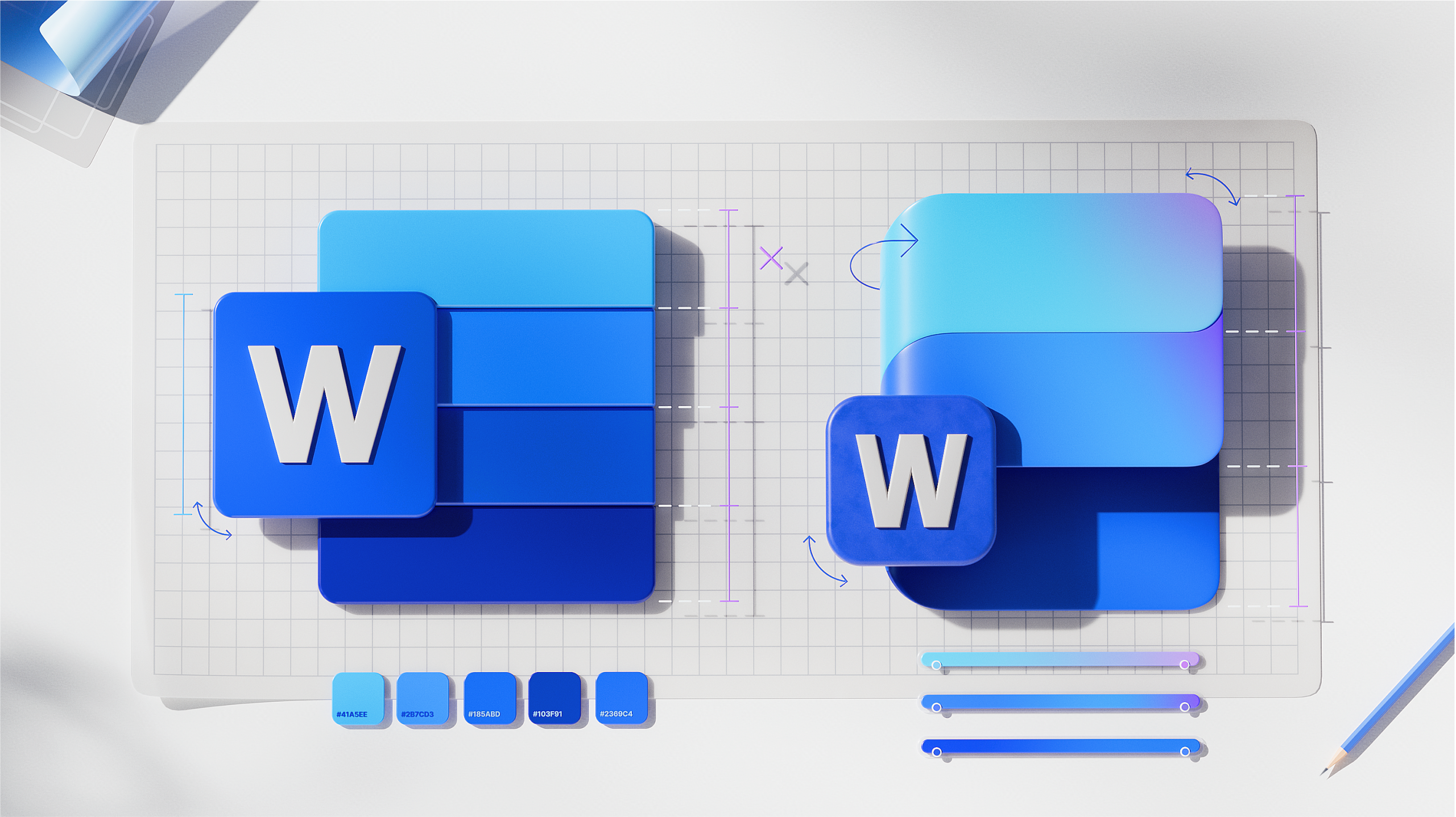
Delightfully simple: to maintain familiarity while streamlining the visual experience, we graphically simplified the icons for clarity and reduced visual noise. Whereas Word’s icon previously used four horizontal bars, the new version uses just three, improving legibility at small sizes and creating more visual concision.
Fluid shapes: We’ve moved away from bold, static solidity to embrace softer, more fluid forms. Sharp edges and crisp lines are replaced by smooth folds and curves, giving the icons a sense of playful motion and approachability.
Rich and colorful: The color palette has been dramatically refined. Where gradients were once subtle, they’re now richer and more vibrant, featuring exaggerated analogous transitions that improve contrast and accessibility. This shift makes the icons feel brighter, punchier, and more dynamic.
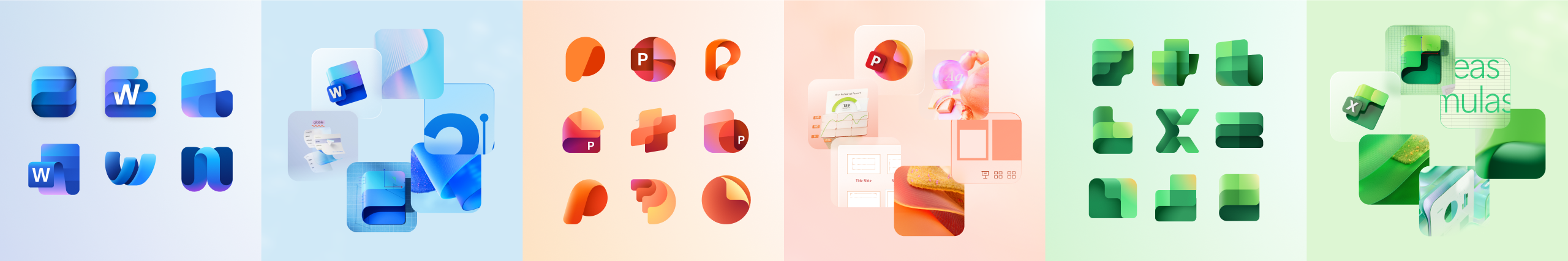
Instantly recognizable: Letter plates were much debated because they’re valuable real estate and icons following the core 10 Office ones no longer use them. Their brand equity is so strong, however, that we decided to keep them—maintaining our heritage while also modernizing them through a more cohesive visual integration with the overall design.
Art imitates truth; truth imitates art
Iconography often balances accuracy and aspiration. No digital product is ever fully baked and so your metaphors must embody present-day truth and the future you’re actively building. When we redesigned our icons in 2018, the artistry mimicked the idea of Microsoft 365 beginning to meld together. That product truth had been getting ever stronger, and then Copilot turbocharged and transformed our ability to create a truly connected ecosystem for customers.
To create Copilot’s icon, we drew from a broad lineage of design influences—traditional Office icons, newer apps like Designer and Viva, Business and Industry icons like Copilot for Sales, and many more—while embracing new metaphors to signify a fluid exchange between you and AI, where you are always in control. The icon’s vibrant color palette represents all Microsoft products, rather than just the traditional blue, and it visually expresses collaboration and creativity in simple, playful, and accessible ways.
With Copilot now being such a more complete and integrated system within Microsoft 365, it’s fitting that when refreshing the core 10 Office icons, the primary source of inspiration was the Copilot icon itself. A reflection and a result of Copilot’s transformative impact, the new designs visually complete a cycle where art and truth continuously shape each other.
A project of this size takes a village! There are too many folks to shout everyone out, but a special thanks goes to Aaron Martinez, Ada Hurd, Alexis Copeland, Anna Gray, Anthony Dart, Arman Keyvanskhou, Braz De Pina, Claudia Nafarrate, Cole Rise, Colin Day, Danny Pak, Heath Hinegardner, Jana Huskey, Jason Custer, Ju Hyun Lee, Kris Bennett, Laura Clark, Mathieu James, Michelle Barrueto, Mike LaJoie, Phil Evans, Shelby Hutchison, Sven Seger, and Tati Astua.
Read more
To stay in the know with Microsoft Design, follow us on Twitter and Instagram, or join our Windows or Office Insider program. And if you are interested in working with us at Microsoft, head over to aka.ms/DesignCareers.
From incubation to impact: Microsoft 365 Companion apps
How scrappy prototypes became polished apps—shipped on the taskbar, grounded in Fluent, and refined by research.
When AI joins the team: Three principles for responsible agent design
A practical guide to build agents that stay differentiated, intent-aligned, and bias-resistant
The new Microsoft 365 Copilot mobile experience
How we redesigned the Microsoft 365 Copilot mobile app to create a workspace built around conversation, dialogue, and discovery.