Craft – Design Thinking, UX/UI
Designing for scale and complexity
How we implemented the Fluent Design System across Microsoft Azure to improve usability, consistency, and accessibility for a highly complex and evolving cloud
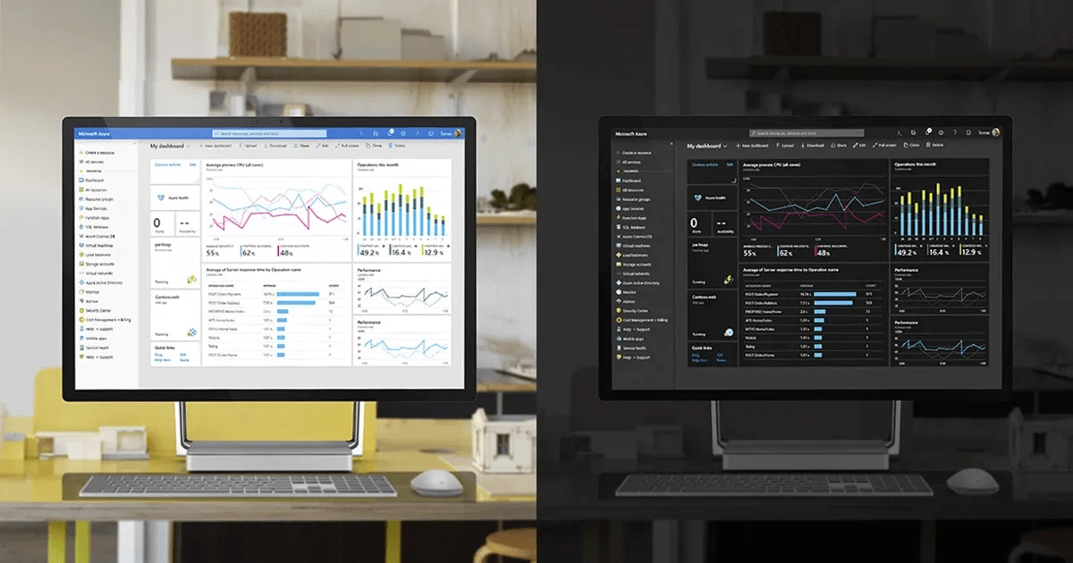
Our team has just released modern design improvements to refresh the look and feel of the Microsoft Azure portal. These changes increase productivity, improve accessibility, and make better use of your valuable screen real estate. Some key changes include:
- Hierarchical depth that draws focus to the right information at the right time
- Improved information density and better use of screen real estate by aligning to a new Microsoft standard for data density
- Simplified visuals that reduce clutter, remove unnecessary lines and decorations, and create better flow between different areas in the UI
- Improved information architecture
- Increased clarity around key navigational elements, including updates to search entry, breadcrumb improvements, changes to our menus
- Improved accessibility, including updated colors, contrast ratios, discoverability of errors and alerts, and type ramp simplification and alignment across the portal
Since the Azure portal is a complex user experience that supports hundreds of different product scenarios across multiple personas, it was important for our team to maintain our existing interaction model. Our customers don’t need to relearn how to use the portal. We based these design improvements on the Fluent Design System principles to enhance consistency and brand alignment.
In this article, we reveal the improvements we made and the journey to get there.
Our goal: making the cloud simpler
Cloud management, operation, and monitoring are complex tasks. Our goal is to make them easier for every person on the planet through a simple, consistent, and beautiful user experience.
The new Azure design provides customers with a single experience model to manage hundreds of different services using a small set of interaction patterns that apply across the platform.
The team introduced a high-throughput iterative research process to provide a near-constant stream of research insights and feedback from customers. Our research methods included proactive and recurring usability testing and benchmarking, customer interviews, customer feedback analysis, and continuous analysis of customer behavior through usage telemetry. The design updates in this post stem from years of listening to our customers’ needs and seek to meet the evolving requirements of a fast-changing industry.
Introducing depth: improving orientation and navigation
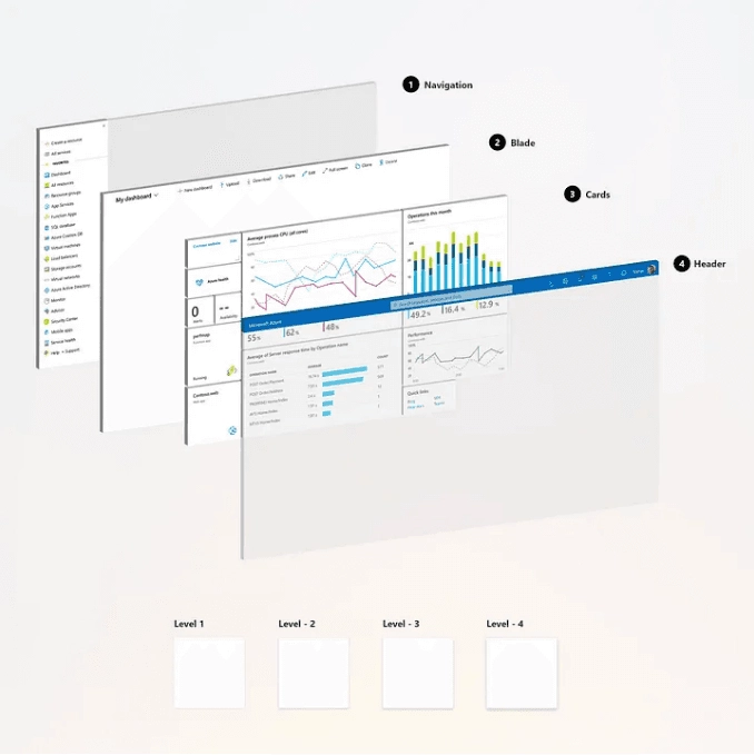
Depth is a key cognitive tool to understand relationships between elements both in the physical and digital world. Our previous design was flat and therefore lacked a very important element for orientation and perception of hierarchy in the screen.
We have incorporated depth in our design system to help our customers orient themselves in the system while emphasizing important parts of a workflow. The team created a set of rules around depth and how light affects the different layers of depth, resulting in semantics customers can unambiguously and consistently apply to a vast set of scenarios.
Depth contributes to better information architecture and more effective navigation of Azure.
Improved data density: showing more in less space
Azure is constantly expanding: we’re simultaneously making improvements to our existing services and releasing new services all the time. Consequently, there is a lot of information and functionality for our customers to take in. We design and deliver experiences that work across multiple devices and form-factors, so we need to meet the expectations of customers using desktop computers, laptops, and touch-enabled devices.
We updated the design for improved information density without regressing our multi-device and multi-form factor experience. In the image below, you can see these principles at work in our dashboard and left navigation bar. Although the scroll bar is no longer present in the left navigation, we are still touch friendly!

We updated the top navigation header to align with the overall Microsoft header design. This also gave us the opportunity to better align with our brand color, improve discoverability of our search control, clean up our global commands, and simplify our ‘Me’ control entry point (see below).
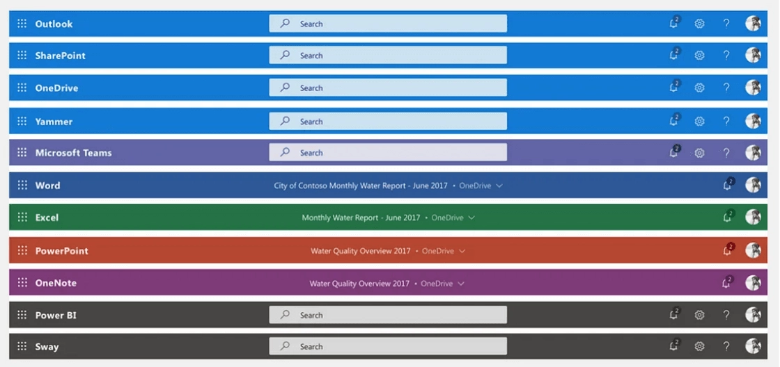
Top-level headers from various Microsoft web experiences have aligned around a common pattern. We updated the top navigation header to align with the overall Microsoft header design. This also gave us the opportunity to better align with our brand color, improve discoverability of our search control, clean up our global commands, and simplify our ‘Me’ control entry point (see below).

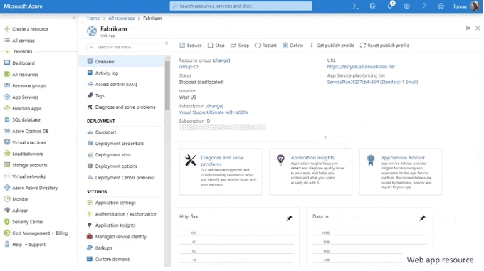
Azure experiences follow consistent customer journeys, and its core functionalities align with what users already know. The image below shows the management screens for virtual machines (VMs), storage, and web apps. All follow the same information architecture and navigational structure, offering the same options in consistent placement.
Accessibility: inclusive technology for everyone
We strive to create experiences that are accessible to everyone. We believe everyone can benefit from truly inclusive user experiences. Accessibility is a core part of our design principles and design language.
The updated Azure design leverages a newly curated color system that improves accessibility, reduces eye-strain and eye damage, and enables more differentiated themes while reducing the total number of colors used across the system. We also updated our type ramp to simplify our hierarchy and improve readability. These changes supplement our full support for high contrast modes and screen readers.
All screens, all resolutions
We cater to a global audience using all screen resolutions and qualities. Therefore, our design must accommodate that broad spectrum of resolution and display quality. This spectrum ranges from large top-of-the-line monitors to small screens and low-resolution projections.
Below is an example of this flexibility in our top header. The header responsively accommodates different screen sizes and controls adjust for easier input (e.g. search).

Themes: make it your space
The Azure portal supports four different themes to accommodate different customer preferences. Before doing any work on the themes, we conducted a usage analysis and customer research to understand the usage rates and customer preference for each of our themes.

After validating our assumptions with customers, we revamped the three most popular themes and re-imaged the lowest-performing theme. This resulted in the new “Azure” theme, which is becoming the new favorite in our first customer surveys!
Final thoughts
We have just released these modern design updates and already started to collect great feedback from our customers and partners. We look forward to hearing your thoughts and hope you enjoy the updated experiences as much as we enjoyed building it for you!
Read more
To stay in the know with Microsoft Design, follow us on Twitter and Instagram, or join our Windows or Office Insider program. And if you are interested in working with us at Microsoft, head over to aka.ms/DesignCareers.
Paper, please: The box that did more with less
How Microsoft reduced single-use plastic in packaging to just 0.07%

Outcomes over output: Designing shared cognition
How we are shaping systems that help people think better, not just type faster.
We can all be friends: Times New Roman vs Calibri
Explore how typography decisions really affect readability, accessibility, and brand expression.
