Craft – Design Thinking, UX/UI
Designing for power and simplicity
How we evolved the Microsoft Office 365 user experience to support a more simple, powerful, and intelligent suite of connected products

The spectrum of work and ideas that Microsoft Office supports is diverse beyond imagination.
That’s not hyperbole; it’s simply what happens when over a billion people use Office across vastly different industries, disciplines, geographies, and generations. People trust Office to help manage trillions of dollars of global business as much as they trust us to help with their child’s homework.
For Microsoft Design, our biggest challenge and our biggest reward is that our audience is quite literally everyone.
An audience of this size brings into laser focus the universal need for simple, powerful tools that help people stay focused amid an increasingly crazy world. Office has always offered a powerful set of tools with a wide range of useful features. Through refreshed UX, we make that power even more accessible with simple designs that use AI to supercharge a diverse range of ideas and workflows.
One billion people can’t and shouldn’t have a one-size-fits-all design solution, and we’re evolving Office 365 into a suite of connected services with experiences that adapt to the needs of whoever is using it. We’ve put a lot of heart (and some serious midnight oil!) into these changes, and we’re excited to share them with you today. As always, we welcome your thoughts and feedback in the comment section below.
Designing for simplicity: expanding our Fluent Design System
Last year, we unveiled the Fluent Design System, a simple and connected visual system that supports Office as it moves toward faster, frictionless, and more intelligent experiences. For the first time in history, five generations share the workplace — this remarkable reality makes improvements like these more important than ever.
We’ve been working hard to expand Fluent Design, and we’ve now aligned the entire Office 365 suite on typography and iconography. You’ll notice a shared header across products, the same grid everywhere, and added depth to focus on what matters.
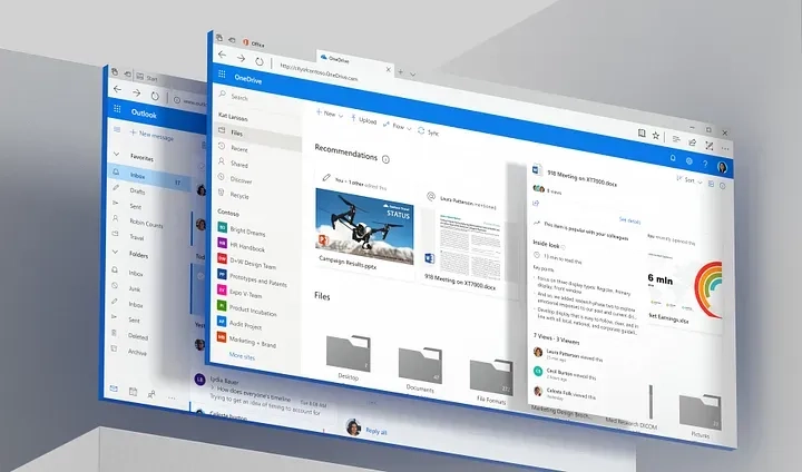
Microsoft has long been committed to inclusive design principles, and themes like Dark Mode ensure Office 365 can best adapt to the diverse needs of our many users. We’ve also evolved our color palette so, while still very familiar, the hues are lighter and more vibrant.
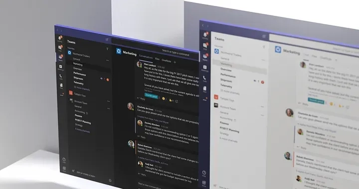
Designing for power: meet Microsoft Search
If Fluent Design removes what’s not necessary through simpler visual interfaces, Microsoft Search delivers what is necessary through powerful intelligence.
People rarely create content in a vacuum, and we typically need to reference files or conversations outside a single workspace. It’s a disruptive process that invites distraction while toggling between tabs and tools.
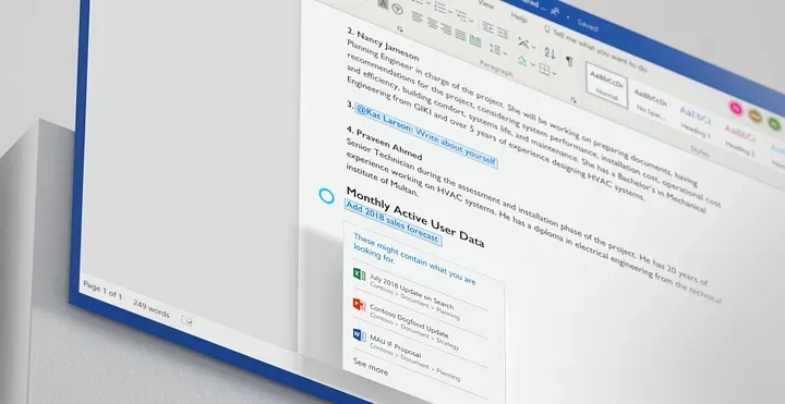
With Microsoft Search, we combine AI with Microsoft Graph to deliver results directly into your workflow. Search is visually prominent across every Office app, fostering a consistent experience that brings contextual results before you even begin typing.
Our zero-query search means just that: there’s zero for you to do. The simple act of putting the cursor in the search bar surfaces relevant apps, content, and people based on past behavior.
Our redesigned start pages also leverage intelligence to organize files by frequency and activity instead of date and size.
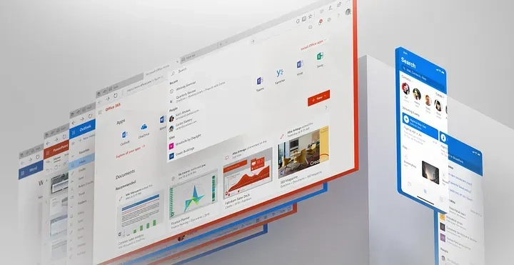
Designing for superpower: sharing Ideas with you
Human-centered design underlies everything we do and beyond powering tools like Microsoft Search, weaving AI throughout the design process has enabled us to carefully craft experiences that intelligently extend your own capabilities in natural ways.
Not everyone using Microsoft Word, Microsoft Excel, or Microsoft PowerPoint is going to be a professional designer, writer, or analyst (I’m certainly not innately geared toward Excel wizardry!). Still, that shouldn’t bar people from creating professional-quality work. Our new companion experience, Ideas for Office, docks alongside your work and offers one-click assistance with grammar, designs, data insights, rich imagery, and more. Ideas helps you work faster and look like a pro while doing so.
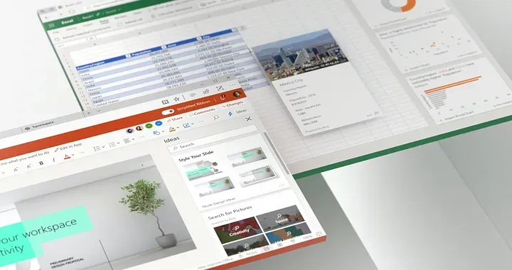
To complement this sidebar experience, we’ve also designed in-canvas interactions that help keep you in flow and will be forthcoming in future releases. (By the way, “canvas” is Microsoft lingo for the main body part of a tool, like the page in Word or the slide in PowerPoint). For many types of work, it’s where you want to stay when you’re in the zone. To enable that, we’ve made it lightning fast to pipe in the contents of other files; in Excel, for example, simply type “Insert a chart” and all of the relevant docs and graphs come right to you.
We always engage deeply with users to collect feedback. For example, we learned that people often leave reminders for themselves within documents. To help complete the task at hand without distraction, you can now simply type “todo” into the main body of the document to create a reminder or @mention someone who can help.
In Excel, we found that people were spending a ton of time crunching numbers about geographies and stocks, so we made that process faster and more accurate. Now, you just type the names of places or traded companies in succession, mark them as the appropriate data type, and Excel can automatically pull in related information about the geography or security for further analysis.
Designing for you: let us know what you think
Any designer knows that our process is one without a beginning, middle, or end. It’s an iterative cycle, and even huge milestones like today’s mark the start of the journey’s next leg. Our customers are on this journey with us, and the improvements we’ve unveiled are all part of our effort to support their best work. If you have feedback on how to make our designs even stronger, we welcome them in the comments below!
Read more
To stay in the know with Microsoft Design, follow us on Twitter and Instagram, or join our Windows or Office Insider program. And if you are interested in working with us at Microsoft, head over to aka.ms/DesignCareers.

Paper, please: The box that did more with less
How Microsoft reduced single-use plastic in packaging to just 0.07%

Outcomes over output: Designing shared cognition
How we are shaping systems that help people think better, not just type faster.
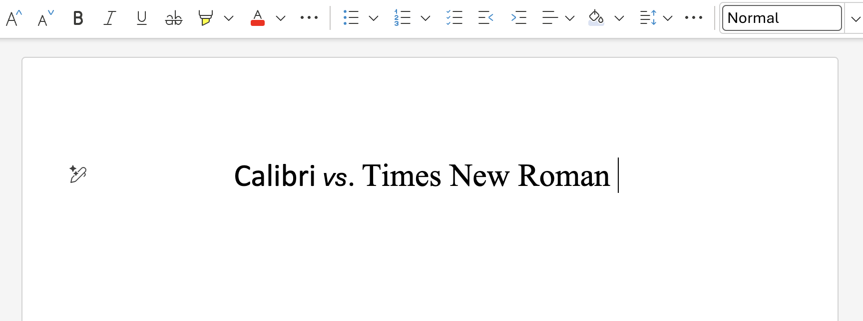
We can all be friends: Times New Roman vs Calibri
Explore how typography decisions really affect readability, accessibility, and brand expression.
