Craft – Design Thinking, Content Design
3 Ideas for improving content strategy
Whether you’re a novice or a vet, there’s always more to learn about content strategy

Confab (n.): An event where people who are committed to make content useful and usable converge for a meeting of the minds.
The world of content swiftly evolved from thick tech manuals to intuitive UX, so it’s no wonder that content teams from across the globe are clamoring to learn from each other so they can stay ahead of the curve.
Our team is no different and we were excited to see how other companies were creating and managing content — and the presenters and attendees did not disappoint! We left Confab ruminating on many ideas and here’s what resonated with us:
Remember the humanity behind content experiences By: Jill Reinauer, Sr. Content Experience Manager
Confab reminded me there is a huge world of content strategists. It was so cool to meet content people from marketing agencies, tech companies, universities, and government-funded entities like The Smithsonian and the Library of Congress. We work in a fascinating discipline!
Although I learned many tools and best practices, some of the most unforgettable parts were not the specific gems from sessions, but rather the human parts of the conference like, chatting with folks at a “secret menu” dinner, or whispered conversations during a workshop. That makes me think of two things:
- An event is memorable when you feel invited. And when you feel invited, you feel like you belong. How can we recreate feeling that with content, with our experiences? We’ve already started with personalizing the user experience, but how do we welcome our customers?
- It’s important to be seen as an individual, not only as a representative of our companies. Although we all work at different companies, we’re all trying to solve the same problems. How do we look beyond the badge, the title, and the industry to connect to each other on a human level?
I hope to infuse the human element into my work and my thinking. I hope to make users feel invited and to let users get a glimpse of the individuals behind our products and behind our words. I challenge you to do the same!
Let the people write for the people By: Rose Cooper-Finger, UX Writer
Confab drew many returnees who were excited by seeing familiar faces. However, familiarity can turn stale when the same people speak about the same things. This isn’t a problem Confab has, in part because of their lightning talks — the highlight of the conference’s final day.
Two talks that stuck with me focused on seemingly simple concepts that some people still forget: language, inclusion, and how the two intersect.
- Katherine Spivey talked about the Plain Writing Act of 2010 and how governmental publications are legally required to be as readable and navigable as possible. In order to be for the people, the government needs to write for those same people.
- Marchaé Grair shared ways to center marginalized people in content and community engagement, reminding the audience that companies that don’t employ marginalized people to create content won’t be able to speak to marginalized groups, since “superficial diversity disengages the people [you] want it to engage.”
Inviting participants to join the conversation on the main stage and without alternate programming next door was powerful. For content to truly include, it must be written for an audience that doesn’t always look the same as the person or people writing it. I’m eager to see how businesses prioritize comprehension and inclusion in their content.
Use cognitive empathy in UX design By: Heidi Lohr, Writer
There was much discussion about the concept of “empathy” at Confab. Some speakers advised for greater empathy to customers, using examples of content that caused PR fiascos. Others cautioned against too much empathy, such as interrupting a client to give unwanted advice. In both scenarios, these speakers discussed the same problem in different ways. But the problem wasn’t the amount, it was the type of empathy applied.
In psychology, there are currently two officially recognized categories of empathy:
**1. Affective empathy: **the outward behavior we consider the act of caring.
2. Cognitive empathy: understanding the situation’s emotional context, and the ability to mentally “put yourself in another person’s shoes.
What happens when you have affective empathy without cognitive empathy? Let’s say your friend looks miserable during the holidays. Holidays are typically a joyful time, so you show affective empathy by dialing up the cheer to help her feel better. Only it turns out someone close to her passed away last December, and this time of year reminds her of the tragedy. If you’d asked what was wrong before acting, you could have avoided her interpreting your well-intentioned holly jollying as an act of spite.
The same goes for designing UX. Like the enchanted broomstick from The Sorcerer’s Apprentice, a UI has no understanding of social context. It functions exactly as well as the input the designer gives it. When a poorly designed UX does something upsetting or even actively harmful, there’s no one to step in and correct the misunderstanding. If you assume the system will do all the work for you, you’ll wake up from your nap to find that the enchanted broomstick flooded the whole castle.
Taking a more empathetic approach to creating customer-facing content is important — just make sure to stop and think first. Cognitive empathy can help you take a more thoughtful approach.

Outcomes over output: Designing shared cognition
How we are shaping systems that help people think better, not just type faster.

We can all be friends: Times New Roman vs Calibri
Explore how typography decisions really affect readability, accessibility, and brand expression.

Designing loops, not paths
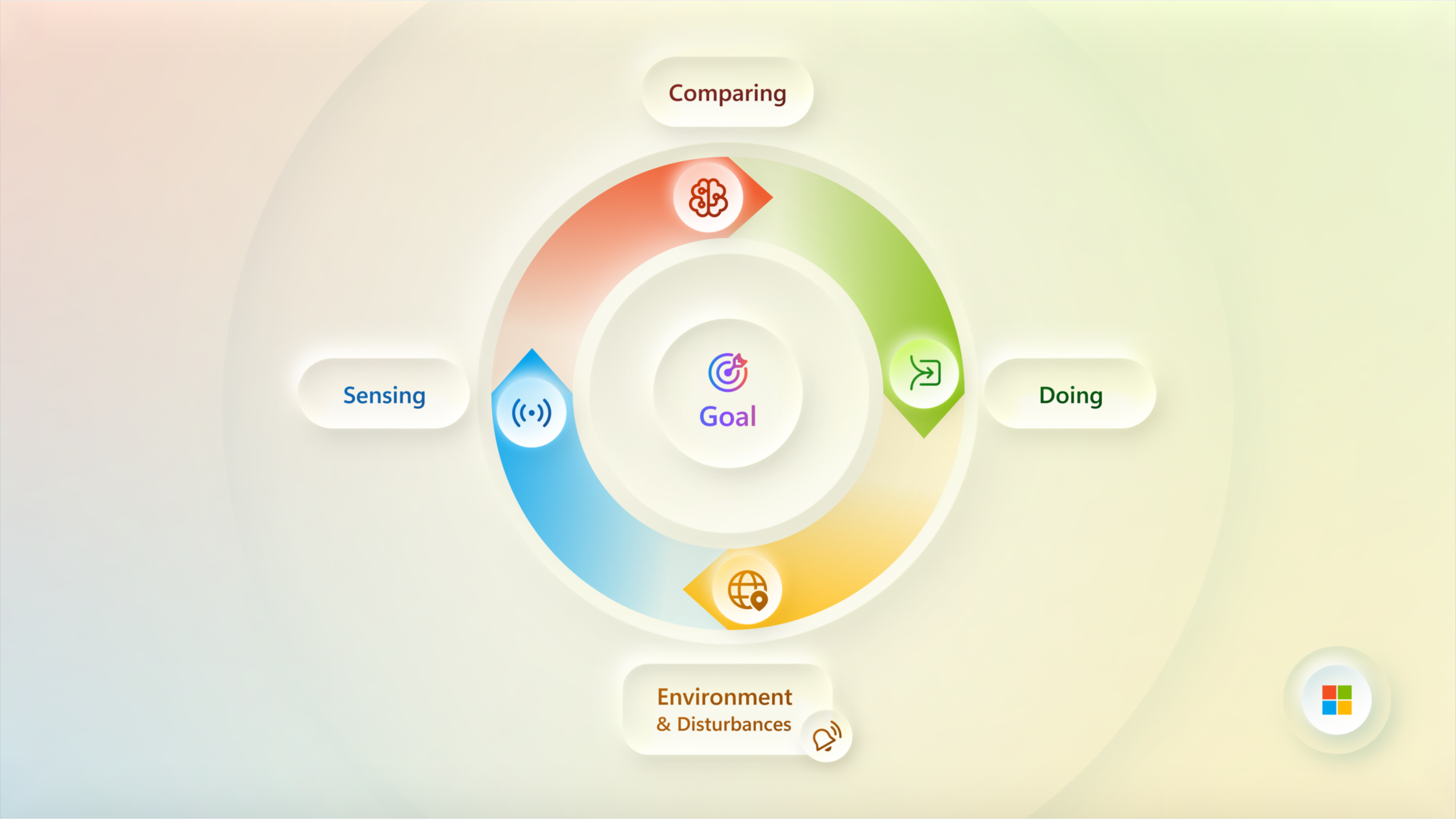
How cybernetic loops are helping us turn “human in the loop” from a catchphrase into a design practice
