Windows 11: Designing the next generation

Windows has been with many of us as far back as we can remember. It has a rich 35-year history, full of new experiences that showed us how computing can enrich our lives: writing your first essay in Microsoft Word, drawing your first digital piece of art in Microsoft Paint, or perhaps writing your first line of code.
Designing the next generation of Windows requires an understanding of the past, but what is more essential is a deep empathy for current and emerging human needs — and an understanding of how technology can support them. As we began our design journey for Windows 11, we examined how the world changed over the last 18 months, including ways in which the pandemic exposed unmet needs and accelerated new behaviors. More importantly, we talked to people about their dreams and aspirations so we could learn what drives them and what they need from their technology in order to achieve their goals. The designs for Windows 11 are steeped in this pointed focus on people, how computing can empower them, and what they love.
Creating a whole lot of love takes a whole lot of connection with the people, which we relish because human-centricity is at the core of our design philosophy. During 85+ research studies and tens of thousands of testing rounds, we spoke with everyone from long-time fans who love the familiar aspects of our product, to new customers wanting Windows to be easier and more approachable. To learn more, feel free to check out our videos about our design and research process and philosophy!

This has been one of our most people-driven releases ever and a guiding design principle was based on a key theme surfaced during research: calm technology that makes our lives genuinely better. Calmness is much needed in today’s world, and it tends to hinge on our ability to feel in control, at ease, and trustful. Windows 11 facilitates this through foundational experiences that feel familiar, soften formerly intimidating UI, and increase emotional connection. Experiences that bring you closer to what you love most: family, friends, passions, entertainment, and creations. Windows 11 is where everything comes together, and the need for this has never been stronger.
Much as it has with everything, the pandemic influenced Windows 11. While the rise of mobile technology had nudged the PC away from the spotlight, last year brought it squarely back to center stage. Amid a new virtual paradigm of personal blended with professional, the power and flexibility of PCs enabled us to work from various corners of our homes. It held steadfast as a trusted tool and worthy partner across work, home, and school, quietly awaiting our small moments of brilliance.
And the past year has shown us just how brilliant humans can be. Amidst the tumult and turmoil, we watched people learn in real-time how to work in a hybrid environment, help children learn, and find new ways to connect and play. As we iterated the designs for Windows 11 alongside them, we strove to create a beloved experience that makes it easy to focus on what matters most to each of us.

The Microsoft Windows Design Team is driven by creative pragmatism. Designing for over one billion people requires empathy. It relies on internalizing human needs to build solutions that are inclusive of all, while still delivering a personal touch. As Windows leaps into its next era, the story of its evolution is told again through human-centered product design and a deep commitment to build the most inclusive and personal operating system.
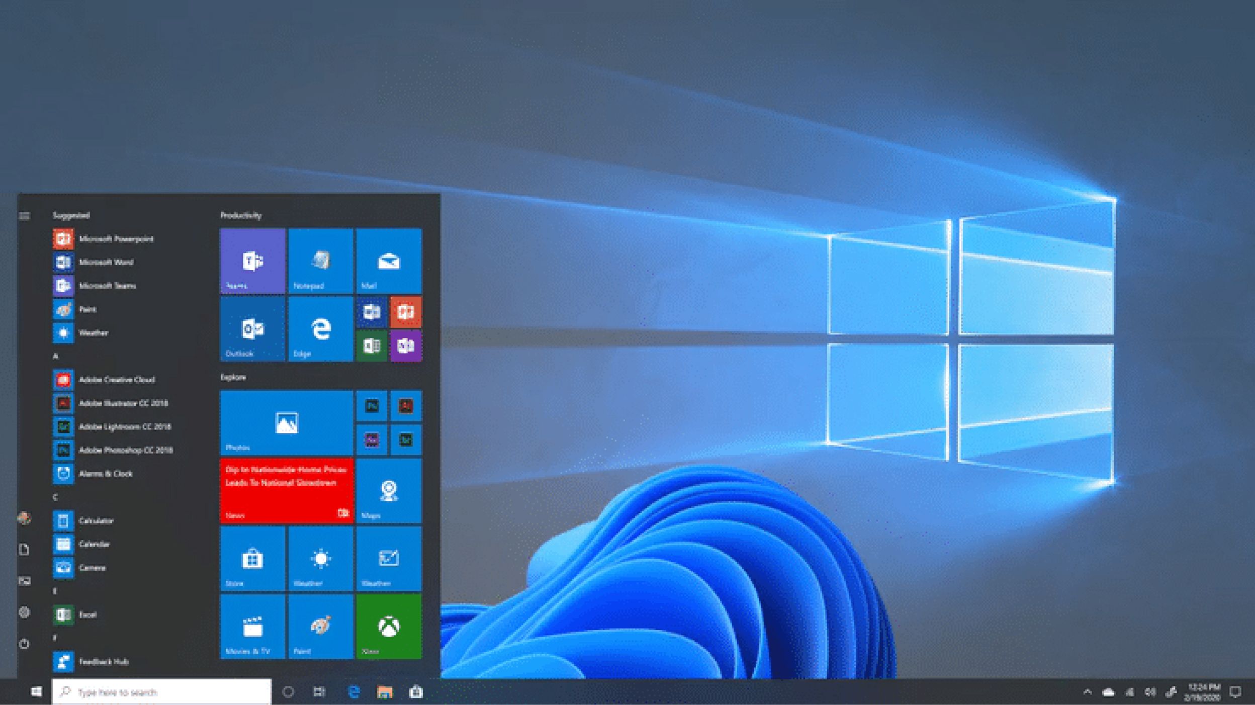
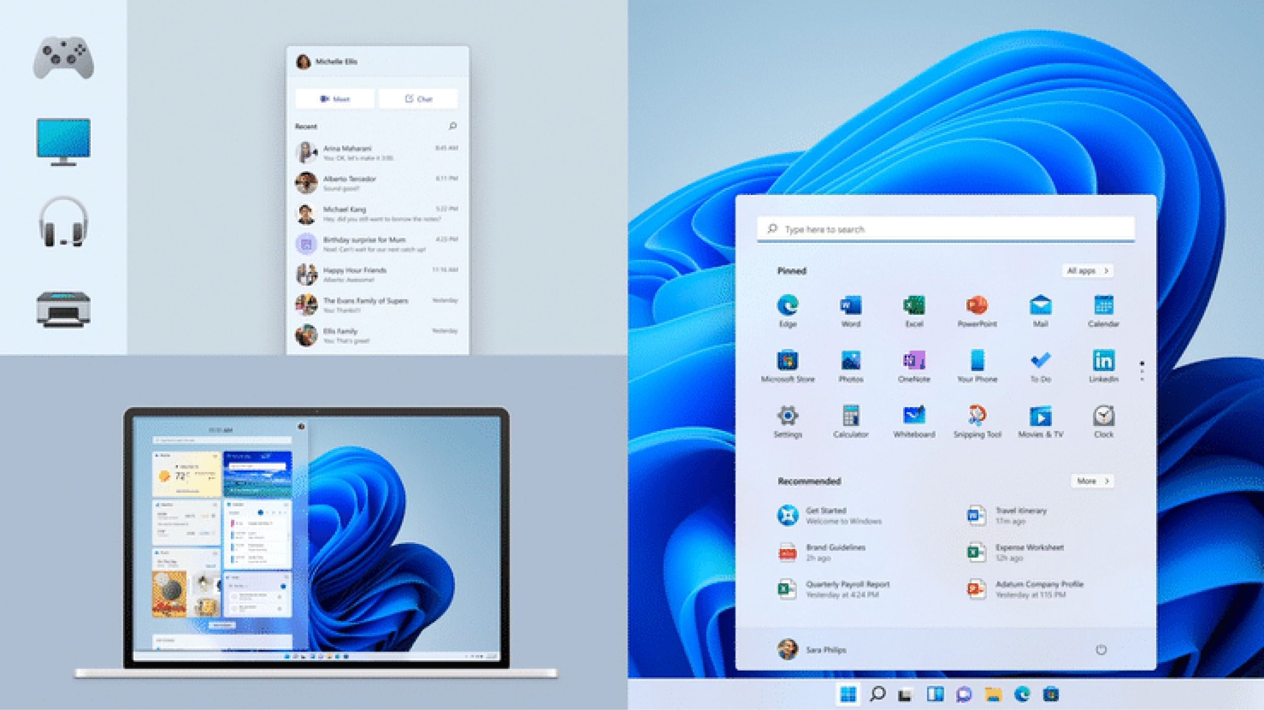
Consider the Start menu: the cornerstone of the Windows experience moved into the centerpiece position. After listening to people express a need for more efficiency and less noise when using Start, we designed a cleaner and simpler experience that puts people at the center by prioritizing the apps they love and the documents they need. It also adapts to modern device form factors and enables easier access for all screen sizes, from a Surface Go to an ultrawide monitor.
At Microsoft, these design decisions are not taken lightly. The team obsessed over every pixel; we updated the Start logo to align with our new visual language and leveraged animations to add delight and confidence to the interaction. We were also intentional with the choice of the wallpaper imagery, which welcomes you on boot and complements the new center alignment to make your experience more balanced and focused. We want your journey into Windows 11 to be literally centered from the start.
Our focus on making technology more human is reflected in the out-of-box experience as well, a moment that once welcomed you in but now welcomes you back. We know that not everyone is a first-time customer and we’re eager to honor our relationship with longtime loyalists through our designs. You can also give your PC a name during setup so that Windows feels uniquely yours, more human than the random name used to accompany the system settings. Windows is yours, and we designed it to celebrate the way you live and work.
These changes come to life through a beautiful new design language that makes Windows more coherent than ever across experiences. Hearing people’s desire for UI that felt softer, friendlier, and less intimidating, we evolved our visual and auditory expression.
We rounded sharp corners and created a warmer color palette to build a more human and approachable language that doesn’t get in the way of your productivity.

More than an operating system
How do you build a product for over a billion people with diverse and unique needs? You listen, iterate, and adapt. Through customer insights, we made Windows 11 more human and welcoming by softening edges, reducing clutter, and designing for consistency. These changes also elevate self-expression through new materials and typefaces, a refreshed color palette, and new wallpapers and theme packs designed to appeal to a broad range of tastes.
With Windows 11, we see a shift from technology that is simply functional to technology that is emotional, human, and deeply personal. Windows is more than just an operating system — it is a fabric woven into our lives that brings us closer to everything we love and helps us create and connect.
Now that we’ve shared our design journey with you, we’d love to continue listening and learning! We welcome any thoughts or feedback you may have in the comments below.
Thanks to the following for contributing to this article and the images: Danielle McClune, Rachel Romano, Joline Tang, Rodney Edwards, Diana Archer, Simone Magurno, Sheetal Agarwal, Ralf Groene, Albert Shum, Cassie Klingler, Marianna Levant, and Samuel Webber.
Read more
To stay in the know with Microsoft Design, follow us on Twitter and Instagram, or join our Windows or Office Insider program. And if you are interested in working with us at Microsoft, head over to aka.ms/DesignCareers.

