
When outputs are the experience
Inside our latest Copilot redesign, where the experience adapts to how people use it.
– The estimated reading time is 8 min.
For nearly 50 years, we built interfaces people had to learn. The visual layer on top of all those ones and zeroes became the design system. We obsessed over toolbars. We tuned components just right, spacing the controls not too close together or far apart. We made digital metaphors out of desktops, folders, and files to give people a mental model for the complexity underneath.
Navigating the system meant memorizing actions and zigzagging through menus to find buried capabilities. Could you merge documents in Word? Configure a formula in Excel? Chasing your dreams was a prescribed process, where you had to adjust to the system. Today, the system is becoming adaptable to you.
That change has taken us far below the top layer, where we’re not just designing the interface. For the first time, we design how a model behaves. Does it show up at the right moment, ready to help? Is it honest about what it’s doing? Are its outputs useful to the task in front of you? We don’t treat AI as a feature to showcase. We treat it as a material to shape around people. Our craft depends on knowing that material. What it yields. How it bends, and how to make it feel made just for you.
It’s kind of like Cheers.
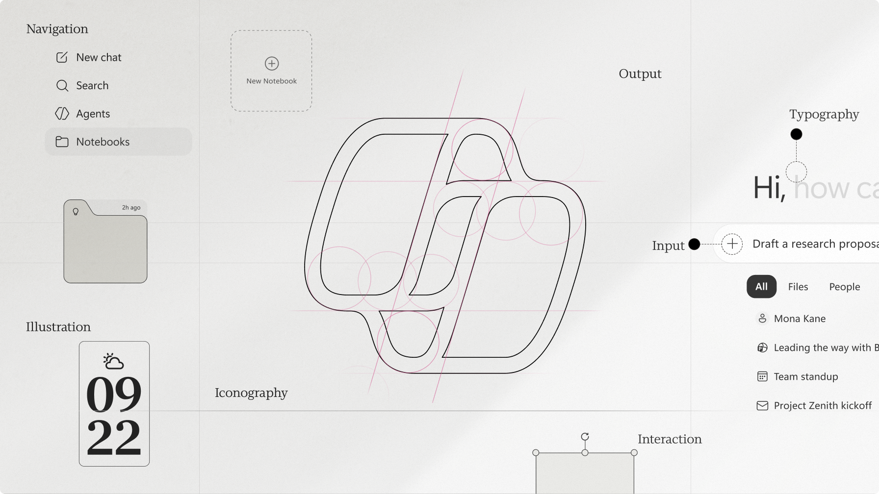
A responsive system,
shaped around you
Jon was a kid watching Cheers in the 80s, a TV show set in a Boston bar “where everybody knows your name.” Cheers captured the emotional feeling of personalization where a shared experience is adapted to a single person. In each episode, Norm, one of the bar’s regulars, would come rolling in, and everyone would say, in unison, “Norm.” Norm always sat at the same corner of the bar. His seat was his seat. By the time he slid onto his stool, everything around him seemed to know what came next. It was a choreographed moment of care, anticipation, and timing. That’s the feeling behind Copilot’s redesign.
Good design is a form of hospitality: the art of making people feel seen, met, and at home. Instead of taking up space, hospitality creates it, anticipates your needs, and crafts every aspect of your experience as you work. Built on progressive disclosure and considered restraint, the interface moves with you. We strived to make it responsive and improvisational, revealing just enough at the speed of your rhythm. As content is woven into rich, meaningful results, a relationship is built not by grand gestures but the steady accumulation of getting things right. It’s an experience that’s felt before it’s noticed, as if the system is thinking with you.
Where outputs become stories
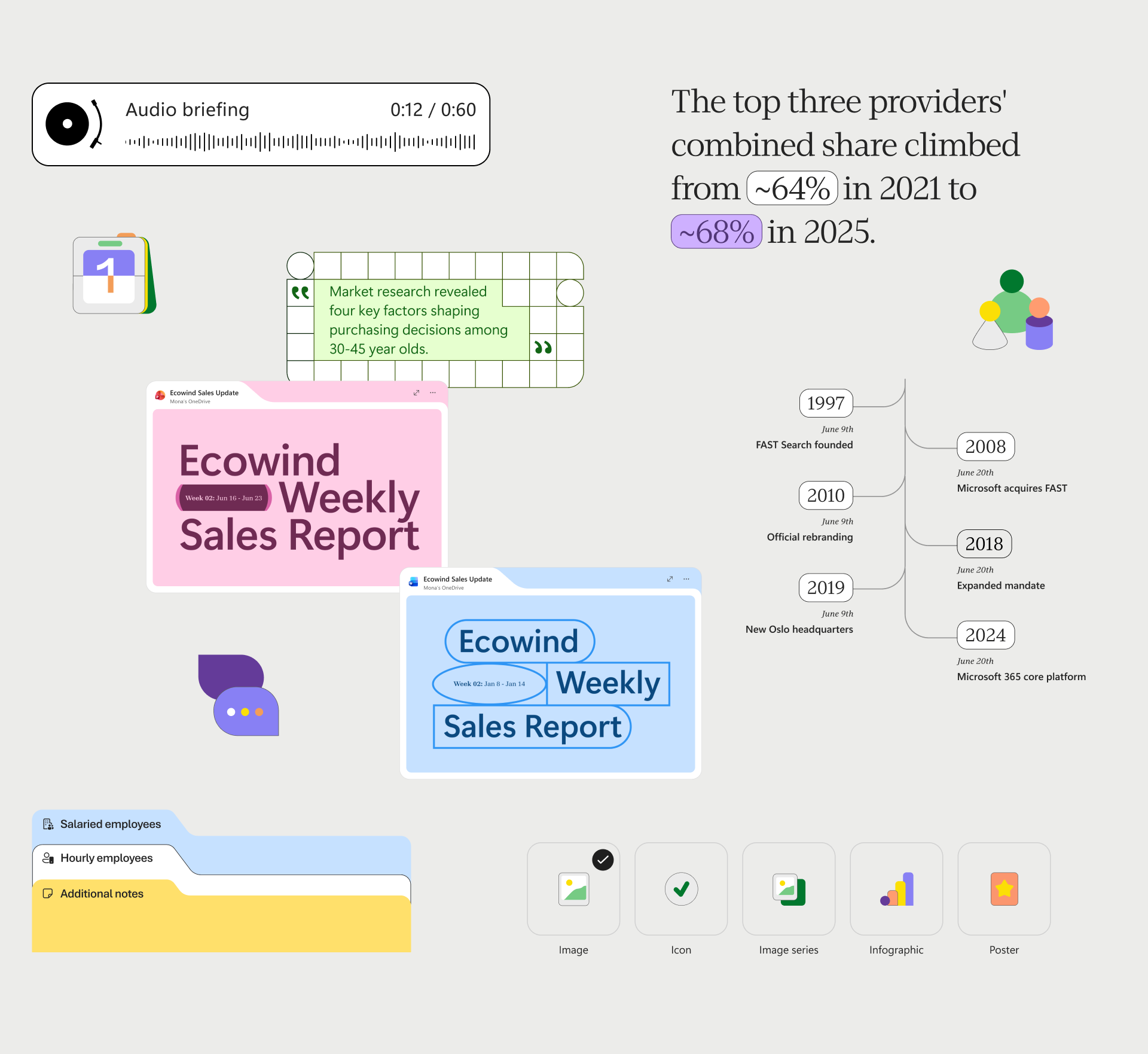
The guiding principle behind the Copilot redesign is that output is the new UX. We think of the interface as the plate and the output as the meal. Copilot is your personal chef, preparing every dish catered toward your palate. The way it cooks is a multimodal system that contextualizes outputs using storytelling, typography, video, audio, motion, and UX patterns. It’s a vocabulary built specifically for AI-generated work, one that encodes components, and the rules of composition: when to emphasize, when to play the background, and how to guide attention.
That vocabulary brings editorial structure to artifacts that have, until now, often felt like raw ingredients, rather than a thoughtfully cooked meal that’s artfully plated and served. A dump of bullet points, loose paragraphs, and mismatched images can feel cold and jumbled together. It’s in contrast to a PowerPoint deck with a point of view, a story that reads with intention, or an infographic illustrating a complicated concept.
We drew inspiration from newspaper and magazine design: beautifully organized layouts with elegant pacing. They’re arranged by hierarchy, cadence, and familiar components like headlines, pull quotes, and timelines. It makes the information easier to scan, digest, and implement. Images, code, and graphs each get served with the same attention to detail, making what Copilot puts in front of you feel unique and carefully made just for you.
As the outputs generate, attention turns away from the plate and onto your deck, your draft, or your answer. It’s why you came to Copilot. When you enter, the pared-back interface clears the space.
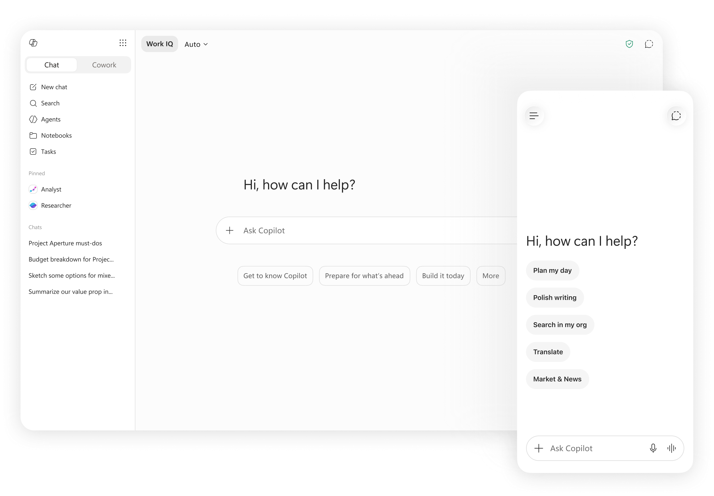
A calm interface, giving you space to think
The first thing you notice about the shell is what’s not there. No crowded panels, no decorations, no UX maze to figure out. What’s there is generous uninterrupted space as the plate, and a feeling that someone has already set the table for you. The simple shell is designed to quietly serve you, never imposing its presence.
There are no competing visuals fighting for attention. The experience is calm, focused, and easier to approach. As soon as a user sends a query, Copilot guides the eye. Using motion, it directs you to watch the entrée take shape without calling attention to the plate.
Motion: The choreography of trust
We use motion to help people understand where information comes from. It’s the tempo and choreography of the service, the comfortable speed at which the plate is placed in front of you.
When you hover over prompt box controls like the microphone or voice icon, they subtly animate, showcasing their responsive state, ready to help you dictate a prompt or start a voice chat. We’re working on moving the needle to and from the record icon when you play voice memos. These kinds of minor details are short burst of delight, communicating an interface attuned to what you’re doing.
Copilot is your reliable server, shaping the experience as much as your actions. In this way, motion becomes foundational to trust. As outputs arrive, animate, and settle into place, the experience eventually points to something bigger: behavior.
Personality at scale
Working on Microsoft 365 Copilot revealed to us that enterprise customers consistently preferred Microsoft’s long-standing voice principles, that the personality should be warm and relaxed, crisp and clear, ready to lend a hand. With the redesign, personality is ultimately about how Copilot performs: calm under uncertainty, deliberate in motion, respectful of focus, and reliable enough to disappear when the work itself should be the sole focus. It becomes part of the experience architecture itself. Over time, the system adapts to the person using it.
Aside from personalization, trust is the system’s differentiator. When the model can’t deliver, it’s honest. When it’s uncertain, it’s clear and responsive rather than proactive. As your personal chef, it doesn’t oversell or try to get you to order something you don’t want. It meets you where you are and stops when it should. The relationship is supposed to grow from the same way the outputs do, with clarity, consistency, and the steady feeling of personal relevance.
An experience big enough to feel personal
Designing for a billion people has taught us that real value doesn’t come from the tool itself, but from the outcomes it sets in motion. As AI becomes more adaptive, the quality of the experience depends on how well the system understands the person using it. Does the meal taste just right? Are the outputs moving your work forward?
With the Copilot redesign, we aspire to make room for many ways of working, thinking, and expressing ideas. A billion customers don’t share the same taste, rhythm, role, or reason for coming to Copilot, but just like Norm, they all need to feel comfortable and welcome.
As the redesign continues here at Microsoft Design, we’d love to hear your feedback and suggestions. We’ll keep sharing our progress, thinking, and prototypes as the work evolves.