What does an icon designer do?
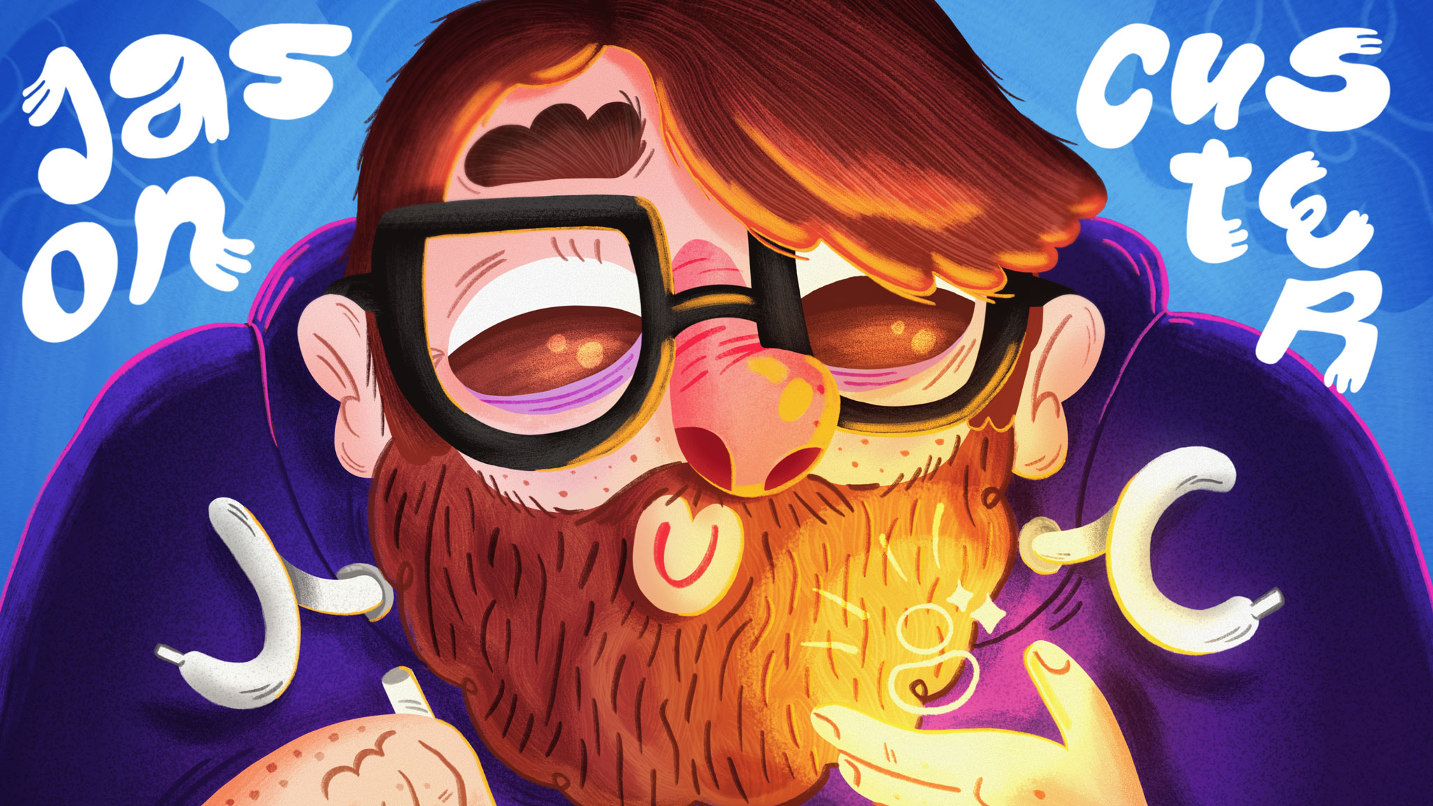
Meet Jason Custer, an icon designer on the Fluent Design System team

Jason Custer has been “drawing for money” as he calls it, on the Fluent Design team since 2016. He’s ultimately touched everything Fluent Design, from icons to mobile development. However, most of his work has centered around personal expression with the development of Fluent Emoji. With recent developments of Fluent Design, including the launch of Fluent 2, we sat down with Jason to discuss all things system design, his workflow, and more.
How would you describe your job and what you do?
I like to tell people ‘I draw for money’… haha. I work as part of the Fluent team, which helps with Microsoft’s design system. The work comes in many ways, but the number one goal is to empower other designers in their work.
How did you first become interested in product design and what motivated you to pursue it as a career?
I started out as an animator – I did a bunch of freelance ’til a game studio hired me. That’s when I started doing a lot of UI design, illustration, and general visual design. I was hooked as soon as I saw the impact that all those changes in UI could have on an experience.
What educational background or training do you have that has helped shape your skills?
None really – I mostly made-up stuff while working with companies that had established patterns, or knew exactly what they wanted – which made playing in their sandboxes easy. The rest of the more creative work, I had rad art directors willing to help me grow.
Wanna do a quick shout out to my managers over the years who have contributed to my growth – Matt Greff, Dave Riensche, Jeremy Grubaugh, Kris Bergen, Joseph McLaughlin, Benedikt Lehnert, Damien Aistrope, Phil Evans, Neil Cueto, Taili Feng and Kurtis Beavers.
How long have you been with Microsoft?
This time around – 7 years – but because I grew up in the pacific northwest (Tacoma, 253 baby! ), I’ve bounced in and out of contracts for Microsoft over the last 15 years. Been lucky in the work, with a wide range – got to work on early days Xbox Kinect, help craft early days iOS experiences, update iconography and emoji across the company.
What are you currently working on?
A few things I can’t mention 😉, Helping with a lot of AI work now – also general visual design, product and system iconography, toolkit design, emoji fun, and design community contributions as I can.
Can you share an overview of your role as a product designer and how it specifically relates to creating icons within a design system?
I’ve been very lucky through the years here, helping craft early versions of the Fluent design system. With icons specifically, there was a small team working on updating the set. With a small subset established we built out guidelines to help scale – basic rules that help grow quickly, details around pixel alignment, specific sized curve – which all contribute to clean, readable icons on all devices.
That work continues today, even if it’s just a fraction of my time anymore. Shout out to Jillian Poppe, who draws up a lot of icons so I can support in other arenas.
How did you learn about design systems? What advice would you give to someone who wants to get into design system work?
In my mind, the longer you work in a field, the more processes and elements get defined. Design systems used to be sticker sheets or POR (plan of record) files, something we already worked with engineers to have built. So, I kinda just looked up at some point and realized I was a systems designer… haha.
As for advice, design systems touch on every product, so even if you’re not working on design systems, find a way to contribute. Reach out to your systems designers or start organizing your files while considering the needs of your teams’ designers. Great way to start that work and see how much you like it.
How do you approach the process of creating new icons for Fluent?
Because we have so many now, we usually reference a few icons that are close, or at least have a base to start from, but we’re always sketching on paper as well as discussing ideas. Fluent iconography is about being clean and clear with readability being paramount. Pixel mess is not allowed… haha.
What key considerations do you consider when designing icons for a design system? How do you ensure they are visually consistent and cohesive?
First thing we ask is the context of where the icon will live. In the past – I’m always surprised when asking an icon makers and illustrators where the art will sit – and hearing they don’t know.
When making an icon, we’ve built out a full set of guidelines around standard keyline shapes to make things consistent. We also always sit the new icon next to established ones and also in the UI it’ll show up to make sure it feels balanced and connects to its icon siblings.
What role do user feedback and usability play in the icon design process within the design system? How do you incorporate feedback to improve iconography?
Making iconography is an interesting challenge of mixing old and new – as there are some standards that are so set in stone, it’s hard to break free of those – while new features roll out all the time. The more abstract the concept, the more challenging the drawing can be. That’s where research around icons is immensely useful. With that said, icons are all about learned behavior – so we try to give each icon the opportunity to be useful – not rushing to replacement too quick.
As for updating iconography, we’re always improving the set, whether it’s cleaning up of shapes, refinements to metaphors, or creating new icons. When implementing the Fluent system icons, we set up a process that allows for quick and easy updating. This is why we push for SVG icons and not icon fonts – fonts make updating iconography a much bigger and slower process.
With the introduction of AI, what changes or shifts do you anticipate within the industry?
Oh damn, having a position on AI is everything now… haha. I’m optimistic on the usage of AI to do some of the menial things we’ve had to. A perfect example of this is having a meeting summary – something that my ADHD makes really challenging.
What excites you as a design system designer with the integration of AI?
My goal as a system designer is really to help curate a set of patterns that will be useful to as broad an audience possible and then work to make them real with engineering. We’ve already seen examples of AI building UI – but making it easy for designers and developers outside the system team to find, use, and implement patterns will be amazing!
How do you stay updated on current design trends and emerging practices in icon design?
I try to stay an open sponge – consuming as much design, illustration, iconography, technical information as I can. I also am trying to get back into conferences (just went to Config and Adobe Max later in the year), which have always been a great way to keep a pulse on tooling, something that helps dictate trends typically.
Looking back at your journey, what advice would you give to aspiring product designers who are just starting out on their own path?
The thing I have to constantly remind myself – each project is either a mound, hill or a mountain – and until I’m at the top of it, I’ll want to throw away my work and give up, even after all these years. Once I hit the top though – I realize that things are coming together – and it’s then hard to stop me at that point.
Read more
To stay in the know with Microsoft Design, follow us on Twitter and Instagram, or join our Windows or Office Insider program. And if you are interested in working with us at Microsoft, head over to aka.ms/DesignCareers.
Design Week 2025: Shaping the future of design at Microsoft
Joining forces across our design community to push the boundaries of creativity and collaboration.

Vibe coding makes prototyping close to code, closer to users
Meet Quirine, a computational design manager exploring how AI reshapes the way her team builds and test ideas

Breaking the mold: Braz de Pina on the evolution of creativity and design in this AI era
Meet Braz De Pina, a Principal Product Designer for Microsoft’s Experience Collective Horizontal Design Studio
