We can all be friends: Times New Roman vs Calibri
Explore how typography decisions really affect readability, accessibility, and brand expression.
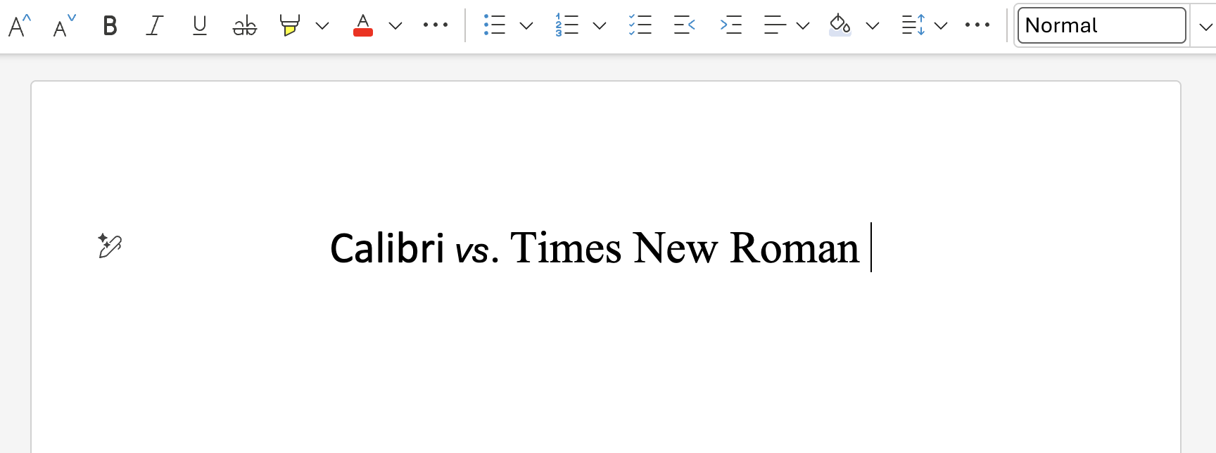
I started as a font team intern in 1995. Working on fonts for Windows, Office, and a plethora of other products and projects, I’ve been at the sharp end of numerous font-related controversies. Webdings conspiracy theories, questionable emoji, government font collabs, rolling out new defaults, I’ve seen, and been involved in it all.
The news story that’s gripping the font world—the battle between the allegedly woke Calibri and the stately Times New Roman—is tame in comparison to some of the earlier stories, and from a Microsoft perspective it’s neutral. We supply both fonts, neither is the current Office default, and our users are free to choose between them and the hundreds of other fonts we provide.
But as an educational exercise, let’s dive into the various issues raised by the U.S. State Department decision to revert to Times New Roman as the font for official communications.
Legibility and readability
Let’s get this argument out of the way – successful, well-designed, body text typefaces, as opposed to those intended for use decoratively at display sizes, are, by definition, legible and readable. Legibility is how easy it is to recognize the individual letters that make up a word, so they aren’t misidentified. Misidentified letters can lead to misread words, and as such it’s about both letter shapes and the space between them. Readability is how comfortable the text is to read overall, how quickly you can read it, and how much information is retained.
It’s quite difficult to detect meaningful differences in legibility and readability between different well-made body text typefaces, which is why the sans vs. serif debate has not been settled and rages on. Both Times New Roman and Calibri are legible, readable typefaces. You can argue about design features that aid or detract from legibility and readability, and you can find studies that support one over the other, but both fonts meet the basic requirements.
Accessibility
For low-vision readers, the number one factor that improves reading is type size, followed by contrast. So, using a well-designed text typeface set at a large size, black on white or white on black, will be the best thing you can provide for low-vision readers.
For dyslexia, while some readers express a preference for the special dyslexic fonts, research indicates that for these readers reducing visual crowding – increased letter spacing and line spacing – is probably the most helpful. We even have a version of Calibri that has this extra spacing built in.
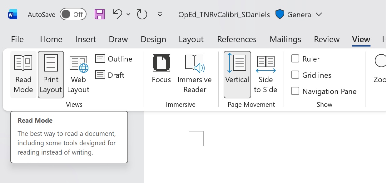
For electronic documents and web pages, immersive “reading modes” largely solves this problem. If the document can use the reading mode features of your app or browser, the font choice of the author will be overridden by the feature to ensure accessibility. While using good fonts and layouts is still important, accessibility features means readers can read documents in ways that are most comfortable for them.
Technology advancements and the passage of time
Times New Roman was designed to survive the rigors of hot metal letterpress type printed on newsprint paper in the 1930’s, and although the Office version originated much later, it had to conform to the design and spacing of the letterpress version and be compatible with digital versions deployed in the market. In contrast Luc(as) de Groot, the designer of Calibri, was not shackled to the past, he was free to design a typeface that worked best on the emerging LCD flat panels of the mid 1990’s. Calibri works better on screen, because it was designed with that medium in mind.
Today, Calibri and Times New Roman perform better on screen than they did when originally released, largely due to improvements in the resolution and quality of displays, which edge ever closer to that of the printed page.
It’s worth noting that in the real world, especially for office workers, hardware refresh cycles may be stretched, so older, lower resolution monitors are common.
I encourage anyone to pull monitors – the older the better – from the PC recycle pile or “buy-nothing” groups, specifically to see how their designs, colors, and fonts perform on these devices – which mirror what millions of information-workers use day to day.
Font pairing
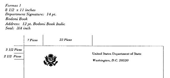
Reports mention that Times New Roman better matches the State Department letter head. The letterhead and business cards seem to use the Bodoni Book typeface.
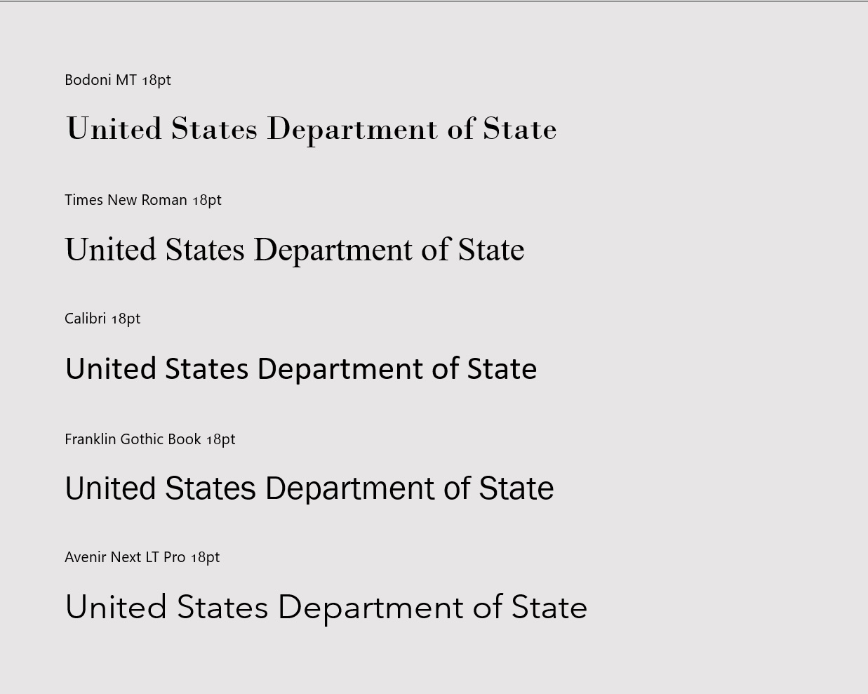
Bodoni is a “Didone” or “modern” serif style font, a different style to Times New Roman which is a “transitional” serif. Compare the letters in the words below to see the differences; wedge serifs and diagonal stress in Times New Roman on the left, and hairline serifs and vertical stress with the Bodoni variant on the right.

One of the first things they taught me in typography school – yes, I graduated with a first class Bachelor’s degree from the University of Reading’s Department of Typography & Graphic Communication in 1995 – is that’s it’s better to pair a sans with a serif rather than pair two different serifs or two different sans. Is Calibri a good font to pair with Bodoni? Probably not, but that’s no reason to throw all the sans options out with the bathwater.
Perhaps a grotesque like Franklin Gothic, a very American font, or a geometric sans like Avenir, admittedly a very European font, might be an option?
Personality and branding
It’s certainly appropriate for an organization to dictate or strongly recommend which font to use in official communication. Many large companies, and even some governments, have commissioned custom typefaces so they can maintain a typographically unique identity. Countless others have licensed typefaces for their branding and even more choose to standardize on an Office font or free open-source font for this purpose.
Branding is important, and consistent application of a branding font is essential. So, with that in mind, neither Calibri, Times New Roman, Arial, Segoe UI, Roboto, San Francisco, or the standard weights of Aptos seem like very good branding choices due to their near ubiquitous use in documents, the web, app and OS user interfaces. When your brand is a default, is it really a brand?
Even the most casual observer will notice that Calibri and Times New Roman evoke a different personality; sans vs serif, modern vs traditional, handmade vs chiseled, informal vs institutional, corporate vs governmental. And as much as some might not like it, Times New Roman does seem better fitting for government, legal, and institutional documents.
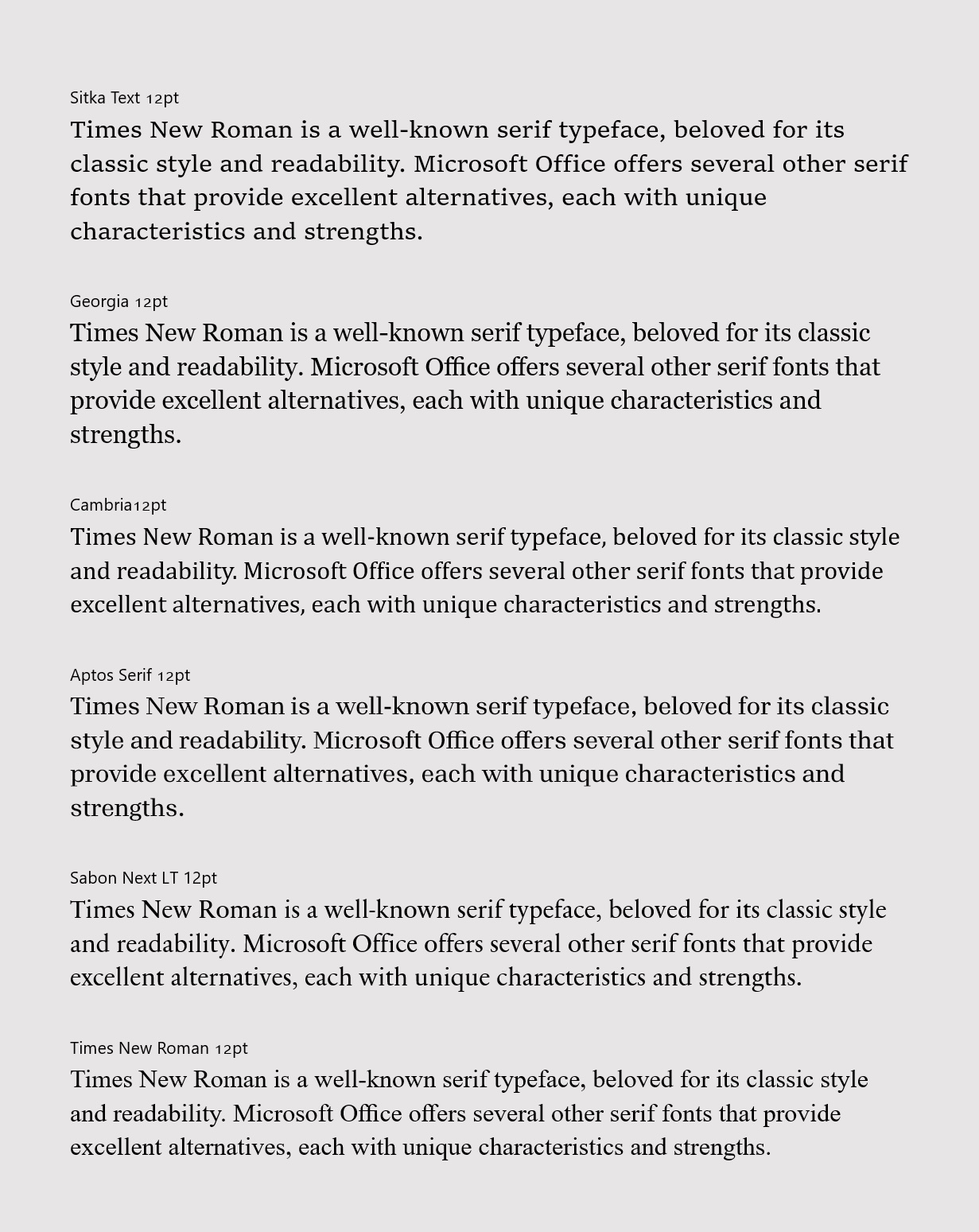
Leaving sans aside, arguably there are better options in the serif category. So, I’ll leave a few of my favorites for Secretary Rubio to consider when it’s time for the next brand refresh…
- Sitka – designed by Matthew Carter (designer of the 1990’s web fonts Georgia and Verdana) with legibility and readability in mind. Available in a range of optical variants (intended for use from tiny captions through to big, bold beautiful headlines) and character variants were chosen based on real-life research studies comparing the legibility of each. Sitka can be thought of as an evolution of Georgia and Georgia Pro, which despite their age are still worth considering as alternates for Times New Roman.
- Cambria – a contemporary of Calibri, Cambria was for a time the default text face in Mac Office, before the product aligned with the Windows version. It’s a robust workhorse, with a complete math symbol component for those that care about such things.
- Aptos Serif – a little unconventional, but a readable serif companion to Aptos. It has the benefit of having the same vertical metrics as the Office default, making it easy to combine with, or even replace the sans serif original.
- Sabon Next LT – French type designer Jean François Porchez’s 2002 revival of Jan Tschichold’s Sabon. This version is truer to its sources and not constrained by the technical requirements of mechanical typesetting.
Some commentators have put forward Garamond as an alternative to Times New Roman, but the version we include in Office is of a similar vintage to Times New Roman, and is best avoided. As luck would have it a revival, Garamond Now, is in development. It solves a lot of Garamond’s issues and we hope to include it with Office in the future. Stay tuned! That was a teaser.
And one last thing
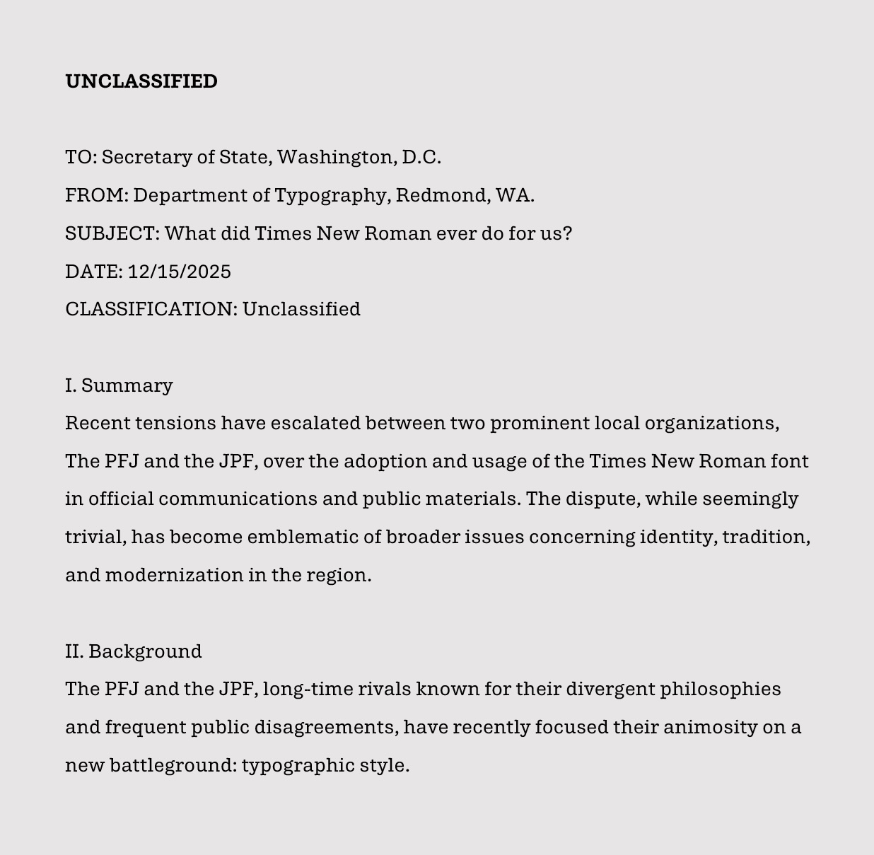
Before moving to Times New Roman, the Department of State dictated the use of Courier New, the popular typewriter font designed by Bud Ketler for IBM. Although I would not recommend a return to Courier New, or another monospaced font for that matter, perhaps a typeface that evokes the typewriter age might be worth considering. By coincidence, we’ve been working on a prototype variant of Aptos we’re calling “Aptos Typewriter.” It may not see the light of day, but if anyone at the State Department is interested in a collab, please hit us up.
Read more
To stay in the know with Microsoft Design, follow us on Twitter and Instagram, or join our Windows or Office Insider program. And if you are interested in working with us at Microsoft, head over to aka.ms/DesignCareers.

Outcomes over output: Designing shared cognition
How we are shaping systems that help people think better, not just type faster.
Designing loops, not paths
How cybernetic loops are helping us turn “human in the loop” from a catchphrase into a design practice

The future of AI isn’t just in the office—it’s on the job site
AI could create economic mobility for essential frontline workers—here’s how product makers can shift our thinking to encompass those experiences
