Product – Brand, Visual Design
The vibrant evolution: Microsoft’s colorful transformation
In the ever-evolving landscape of design, color isn’t just visual—it’s emotional.
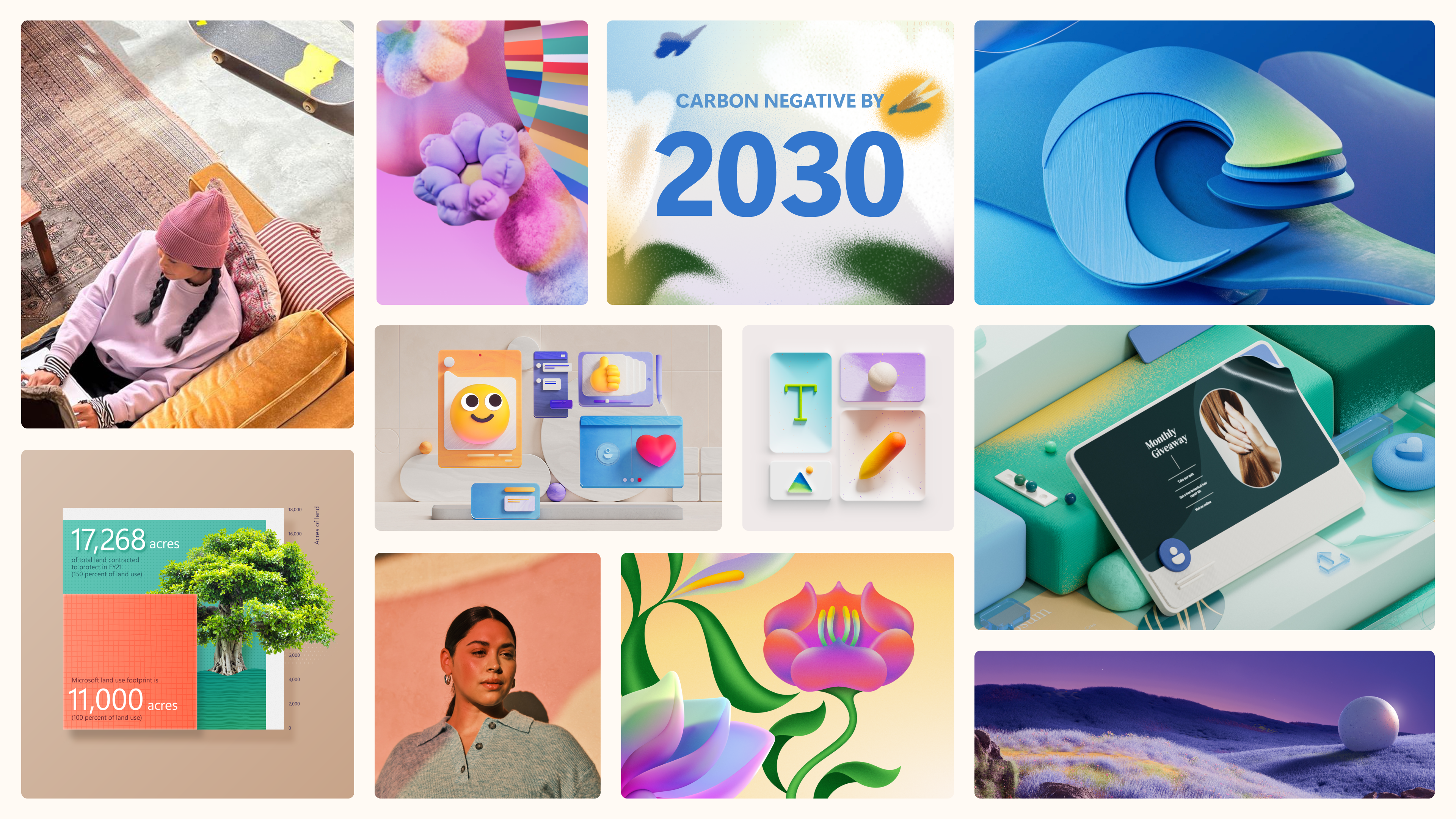
The Microsoft brand team recently embarked on a journey to redefine Microsoft’s entire visual identity through color—to transform the way people feel about Microsoft and to connect emotionally with more people, in more places.
Microsoft’s old color palette lacked relevance. It was a methodically created palette that spanned the color wheel, and included basic primary, secondary, and tertiary colors. Although it was colorful, it fell short of evoking emotion and connecting with users. In fact, the palette seemed defined by what people ‘couldn’t’ do with it. For Microsoft to resonate with diverse, global audiences, that needed to change, starting with the saturated blue and gray legacy colors. “They didn’t speak to who we are,” says Creative Director Steve Foyle. “We described ourselves as a colorful brand, but it wasn’t coming through.”
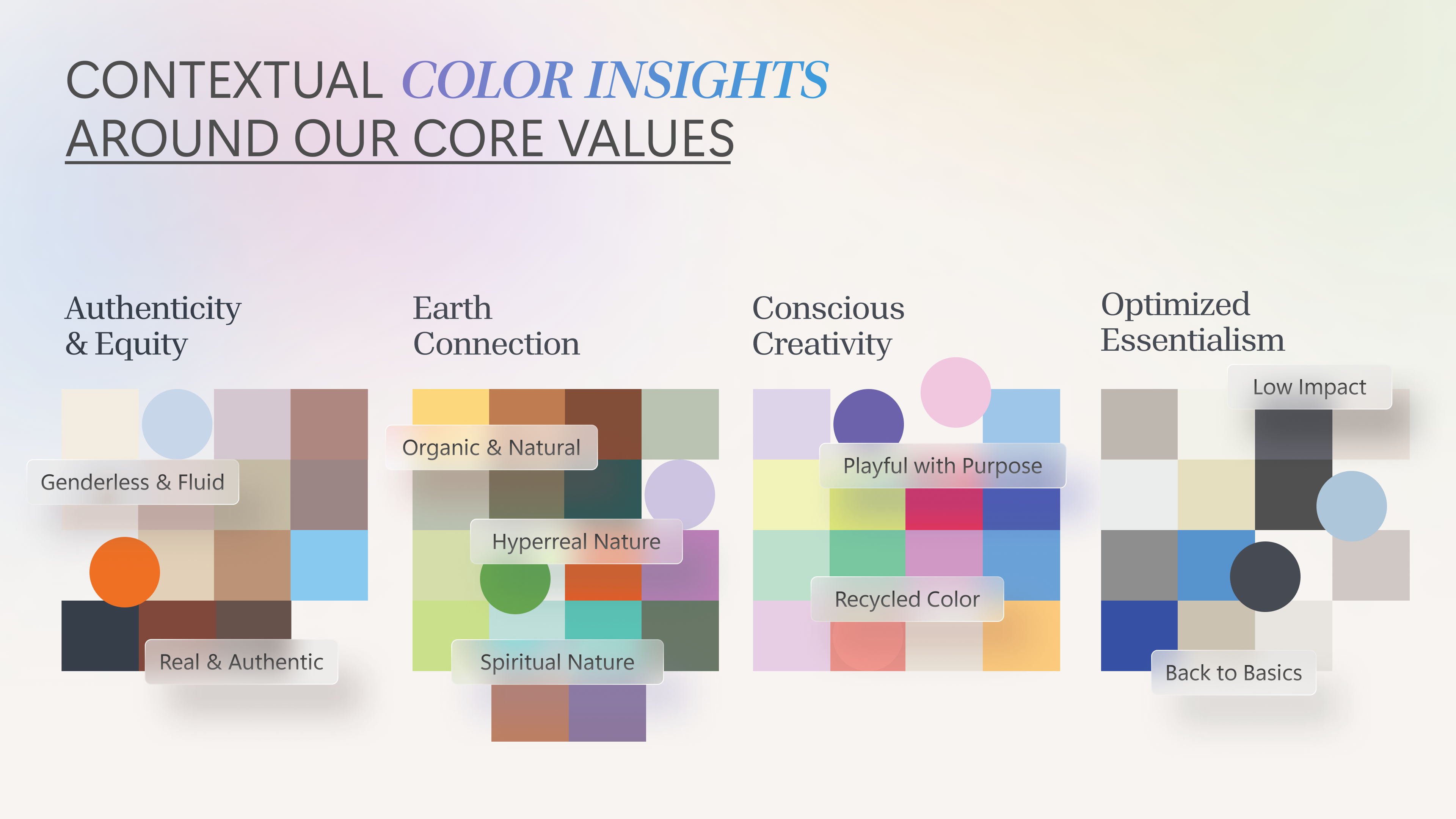
At the same time, we didn’t want to simply throw away our legacy colors. “Our intention was to augment them by testing an array of tones related to themes of authenticity, equity, conscious creativity, and humanity’s connection to the Earth,” says Global Creative Director Sven Seger. The new colors needed to be channeled through those principles to create a conceptual palette and the right tonal combinations.
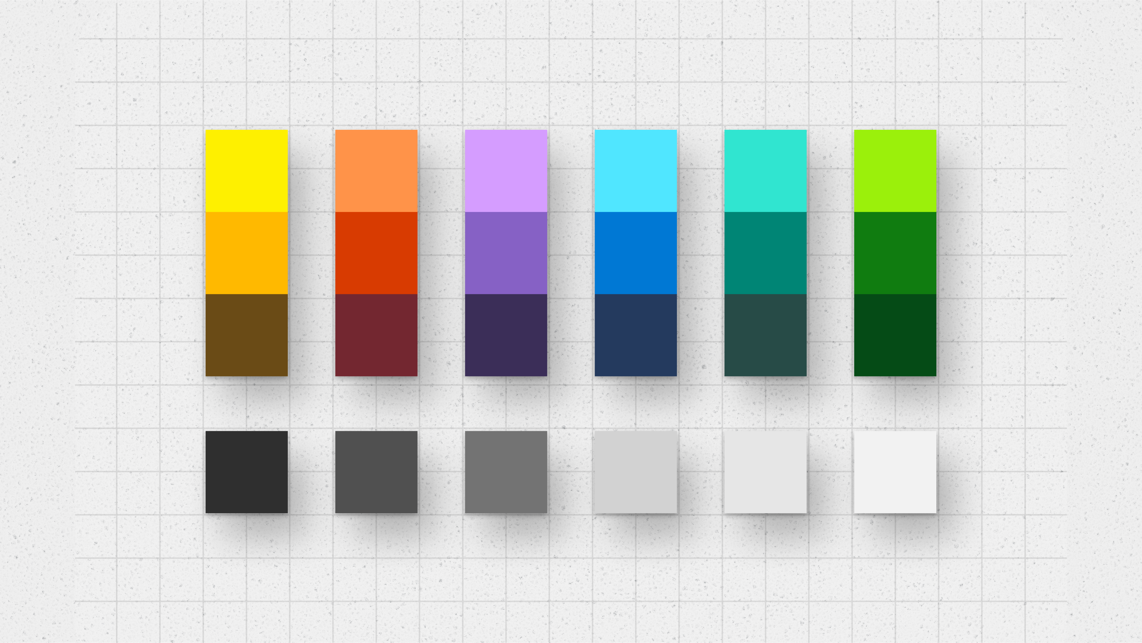
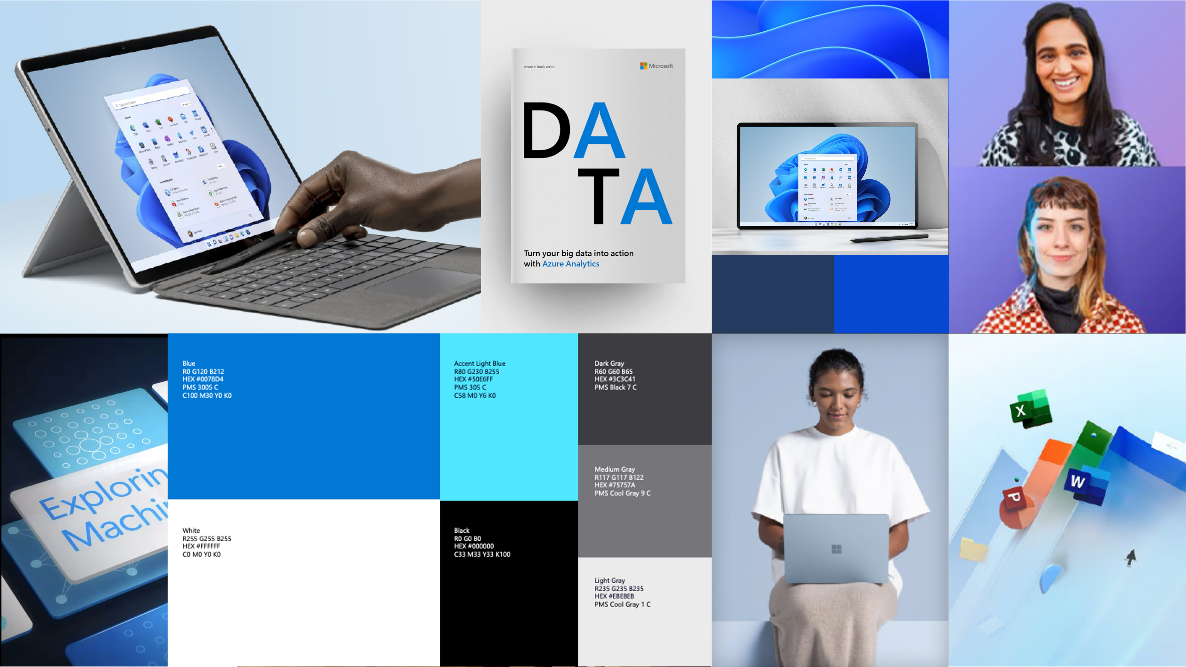
The key to the new color strategy was to influence how designers used color in their work. According to Seger, there was a gap between what designers needed to express and what they had to work with—namely the old tools and color palette. There was a need for new tools to express a point of view in the right tone and manner. Foyle underscores that the new colors had to offer definition, flexibility, fluidity, and freedom, allowing designers to interpret them for their specific needs and products.
“We wanted our designers to be more intentional and thoughtful in how they used color,” Foyle said.
So, the team aimed to drive brand love for Microsoft through a reimagined palette—challenging itself to evolve Microsoft’s brand position and audience perceptions globally. And they invited partners to join them along the way: Pantone, renowned for its color matching system, and Franklin Till, trend-forecaster for emerging design trends and insights.
Colors with purpose: Human, Vibrant, and Dimensional
After meticulous study of our brand relationship to color, the teams respectively drew on macro-trends and tapped the broader cultural zeitgeist to introduce a global color landscape to a wider audience. It reflected who Microsoft is and informed the strategy for their creative work. After further explorations of behavioral shifts, mindsets, and design trends, they mapped their insights to Microsoft’s creative principles to develop and define a strategic palette that captures the essence of Human, Vibrant and Dimensional.
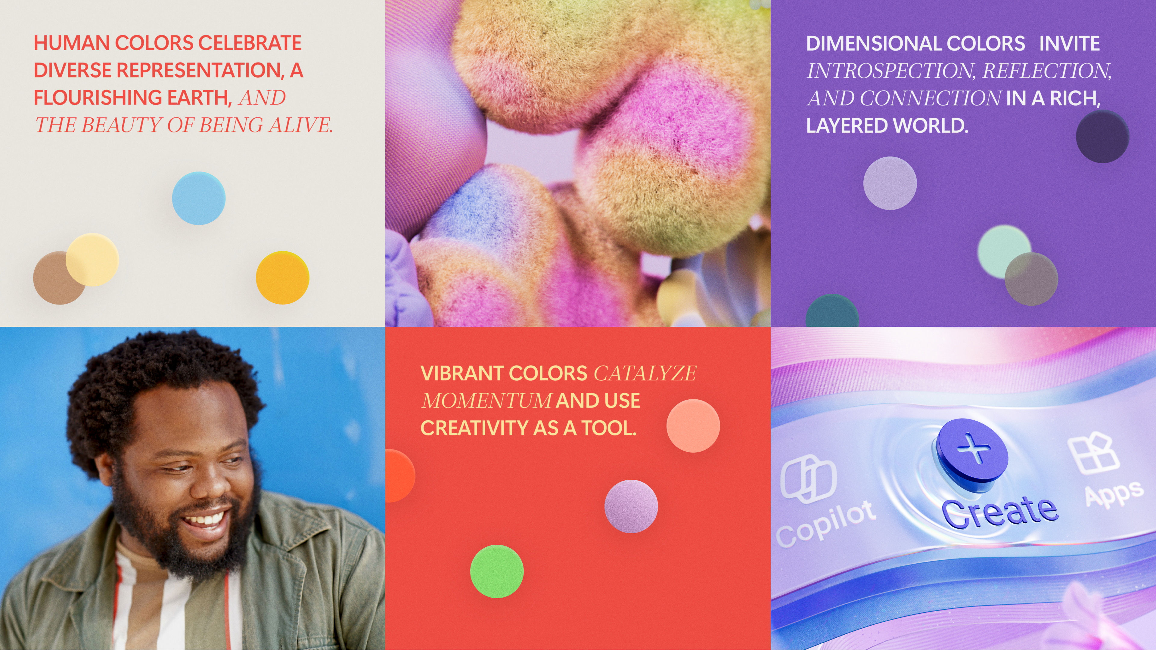
Human: A nuanced palette features harmonious, tonal combinations that embrace the complexity of the individual. A flourishing earth and the beauty of being alive are celebrated with warm, non-binary, neutral colors.
Vibrant: Bold, saturated colors grab attention. They catalyze momentum and use creativity as a tool for change by challenging conformity with bold, playful, and unexpected combinations.
Dimensional: Colors are quiet and nuanced, adding a sense of sophisticated clarity to applications. They invite introspection, reflection, and connection to a rich, layered world.
“The new color palette gives Microsoft designers the ability to create a really unique dynamic,” said Principal Creative Director Alexis Copeland. The new guidance and hues offer the definition, flexibility, fluidity, and freedom that designers have been waiting for.
Challenging perceptions of vibrancy
Group Creative Lead Director Samuel Clarke wonders why the tech industry is so digitally minded: “My eyes never see that level of intensity outside of my computer screen … which isn’t something that’s real.” So, where exactly do CMYK (cyan, magenta, yellow, key black) and RGB (red, green, blue) meet? In other words, how do we better connect digital color applications to the physical world?
As the team’s research would reveal, complex and nuanced natural colors open our collective vision to see beyond long-held beliefs, preconceived notions, and the glowing screens that influence us. Faded colors used to be viewed as bland or passive; now they embody human qualities. They are tactile and tangible, adding emotion and consciousness to our digital and physical products.
Some of the immediate feedback from designers was that our principles of “human” and “dimensional” should be tactile and warm. The palette had to represent real world textures like the softness of a pink tissue or the coarse feel of a red brick. “Vibrant” was a trickier proposition. Given our old palette mostly consisted of overly saturated colors, the team decided to move in the opposite direction. “To be vibrant all the time is exhausting,” said Art Director Phil Evans. So, the team landed on softer and more neutral tones—an unconventional choice.
A palette for people
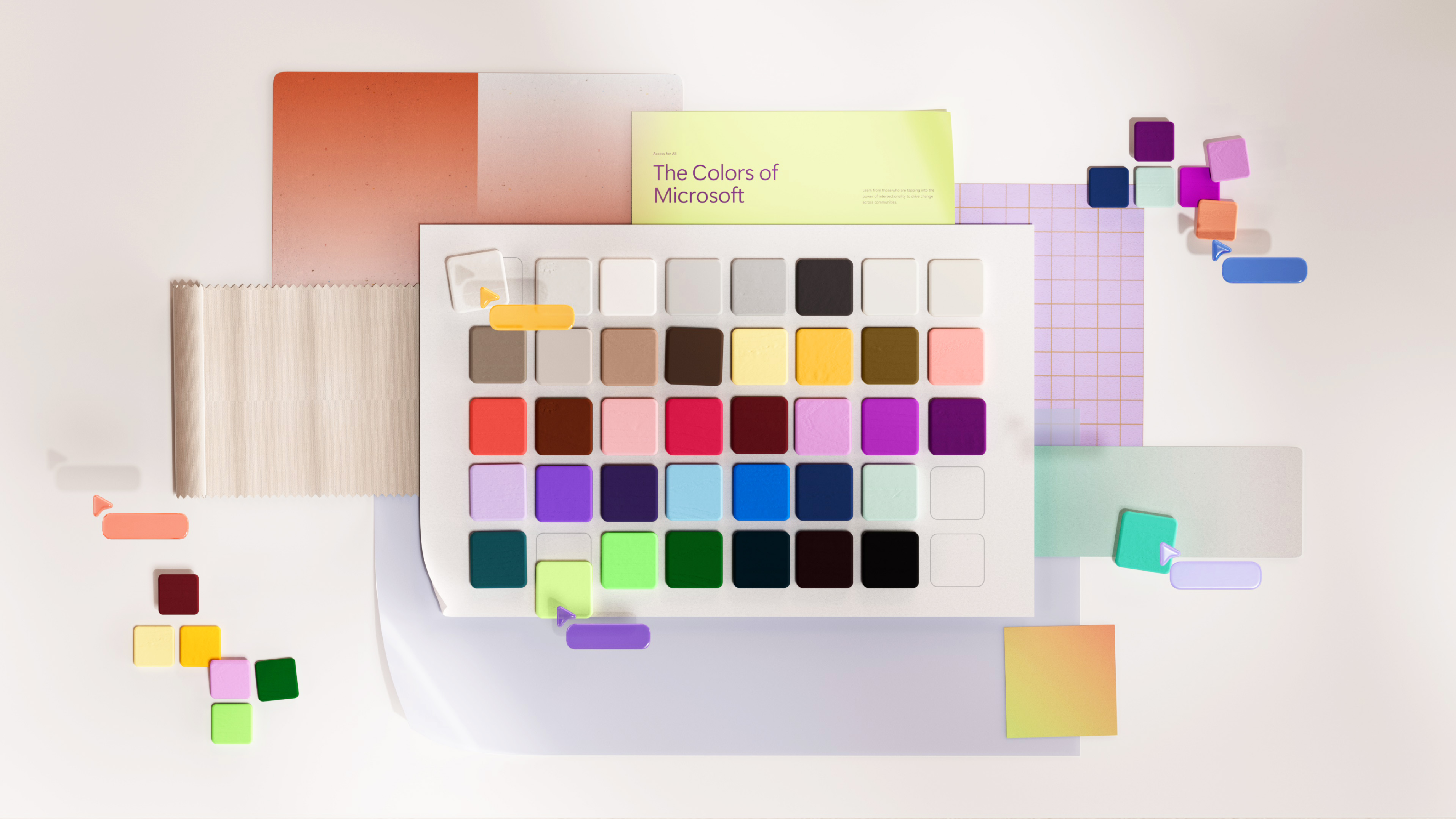
Microsoft’s new brand colors aren’t just pixels on a screen—they’re emotions, stories, and connections. The evolution isn’t about aesthetics alone. The palette now speaks to more audiences and contexts, conveying both information and emotion. And it empowers designers to navigate color with rationale that connects to the Microsoft strategy, inspiring them to use our visual expression to communicate in more essential ways.
Our colors are relevant to the present moment and enduring, emblematic of our beliefs that fundamental human rights and a sustainable future should be protected. To be human, vibrant, and dimensional is to be alive, and diversity in non-binary neutrals celebrates the breadth of humanity. To recast the conventional definition of what it means to be colorful is to reinforce our core values by establishing a color palette that reflects an astounding and transformative world.
