Product – Iconography, Microsoft Viva
Iconography for Microsoft Viva
Designing icons for experiences that empower employees
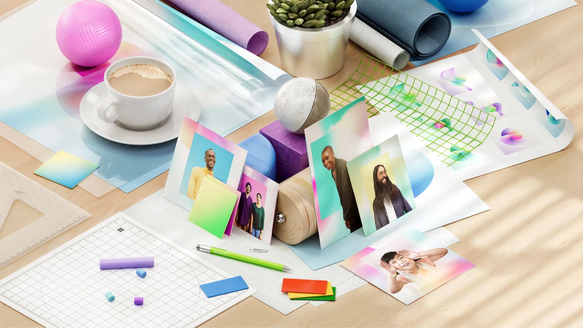
Last year, droves of people quit their jobs amid what became known as the Great Resignation. This year, the trend is “quiet quitting,” aka burned-out or unhappy employees refusing to go “above and beyond” or hustle at work.
The reasons for both vary from not enough money or flexibility to a lack of career growth or sense of purpose, but the catalyst is the same: a global pandemic that upended every system and paradigm we know, including Industrial Era work norms that asked you to keep your nose to the grindstone regardless of working conditions.
It’s within this landscape that we launched Microsoft Viva, a new series of experiences geared toward empowering employees. Viva was deeply informed by the many wake-up calls in Microsoft’s Work Trend Index — a report consisting of a global survey of over 30,000 people in 31 countries and trillions of productivity signals from Microsoft 365 and LinkedIn — including the takeaway that business leaders are faring far better than their employees.
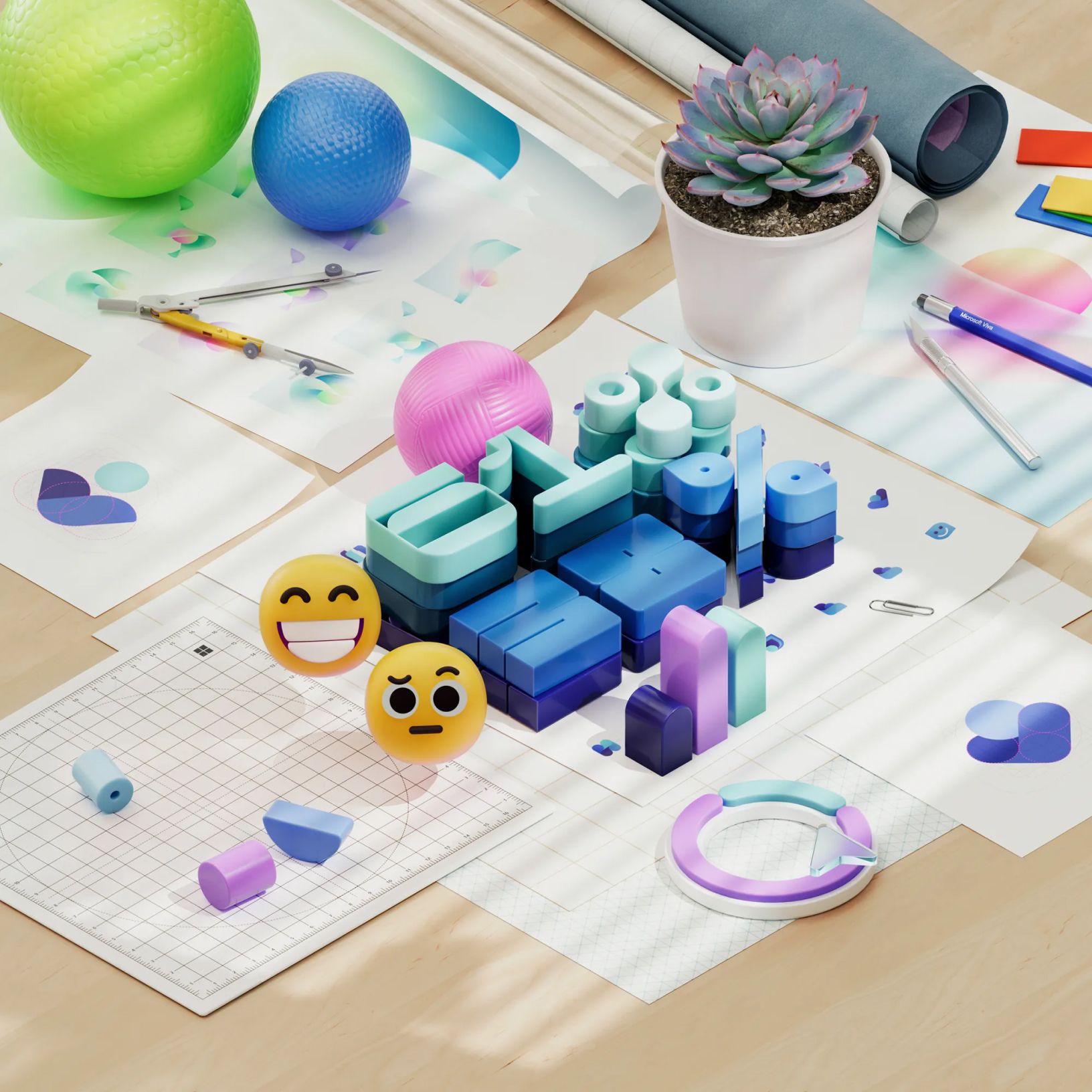
Sixty-one percent of leaders feel they’re “thriving,” which is twenty-three percentage points higher than those without decision making authority. Leaders also cited building stronger relationships with coworkers, higher earnings, and taking full vacation days.
This starkly contrasts with the employees in non-leadership roles. One in five felt their employer didn’t care about their work-life balance, fifty-four percent felt overworked and thirty-nine percent felt exhausted. No wonder folks are saying thanks but no thanks to their jobs, and few current internal tools don’t offer meaningful solutions.
We shape our tools and, thereafter, our tools shape us.
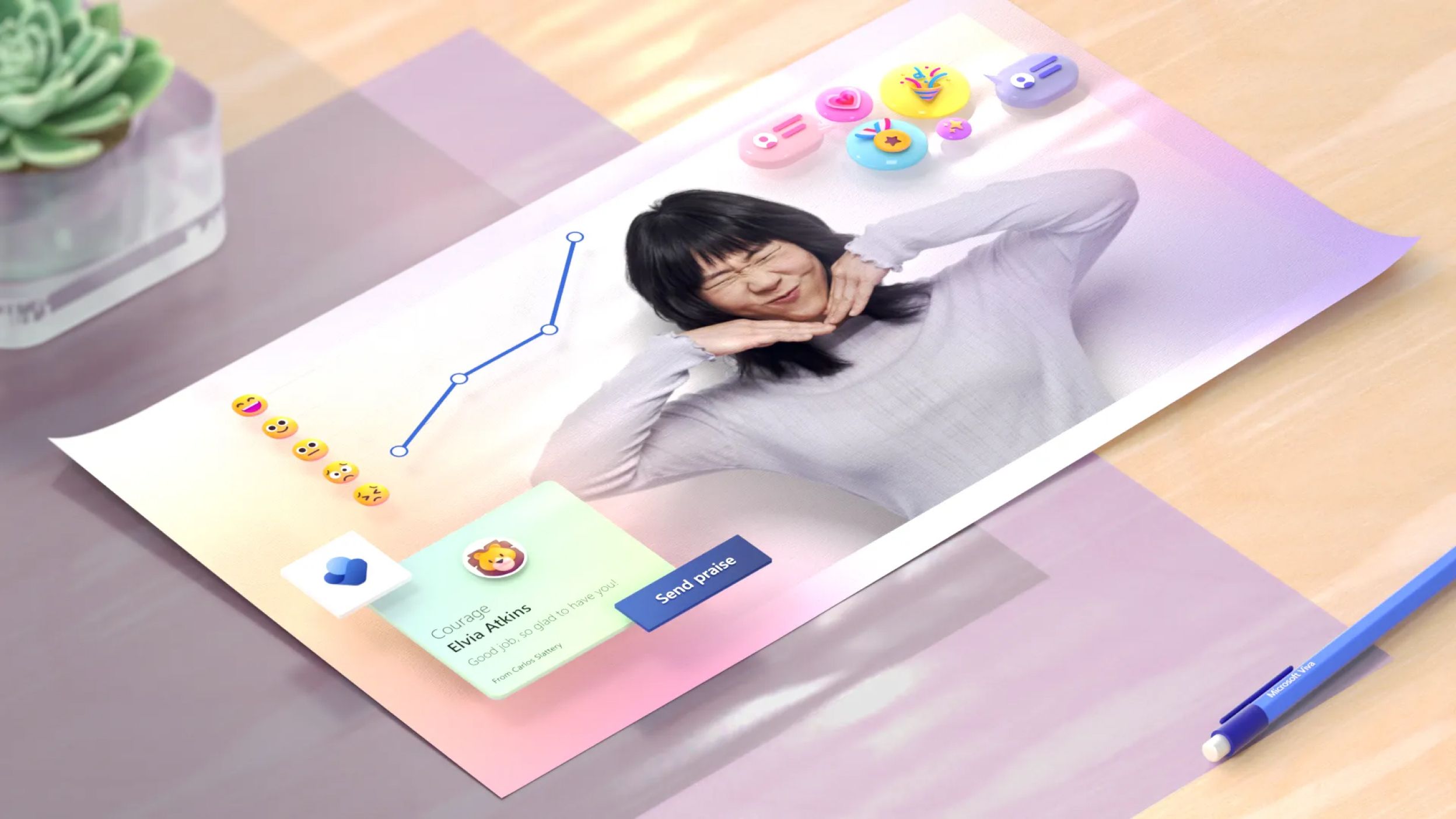
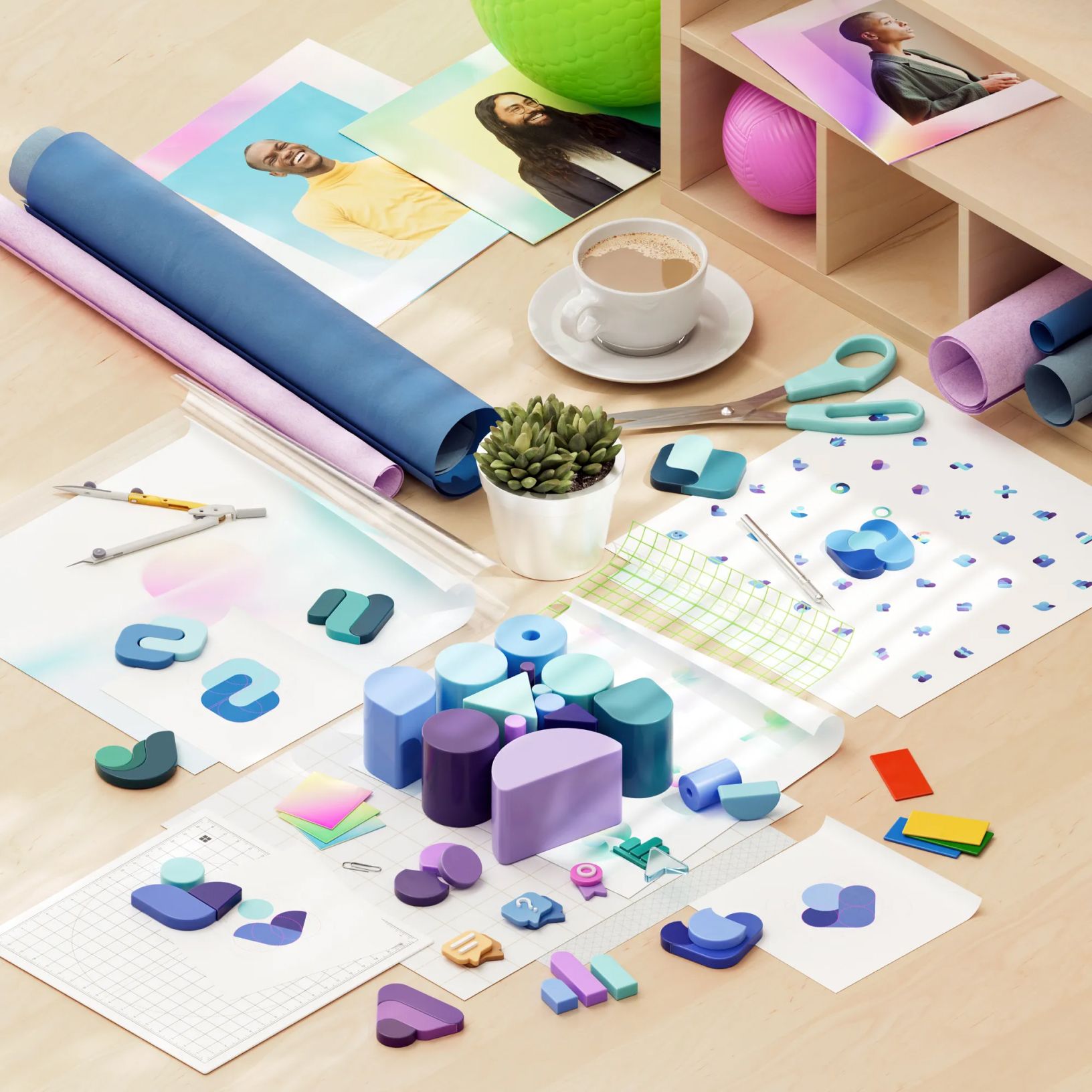
As such, we wanted Viva’s iconography to feel as human as possible, but “human” is a wildly diverse notion. We ended up using multiple human emotional and personality traits to influence the designs and indexed higher on certain aspects of the Microsoft personality and creative principles. We leaned into the “make it personal” creative principle and Approachable and Empathetic personality traits.
Viva Learning: 94% of employees say they would stay at a company longer if it invested in their learning and development, and 79% of CEOs say talent and skills of their workforce is their number one issue. This makes career growth and learning mutually beneficial, and Viva Learning makes it easy to discover learning-centric content, share knowledge with colleagues, and track your learning journey.
To communicate this, we chose an icon representing the turning of pages in a book. Finding metaphors that universally resonate is challenging and our research indicated that a wide majority of cultures associate books with learning and training.
Viva Connections: Connection is harder in hybrid environments, and you’re more willing to bring energy and creativity to work when you feel connected to the people and purpose of an organization. By bringing together relevant news, conversations, and resources, Viva Connections is a one-stop shop to foster cross-org connections and rally teams around a shared vision, mission, and priorities.
To represent this, the primary shapes of the icon form an interlocking mark that represents news, conversations, and resources coming together. For many, it’s reminiscent of a handshake, and the design embodies collaboration, communication, and unity.
Viva Insights: Promoting employee wellbeing and creating a thriving culture is at the crux of Insights. Individual and team reflection is critical and by providing data-driven and privacy-protected insights, we can recognize and shift behaviors that don’t serve (like ineffective meetings), or and amplify the ones that do (like reserving focus work or building in breaks to walk or stretch).
The circular shape at the center of the Viva Insights icon embodies the aspects of humans and knowledge and is supported by the two shapes at the bottom forming a foundation and support mechanism. There is a sense of calm and protection in the icon, evoking comfort and empathy.
Viva Topics: By using AI to automatically organize content and expertise across an organization, Topics makes it easy to find and apply the information that matters most. For this icon, the three circles coming together suggests an integration of diverse ideas and topics to enable seamless collaboration. The shapes also communicate some aspects of atoms and molecules forming together and representing a network as well.
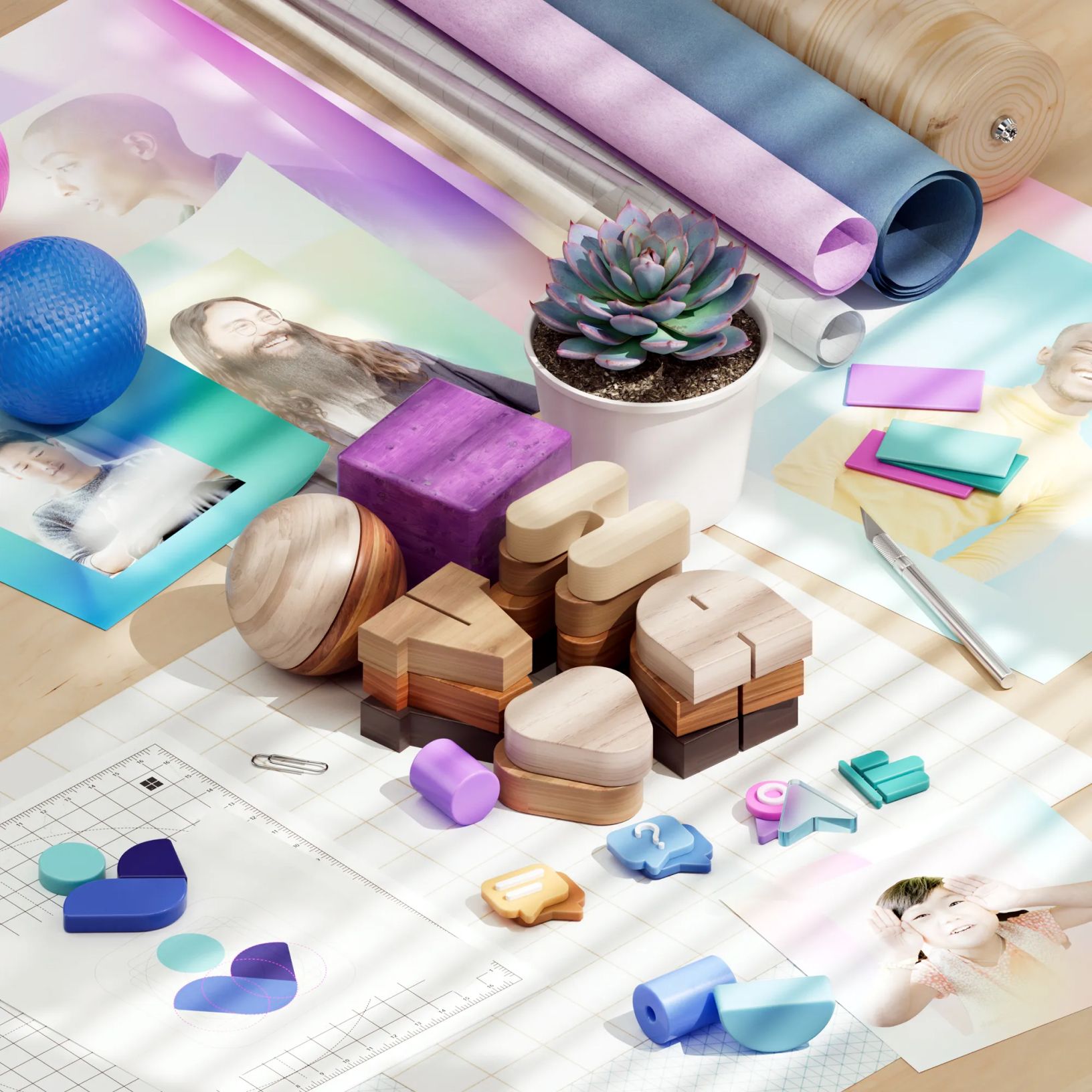
Empathetic evolutions
The great secret of adulthood is that you never really grow up. We’re in a constant state of becoming, continuing to learn who we are and want to be. New jobs and cities, unpredicted world events, loved ones entering or leaving our lives — we keep evolving, finding and losing and finding ourselves anew.
As the world of work continues shifting, Viva will evolve alongside it and we’re currently designing additional modules to support and empower different facets of best-in-class employee experiences. Experiences that enable managers to model empathy, that empower employees to bring their best, authentic selves to work, and that open up new avenues for product designers to meet human needs creatively, ethically, and innovatively.
Read more
To stay in the know with Microsoft Design, follow us on Twitter and Instagram, or join our Windows or Office Insider program. And if you are interested in working with us at Microsoft, head over to aka.ms/DesignCareers.
From incubation to impact: Microsoft 365 Companion apps
How scrappy prototypes became polished apps—shipped on the taskbar, grounded in Fluent, and refined by research.
When AI joins the team: Three principles for responsible agent design
A practical guide to build agents that stay differentiated, intent-aligned, and bias-resistant
The new Microsoft 365 Copilot mobile experience
How we redesigned the Microsoft 365 Copilot mobile app to create a workspace built around conversation, dialogue, and discovery.
