
Start, fresh — Redesigning the Windows Start menu for you
This is the first post in our new Beyond the Surface series, a behind-the-scenes look at how craft comes to life in Windows products and features.
A quiet moment of déjà vu
Think back to the very first time you pressed Start.
Maybe you were nine, borrowing your mum’s laptop to play Minesweeper.
Maybe you were twenty-three, racing against a deadline and hunting for PowerPoint.
In that single click lived a promise: everything you need, right here, ready when you are.
Thirty years later the promise remains, but the world around it hums at a new tempo. Phones flicker, tasks blur, screens multiply. So, we asked ourselves: How do we keep that original promise and let it breathe in 2025?
The answer arrives today in a refreshed Start menu that is lighter on its feet, warmer to the touch, and—above all—yours. Our journey echoes the wider Windows 11 philosophy of calm, human-centered technology.
The spark
Great design usually begins with a whisper, not a thunderclap.
Over coffee chats, Feedback Hub notes, and thousands of remote interviews, we heard the same refrain:
“Help me find my apps faster. Let me bend Start to fit the way I work. And please—keep the magic, don’t lose the soul.”
Those voices lit the path ahead, inspiring our design decisions.
Four guiding stars
- Apps, at a glance
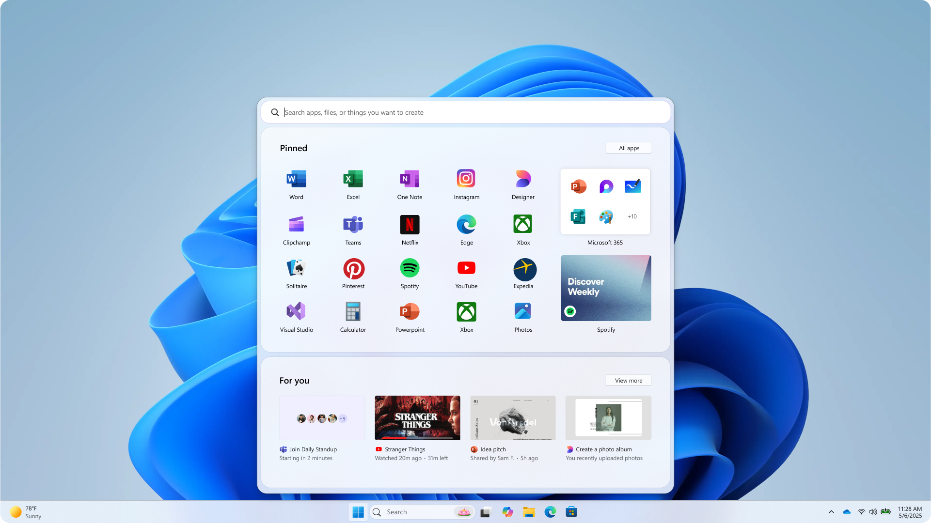
Your entire library—pinned, installed, or freshly discovered—should be right there. - Make it yours
Start should feel like it grew up on your desk, featuring only what and how much you want. - Accelerate the day
Every pixel must earn its keep, shaving seconds off routine actions so creativity gets a head start. - Honor the icon
Respect three decades of muscle memory. Update, don’t upend.
The craft journey
From net new features to redesigns like the Start menu, every Windows design journey is deeply rooted in craft and follows three key steps:
- Explore
Whiteboards, Figma frames, floor-to-ceiling paper prototypes—nothing was too scrappy. We sketched out a plethora of layouts, letting ourselves go wild and discover new things before applying the editorial pen.
- Validate
Over 300 Windows 11 fans joined unmoderated studies and dozens more hopped into live co-creation calls. We watched eye-tracking heat maps swirl, counted scroll wheels, and listened for “oh!”s of delight to know where we were hitting the mark.
- Refine
| You asked for… | We built… |
|---|---|
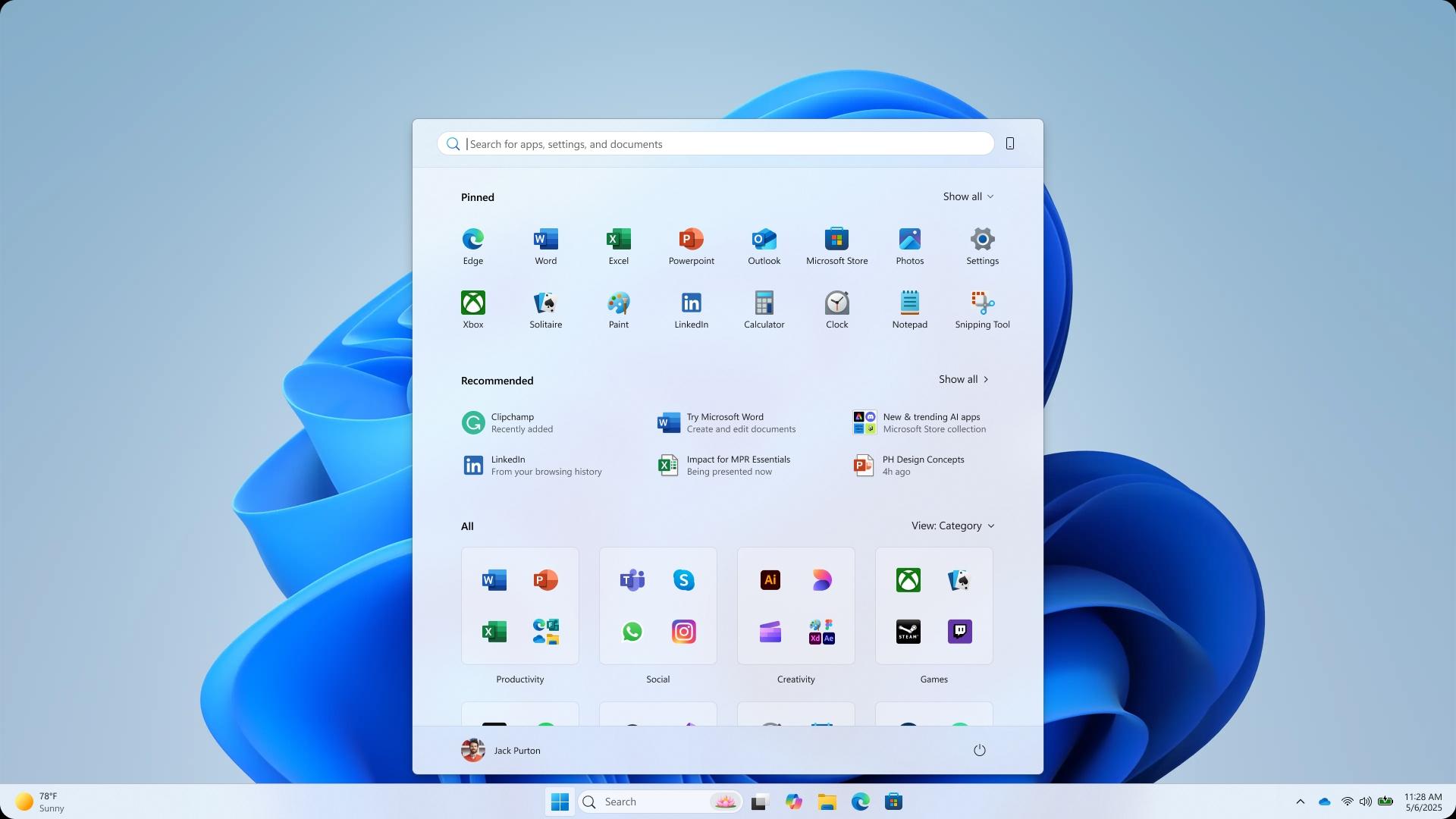
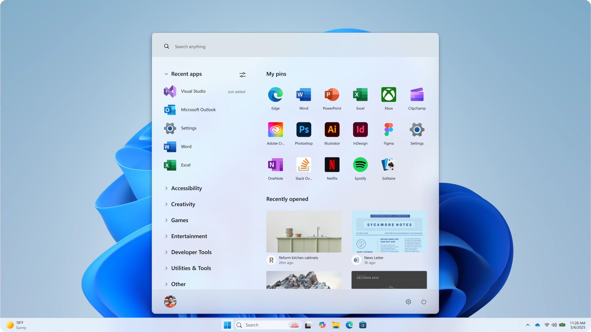
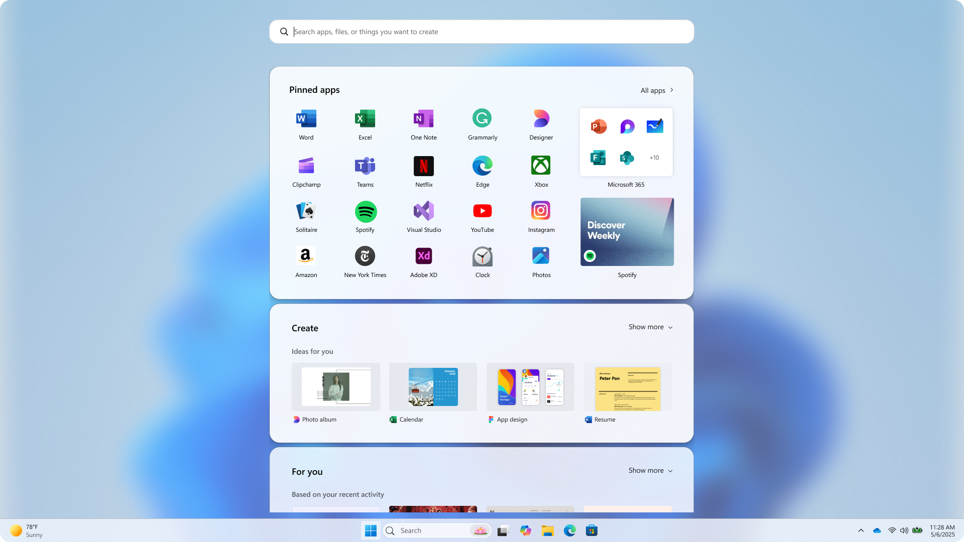
| Easier app discovery | All apps brought up to the top level, in three views, including a category grid view that prioritizes your most used apps—reminiscent of your phone, no more marathon scrolling. |
| Smarter suggestions | Recommendations made just for you that learn in real time and a way to hide them if you don’t find them helpful. |
| More control | Quick switches to show “More pins”, “More recommendations”, or a perfectly balanced mix. |
| Clear mobile separation | A slim “phone sliver” that glides in from the edge—there when you need it, gone when you don’t. |
We tested and tweaked the design on a huge range of devices until the menu felt like it belonged on both a Surface Go and a 49-inch ultrawide. We sweated every pixel to make sure it needed to be there and to ensure the experience was filled with grace and ease.
The final experience: a fresh Start
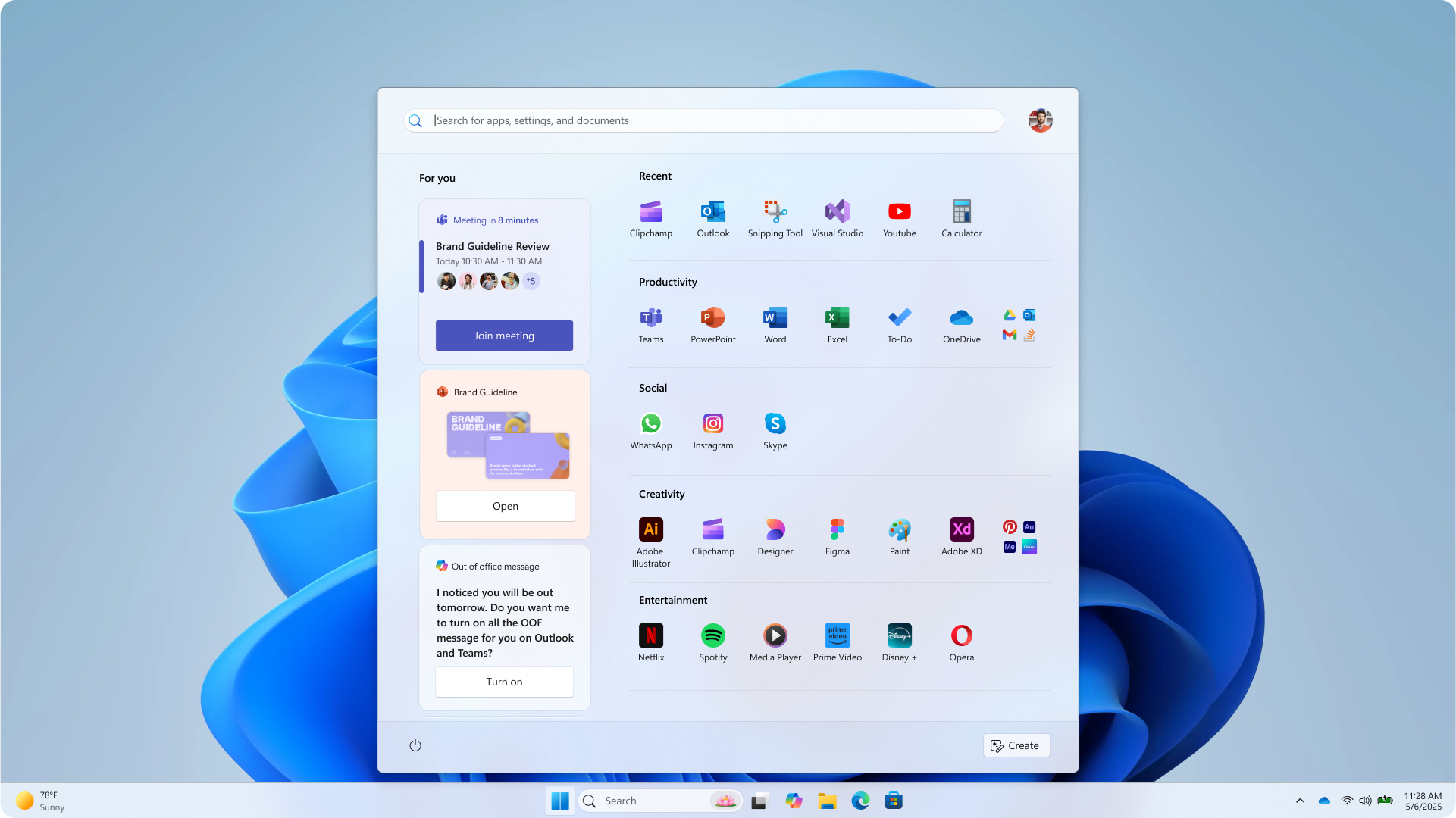
Dynamic recommendations
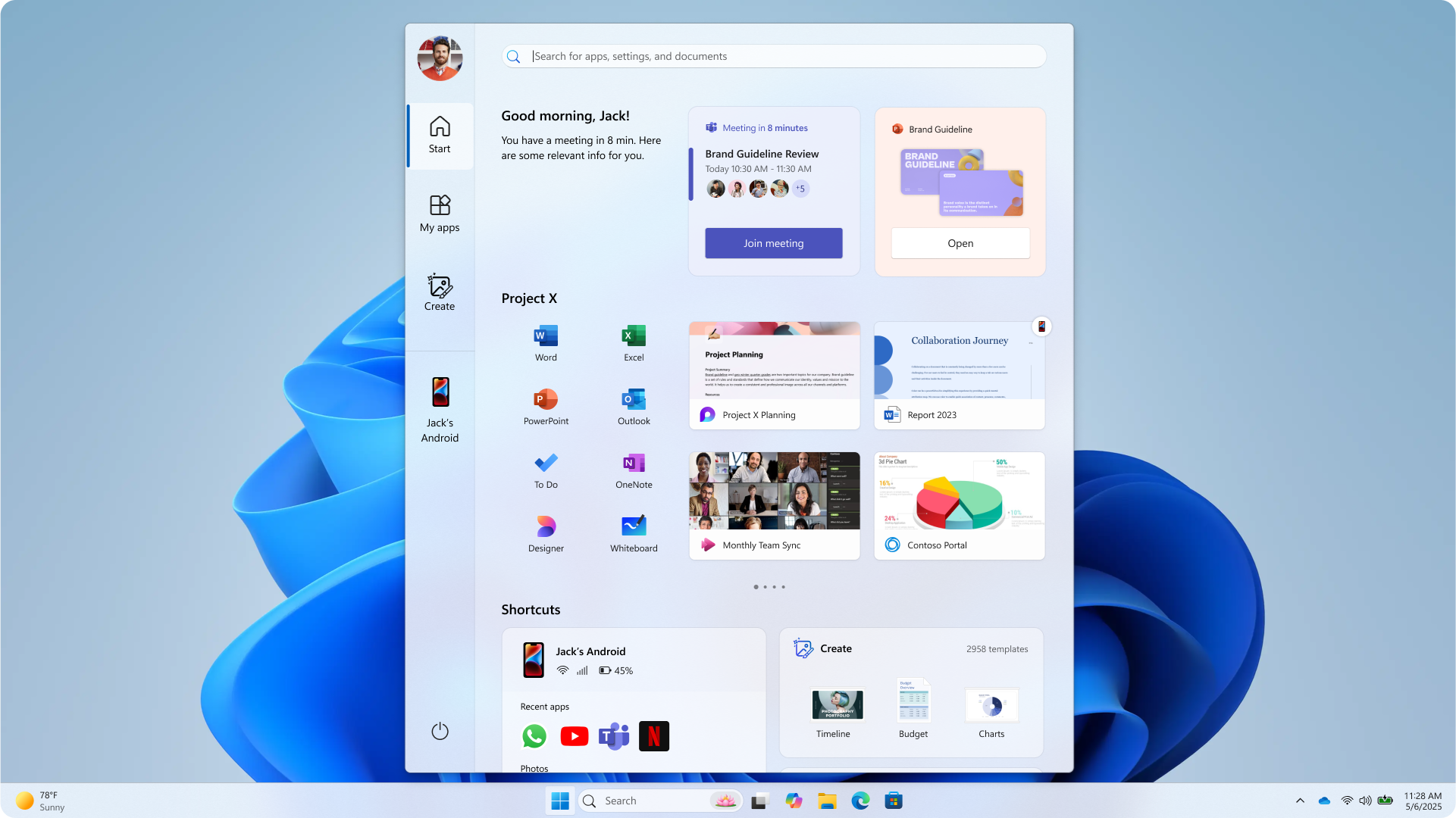
Files and apps surface exactly when they matter—yesterday’s missed meeting recording at 9 am, snap groups to get you back in the flow throughout the day, that app you always open around 2 pm, the app you didn’t know you needed just when you need it.
More and better views for all apps
No more digging to find your apps! They now live at the top level now and you can choose between logical categories, a neat grid, or the familiar A-Z list. Each is effortless to skim and scroll wheel friendly.
Mobile content, gently blended
Pick up a WhatsApp photo or a to-do from your Android phone without losing desktop flow. Keep on top of the latest messages from your iPhone. The phone panel attached to the Start menu respects screen real estate—and your attention span.
Personalization, elevated
Expand the section you use most; collapse or completely hide the ones you don’t. Pin your most used apps, set the all-apps view you prefer. Start makes better use of your screen real estate by being bigger on big screens and more compact on smaller ones.
Under-the-hood speed
We’re keeping the promise of Start being the accelerator of your day by making it load in a snap, so you won’t be dragged by lag.
Looking forward
Design is a conversation, not a monologue. Yesterday we listened with all ears, today we speak with pixels; tomorrow we’ll take our turn and listen again. Install the latest Windows build, click that familiar logo, and let us know what sings—or what still needs tuning.
Together we’ll keep the promise of Start alive: everything you need, right here, ready when you are.
Thank you for beginning (again) with Start.
Read more
To stay in the know with Microsoft Design, follow us on Twitter and Instagram, or join our Windows or Office Insider program. And if you are interested in working with us at Microsoft, head over to aka.ms/DesignCareers.
From incubation to impact: Microsoft 365 Companion apps
How scrappy prototypes became polished apps—shipped on the taskbar, grounded in Fluent, and refined by research.
When AI joins the team: Three principles for responsible agent design
A practical guide to build agents that stay differentiated, intent-aligned, and bias-resistant
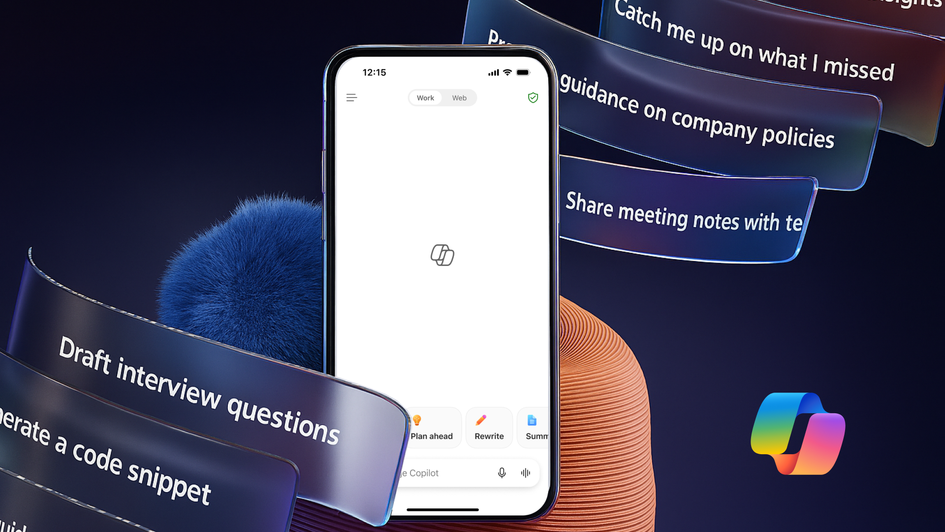
The new Microsoft 365 Copilot mobile experience
How we redesigned the Microsoft 365 Copilot mobile app to create a workspace built around conversation, dialogue, and discovery.