Silver linings and new hues
Collaborating with Pantone to bring more color to work and life

From custom-designed hamster homes to the sourdough bread baking craze, one silver lining of the pandemic was a return to the creative impulses that adulthood so often stymies.
Even we creative professionals fall prey to busy adult life and there’s currently a process of collective evaluation taking place. What pre-pandemic trends or tendencies do we want to shed? What new ones do we embrace?
It’s from this place of conscious consideration — an act that we call design — that we’re rethinking digital experiences for Microsoft 365. From new fonts and 3D emoji to new Teams backgrounds and themes, we’ve been infusing our suite with more dynamic, personal, and colorful forms expression.
When it comes to color, Pantone is a bonafide synonym (few design artifacts are more iconic than that infamous color wheel), making them the perfect collaborator to bring more color into work and life.
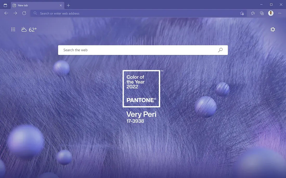
This month, the PANTONE Color of the Year for 2022 was announced: PANTONE 17–3938 Very Peri — a dynamic periwinkle blue hue with a violet-red undertone that blends the faithfulness and constancy of blue with the energy and excitement of red. It’s the first time Pantone has created an entirely new color for this and starting today it will be popping up in Teams, Windows, Edge, PowerPoint, and more.
Crafting a new color

From a UX perspective, color is so powerful because it’s a universal language. It can instantly and viscerally influence perception, telegraph information, or explain a product or service’s characteristics.
As an expression of a mood and attitude, crafting a new color requires an awareness of the global zeitgeist. Color influences come from myriad sources: films in production, traveling art collections and new artists, music and new musical artists, fashion and beauty. New technologies, materials, textures, and effects that impact color are also studied, as are new lifestyles and playstyles, cultural events, and socio-economic contexts.
The Pantone Color Institute’s global team of color experts carefully considered these and numerous other factors when creating PANTONE 17–3938 Very Peri, resulting in a fresh new hue whose carefree confidence and daring curiosity embodies the energy, excitement, and newness of today.
A new color for a new professionalism

Color is a part of every design decision we make here at Microsoft, and we wanted to incorporate this new color into our designs in a way that could inspire people to feel more empowered and creative in their daily endeavors.
Periwinkle blues are special in that they encompass the trusted and dependable qualities of the blues, yet their purple cast makes them feel more playful and joyous. This simultaneous message of credibility and excitement sets an ideal tone for creative collaboration and personal expression, which are needed more than ever at work.
You’ll see PANTONE 17–3938 Very Peri in new Teams backgrounds, along with a palette of complementary colors that will bring a fresh, new dimension of personality to meetings. It will also appear in the newest PowerPoint templates, Windows 11 wallpapers, and an Edge browser theme. Throughout 2022, this color will show up everywhere we need it most in our refreshed Microsoft workplace tool kit, infusing a sense of possibility throughout.
What’s your next colorful creation?

Whether it’s a new color or a new product feature, designers never know what shape our creations will take until they’re out in the wild (who would have predicted Excel would be used to make music?).
That’s perhaps the coolest part of our job, watching our designs grow in unexpected and delightful ways. PANTONE 17–3938 Very Peri is particularly fun because of the carefree confidence it conveys, that childlike feeling of unbridled potential to experiment and create. A sense of wonder, delight, and possibility can strengthen relationships, empower self-expression, and spark innovation, helping us move toward a new, more human kind of professionalism.
What do you think of the new color? How do you see yourself bringing it into your life? Your daily work? Your sense of personal expression?
Whatever it is, we’re sure it will be cool. And warm. A bit of both.
Read more
To stay in the know with Microsoft Design, follow us on Twitter and Instagram, or join our Windows or Office Insider program. And if you are interested in working with us at Microsoft, head over to aka.ms/DesignCareers.

A canvas of community narratives
Xbox celebrates a year of visual storytelling by launching new dynamic backgrounds

In the age of AI, will content designers become extinct?
Senior Content Designer Jenny Williams talks about her role, and working with AI

Leave no trace
How product designers can break from the status quo and help our planet
