Self-portraits: Anthony Dart
A South African artist on his graphic design journey
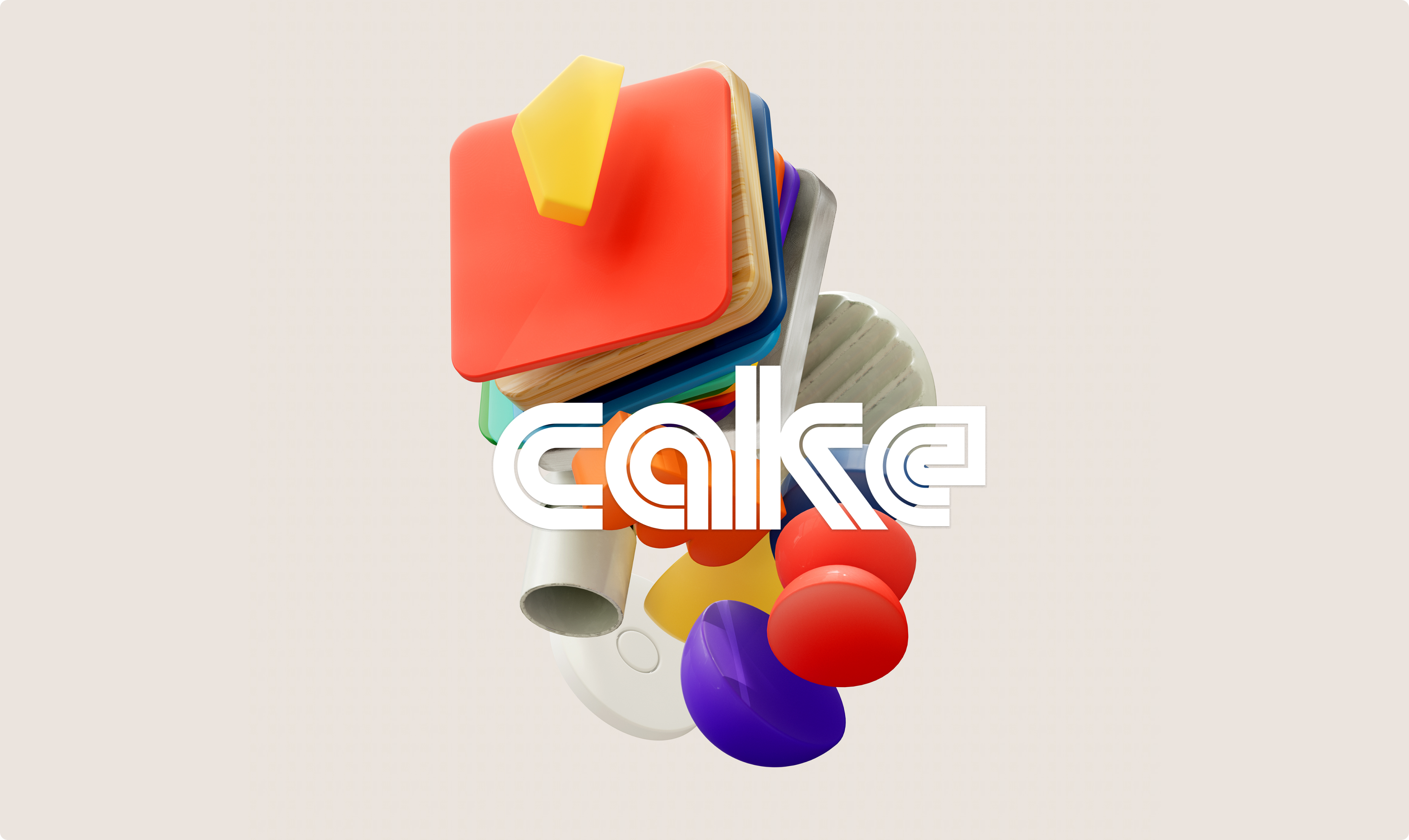
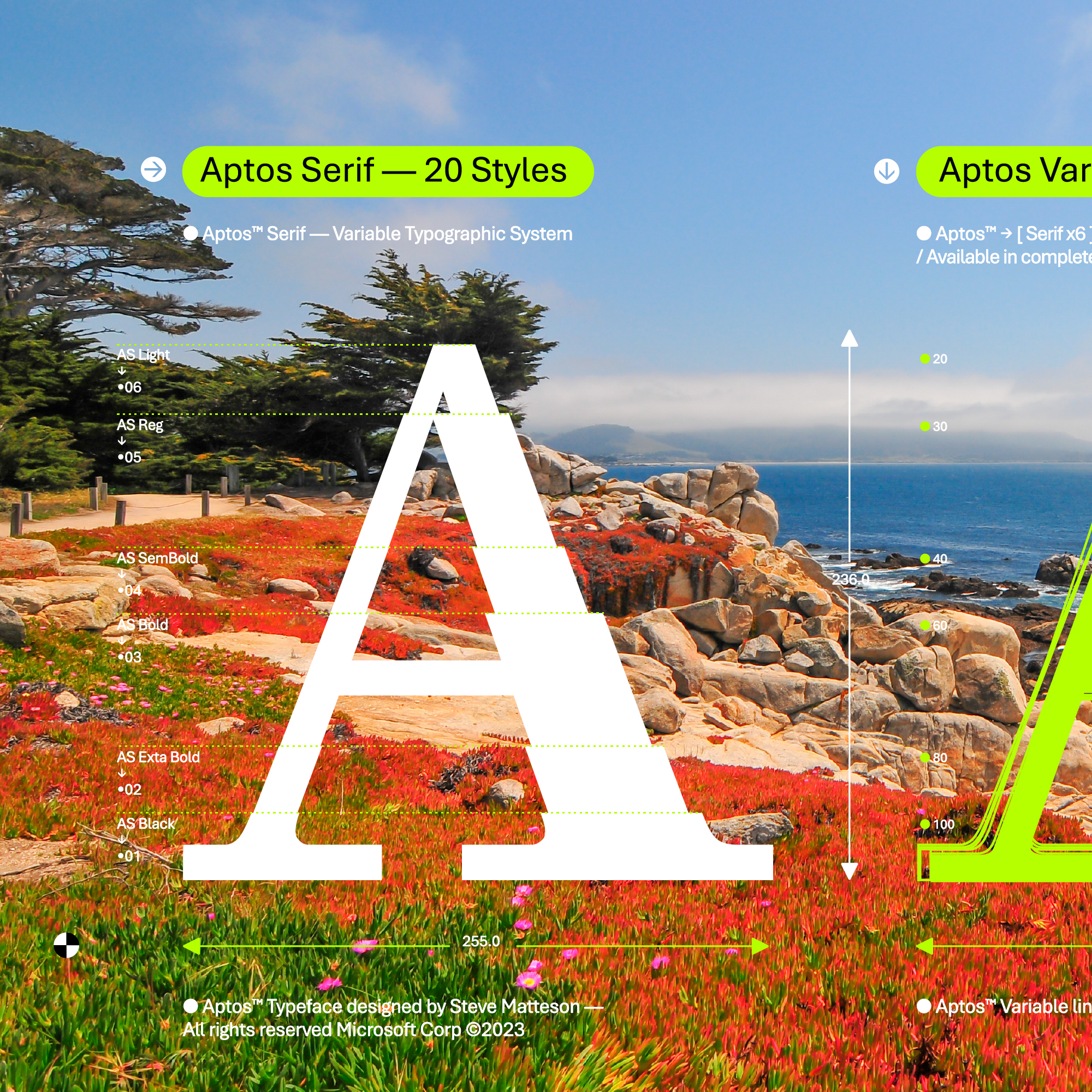
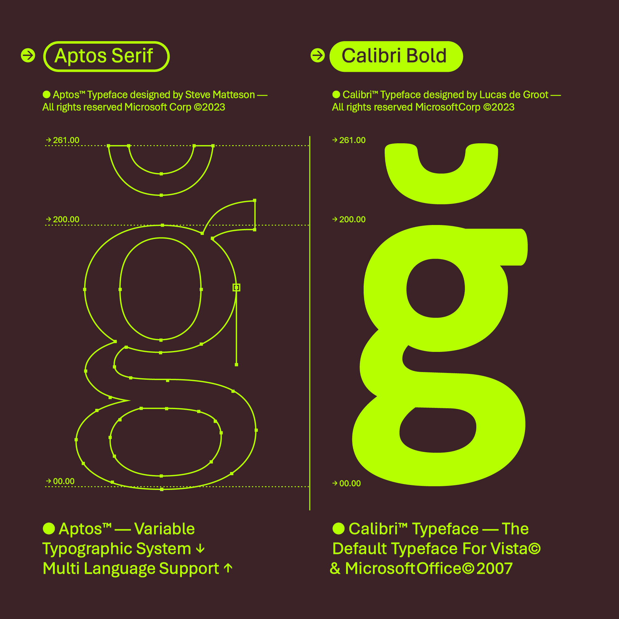
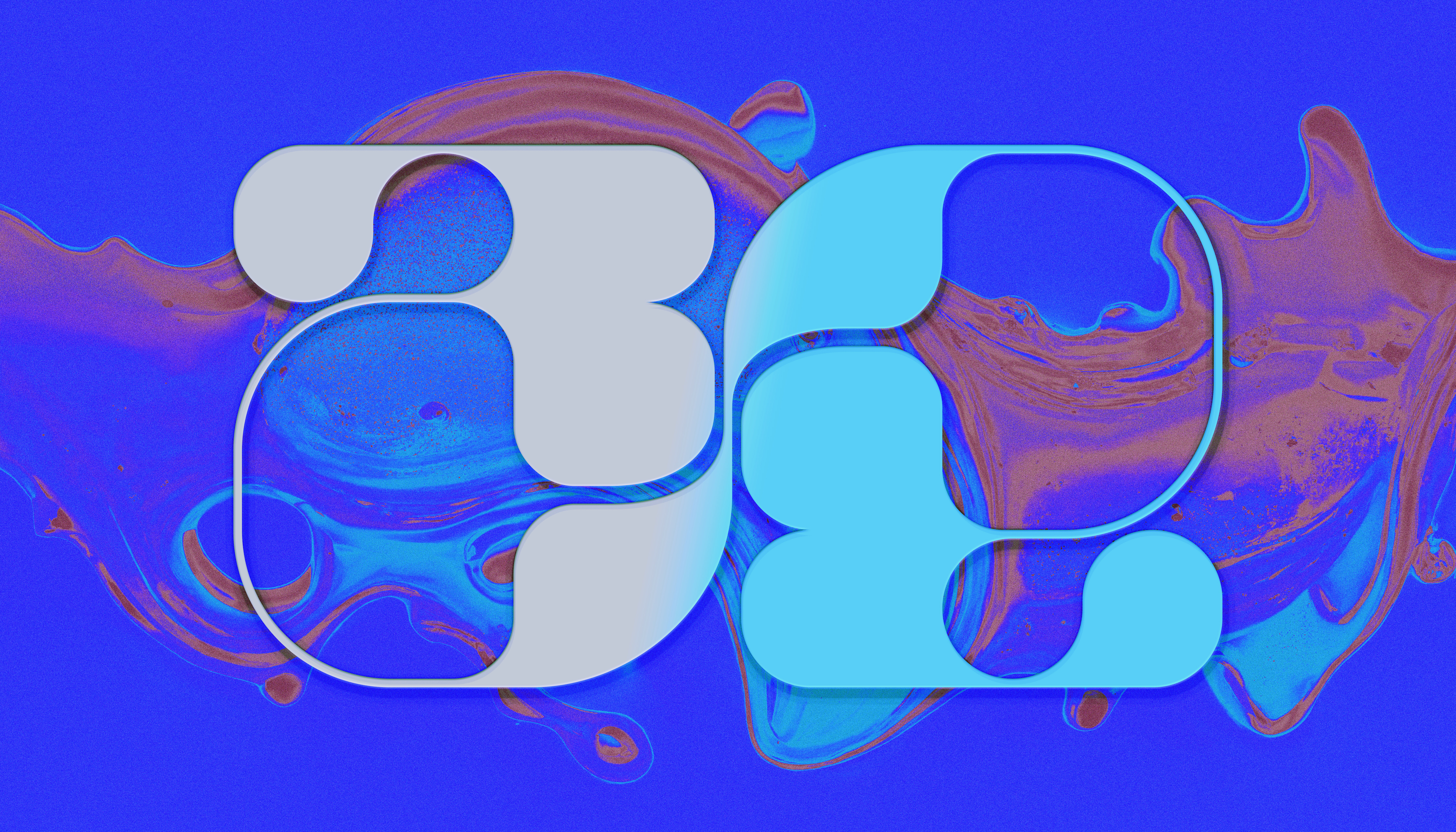
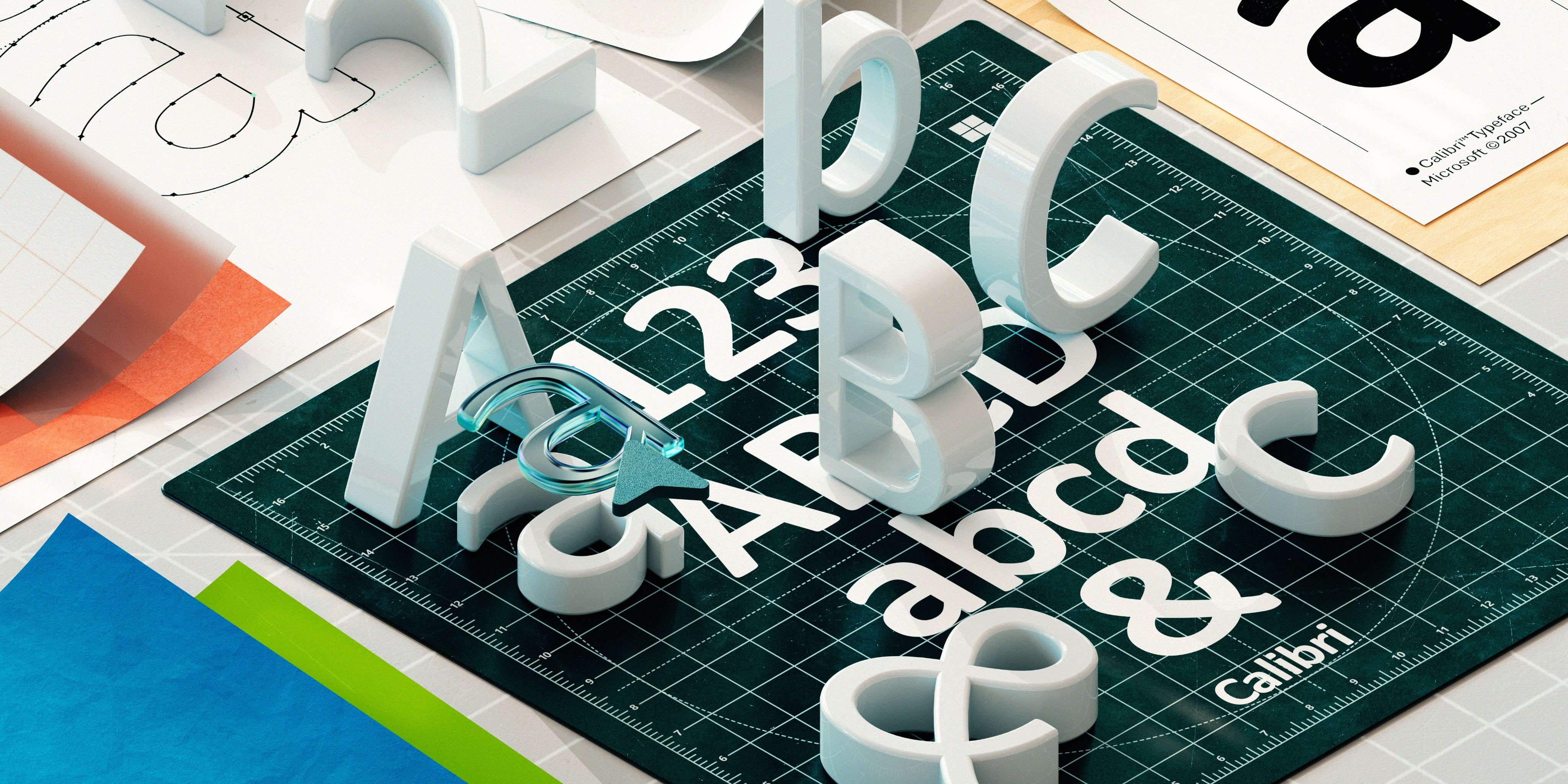
South African graphic designer and artist Anthony Dart has been at Microsoft for twelve years. His work is always razor sharp, from typography to iconography, and he’s worked across Xbox, Windows, Microsoft 365, Copilot, and more. His Instagram page is a visual odyssey of original typography layered over colorful meandering flourishes, colliding contours, and juxtaposed compositions. The shape of the human body and that of type are often in dialogue, intertwined, and pulled apart. If you’re a frequent Microsoft Design reader, you may also recognize his work from the Aptos font announcement, Microsoft Viva, ClearType, and many other stories!
There’s an overt rhythm to his work, so it may not be a surprise to learn that he composes moody soundscapes and videos that seemed like twins born in different mediums. In his own words, Anthony talks about his journey to becoming a graphic designer and what inspired his approach to designing bespoke letterforms.
In college [Parktown College of Art & Design], I majored in photography, sculpture, Art history and graphic processes. So that was lino printing and silk-screening, and all those old printmaking techniques, including graphic design. I am probably one of the last generations to learn things by hand.
When I started, my original intention was to be an artist rather than a designer. However, when I left school and saw the reality of it, like, “Oh, this is the workplace. No one is going to hire artists,” but when you’re young and without mentorship or wisdom to guide you, intuition is all you have. I was like, “Okay, I’m going to have to take this computer graphics thing seriously.” So, I got a dodgy copy of FreeHand and CorelDRAW and Photoshop, like version three, and started teaching myself. Still, I couldn’t get a job. Everybody at the agencies would say, “Your art is amazing,” but then they’d ask if I had computer experience. And I’d be like, “No.” So I worked retail. I worked all these odd jobs, and got myself a 486 Siemens Nixdorf computer that ran Windows NT. I just started teaching myself as much software as I could.
Once I got into that, I started fabricating my own portfolio. I’d reinterpret brands, I’d fabricate ads, you know. I would go into places with a totally faux portfolio, and that’s how I finally got hired into the design industry.
Working with agencies, I realized just how important type was as a differentiator, because all my peers around me didn’t really pay attention to type the way I did. I have always felt that type can do far more, you just have to deploy it. I do not really differentiate between type and image; for me, they are the same. I would not refer to myself as a traditional typographer, but I’ve always had this instinctual thing about typography, the idea that you put visual signals into people’s heads by giving typography and image-making the same amount of care.
Typography is amazing in the sense that it can express language and ideas. It’s graphic design, illustration, and anthropology all condensed into one systematic place. We have such diverse customers and audiences, yet brands only stick to one typeface, which I always felt was a little absurd. Imagine using more variations and styles of targeted display type for more nuanced and contextual communications and systems. We have so many languages and cultures, so why not celebrate this diversity with more typefaces?
I have created numerous typefaces over the years with the express intent to expand upon my own visual vocabulary to express ideas. It’s all about construction within a coherent framework, with the clarity and universality of grids and geometry to solve complex problems. I’m a Lego guy, modular, fitting things together in my work. It’s almost all architectural. Everything is built brick by brick.
I revere modernist rigor, people like Wim Crouwel, Ben Bos, and Karl Gerstner who epitomize expressive and systematic clarity, yet I also like to break rules and mess things up a bit. So I find myself somewhere between rational, playful pragmatism and expressive idealism.
As a designer this can feel tricky to navigate, this feeling of being between two conflicting philosophies, and yet this has become the new normal for modern graphic design, especially when type and image continue to collide into a dizzying array of culturally kaleidoscopic aesthetics. In interviews, Crouwel would often say “the meaning of the text should be in the text itself.” I find this statement to be true but also feel that modern display typography can have an almost illustrative quality that extends its narrative meaning. Creating my own typefaces, usually a custom one for each new project, assisted greatly in giving the work its own tailored voice and structure. I have always been interested in trying to extend my own visual vocabulary.
Another Dutch design outfit, Experimental Jetset are renown for using only one typeface namely Helvetica in all their projects, again there is that utilitarian philosophy. Danny van den Dungen mentions the reasoning for that. He said, “Choosing a new typeface for every new project took up a lot of time and energy.” Danny continues on to say that when they were students there may be another designer using the same typeface so now there is the issue of trying to strive for originality. Early on in my career I had a similar experience and so why not create my own vocabulary through custom typefaces that are bespoke, intentional, and expressive.
Graphic design should not be an appropriation of a style, and I think this is a point many younger designers miss in an age where AI can mimic just about any style you want. Systematic rigor, ideas, storytelling, even failure, are far more important to develop as a designer. Style and aesthetic nuance come out of that. Whether I am designing for motion, letters, logos, or app icons, the process is similar.