
Craft – Inclusive Design, Visual Design
Prioritizing inclusion over convention: Rethinking how we design packaging
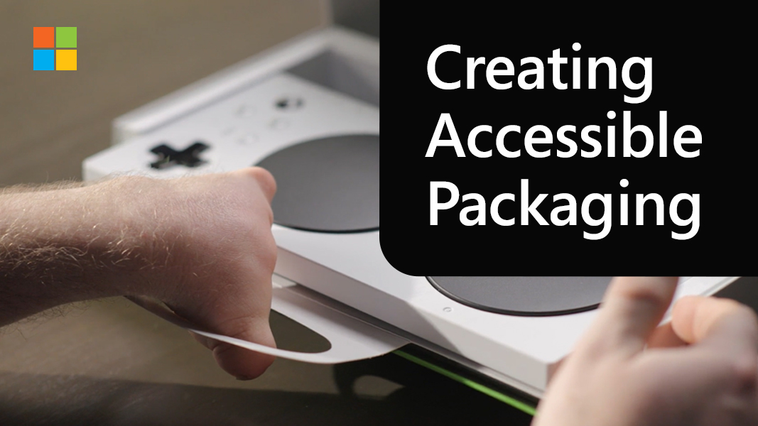
The Microsoft Packaging & Content team just released “Creating Accessible Packaging: An Inclusive Design Guide,” available for all.
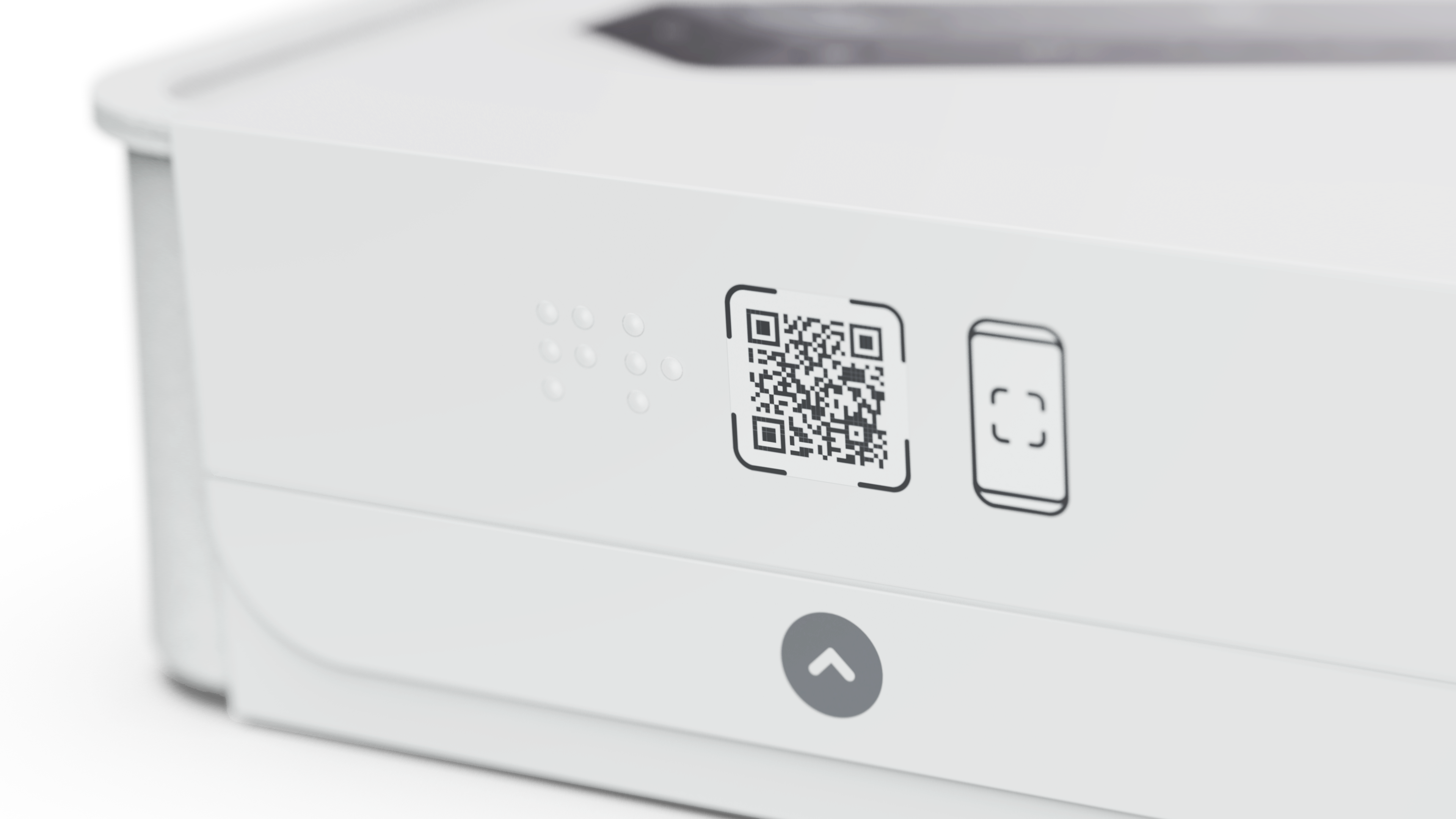
You’ve been waiting for days, and your new headphones have finally landed on your doorstep. Brimming with excitement, you can’t wait to unbox them and dive into your favorite playlist. You turn the box over and spot a nearly invisible seal holding the lid shut. No problem, you think, until you recall trimming your fingernails just last night. Peeling the seal with your fingertips is like trying to grip air. Frustration builds. You rummage through drawers for a knife or anything sharp enough to do the job. Minutes pass, after a battle of wills, you finally access your headphones, but your excitement is dulled, replaced by irritation and frustration.
This frustration across everyday objects is the reality for millions of people with disabilities or even temporary injuries. Whether it’s a cereal box with a tiny font ingredient list, or a jar with a lid so tightly sealed it feels like a workout just to open it, accessible packaging is often overlooked in the design process.
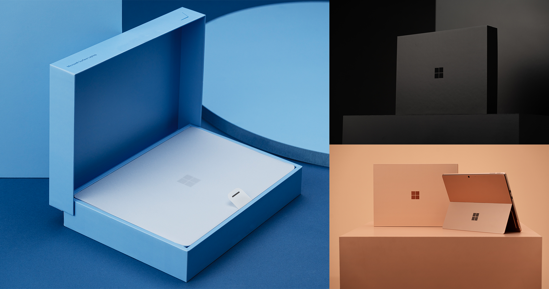
The Packaging and Content team at Microsoft is passionate about bringing Microsoft product experiences to life through packaging in the most sustainable and accessible ways possible. After years of experimentation, research, and engaging with the accessibility community, the team is excited to share “Creating Accessible Packaging: An Inclusive Design Guide.” This guide is for anyone interested in inclusive design and accessibility, with a focus on product packaging.
What’s in the guide?
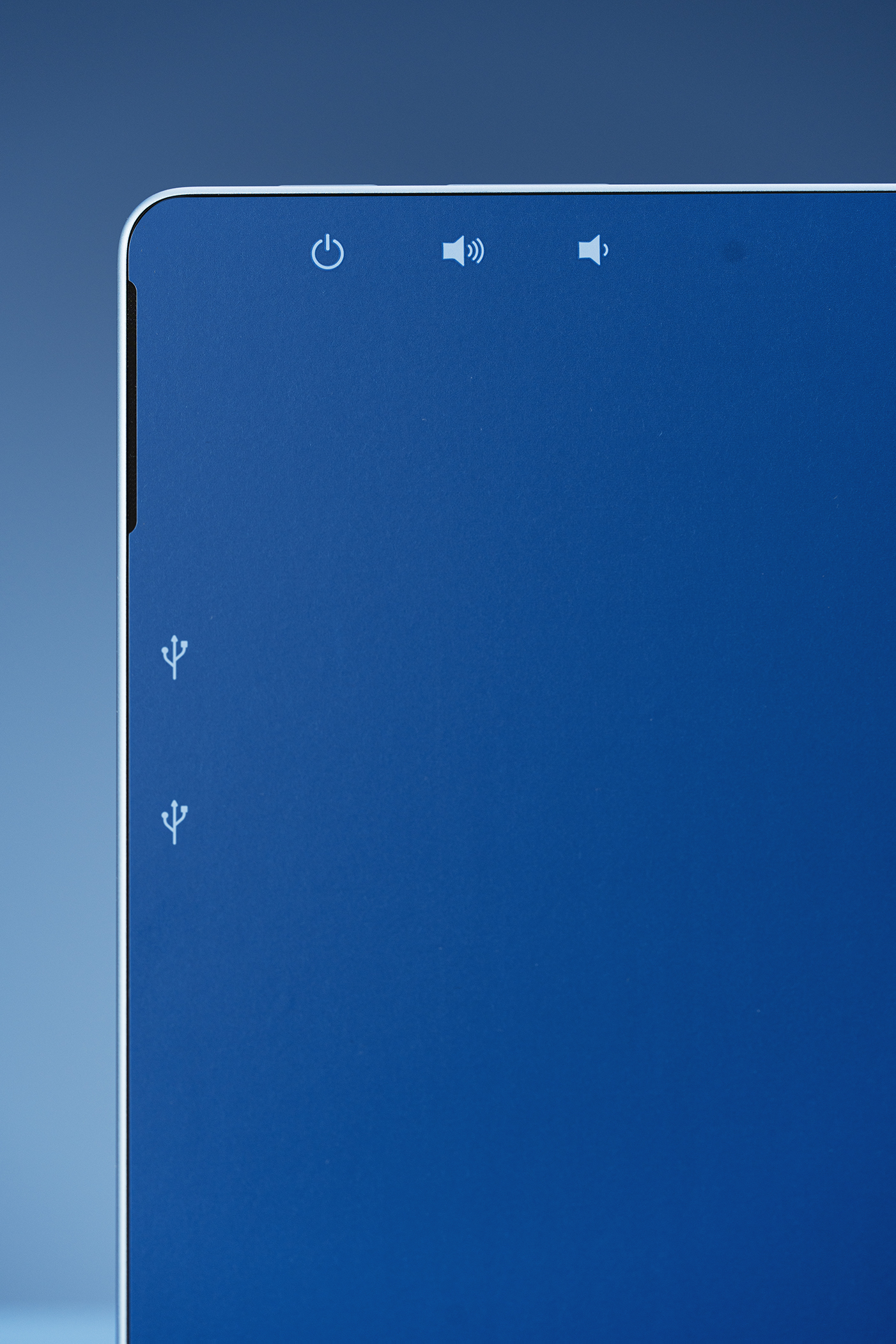
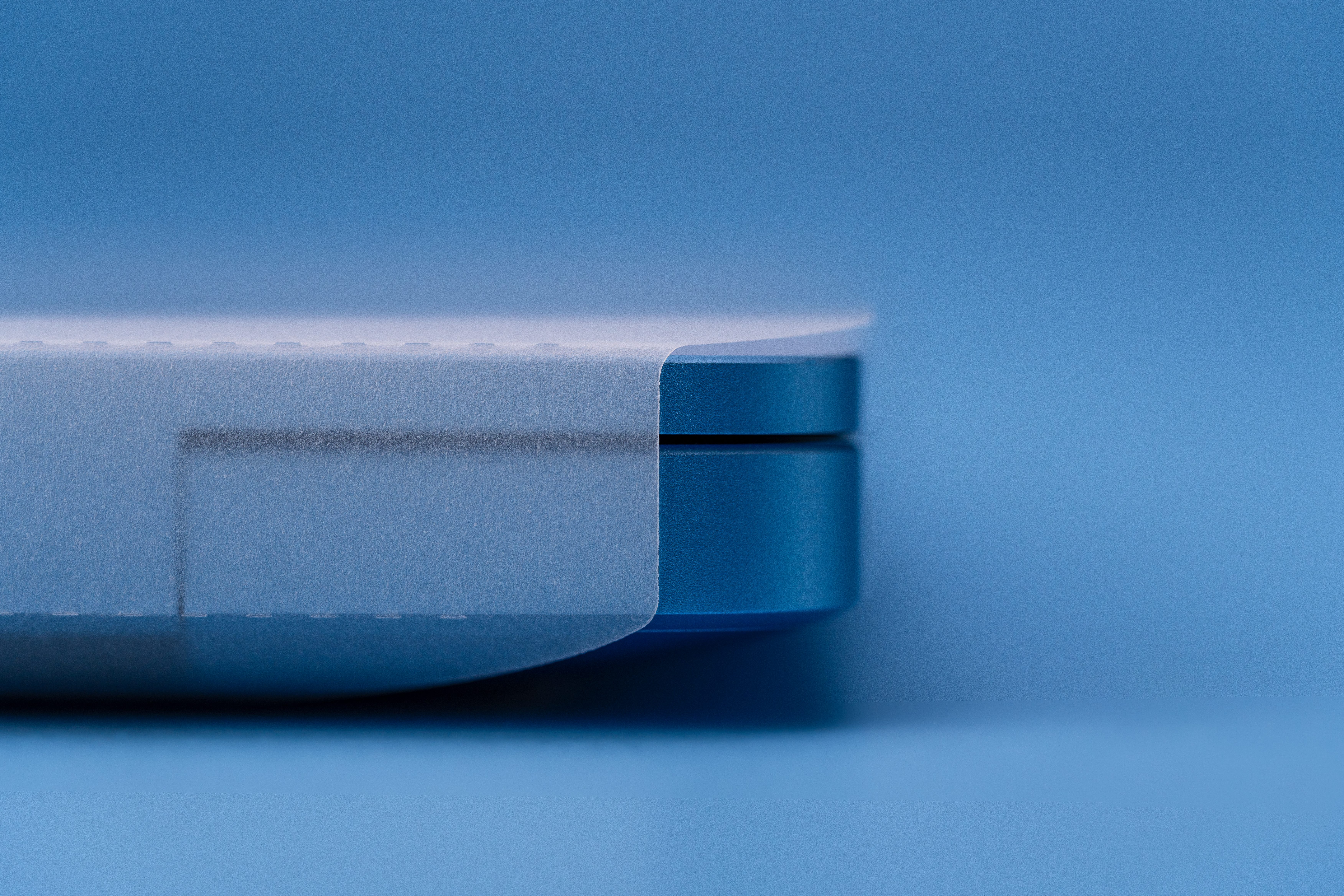
Explorations around tactile features, such as raised symbols to make packaging more navigable by touch and experimenting with high-contrast colors and larger fonts to improve readability for people with visual impairments are just some of the many efforts the Packaging and Content team has taken towards innovating accessible packaging. These efforts over the years have culminated in the creation of this guide that includes elements and design principles that act as guideposts for the work we do here at Microsoft to shape meaningful end-to-end experiences for our customers. Whether you are just beginning your journey in inclusive design or are an industry leader in your field interested in driving greater accessibility design in your products, this guide is for you.
The guide also contains the Packaging and Content team’s approach to designing inclusively and outlines a step-by-step methodology around inclusive design sprints. “We are constantly learning from them (accessibility community),” says Michael Zuberbier, Content Creation Program Manager. “It’s their generosity and the time they spend with us that allows us to do our jobs right.”
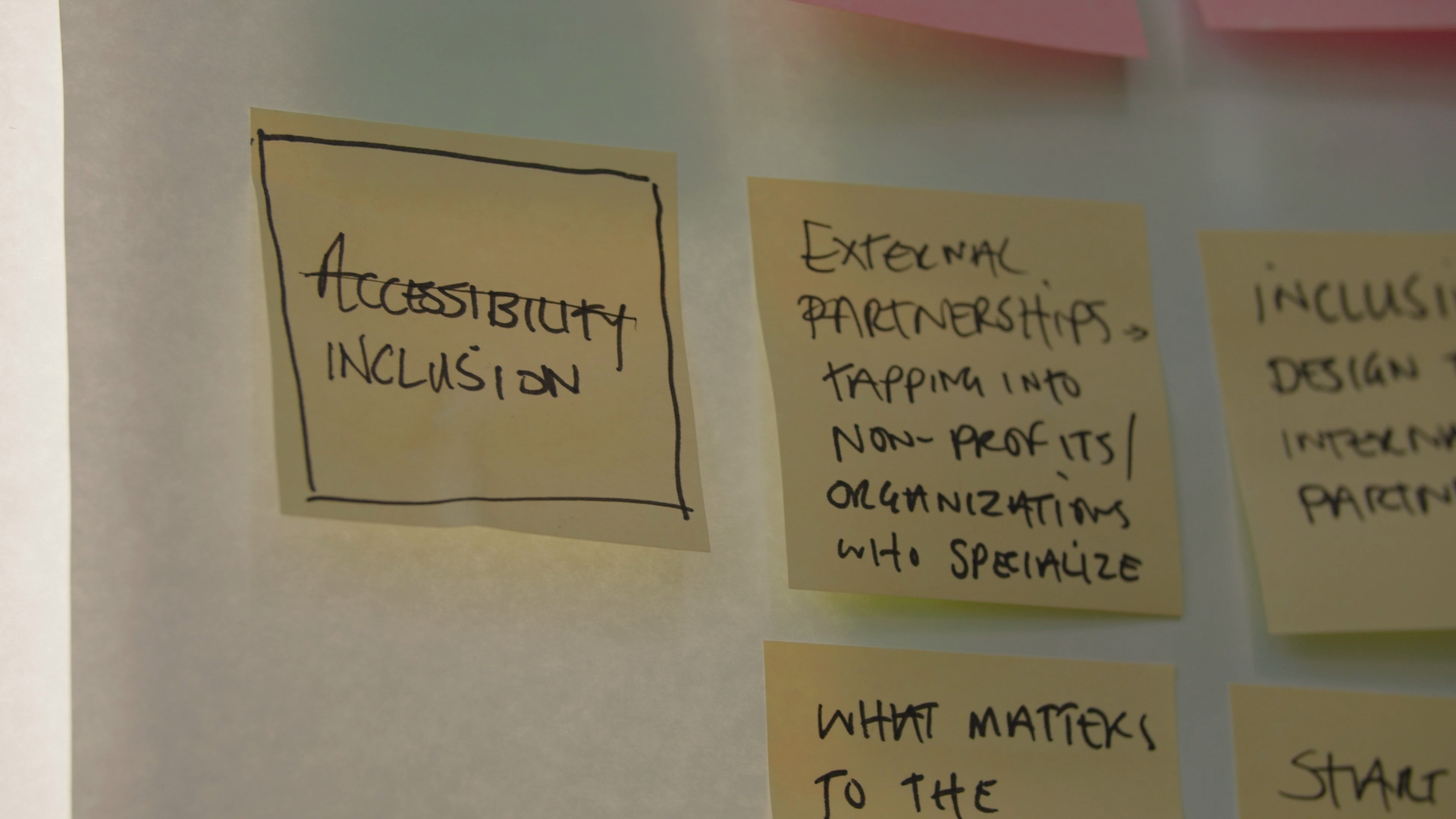
With designing for accessibility being a journey, assessing one’s progress is crucial. To this end, the guide leverages Microsoft’s Accessibility Evolution Model to help orientate where you are in your accessibility journey. Understanding where you are allows you to determine what actions need to be taken. The guide also shares a checklist of features and metrics that can help drive accessibility in packaging. “Introducing accessibility metrics has shifted stakeholder focus, making accessibility a key consideration in design reviews,” says Michael. Through these metrics, one can evaluate and track improvements over time, while creating accountability across teams. This ensures that accessibility is integrated into the product making process right from the beginning, instead of being an afterthought.
Our beginnings around accessible packaging design
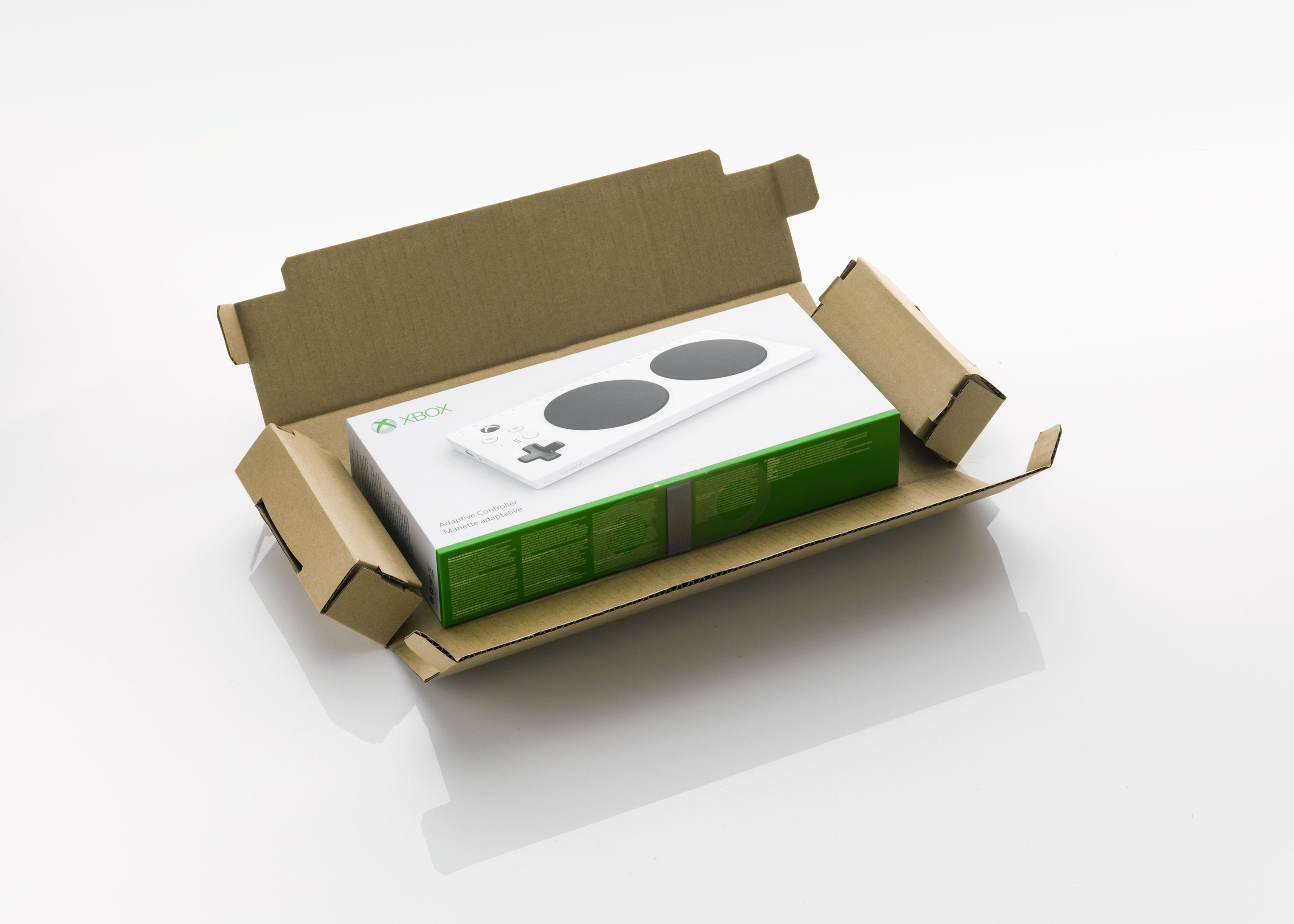
Microsoft’s journey toward accessible design reached a pivotal moment with the release of the Xbox Adaptive Controller in 2018. This groundbreaking device was specifically designed for gamers with limited mobility, allowing them to customize their gaming experience using external buttons, joysticks, and switches. It wasn’t just a product—it was a statement. The Adaptive Controller demonstrated how inclusive design could empower individuals and redefined what accessibility meant in technology.
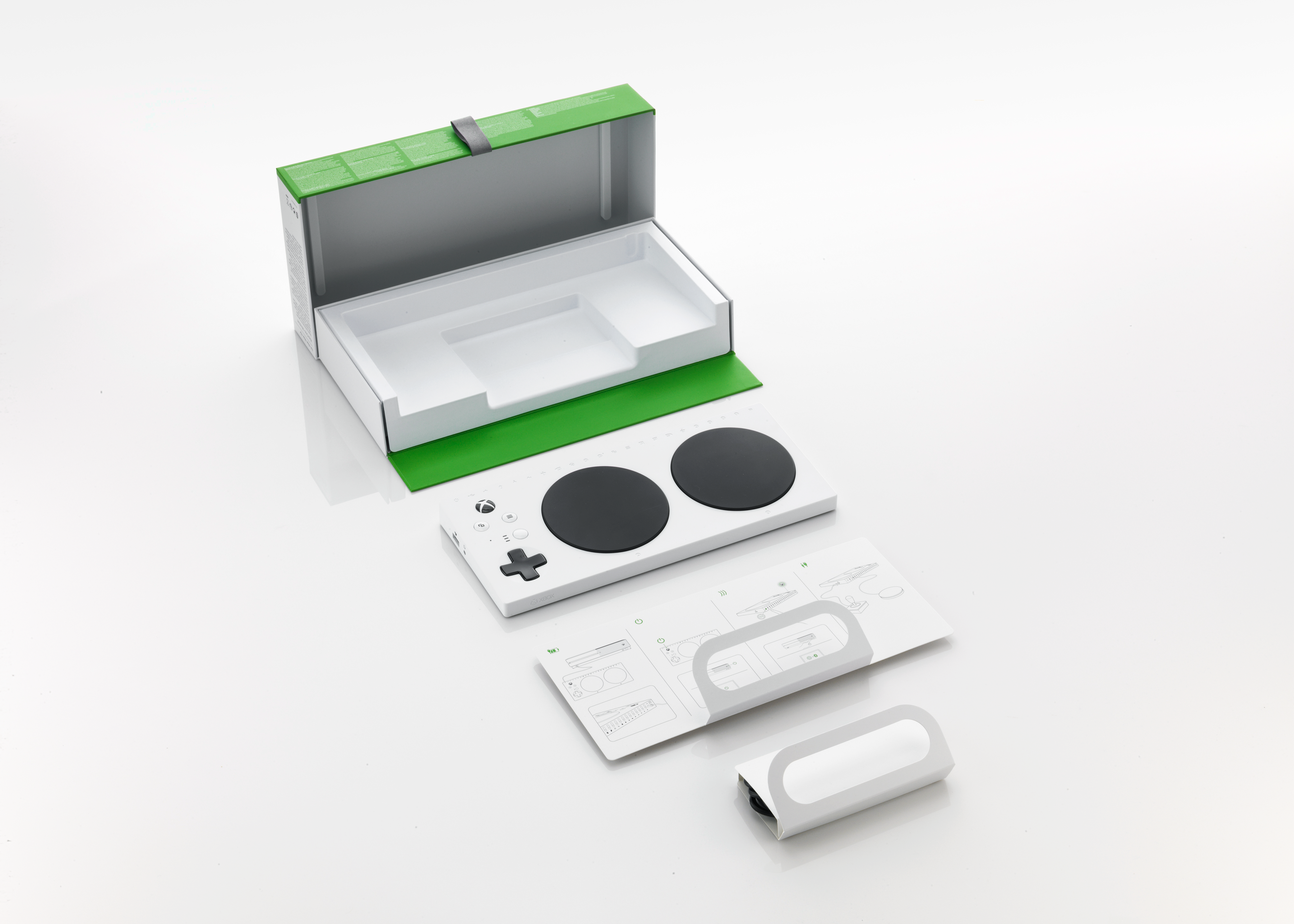
The opportunity to create the packaging for the Adaptive Controller became a catalyst for the Packaging and Content team to rethink their own approach to design. After all, how could they champion inclusivity if the packaging didn’t reflect the same accessibility standards as the controller?
“When we were first introduced to the Adaptive Controller, we realized that the principles we were using to define packaging design success were incomplete,” says Kevin Marshall, Design Director. “How humbling is it to be an expert in your field and realize there’s this whole other way of interpreting what you do for a living that you never considered?”
This realization marked the beginning of a transformative journey—one that would challenge the team to redefine their ethos and embrace accessibility as a core design principle.
Redefining premium
The journey towards accessible packaging wasn’t without its challenges. The Packaging and Content team has always prided itself on producing and creating premium packaging for our customers. But what exactly is “premium”? Traditionally, premium packaging was defined by its visual appeal—sleek designs, intricate details, and high-end finishes. The team, however, soon began to realize that true premium packaging was about more than just aesthetics.
“The biggest challenge was redefining high-end packaging—not just for one type of customer, but for everyone. We focused on making it intuitive, easy to open, read, and use,” says Joann Maisonet, Product Designer. “Letting go of some design conventions was tough, but it led to smarter, more inclusive solutions.”
Prioritizing inclusion over convention, the team now consistently conducts inclusive design sprints and collaborates with members of the accessibility community to continuously gather insights and refine their design principles. They co-create with customers, immerse themselves in challenges their customers face daily, and reshape packaging designs to better meet their needs. “Inclusive design is fundamentally human design. It means creating a culture of empathy and understanding, where accessible design is simply good design,” says Anna Perrella, Product Designer.
If not us, then who?
Prior to making the “Creating Accessible Packaging” guide, the Packaging and Content team felt a looming question: Why us? They debated whether it was their place to develop such a guide, or if they had the expertise to provide valuable insights to packaging professionals. This hesitation stemmed from a deep respect for the complexity of accessibility and a recognition of their own learning curve. However, reflecting on their extensive experience and the knowledge they had accumulated through engaging with the community, they found themselves faced with the answer: If not us, then who?
The countless hours of learning from accessibility advocates, people with disabilities, and industry experts drove this responsibility that extended beyond the team’s immediate work. There was now this sense of duty and a desire to make a meaningful impact to not only share best practices but also invite ongoing dialogue and engagement. Aligning with Microsoft’s core values of inclusivity and accessibility, the team recognized the importance of designing in the open to drive more innovative and impactful solutions for everyone. “Adhering to the philosophy that ‘the water raises all boats,’ the decision to openly share and engage just felt like the right thing to do,” says Kevin.

Writing and creating the guide forced the team to deeply reflect on their design principles and how they manifested in their current products. Approaching the task with humility, the team recognized that the guide needed to serve as an engagement point, evolving and growing based on feedback and new learnings from the community and their peers. Striking the right tone was crucial—one that illuminated their learnings in an expansive and inclusive way, without presenting them as definitive rules. “It’s not perfect, but it’s a start, and we’re so excited to continue growing with accessible visual design,” says Anna. The guide today serves as a marker of progress, a snapshot of the team’s current understanding and what they hope will be a source of inspiration for others in their industry to build upon.
A broader vision for accessibility
The impact of accessible packaging goes far beyond convenience. It’s about dignity, independence, and inclusion. At Microsoft, our work on accessible packaging is part of a larger commitment to inclusive design. For someone with limited dexterity, a simple pull tab can mean the difference between frustration and empowerment. For someone with visual impairment, braille labeling can transform a product from inaccessible to usable.
Accessibility isn’t just a feature, nor a one-time effort. It’s an ongoing responsibility and journey of learning, adapting and improving. There is a need to consider the full diversity of human experience and abilities to ensure that as many users as possible can enjoy an equitable experience. “Beyond sharing what we’ve learned and seeking to learn from others, this guide reflects our commitment to empathy and inclusion,” says Joann. “It’s about fostering a more inclusive industry, and we hope it inspires others to take meaningful steps toward inclusion.”
Viewers of “Creating Accessible Packaging: An Inclusive Design Guide” are encouraged to reach out and share their feedback at [email protected]. Your insights and experience are invaluable in helping us refine and expand our approach to accessible design. Together, we can drive meaningful change and set new standards for inclusivity in the industry.
Read more
To stay in the know with Microsoft Design, follow us on Twitter and Instagram, or join our Windows or Office Insider program. And if you are interested in working with us at Microsoft, head over to aka.ms/DesignCareers.

Outcomes over output: Designing shared cognition
How we are shaping systems that help people think better, not just type faster.
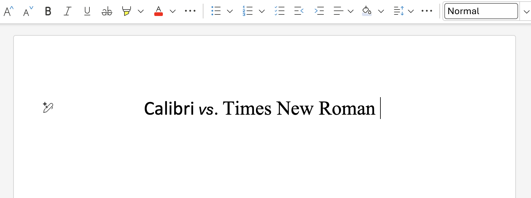
We can all be friends: Times New Roman vs Calibri
Explore how typography decisions really affect readability, accessibility, and brand expression.
Designing loops, not paths
How cybernetic loops are helping us turn “human in the loop” from a catchphrase into a design practice