


More than a mark
How Copilot’s icon joined the conversation
– The estimated reading time is 5 min.
Take a look at the icons on your phone. Most are designed to help you spot a product quickly, and for a long time, Copilot’s worked the same way.
But Copilot was changing. We were launching a new experience built on the belief that work, and life, gets more powerful when everything comes together. Meanwhile, our icon looked a little different depending on where you found it.
Consistency was only part of it, though. The bigger opportunity was in how Copilot works. You don’t just open it. You talk to it, and a lot happens between question and response. Through all of that, the icon stayed still, which left the most visible part of the experience with plenty of room to do more.
And as any interface designer would say, words are only half the message. The rest comes through things like shape, color, and motion. That got us asking a simple question: What if the icon could join the conversation?
Finding the form
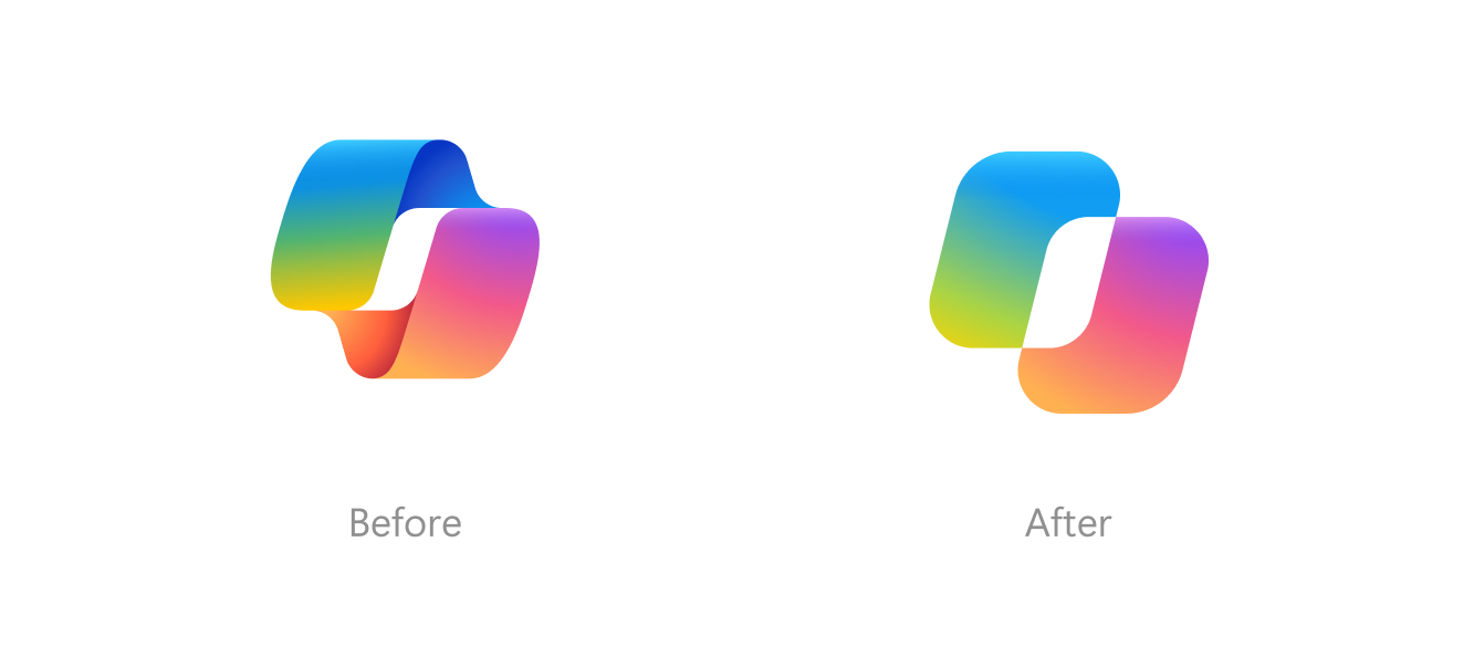
Answering that question started with a constraint. We knew this mark would need to move. A shape in motion has to stay readable in every frame, so we went back to one of the simplest, most familiar shapes in Microsoft’s visual language: the square.
Then we asked what would happen if two squares met? We played with proportions, angles, and the space between them. Some versions lacked dynamism. Others got complicated fast.
After many iterations, we found two distinct forms that make one silhouette and can move in relation to each other without losing their connection. It was the idea we set out to express: separate pieces coming together into something more useful, more harmonious, more powerful.
We went back to one of the simplest, most familiar shapes in Microsoft’s visual language: the square.
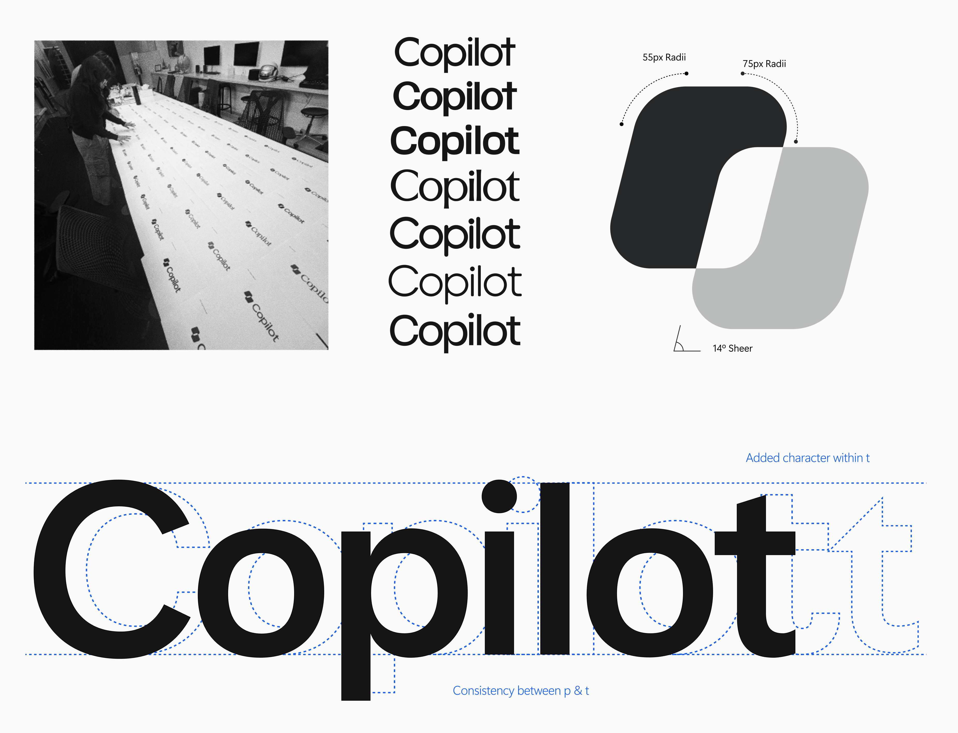
We took a similar approach with the wordmark. It’s built on Segoe, the humanist typeface people already read across Microsoft’s products, paired with Segoe Serif. The sans keeps things open and easy to read, and the serif brings a little more personality. Like the two forms, they stay distinct while working as one.
Making room for color
Keeping the mark simple paid off right away when we got to color. When the shape stays simple, it also has more room to be expressive.
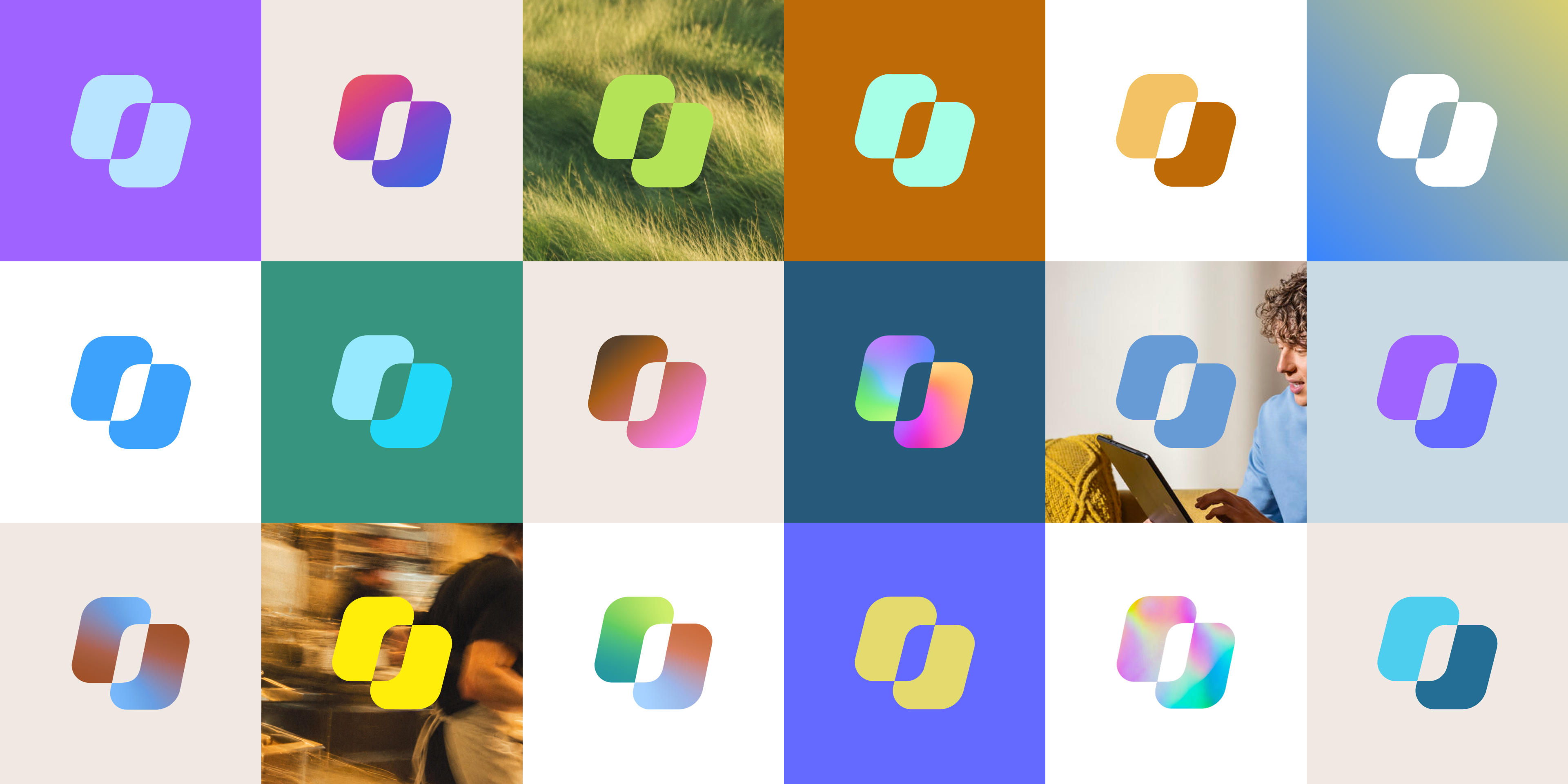
So we pushed it. We tested color running along the curves, shifting between the two forms, and building depth, on screen, in print, and in physical materials. Some studies were quiet and grounded. Some got much weirder than we expected, in a good way. A few looked beautiful on their own and fell apart next to the rest of the system. Those were some of the most useful experiments, because they showed us how far we could go.
Where we landed keeps a thread back to Copilot’s original gradient while letting color shift and blend from one context to the next. That gave the mark range, but it still couldn’t communicate what Copilot was doing. That’s where motion came in.
An icon that communicates
Think about the last time you asked an AI tool for something and just sat there wondering. Has it started? Is it working out a plan? Is it digging through my files? A mark that stays still can’t signal any of that. One that moves can.
So we built a shared motion language around three moments when Copilot is busy working for you. Each is a simple gesture, with the same two forms moving in relation to each other and coming back as one:
Thinking: when Copilot is working through your request
Planning: when it’s organizing the next steps
Retrieval: when it’s pulling in context from your files and work
Each gesture follows Copilot across the ecosystem, so one that greets you in Windows feels familiar when you see it again in Word or PowerPoint. A mark that used to sit still is now part of how the product communicates, wherever you find it.

The seconds that took months
A lot of this work happened away from the screen. We printed icons to see what held up on paper, debated the weight of a single curve, and sometimes changed our minds overnight.
There’s an irony in this process. Copilot can work through a request in seconds. Deciding how those seconds should look and feel took a room of brand, product, and motion designers months. Fitting, for an idea about things coming together.
We printed icons to see what held up on paper, debated the weight of a single curve, and sometimes changed our minds overnight.
But Copilot isn’t just one conversation. There are many, happening across apps, devices, and much bigger product moments. And in global marketing and advertising, too. Connecting all of them was always our goal. The icon links them, and the same idea carries through the whole Copilot identity. Work gets more powerful when it all comes together.
As AI gets more capable, it will keep creating new possibilities. Design gives those possibilities meaning, form, and a place in people’s daily lives. That’s the work we care most about, and we’re excited to see where the conversation goes from here.
Design gives possibilities meaning, form, and a place in people’s lives.
Special thanks to the remarkable group of designers across COLLINS, Koto, and Microsoft who came together to bring all of this to life.