Product – AI, Design Thinking, UX/UI, Microsoft Power Pages
Microsoft Power Pages and the age of low-code no-code
The design thinking behind a new website building experience

No matter the industry, every big business or enterprise is now a digital company. However, organizations face a shortage of professional developers while looking at a pipeline of millions of digital solutions that still need to be created. This labor deficit of four million developers, coupled with the acceleration of technology advancements, has made low-code platforms a viable option. “The next generation of applications are going to be built by everybody,” said Sangya Singh, VP of Power Pages. Among these advancements, businesses and governments around the world need not only well-crafted digital workflows but websites. Power Pages is a platform that empowers people with different technical fluency (non-coders to professional developers) to build scalable and secure data-centric sites together. Now anybody can be a developer, but to bring the web-building experience to life, the Power Pages team had to figure out how to make site building quick and easy.
The birth of Power Pages
Prior to becoming widely available in October 2022, Power Pages was nested as a feature within Power Apps for creating externally-facing sites. When the pandemic hit, the need for that feature became critical as businesses and governments had to rapidly adjust to changing healthcare, workforce, and economic needs. Government agencies needed to churn out websites overnight for vaccine registrations, partner portals, and government aid applications. Corporate decision-makers went to their IT departments and web developers asking them to quickly build sites with complex requirements that would typically take months.
With Power Pages gaining customer momentum, the small but mighty Power Pages team would expand. Sangya, known to be a human-centered design advocate and product leader, stepped in to evolve Power Pages from a feature into a standalone product. Power Pages fundamentally changed the way businesses built websites that suited the needs of their citizens, customers, and partners. Just like Microsoft Office is comprised of Word, PowerPoint, Excel, and Outlook, Power Platform includes Power BI for analytics, Power Apps to create internal model-driven apps, Power Automate for workflows, Power Virtual Agents for chatbots, and now Power Pages to build data-centric websites. To lead Power Pages, Sangya would combine design, engineering, and product management to form “the trio,” better known as the Power Pages team. It was a systematic blending of design thinking and product strategy. Together, this cross-disciplinary team would study product issues and come up with solutions grounded in product truth. “The grounded truth will set you free, but first it will piss you off,” Sangya noted.
Led by four customer promises
At the inception of Power Pages, the team’s first task was to do something that made solving customers’ needs an emotional endeavor. “Fall in love with the problem,” Sangya told them. It was a way of asking, how do you create a fluid experience that enables people to build sites simply? Driving the team’s ideation to designing solutions were four customer promises: easy authoring, total control, secure and accessible, and modern and responsive. They were challenged to create an intelligent platform that would guide makers to rapidly build sites. The site-building experience had to be smart and efficient, empowering makers to be confident and in control of every choice. There had to be a secure and compliant data ecosystem, ensuring enterprise-level data security and sovereignty so makers can confidently build safe and accessible websites. The team had to design an experience with the maker’s customers in mind. The maker’s website had to be smart, engaging, secure, easy to use, intuitive, and responsive. The team designed and tested their work against these promises.
Falling in love with the problem
The design team’s approach to fulfilling those customer promises was through the process of discovery-based planning and innovation. In other words, explore, create, and implement. To fall in love with the problem, you have to explore and get to know it. Start by considering the maker’s needs and understanding their workflows. Then define the different types of makers with whom you’re designing for. Ask what makes them happy or frustrated when trying to build their site. Ideate to generate unique iterations. Develop early prototypes to test, get initial feedback, course correct, and fail forward fast. This process would eventually prove effective, but the team’s extensive research was ongoing. Lightening the cognitive load of building a site meant that the approach would include co-creating with the makers. A person with low technical fluency or a person who had no experience building sites had to be able to easily create a site without friction. To understand what people were experiencing when going through the different phases of creating a site, the team developed the maker’s journey.

Keeping the Power Pages maker top of mind
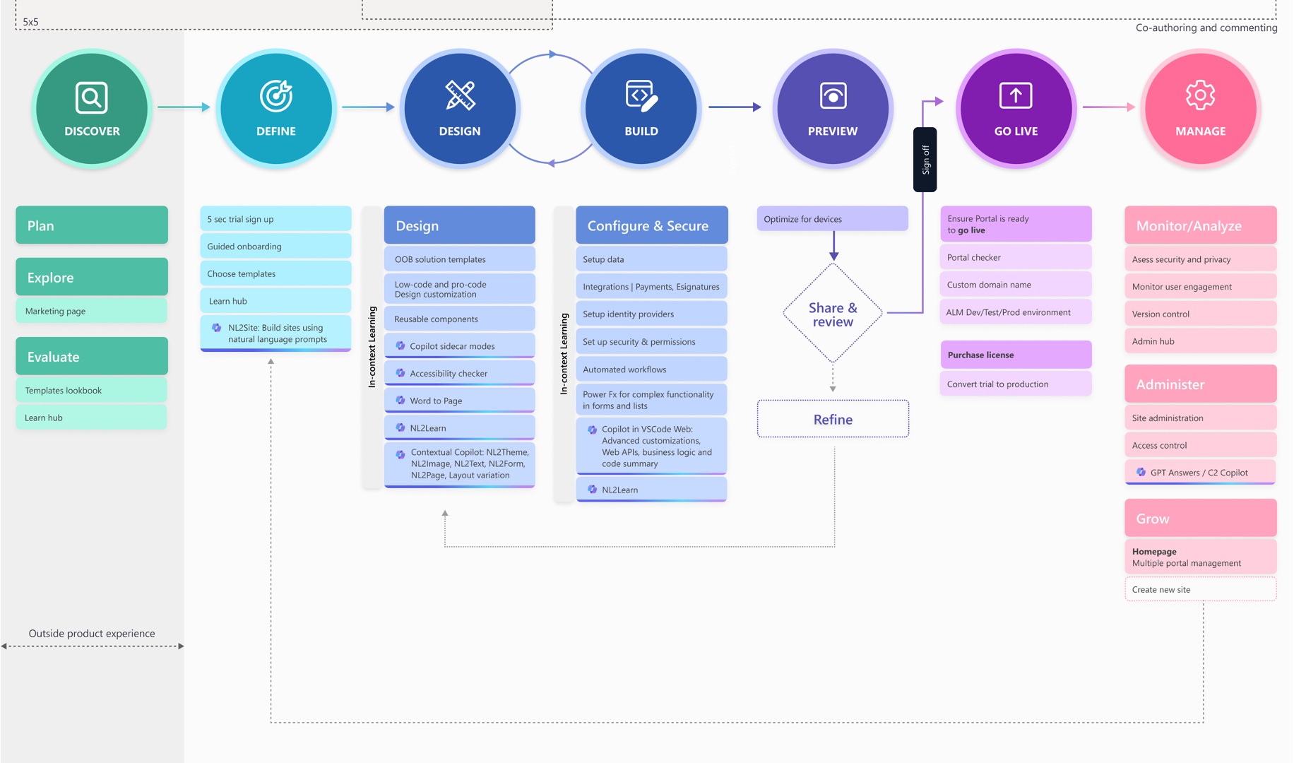
The Power Pages maker’s journey is comprised of these six steps in the makers’ workflow: discover, define, design & build, preview, go live, and manage. Through research and ethnography, the team was able to define each of these steps and then define the product and its supporting features within the workflow. The journey begins with the maker evaluating and testing the product’s capabilities based on business requirements. First, they choose a template or design and customize a site. Second, the maker sets up automated workflows to streamline their business. Third, they collaborate with teammates in real-time to accelerate progress. Fourth, they then review their site and make adjustments. Fifth, they go live, and lastly, they manage, monitor, and grow their site presence.
Based on the maker’s journey, the team would determine how it aligned with a person’s business requirements and technical fluency. Makers ranged from professional developers with high-tech fluency to business decision makers without coding experience. When a problem was identified, the team was able to quickly set the context in which the problem occurred, allowing them to spend more time solving it. In some cases, the maker’s journey would reveal that the team needed to define other types of customers using the platform to accommodate the diversity of makers. As a result, using the journey to test customers would keep the maker in mind at every step of developing the site-building experience. It would also reveal capabilities that will increase maker productivity by introducing a large language model-based AI assistant, aka Copilot, in the side panel of the Power Pages Design Studio interface, making Power Pages, unlike any website-building software of its kind.
Creating business data-centric websites with Copilot
For the Power Pages team, crafting Copilot experiences within Power Pages was revolutionary because enabling an AI assistant to build business data-centric sites using natural language had never been done before. As the Copilot within Power Pages starts to release first in the U.S., the team put in the due diligence to incorporate responsible AI principles. “We had to shift our focus from designing a static product to designing a fluid and dynamic experience,” said Maker Studio designer and Principal Designer Nitish Kumar Meena. The way we work has become an interconnected digital ecosystem. Collaborating within the same document and simultaneously switching screens from desktop to laptop or mobile is commonplace. At the heart of Copilot is the idea that by collaborating with AI, we can unlock new methods of creativity and innovation. Imagine multiple disciplinary teams creating sites birthed out of a direct fusion of different lived experiences and perspectives. As the maker, you describe what you need in an open text field or use intelligent suggestions to design web pages, create content, and complex business data forms. Copilot gives you suggestions on how to design your site as you’re building it. Intelligent suggestions based on your business requirements can be easily and quickly implemented. Though the intelligent suggestions get you started, Copilot works with you to refine the results and give you new ideas.
With forms, you can tell Copilot what information you need to collect, and it creates the form needed to collect the data. The data then goes to a secure database where it can be used by other intelligent apps within Power Platform. Without writing code, you’re at the helm of creating a site for your organization and you can edit the various components of the site’s layout. Today, conversational UX is the new interface and Power Pages is using it to make creation almost as instant as thinking of an idea. And what if you or any member of your organization could quickly build a secure site using natural language? Principal Design Manager Charla Pereira responds, “Historically, building a site was a very manual process that felt super tedious. Even though you already had all the assets and the vision, you wish you had this digital assistant to mash it all together and start making it for you.” Speaking your site into existence used to be unthought of, but with Copilot, it’s a reality.
The democratization of site building empowers teams to build solutions for their organizations swiftly and effectively. Power Pages enables everyone to design and develop modern, secure websites to serve millions of customers with access to services like visa applications, building permits, grant distribution, and student loans. It empowers organizations to manage and provide access to mission-critical services and information to their customers and partners safely and from the convenience of their own device, anywhere, anytime.
Read more
To stay in the know with Microsoft Design, follow us on Twitter and Instagram, or join our Windows or Office Insider program. And if you are interested in working with us at Microsoft, head over to aka.ms/DesignCareers.

From incubation to impact: Microsoft 365 Companion apps
How scrappy prototypes became polished apps—shipped on the taskbar, grounded in Fluent, and refined by research.

When AI joins the team: Three principles for responsible agent design
A practical guide to build agents that stay differentiated, intent-aligned, and bias-resistant

The new Microsoft 365 Copilot mobile experience
How we redesigned the Microsoft 365 Copilot mobile app to create a workspace built around conversation, dialogue, and discovery.
