Product – Design Thinking, Microsoft Loop
Microsoft Loop and the future of collaborative experiences
The design thinking and user research that turned into Microsoft Loop
Try the Loop app now: Microsoft Loop
“Paradigm shift,” “revolutionize the future of,” and “sea change” are terms often heard in technology circles. Currently, this chorus is focused on innovation driven by large language models (LLMs) and generative AI. Earlier, it was the rise of hybrid work, the mobile revolution, the internet, WYSIWIG interfaces, and so on and so forth, right back to the invention of the personal computer more than 40 years ago.
Amidst these changes, the role of the product maker is to understand how human needs ricochet within rapidly evolving landscapes, study which trends are here to stay, and craft experiences to support people as they move through work and life.
While certain needs can be met by adapting existing experiences, sometimes things are so fundamentally different that you need to start from scratch. This was the case with Microsoft Loop. Released today via Public Preview, Loop is a first step in addressing one of these paradigm shifts: the rise of online collaboration within productivity spaces, greatly accelerated by the pandemic and lasting rise in hybrid and remote work. A transformative co-creation experience, it brings together teams, content, and tasks across tools and devices to meet the needs of a geo-distributed and hybrid workforce that blurs the lines between work and life.
Productivity software began with analog metaphors. Microsoft Word entered the world as a software tool to create documents on an 8 x 11 page. Excel was a spreadsheet. PowerPoint mimicked projector slides. These were standalone experiences with defined edges and no interoperability. The transition of these tools online enabled a new era of collaboration as we began creating, editing, and refining Word, Excel, and PowerPoint files together as teams.
Yet, this more collaborative way of working is more complex and overwhelming, and even more so in a post-pandemic world. Some of us work in an office, others work from home. Our team members are distributed around the world. Some work while others sleep. Most of us juggle multiple apps daily, while shifting between desktops, laptops and mobile phones. We struggle to keep pace with exponentially increasing content, stuffed email inboxes, and chat overload. We fall behind, get confused over who is doing what, what needs to be done, or requires immediate attention. This shift presented an opportunity for Microsoft to shape a new type of productivity experience.
Such was the mindset of Nathan Kile, Principal Design Director, when he entered a conference room for a demo of a technology called Fluid Framework. On a wall were projections of nine screens, each showing an identical block of text. Eight of the blocks were virtual and one belonged to a person in the room typing. The block of text on all nine screens updated simultaneously. “They asked me, ‘Which one of those screens belongs to the person in the room typing?’” Kile recalled. “It was so real-time that you could not distinguish between them.”
For Kile, this was a lightbulb moment — a freakishly fast syncing technology focused on a snippet of a larger project that designers and researchers could build on to create new collaborative productivity experiences aimed at today’s work from anywhere, anytime workforce. They called these snippets “components,” portable pieces of content that stay in sync across all the places they’re shared and could be worked on in real-time or asynchronously from within other apps, including Microsoft Teams, Outlook, Word, and Whiteboard. It reversed the paradigm of people bending their creativity to fit within technological silos; with moveable, live components, you could just focus on your thoughts and creations, versus which tool to open.
After thousands of hours of meetings, research, brainstorming and design sessions, the concept of components grew to become a key element for Microsoft Loop, an experience that’s specifically aimed, as Kile explained, at helping teams navigate “that messy phase when people are just coming together, starting to gather content from all over, beginning to formulate a rough draft. It’s where you practice before you go into the game.”
With this framework for Microsoft Loop in hand, Trish Miner, Principal Design Research Manager, and her team took early prototypes of fast syncing components to users and studied how they reacted to and used them. At first, they presented a component in the context of an email. “Can people even understand what this thing is?” Miner recalls asking. “It is so completely different and revolutionary, and it is also very different than what a traditional email is. Traditional email is static. Once you send it to someone, unless you take extraordinary efforts, it doesn’t change. It is a record of the past. But if you put a component in there, then it becomes dynamic. It becomes collaborative. It becomes something that regularly updates.”
They asked users to describe aloud their thought process as they used the components. Did they understand what it was and intuit that it was regularly updating? If so, what in the user experience communicated that to them? If not, how could they improve the design to make it clearer? Then, they did the same type of testing in Teams.
“It’s super important that if you can put these components anywhere, they have to work any place you use them. If you only look at them in the abstract, or only look at them in an email, you won’t understand that there are potential differences in how well it’s used because I come to Teams with a different expectation than I come to email,” she explained.
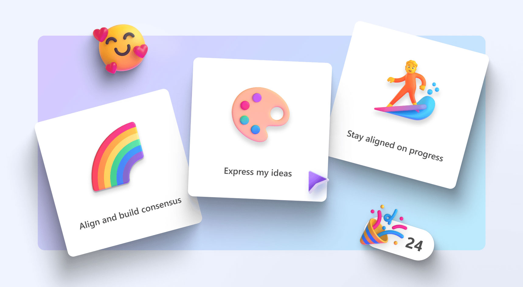
The research team also studied the types of jobs, or tasks, that people who collaborate online need to accomplish, and thus what other types of problems a new type of productivity software could help solve. These so-called jobs to be done range from “find the content I need” and “leverage existing content” to “prioritize and make decisions,” “decide what to do next” and “build rapport with teammates.”
“Each of those jobs has a list of pain points that we know are associated with those things today,” Miner said. “So, we think about how Loop could contribute to addressing those pain points and helping people do that job better than they can today.” For example, the job to “align and build consensus” can be painful amidst asynchronous discussions and conversations. Teams often don’t talk about the framing and goals for the decision, it’s easy to misunderstand each other, feel overwhelmed by the amount of input, or overlook contributions — making alignment challenging or impossible.
These research insights then informed the design team. “Every feature we’re designing is highly connected to and at the forefront of the jobs,” said Angela Allison, a Microsoft Principal Project Designer.
As the design team went about creating Loop, they followed a set of core design principles to ensure a thoughtful, human-centered experience that is messaging inspired, freaky fast, allows individuals and teams to start anywhere, and breaks barriers.
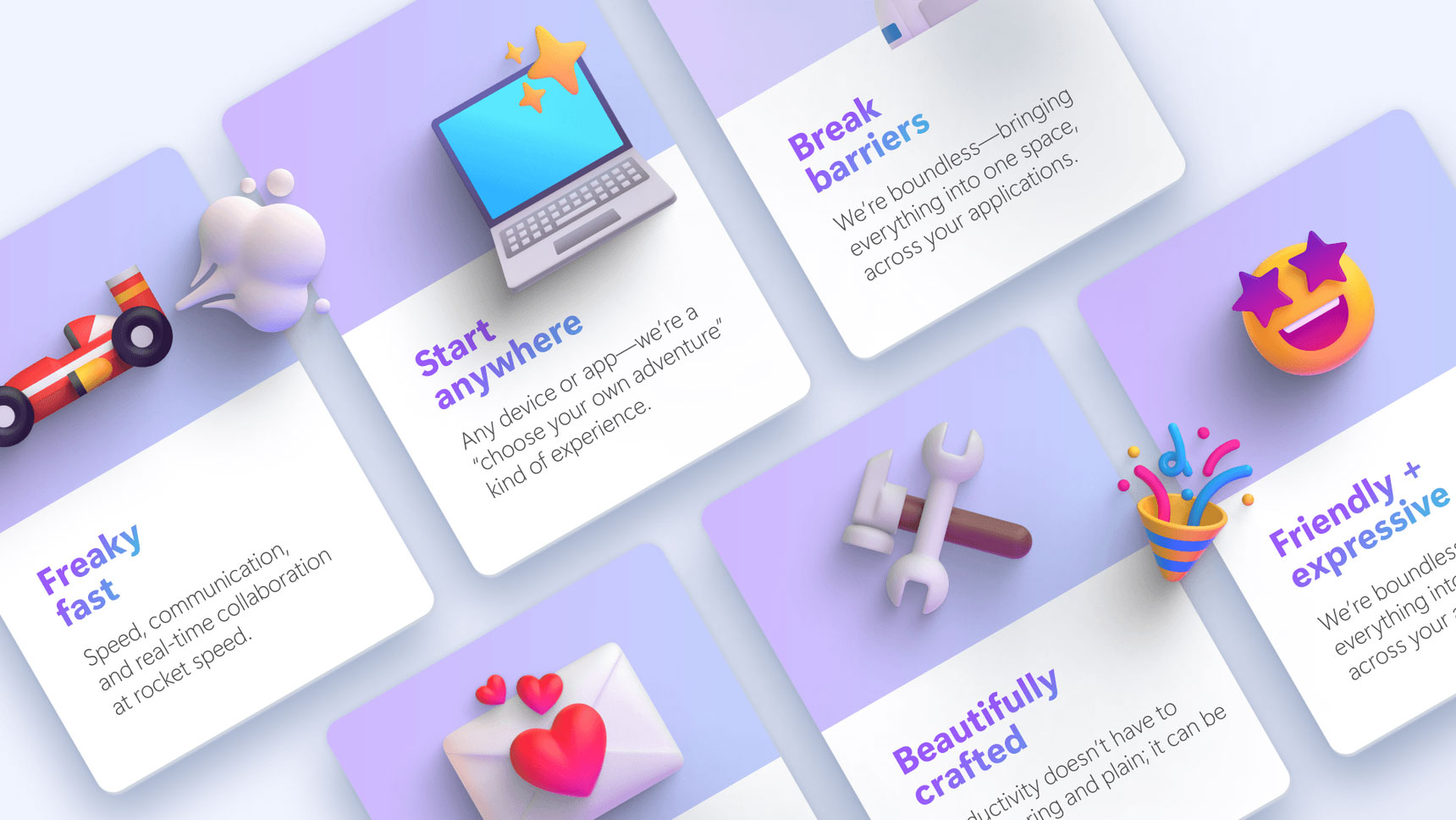
Loop is not a messaging app, the team notes, but it should feel like one: fun, expressive, lighthearted, people-first, inherently multiplayer, safe for unfinished thinking, and focused on a small-but-powerful interaction loops. That freaky fast demonstration Kile attended years earlier morphed into a design principle writ large — a design that helps people quickly get thoughts out of their head, makes it fast for groups to get together, and is optimized for collaborative work.
Loop should allow anyone to start from anywhere and, to help teams work together by making apps work together, it should break barriers between apps. A white paper paragraph, a deck slide, a spreadsheet table — from Outlook to Word to Teams, anyone should be able to collaborate within the context of a big-picture view across apps in a single space.
Loop of the loom
The tight connection and back-and-forth between the design and research teams led to the version of Microsoft Loop available in public preview today. A lightweight and expandable user experience balances structure and freedom, is highly expressive, and gives life color via animated effects like celebratory confetti or reactions that let coworkers know they aren’t talking into a void. “That became the heart and soul of Loop, which is why we call ourselves messaging inspired,” said Kile. “We are not a messaging app, but we take our cues directly from applications that facilitate communication. At the end of the day, collaboration is about people and communication. So, we built an experience where we are connecting people together, both in their ability to reach out and their ability to express themselves in a casual, professional, fun way.”
The Loop app consists of three elements: components, pages and workspaces.
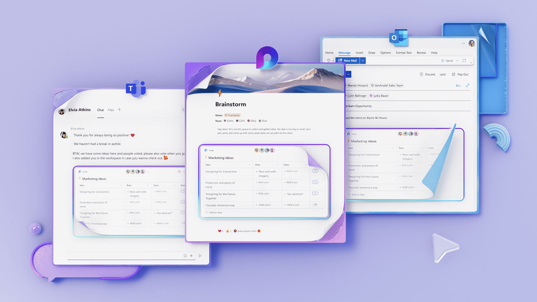
Components are portable pieces of content that stay in sync across all the places they are shared. They allow you to co-create in the flow of work, be it on a Loop page or in a chat, email, meeting or document. They can be lists, tables, notes, and more, ensuring that you’re always working with the latest information in your preferred app — like Microsoft Teams, Outlook, Word for the web, Whiteboard and the Loop app.
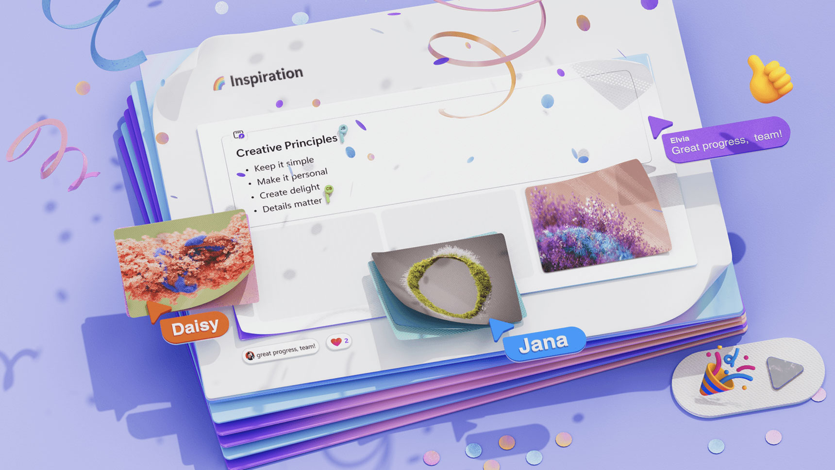
Pages are flexible canvases in the Loop app where you can bring together people and all your components, links, tasks, and data. Loop pages can start small and continue to grow to match the size of your ideas. They can also be shared across M365 apps as a link or embedded Loop component.
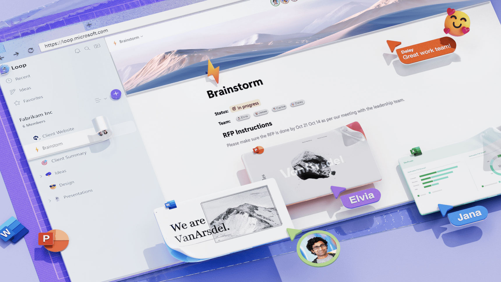
Workspaces are shared spaces that allow you and your team to see and group everything important to your project, making it easy for you to catch up on what everyone is working on and track progress toward shared goals.
Any of these elements alone open new ways for teams to work together, but the combination of them as a system can fundamentally change the way distributed teams think, plan and create. The Loop name, Kile noted, is a metaphor based on a looming machine. “It’s about weaving and combining things together, and a loop is a part of the looming process,” he said. When you take this new way of working and embed it within Microsoft 365, an ecosystem with an incredibly robust range of tools and capabilities, powerful possibilities are unlocked.
The future of collaborative experiences
Last week, Microsoft announced the private preview of Copilot, an experience that facilitates human creation, comprehension, and collaboration by combining the power of next-generation AI with your Microsoft 365 apps and data. Large language models, the technology underlying this type of AI, are ushering in new interaction models that can uniquely adapt themselves to meet human needs — specifically by using natural language. Your words, typed in as prompts, become powerful productivity tools and conversational UX is a new frontier of user interface design as game changing as the first touchscreen devices.
When thinking about Copilot experiences that could be crafted within Loop, it’s particularly exciting because you’re designing not just for collaboration between people, but between teams of people and AI. Within Loop, the main scenarios we focused on are creation, brainstorming, blueprints, and descriptions. With creation, for example, Copilot could help you draft the initial version of a newsletter for you and your teammates to then edit and refine. Or type in a prompt like “help me run a brainstorming session” to have it support you in that process.
You’re in the driver’s seat with Copilot and the best results are often generated through the further refinement of prompts. It’s easy for you and your teammates to go back to earlier prompts, add language to refine the output, and then edit the generated responses to get better, personalized results. Then share your work as a Loop component to meet your teammates where they are, in Teams, Outlook, Whiteboard, or Word for the Web.
A story still in the making
The public preview released today is the result of continuous and frequent iteration, with learnings from customers and our own internal teams deeply informing the experience. From new types of technology like live components to Copilot experiences driven by LLMs, Loop is a story still being written. And like Loop itself, the making of that story is an act of co-creation, a collaboration between product makers and customers as we strive to meet human needs through experiences crafted with power and delight. You can try the Loop app here and keep up with our latest development on Twitter.
We’re excited to share our designs with the broader public today in the hopes of continually refining them and we welcome your thoughts and feedback in the comments below!
Read more
To stay in the know with Microsoft Design, follow us on Twitter and Instagram, or join our Windows or Office Insider program. And if you are interested in working with us at Microsoft, head over to aka.ms/DesignCareers.
From incubation to impact: Microsoft 365 Companion apps
How scrappy prototypes became polished apps—shipped on the taskbar, grounded in Fluent, and refined by research.
When AI joins the team: Three principles for responsible agent design
A practical guide to build agents that stay differentiated, intent-aligned, and bias-resistant
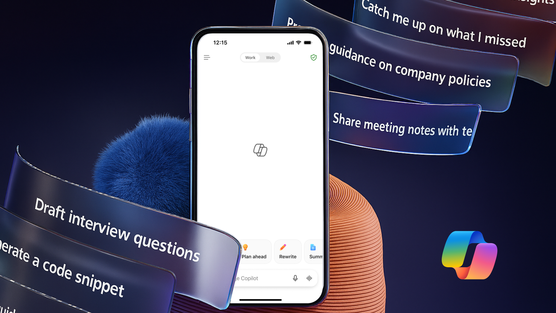
The new Microsoft 365 Copilot mobile experience
How we redesigned the Microsoft 365 Copilot mobile app to create a workspace built around conversation, dialogue, and discovery.

