UX Research – Design Thinking, UX/UI
Making UX research insights and frameworks beautiful
Discover how one team transformed a complex UX research framework into a visually engaging artifact to make insights stick and spark alignment across teams

How many times have you presented the results of a long and difficult UXR study, or tried to communicate a complex new framework, only to get the sense that people aren’t fully engaged or to see afterwards that the insights haven’t been acted upon? With so many meetings, files and general information overload, it’s easy for people to become numb to what you’re presenting before you’ve even started. I find that this is particularly true for UXR, where we often feel the need to provide context, justify a method and clarify certain concepts before getting to the exciting stuff — the results, which, to be honest, can often be a little dull too.
This article describes my experience collaborating with a design agency that has worked with brands like Nike, Instagram and Jordan to create a beautiful, intuitive and impactful UXR artifact that overcame these challenges. I hope that by sharing my experience I can help to spark some ideas for more visual and engaging ways to communicate insights, and maybe even encourage others to work with an agency if possible.
Background
I recently completed a project that took me several months, introduced multiple new concepts and, ultimately, a new framework that spanned a suite of 5+ business applications. I was confident that this tool — a large, interactive Excel sheet — would help teams to understand and prioritise the key integration opportunities between these apps and the most impactful AI features across the suite.
However, as I continued to present and refine the work among a small team of designers, I got the sense that people didn’t fully understand the underlying concepts (business processes, jobs-to-be-done, personas, hats, AI types, etc.), never mind how to filter and slice the Excel data in different ways to make decisions. If this small team of designers didn’t fully grasp the work, how could I expect a much larger team of PMs and engineers to understand and leverage it? If I wanted this to land and stick, I was going to have to think beyond Excel and PowerPoint.
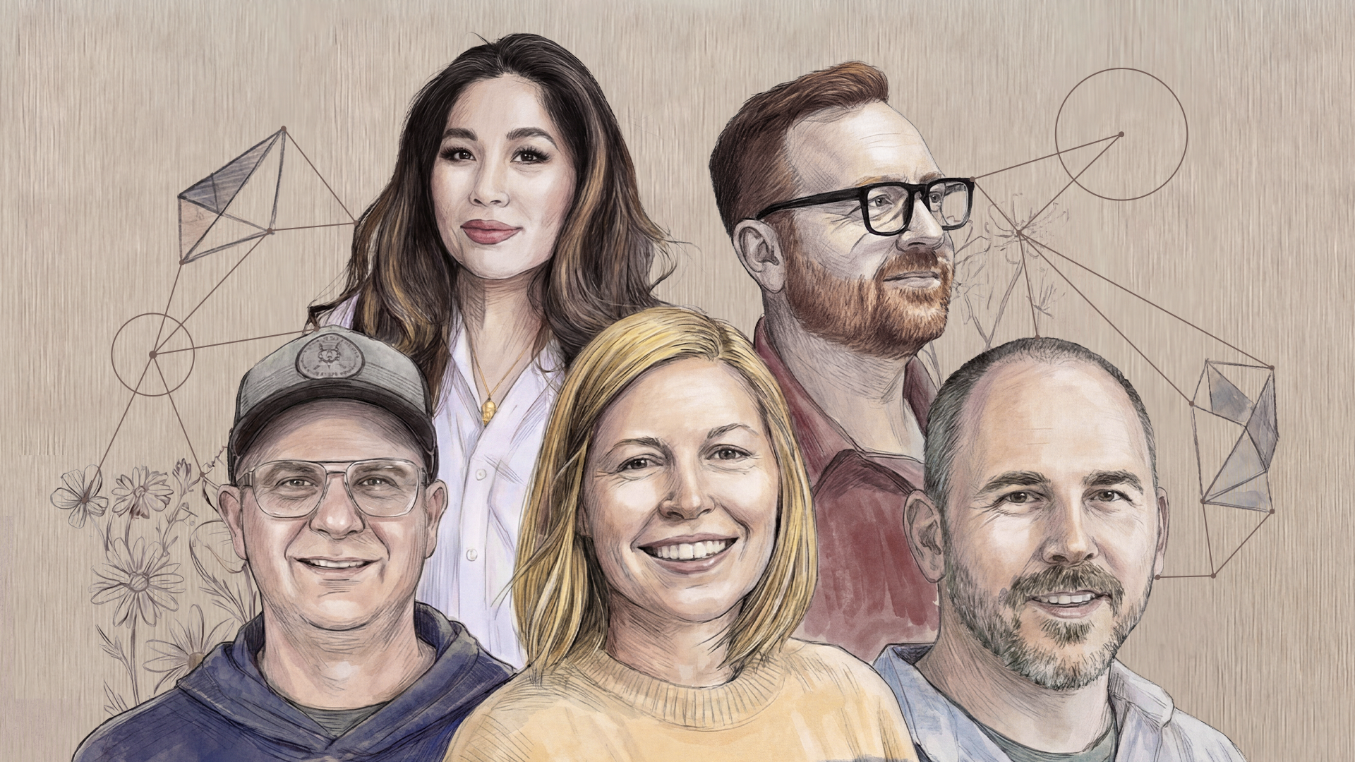
Fortunately, my team trusted me and the work I was doing and so they supported my manager and I in working with an external design agency to communicate the work more effectively. This agency, called Instrument, has worked with several large tech companies, including Google and Salesforce, but also with big brands from other industries, like Nike, Jordan and Levis.
While I had worked with visual designers in my previous role in iGaming, it was always to develop visuals for the end user/player. This was my first time working with designers to take complex concepts and data and make it easier for internal teams to understand and leverage. While I was excited about the opportunity, I was worried that the Instrument designers and storytellers would find it difficult to grasp the work fully, especially considering how my domain-expert colleagues had struggled with it.
The Collaboration
We started with a one-hour meeting where most of the time was spent with me explaining the work, switching between Excel and PowerPoint, going off on tangents and confusing myself. At the end of this, the Instrument team effectively described the work in a couple of clear, succinct sentences and I was amazed. They got it! They even helped me to get it better myself! We explained our tight timeline and budget, and Instrument came back to us a few days later with a clear plan of attack.
During the next 3 weeks we met every few days, with Instrument gradually piecing together more of the story and visuals and getting feedback from us. They would leave comments in Figma, asking us to review multiple versions of different visuals and terminology, and to provide key data and examples from the work (e.g., 45% of users wear X hat and would benefit from Y type of AI).
We began to see this work not only as a way to communicate my particular project, but as an opportunity to get teams on the same page regarding some of the underlying concepts and terminology, like jobs-to-be-done, user hats and AI types. Instrument were fantastic in this regard, proposing visuals, terminology and an overall narrative that would help Microsoft teams to achieve a shared understanding of the weight and opportunity of this AI moment, and through the lens of the newly developed framework.
The Outcome
While the new deck was created in Figma, Instrument provided the final copy to us as an interactive PowerPoint, to make it easier for presenting, sharing and collaborating on internally — particularly for PMs. They also provided visual assets and fonts for us to leverage in future research decks, helping our team to establish a consistent visual language and brand.
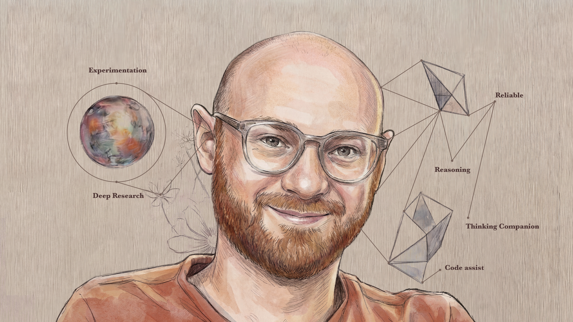
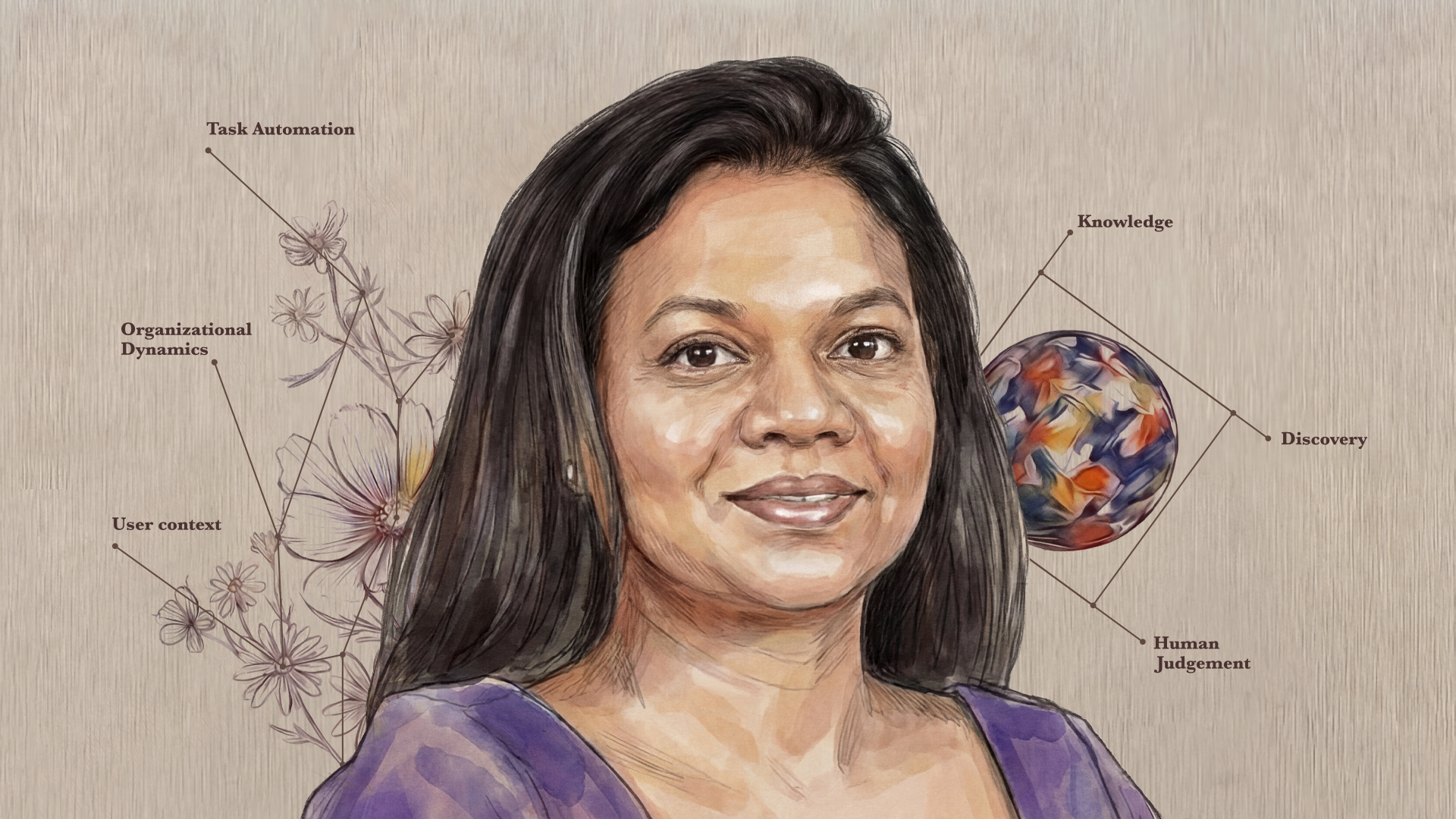
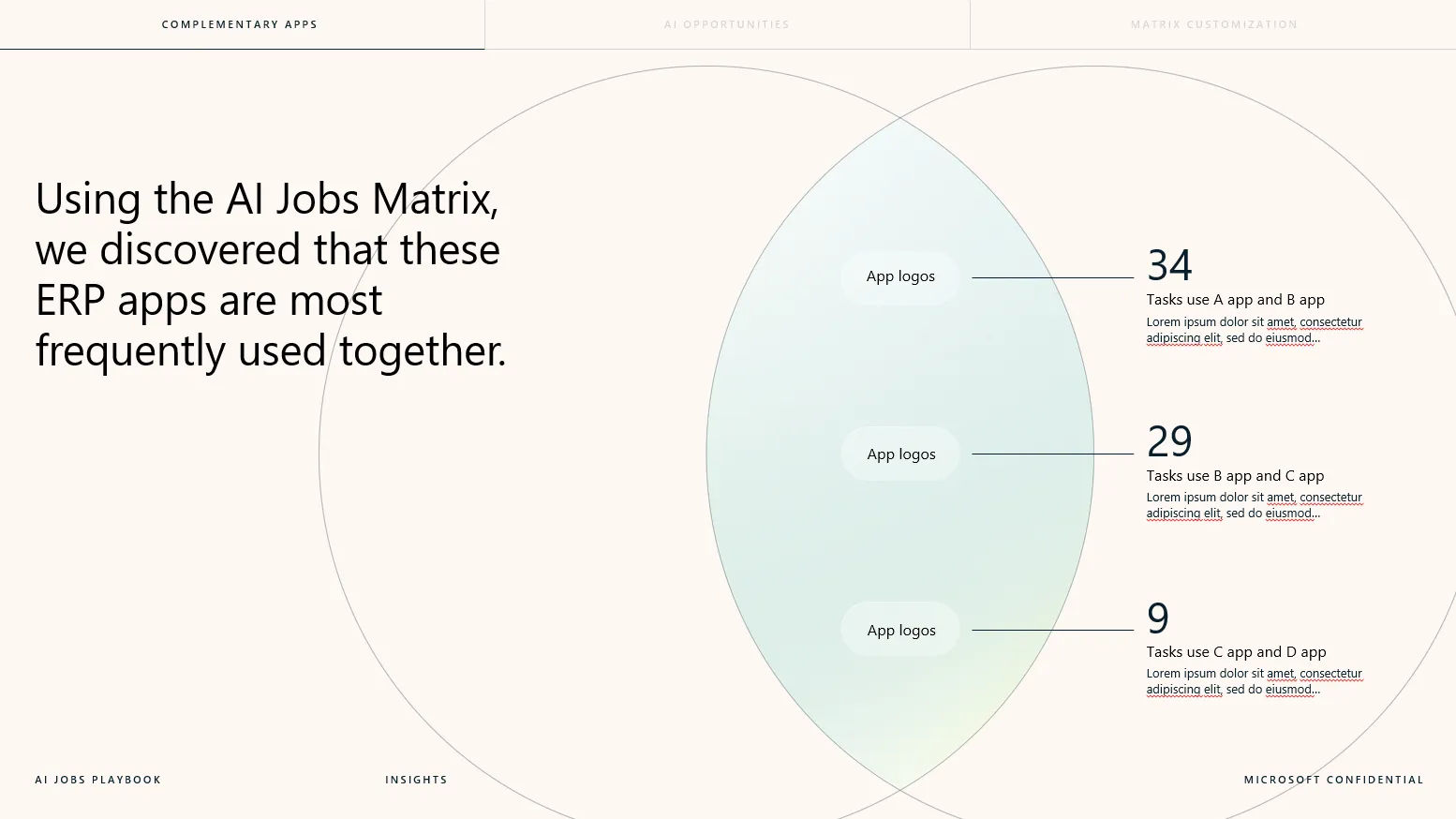
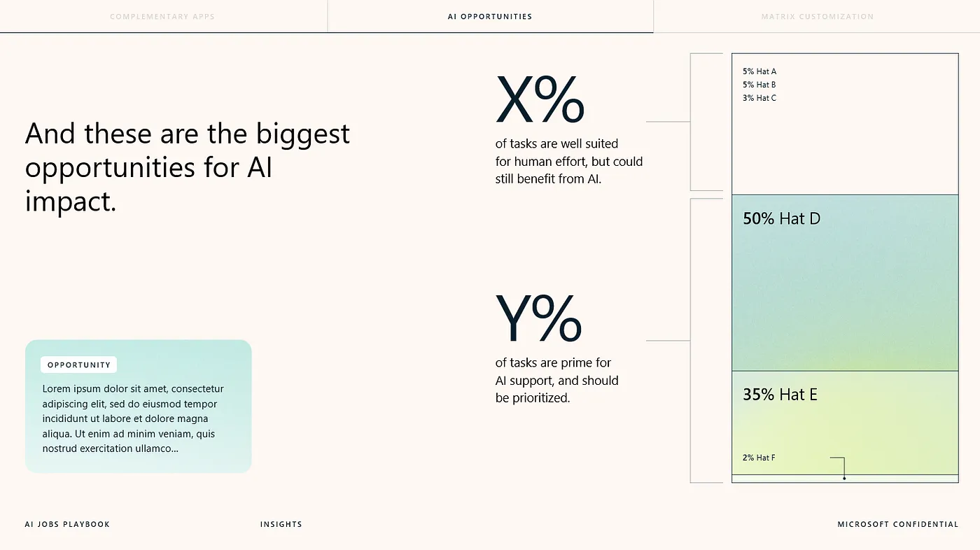
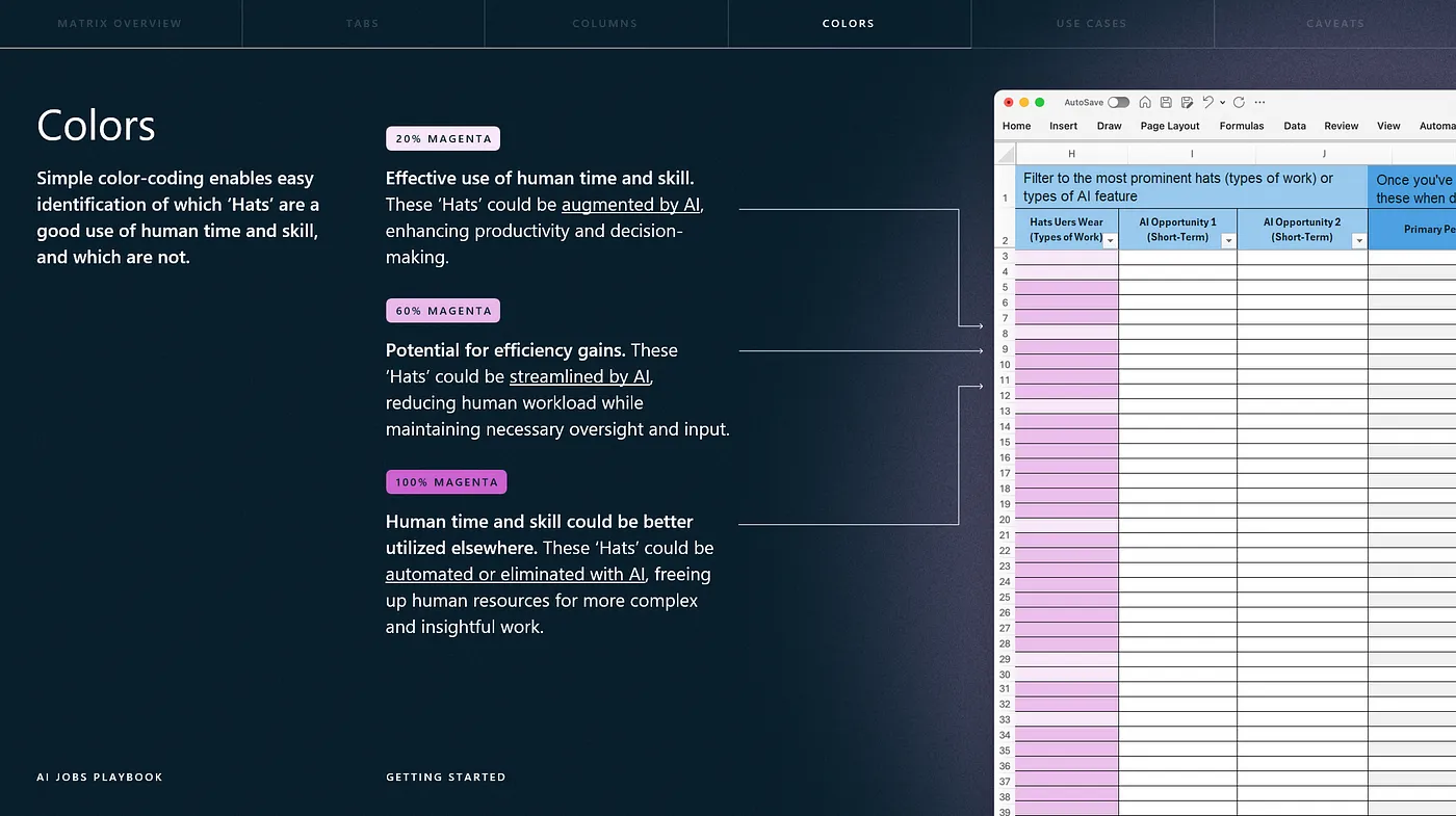
The deck featured beautiful colours and fonts, along with really interesting but simple ways of communicating rather complex information, which helped the concepts and data come to life. For example, using large Venn Diagrams to communicate opportunities for app integration, and battery-like visuals for illustrating the relative difference between the impact of different types of AI.
Note: Much of the text in these images has been edited for confidentiality reasons.
They even managed to make the Excel tool itself look cool, leveraging subtle gradients instead of the harsh red, amber, green we had been using, and introducing the tool like a SaaS product rather than just a file.
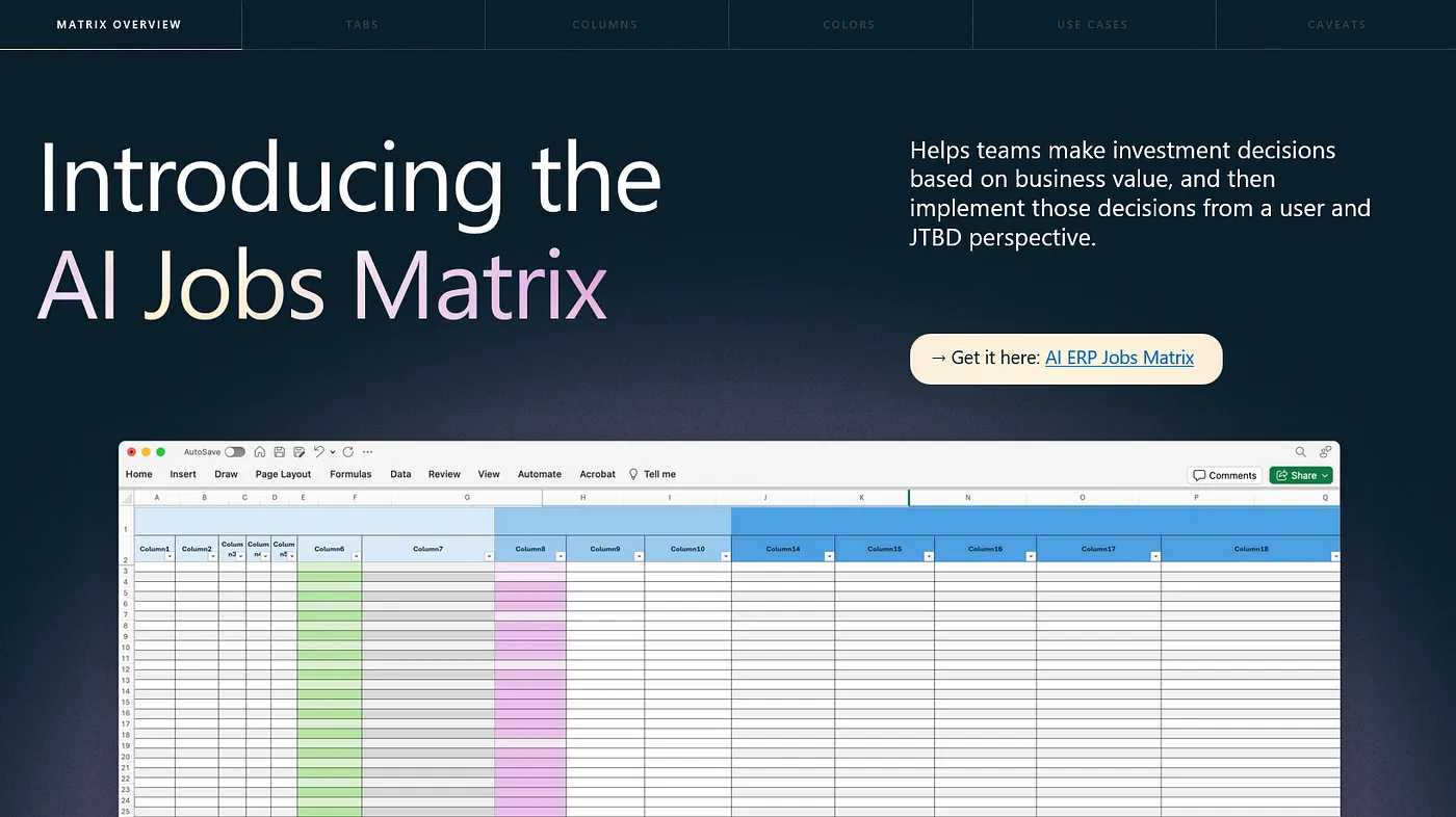
They also provided instructions on how to use it, slicing data in different ways to understand correlations and prioritizations between different personas, their JTBD and the types of AI that would benefit them.
Advice for Others
This new style of artefact went down really well with the team, who appreciated something different to the usual PowerPoint template. It’s been presented, shared and viewed a lot more than my previous studies, and has even helped me to gain recognition beyond my usual audience. In particular, the intro section, designed to get teams on the same page regarding concepts like JTBD and AI types really seems to have landed, with teams demonstrating a much better shared understanding than before. I’ve even seen others using some of the assets in their own presentations, reinforcing the idea of a visual language for our team.
If you find yourself with budget to outsource a study, consider spending it on working with a design agency to better communicate one of your other projects instead. This experience can help you to understand your own work better, help it to reach and impact more people, and help to establish a visual language for you and your team. You might feel that what you’re doing is too complicated to introduce to people outside of your industry or that it’s not worth the time or money investment, but for projects that you feel are important, I think it’s definitely worthwhile.
If you don’t have the budget for this right now, think about how you might work with some of your research and design colleagues to create something beyond the usual PowerPoint, particularly for a study or new concept that you think deserves to have a significant impact.
Overall, this was a fantastic experience and I hope that anyone reading this gets the opportunity to experience it too.
Read more
To stay in the know with Microsoft Design, follow us on Twitter and Instagram, or join our Windows or Office Insider program. And if you are interested in working with us at Microsoft, head over to aka.ms/DesignCareers.