
Craft – Design Thinking, UX/UI
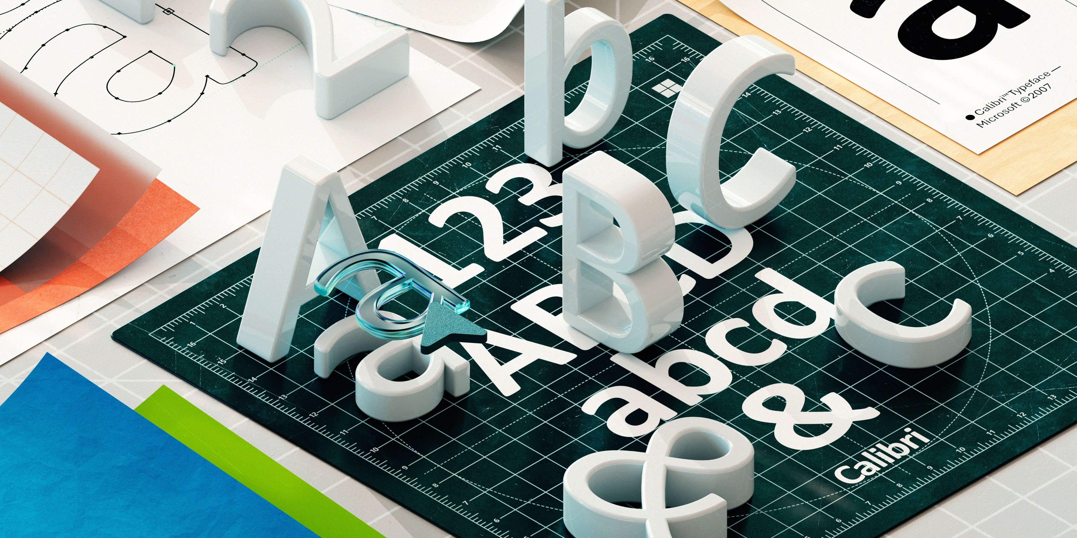
From paper to pixels: The evolution of ClearType and onscreen reading
How we made digital text like printed words on paper
In the mid 1990’s, the rise of the internet tidal wave was growing high enough to kiss the sky. Cyberspace appeared like a slowly expanding phenomenon, but printing emails and web pages remained routine because of the strenuous experience of reading on low resolution screens. It caused eye strain, headaches, and fatigue, especially after prolonged reading.
Traditional desktop displays based on bulky CRT (Cathode Ray Tube) technology left much to be desired, but in 2000, Microsoft started to include ClearType with Windows. This technology improved the readability of text on the increasingly popular LCD panel screens by making it sharper. As ClearType made onscreen reading more comfortable and enjoyable, hundreds of millions transitioned from reading on paper to the screen. By the time Microsoft’s ClearType Collection font set was released in 2007, including the beloved Calibri, web use went from 416 million daily users to 1.38 billion. Future bloggers and new media now typed and published on digital paper. The software normalized the idea that digital text could be book-like, injecting life into the newly emerging eBook industry. Office communications were going paperless. Why print when you can read on screen?
The software’s invention was led by the late Microsoft Researcher Bill Hill. With a ponytail and a bushy beard, he wore combat boots, a kilt, and a six-inch hunting knife on his hip to the office. He was not a hunter, but a vegetarian who loved tracking animals. Once he told a story about tracking a cougar through a mountain range and finding its den before the cougar got there. Realizing that he was at the door of an apex predator, Hill left. Later he discovered the cougar had followed him home, miles outside of the animal’s range. Why would a cougar behave like that, and what does animal tracking have to do with onscreen reading? More on that later. First, we go back to 1987, the start of Microsoft’s typographic design journey, and the hiring of a talented engineer with an encyclopedic memory named Greg Hitchcock.
Windows 3.1 and the integration of Apple’s TrueType
By the late 1980’s, desktop computers were eclipsing typewriters and Microsoft was looking ahead to the release of Windows 3.1. Hitchcock—who would go on to shape Microsoft’s typographic evolution for the next four decades—was part of an effort to improve fonts for the new operating system. “We had bitmap fonts at the time and the Microsoft fonts were System, Tms Rmn, and Helv. We knew we needed something called an outline font technology,” he explained.
Bitmap fonts made each character a tiny image—a holdover from Windows 1 and 2. When scaled up, they became pixelated and jagged. In contrast, outline fonts are like mathematically defined shapes or vector graphics that can be scaled up or down without losing shape or quality.
The improved graphical user interface (GUI) of Windows 3.0 made the operating system more useful and engaging, but our fonts were limited. At a time when people were designing their own layouts and printing professional documents, a selection beyond System, Tms Rmn, and Helv was much needed. As anticipation for Windows 3.1 bubbled, Microsoft founded a font team including Hitchcock, the late typographer Robert Norton, and former Chief Technology Officer Nathan Myhrvold.
To upgrade from bitmap fonts, they ultimately turned to TrueType, a technology developed by Apple. The software employed hinting, a process that allowed for better alignment of characters within pixel boundaries, thereby enhancing the clarity and consistency of text display. Microsoft licensed the software from Apple, and Hitchcock was involved in integrating TrueType into the Windows operating system. Now, what would Windows 3.1’s core fonts be?
People heart fonts
People needed a familiar typeface that linked the past to the future. From the heritage font foundry Monotype, the team licensed Times New Roman, Arial, and Courier New. Simulating the contours and shapes of typewriter fonts and newspaper print, those fonts gleamed on paper, but the team wanted to push font design further.
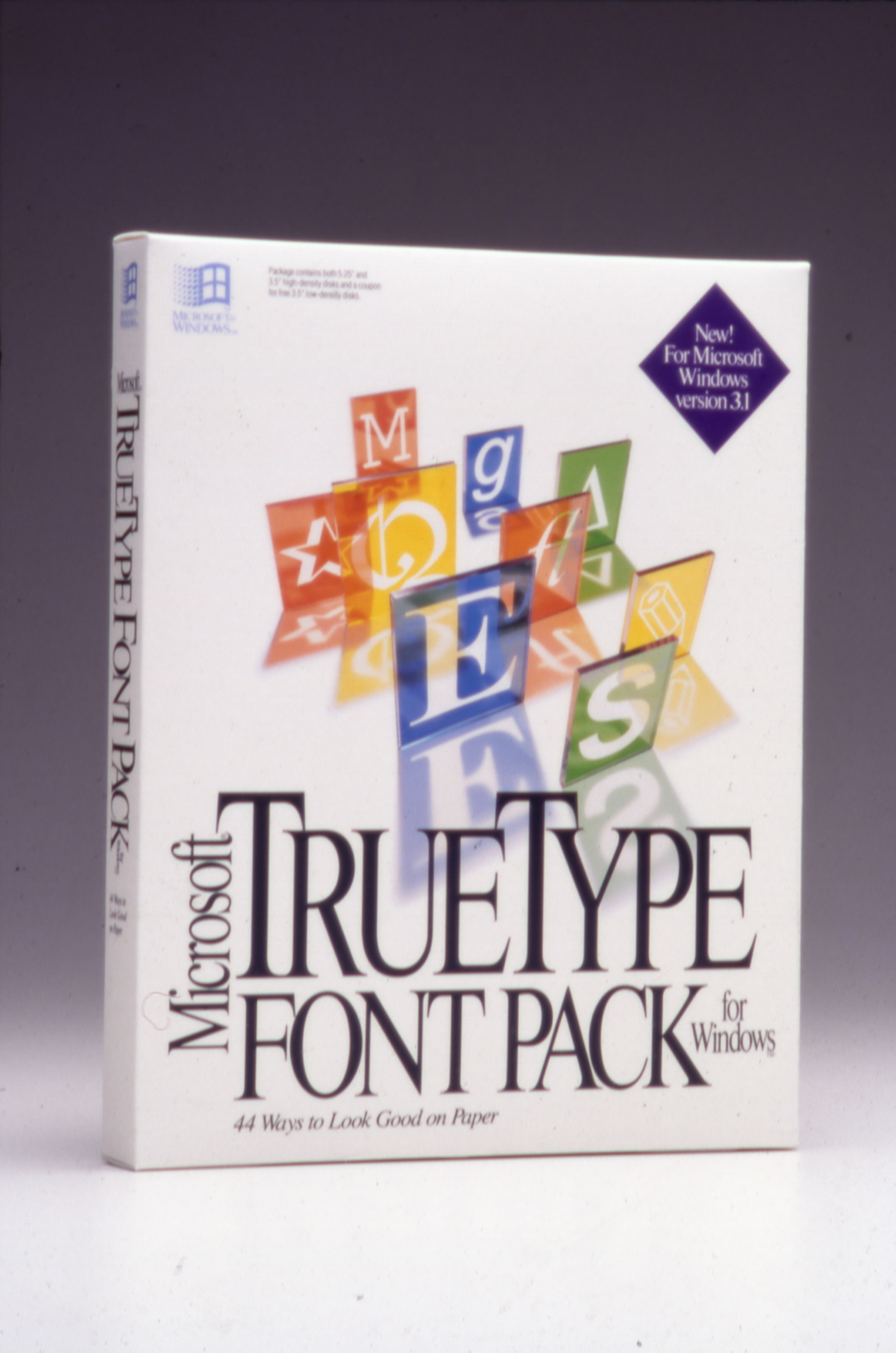
If office communications are a company’s nervous system, type is the brain, transmitting messages. People share their hopes and dreams in text, and that means different walks of life need a variety of fonts to express who they are. As a companion to Windows 3.1, Microsoft released TrueType Font Pack for Windows, a super family of fonts comprised of 22 Monotype fonts and 22 Lucida typefaces created by legendary type designers Charles Bigelow and Kris Holmes. Three of those Lucida fonts were Bright, Sans, and Typewriter.
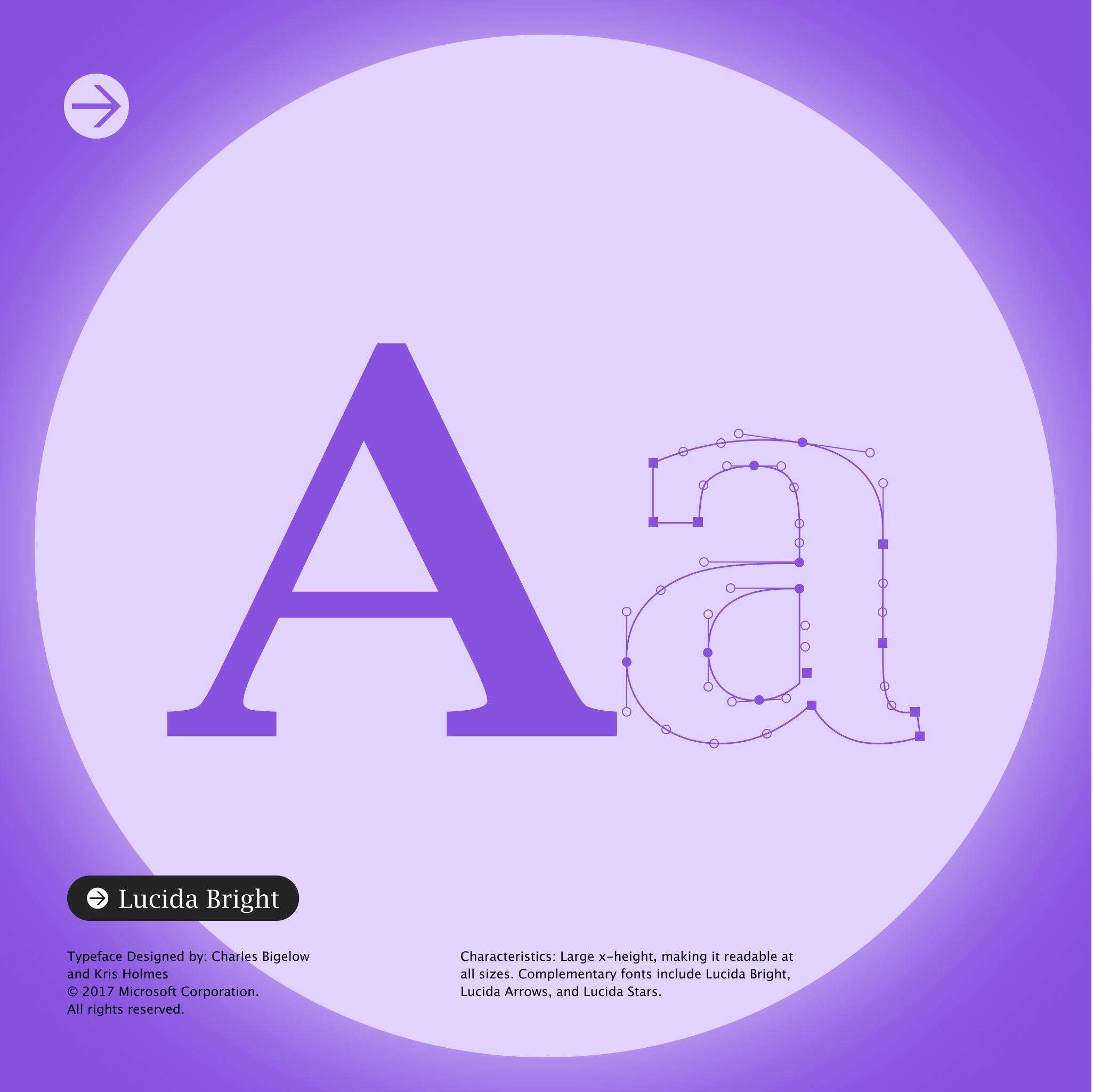
While Typewriter’s letters have a same set width, complementary fonts Bright and Sans are based on the writing styles of the Italian Renaissance, with Bright simulating the printing type of the French Enlightenment period. Both fonts were inspired by an ancient time when owning eyeglasses was as rare as owning a private quantum computer. In 1992, Windows 3.1 and TrueType Font Pack hit the market like a flame to gasoline, but screens still hadn’t improved.
Why better fonts needed better screens
“Computer displays were not following Moore’s law,” said Hitchcock. Moore’s Law states that the processing power of computers doubles every two years, making them cheaper. “We were getting massive improvements in computation, but in the display world, change was miniscule.”
One of the tenets for improving Microsoft’s fonts was to achieve WYSIWYG (What You See Is What You Get), so what you see on screen is what you see in print. But as Hitchcock described, “the screen resolution was so low that you couldn’t really have a good representation of how it would look like on paper. No one would read on the screen because the reading experience was terrible.” As LCD (Liquid Crystal Displays) screens started creeping into the peripheral, the future of media would be digital, but hanging in the tech industry air was a key question: how do you transition the world from reading on paper to reading on screen?
The ontology of reading: Bill Hill’s on-screen quest
In 1995, Microsoft Researcher Bill Hill was hired to head Microsoft Typography, a group that included Hitchcock, former Typographic Lead Mike Duggan, and former Corporate Vice President Dick Brass. “Bill was the vision guy, and when we hired him, he didn’t have a tech background,” said Hitchcock. The son of a steelworker, Hill grew up in the late 1940’s in the tenement slums of Glasgow, Scotland. He learned to read at age three and was said to have read 17 books a week. Hill viewed books as a waterslide for the mind. For 18 years, he was a journalist, but in the mid 80’s, he saw where traditional media was headed and joined Aldus Corp, who was pioneering desktop publishing software.
Once Hill was hired at Microsoft, he began a personal quest to improve onscreen reading and bolster the eBook industry. He saw some early success with the commission and creation of web fonts like Comic Sans MS, Verdana, and Georgia becoming classic types, but people were still more likely to print a document versus read it on screen if it had three or more paragraphs. In the shadow of the rising tidal wave, humanity had spent the last 5,500 years reading, writing, and typing on paper, and no amount of well-designed type was going to lead people from paper to pixels. So, Hill approached the problem from a historic view.
Animal tracking, like reading
“What’s the most important operating system you’ll write applications for?” Hill would famously ask developers. “It ain’t Windows, or the Macintosh, or Linux ¾it’s homo sapiens version 1.0. It shipped about 100,000 years ago. There’s no upgrade in sight, but it’s the one that runs everything.”
That insight stemmed from a realization that onscreen reading was analogous to reading animal tracks since both use symbols to tell a story. Hitchcock, all too familiar with Hill’s theory, said, “You can tell when the animal is running. You can tell when the animal stops. You can actually tell when an animal turns its head and looks one way. Just because of the different weights of the track impressions, you can tell when an animal is lying in wait.” However, to read those symbols, you need contrast and uniformity. When the dirt was too light or the animal’s footprint too shallow, Hill had to get on his hands and knees to figure out if the indentation was a paw or hoof print. His unconventional perspective was changing the company’s debate on digital text display.
The subpixel breakthrough
By the turn of the millennium, the high resolution, flat, light, and energy efficient LCD screens were eclipsing the bulky, heavy, expensive low-resolution CRT monitors. The challenge of creating an immersive reading experience onscreen was related to the way the screen’s light projected into the reader’s eyes versus the way light reflects off paper. How do you take that difference into consideration? Enter Bert Keely. He was an expert in LCD screen technology, brought in to help the group with eBooks.
In Inside Out: Microsoft in Our Own Words, a book that celebrates the company’s 25th anniversary, Hill recalls a revelatory moment in his office: Keely picking up a magnifying lope from Hill’s desk and sticking it over an area of white on the screen. He asked Hill, “What do you see?” Peering into the screen, Hill recalled, “…that’s when the light went on for me.”
At the meeting, Keely drew a pixel on a whiteboard and explained that a pixel is composed of three subpixels: red, green, and blue (RBG). Furthermore, these subpixels can be controlled or calibrated. “The question that we all asked was, what would happen if we could treat each of those [subpixels] as if they were pixels?” said Hitchcock. That meant they could turn off subpixels in every pixel of an LCD screen, sharpen the details in text display, and make the type much easier to read over long durations.
That was the birth of ClearType and, as Hitchcock recalls, “It just blew us away—it looked awesome!” Hunched over a laptop, they saw for the first time onscreen text that rivaled ink on paper. From there, the team started thinking about designing fonts, setting the stage for our future default font Calibri, which recently gave way to Aptos.
Although many other tech companies adopted subpixel rendering, higher resolution displays, faster processors, and touchscreens eventually made ClearType obsolete. Yet, at the advent of the Internet age, ClearType was a wild leap for onscreen reading.
The visionary and iconoclast Bill Hill passed away on October 16, 2012. He was survived by his wife Tanya and their two children, Yssa and Eldon. In 2015, the Microsoft Typography team dedicated their new Sitka font to Hill’s memory. Back in his home country, Hill remains hailed as the “Scotsman journalist who became the father of e-reading.”
Read more
To stay in the know with Microsoft Design, follow us on Twitter and Instagram, or join our Windows or Office Insider program. And if you are interested in working with us at Microsoft, head over to aka.ms/DesignCareers.

Outcomes over output: Designing shared cognition
How we are shaping systems that help people think better, not just type faster.
We can all be friends: Times New Roman vs Calibri
Explore how typography decisions really affect readability, accessibility, and brand expression.
Designing loops, not paths
How cybernetic loops are helping us turn “human in the loop” from a catchphrase into a design practice