Craft – Design Thinking, Fluent Design
– The estimated reading time is 8 min.
Four principles for the future of design

Last year, a group of us from across Microsoft got together to tackle a tricky challenge.
We needed to evolve our design principles — the concepts that articulate our shared vision and influence the spectrum of design, from design systems to design reviews to design scorecards.
To deliver more consistent quality experiences, we needed to rethink our shared vision and acknowledge how it’s shifted, as the world around us shifts, too.
We developed our working design principles more than four years ago — a lifetime in product design. They reflected a point of view around the (then) latest and greatest Windows operating system design language. Cool when they were cool, like our parents, they spoke to a world we no longer live in.
Today, Fluent is our open-source, cross-platform design system for web, iOS, Android, and Windows.
When design principles become less relevant, how do we refocus our vision? Losing our values in design is like losing our religion.

An eye to the past, a nod to the future
To start, we dug in to all the foundational elements that we use to make design decisions across the company.
We began at the beginning, with our mission — to empower every person and every organization on the planet to achieve more. To this day, this message endures and drives everything we do.
Then, we looked at our brand principles, which drive advertising, marketing, the Microsoft store, and other creative efforts.
Keep it simple
Make it personal
Think universal
Create delight
Details matter
Yep, still relevant.
And we took a look at our brand voice — crisp and clear, warm and relaxed, and ready to lend a hand. This continues to feel both modern and evergreen.
Our question — our increasingly tricky one — was, how we could support product teams to design as Microsoft, if we didn’t know what “it” is? We needed designers to speak the same language in design, and to aim for alignment in design reviews. And we believed evolved principles, supported by design systems, could do just that

Fluent product design principles
New principles would honor our heritage, usher in our future, and emerge from a collective design voice at Microsoft. By the designers, for the designers. So, we formed our principles team from designers around the world, with each designer bringing their own set of considerations.
Those considerations ranged from competitive analysis to the question of rules versus principles, from the pressure to release new features to cultural shifts, inclusivity, trust and ethics. All of these perspectives combined with our mission, brand principles and voice, are reflected in our evolved Fluent design principles.
We arrived at four distinct principles that welcome the future while honoring our design heritage.
Natural on every platform
Built for focus
One for all, all for one
Unmistakably Microsoft
Let’s take a closer look.
Natural on every platform
You want to know what to do. Your experiences should adapt to the device you’re on and should build off the familiar, designing for what you already understand.
A layout that adapts to different screen sizes and is aware of the platform it’s on makes an experience feel natural. It also allows us to reuse native platform components and patterns 80 percent of the time, focusing our energy on signature experiences.
Built for focus
You want to stay in the flow. Your experiences should inspire action, drawing you forward, simply and seamlessly.
When technology communicates and performs, it enables people to do what they want on their terms. Our products shouldn’t get in the way. Less visual clutter and noise keeps people centered, calm, and confident.
One for all, all for one
You want to be included. Your experiences should consider, learn, and reflect a range of perspectives and abilities for the benefit of all.
Including and learning from a variety of people with a range of abilities and perspectives earlier in the design process makes for better solutions. It opens up new possibilities and helps us think more creatively through constraints. Because when you’re included, you feel like you belong.
Unmistakably Microsoft
You want to recognize what you’re looking for. Your experiences should feel like one Microsoft. One moment, one product, one experience at a time.
We focus our energy on signature experiences that connect our products together and give them a distinctively Microsoft feel. From color to sound, illustration to icons, these signature experiences increase brand recognition and familiarity.

How principles play out in practice
Design principles appear deceptively simple. The real trick is translating them into action. There are countless ways teams use our new principles to help guide product and feature design conversations. These include:
• Using a shared language for product design development
• Using a shared language for design critiques
• Determining Fluent scorecards to measure how new ideas, features, and products meet the new principles
• Incorporating design principles into all our design activities: in all-hands meetings, design reviews, design handbooks, and even onboarding
Here are a few ways these new principles also surface (sometimes unexpectedly) in our products and experiences.
Focus plan in MyAnalytics
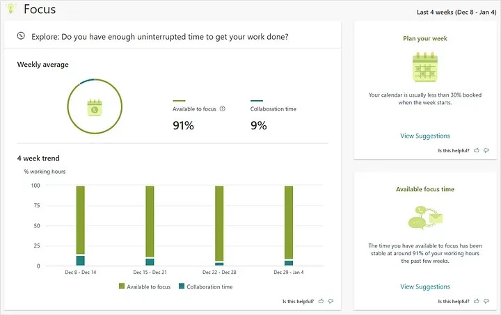
Meetings, emails, and chats are necessary to get work done, but they often leave us with little time during the workday for uninterrupted individual work. Some people report spending over 80% of their day collaborating with coworkers, and research has shown that it can take over 20 minutes to refocus after checking just one email. The focus plan in MyAnalytics helps you block regular time for your top-priority work by scheduling up to four hours every day to focus. Yep, MyAnalytics is quite literally built for focus.

New Scheduler app and voice capability experiences
As product designers, we’re very much aware of accessibility best practices and guidance — technical solutions that address vision, hearing, and motor function limitations. After all, our company mission is to empower every person and organization on the planet to achieve more.
We make sure our products meet these guidelines — it’s our duty. But when we expand our thinking to realize that we all experience limitations at some point in our lives, we can start thinking about accessibility in new ways. For example, maybe you’ve broken an arm or had your eyes dilated after an eye exam. The way you interact with the world changes; your experience changes.
When you stop thinking about accessibility as meeting the needs of a certain group of people, exciting possibilities emerge. One for all, all for one. This inspired our latest voice capability experiences in Outlook mobile, which you can check out in this video.
Updated illustration styling
Illustrating people and depicting their likeness in a positive, equitable manner is challenging at best — and harmful at worst, due to generalizations, unconscious bias, and stereotyping. We’ve heard and learned from customers that when they see character illustrations that don’t look like them, they feel excluded. And when the illustration looks too much like them, they get weirded out. To better align with our inclusive design values, we’re moving away from generic illustrations of people. Instead, we’ll visualize our storytelling through metaphor, abstraction, and illustrative objects.
Inclusive language guidance
As we become more attuned to social injustice around the world, we’ve learned a lot. Much like our illustration styling updates, we’re constantly learning how to become better communicators and better people.
We’ve updated our Microsoft Writing Style Guide with new guidance on the use of historically biased and divisive language, and we’ve recently published Guidelines for Inclusive Language from the Linguistic Society of America. Updates to our style guides make these changes available to our Microsoft Office customers as well. Microsoft Word can help ensure inclusive language in professional communications by checking your writing for gender bias, age bias, and more.

It’s an evolution
Design principles in action can surface in so many obvious, and less obvious, ways — in depth, breadth, and nuance. They’re grounded in our deep understanding of how customers navigate the world and grow from our beliefs about what empowers all people to achieve more.
Principles also reflect the culture that creates them, meaning they will continue to evolve over time. Maintaining a shared design vision is a journey, and we believe these new principles can guide our product experiences for years to come.
An amazing group of product designers came together to make this happen. Special thanks to Benedikt Lehnert, Cassie Klingler, Christina Koehn, Colin Day, Jason Kilpatrick, Jason Blackheart, Joe Hallock, Kate Spengler, Mark Swift, Miles Fitzgerald, Nando Costa, Sang In Lee, Simone Magurno, Taili Feng, Thad Scott, Timothy Achumba, and Yilei Wang.
We adore you.
Read more
To stay in the know with Microsoft Design, follow us on Twitter and Instagram, or join our Windows or Office Insider program. And if you are interested in working with us at Microsoft, head over to aka.ms/DesignCareers.

Outcomes over output: Designing shared cognition
How we are shaping systems that help people think better, not just type faster.

We can all be friends: Times New Roman vs Calibri
Explore how typography decisions really affect readability, accessibility, and brand expression.

Designing loops, not paths
How cybernetic loops are helping us turn “human in the loop” from a catchphrase into a design practice
