Inspiration – Inclusive Design
Evolving the Microsoft Inclusive Design website
What we learned rebuilding the Microsoft Inclusive Design website with the communities we serve

Last week we were excited to launch our newly refreshed Microsoft Inclusive Design website. As the Inclusive Design practice at Microsoft reaches its 10-year anniversary, this project serves as both a celebration and a recommitment. When the Inclusive site was first launched in 2015, it marked a pivotal moment in how we approached accessibility and design at Microsoft. Spearheaded by the Microsoft Design team, the site debuted alongside the original Inclusive Design Toolkit. At the time, accessibility was still largely viewed through the lens of compliance: meeting standards, checking boxes, and avoiding legal pitfalls. But the site aimed to shift that narrative.
The goal was to reframe accessibility as a design opportunity, one that embraces human diversity in all its forms. The toolkit and website provided practical guidance for experience creators or makers to design with, not just for, people with disabilities. It was a bold step toward embedding inclusive design into the DNA of Microsoft’s product development culture.
Over the years, our practice has grown. New toolkits have been added, and the understanding of what inclusive design means has evolved. As technology advanced, so did the expectations of what accessibility and inclusion should look like in digital experiences. While the original site remained a valuable resource, we felt it no longer fully reflected the depth and breadth of inclusive design as it is practiced today. It was time for the site to evolve.
Principles behind the rebuild
The updates and improvements were driven by a need to serve our global audience, reflects the evolving understanding of accessibility, and remains a trusted resource for practitioners, advocates, and organizations around the world. The new infrastructure, content architecture, and adaptive interface are designed to support long-term growth and deeper engagement with the communities the site was built for.
Throughout this project, several key principles guided the team:
- Co-design is essential: Inclusive design means building with disabled and neurodivergent communities—not for them.
- Accessibility is a practice: Compliance is a baseline, not the finish line. Ongoing testing, iteration, and feedback are critical.
- True access is proven in use: Accessibility is validated through real-world use by disabled and neurodivergent people.
- Adaptability drives inclusion: Giving people agency in how they interact creates more usable experiences for a wide range of abilities.

Rebuilding with intention
The revamp of the website was a cross-disciplinary effort to transform a legacy resource into a modern, accessible, and inclusively made experience. We wanted to reimagine how the site’s structure and visuals could evolve.
The redesign was grounded in inclusive research, co-designed with disabled and neurodivergent people, and it was a deep commitment to Microsoft’s mission: to empower every person on the planet to achieve more. We wanted the new site to reflect the lived experiences of the communities it serves, and to be a model of what inclusive design can look like in practice.
We set out with a clear set of objectives:
- Build scalable infrastructure to support a growing library of toolkits and resources.
- Highlight Microsoft products that exemplify accessibility and inclusive design focus.
- Improve usability for disabled and neurodivergent users through thoughtful design and testing.
- Engage directly with communities through co-design and inclusive research practices.
- Serve a global audience by considering diverse needs, languages, and contexts.
- Modernize the site’s framework using Fluent 2, Microsoft’s latest design system.
- Ensure accessibility compliance while going beyond minimum standards to support real world accessibility that considers usability.

One of the most important aspects of the revamp of the Microsoft Inclusive Design website was the intentional and sustained inclusion of disabled and neurodivergent voices throughout the process as co-designers.
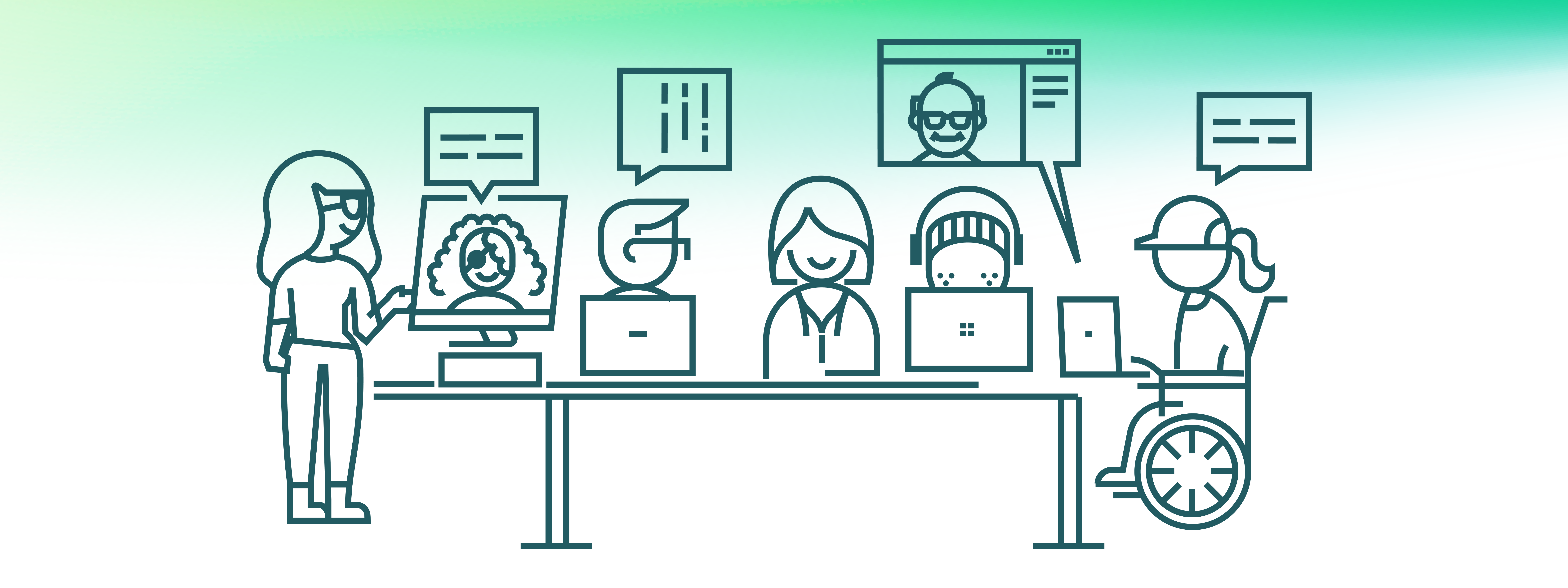
We began the redesign process with a week-long Inclusive Design Sprint. Inclusive Design sprints are a structured, collaborative effort to generate formative insights and co-create solutions with people who live in the realities we aim to design for. In our sprint, we brought together over 25 participants, including product leaders, researchers, designers, engineers, and most importantly, co-designers with lived experience of disability and neurodivergence.
Co-design was a foundational pillar of our process. We held sessions both remotely and in person, depending on the needs and preferences of our participants. We used tools like Figma and FigJam to collaborate, but we also made sure to accommodate those who couldn’t use these platforms by capturing their feedback in alternative ways and integrating it into our design boards.

The sprint was a reminder that accessibility compliance alone wasn’t enough. We needed to go further to support a wide range of user preferences and needs. Three key focus areas emerged:
- Adaptive Content – Participants emphasized the need for multiple ways to consume content. While the existing site offered PDFs and videos, these formats weren’t always accessible or preferred. PDFs were seen as cumbersome for people who rely on screen readers or need to adjust text size and layout.
- Navigation & Structure – Even with a relatively small content library, people found the single-page layout overwhelming. They wanted better ways to search, filter, and explore content. This feedback led us to consider expanding the site beyond a single page and introducing more intuitive navigation mechanisms.
- UI & Theming – While the high-contrast design of the original site worked well for some people, others found it difficult to read. Some co-designers noted that the lack of a dark mode made the site uncomfortable to use for extended periods, and others preferred reading in light mode.
Shaping the structure
With these focus areas in mind, our design team and co-designers began sketching and wireframes. We deliberately stayed in low fidelity at this stage to focus on architecture rather than aesthetics. This allowed us to explore how the site could grow to accommodate more content without overwhelming people.
We landed on a simple, scalable structure:
- A homepage introducing the principles of inclusive design
- A dedicated page for toolkits and resources organized by category
- A page showcasing real-world examples in Microsoft products
- Search functionality and robust heading structure to help users find what they need
- Individual long-form pages and listening options for each toolkit, built in code rather than just as downloadable PDFs
Modernizing our visual design
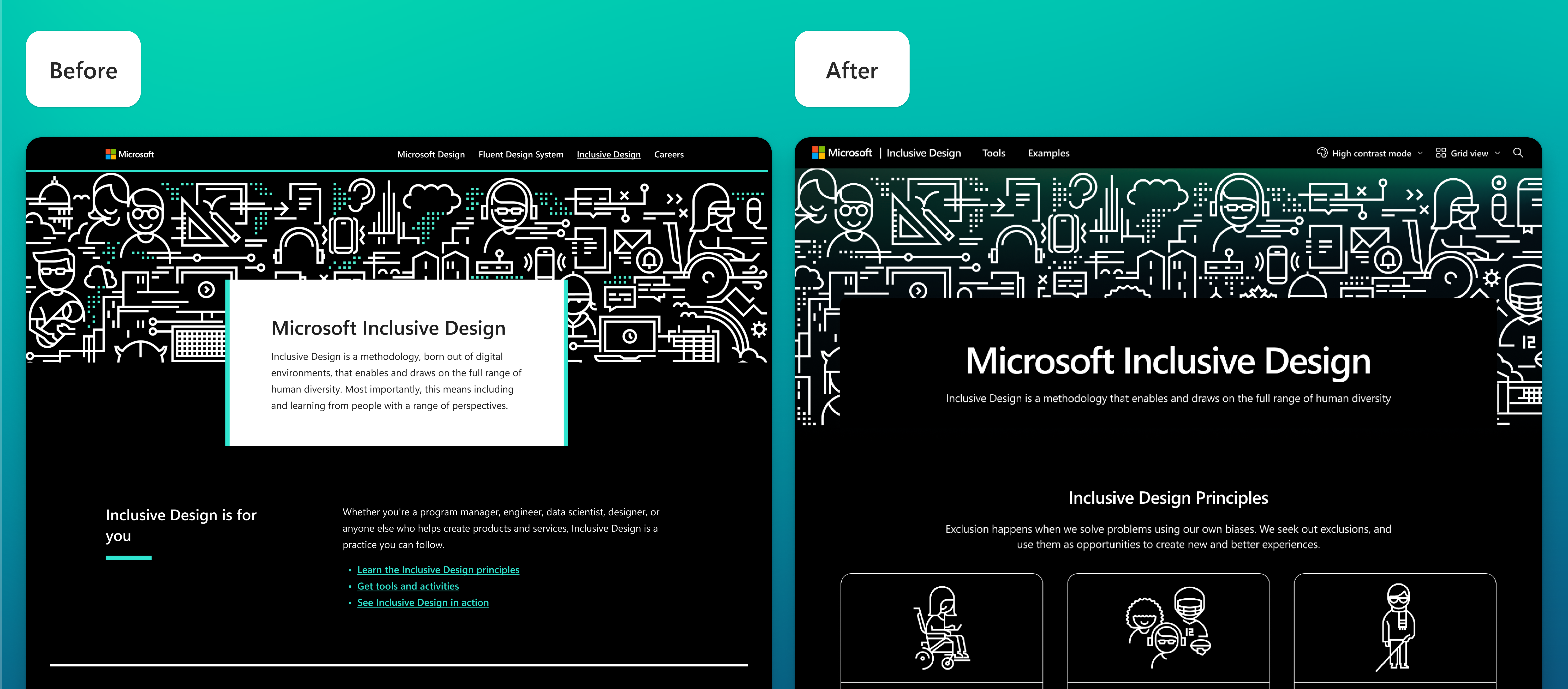
The original Microsoft Inclusive Design website had a distinctive look of black and white with teal accents, paired with a custom illustration system. While iconic, this visual identity no longer aligned with Microsoft’s current brand standards or the Fluent design system. It felt outdated.
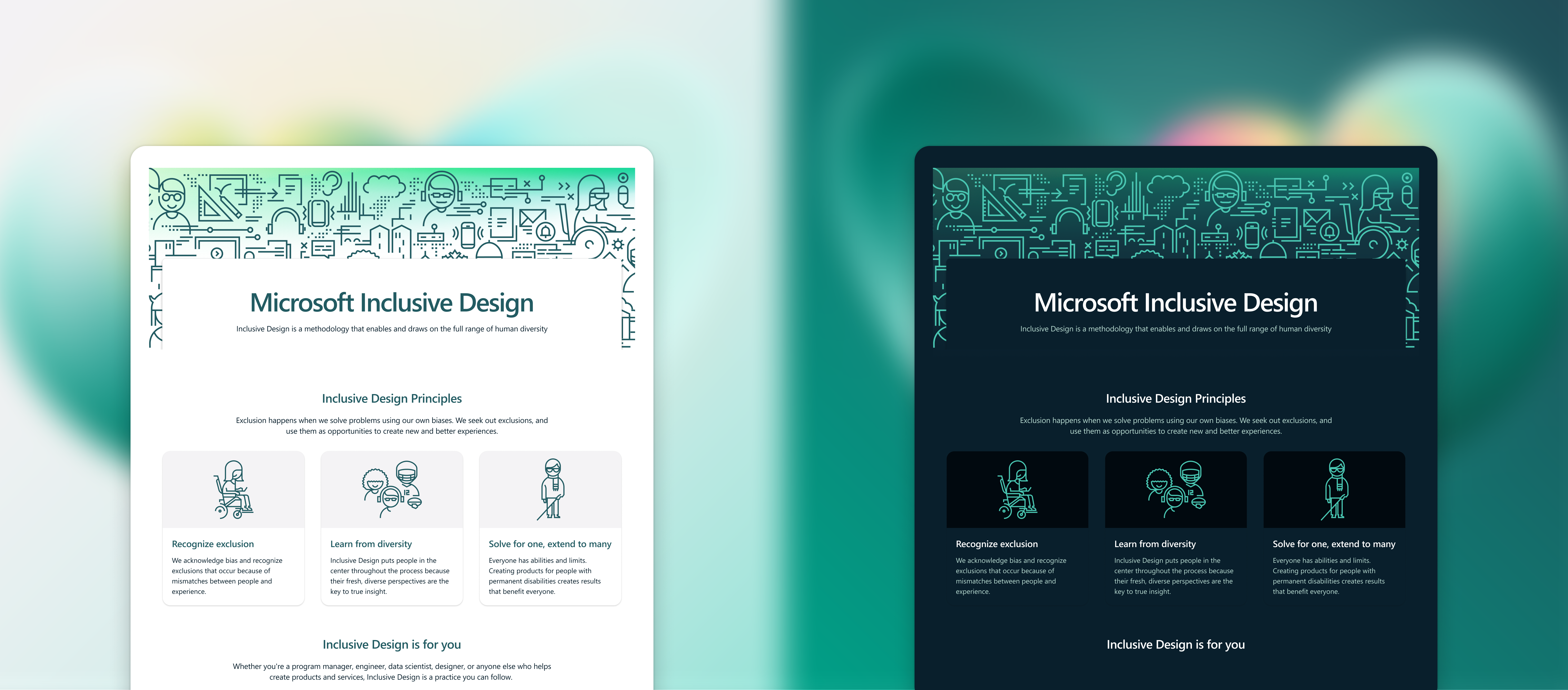
Our challenge was to modernize the site while preserving its unique character. Fluent 2, Microsoft’s latest design system, gave us the flexibility to do just that. With its emphasis on soft edges, subtle shadows, and vibrant colors, Fluent 2 allowed us to create a warm, clear, and adaptable interface that still felt true to the spirit of inclusive design.
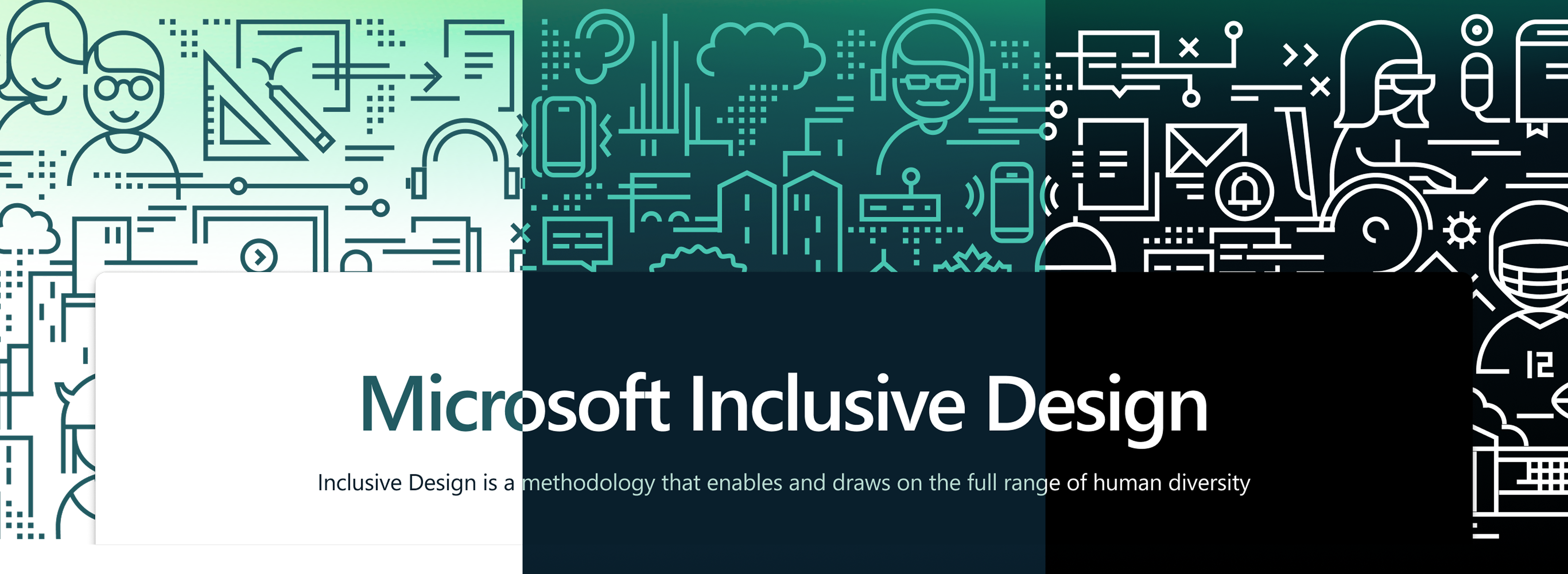
We also made a deliberate choice to retain the existing illustration style. We updated the color palette to align with Fluent 2 and added gradients to give the illustrations more depth and dimension. This allowed us to modernize the visuals while preserving the human-centered ethos that defines Inclusive Design.

Designing for adaptability
One of the core principles guiding our visual design and interface was adaptability.
We recognized that people constantly modify interfaces to suit their needs. They expect to be able to zoom in, switch color modes, or even install custom UI plugins.
We built the UI to support multiple color modes: light, dark, and high contrast. We offered different reading layouts, such as list and grid views, and made these options easy to find and toggle. Our goal was to give people control over their experience, acknowledging that no single design can meet everyone’s needs out of the box. Beyond this initial set of capabilities, Fluent 2 enables ongoing adaptability.
Our approach also helped us avoid the trap of designing for specific medical conditions. Not everyone identifies as having a disability. Not everyone has a formal diagnosis. Even among people with the same condition, needs and preferences can vary widely. Instead of assuming what people need based on a diagnosis, we focused on giving people agency. By designing for flexibility, we recognize that all people have unique needs, regardless of shared experiences or conditions. That adaptability supports accessibility beyond compliance. It expresses a core belief about who we design for and why.
The Microsoft Inclusive Design website is a living expression of a guiding philosophy. One that places people at the center, embraces complexity, and champions technology as a force for equity. In this era of AI-driven innovation, that philosophy remains essential to shaping technology that truly includes everyone.
The rebuilt Microsoft Inclusive Design website reflects a collective effort grounded in collaboration, co‑design, and lived experience. This work was made possible through exceptional leadership from Doug Kim and close partnership across disciplines:
Design: Anna E. Cook, Cherisha Agarwal, My’ria Wilbert
Engineering: Jacqueline Aziz, Adriana Orantes
Product Management: Yue Ou
Research: Deepika Raj, PhD
Content: Janell Kennerly
CELA: Christina Mallon
We are also deeply grateful to the wider Inclusive Design community. Your perspectives, feedback, and lived experiences shaped every decision—from structure and navigation to theming and content delivery. This site exists because we continue to learn together.
We believe in progress, not perfection. If you notice gaps or bugs, or have ideas for how the site can grow, we’d love to hear from you at [email protected].
