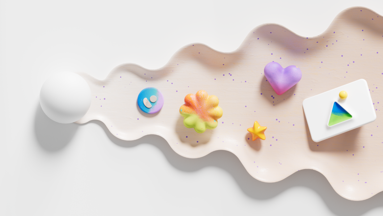
Embracing vibrant universality in Fluent illustrations
Rethinking our illustrations to create better experiences for our customers.

Illustrations are windows into our imaginations. They have the power to stir emotions, enhance experiences, and spark profound thoughts. From the early days of simple clip art in Microsoft Word and PowerPoint to the sophisticated visuals available today, illustrations bring user experiences to life, transcending language barriers and cultural divides.
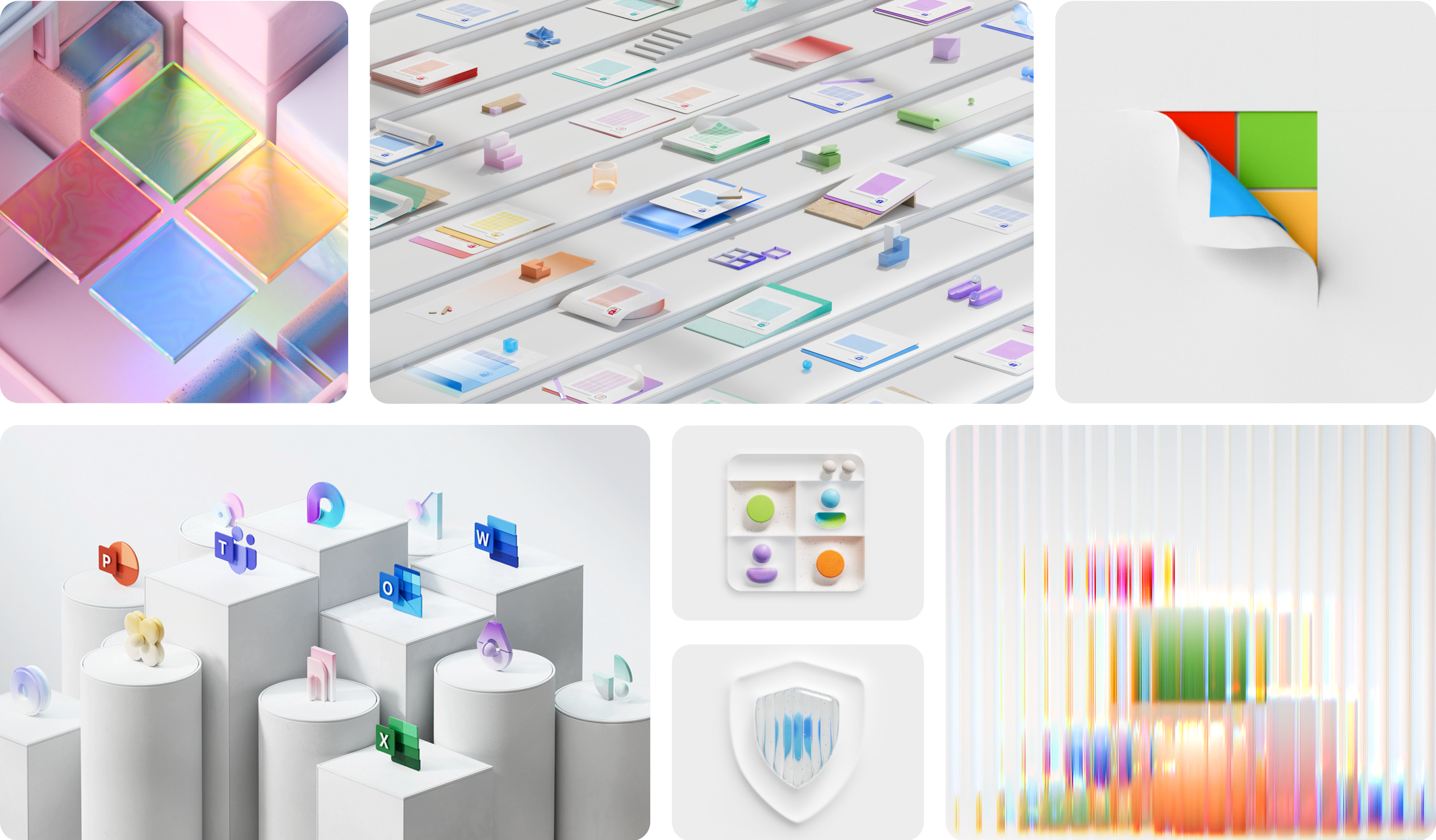
Meet our new Fluent Illustration style, designed to simplify and unify our products with a distinct Microsoft aesthetic.
As practitioners of human-centered design, engaging with our users and gathering their feedback is crucial. Through a semiotic analysis, we learned that our Fluent illustrations needed to evolve to better resonate with our customers.
Semiotics, the study of signs and symbols, breaks down the meaning of everything from cultural representations and languages to brands and emojis. Our analysis showed that while our illustrations could be described as colorful, inclusive, and genial, consumers perceived them as uninteresting. The flat, vectorized style that was once hugely popular across the industry now feels emotionless, and potentially evokes ideas and themes that were misaligned with our company values.
To continue creating delightful and relevant customer experiences, we had to apply these findings and work in tandem with Microsoft’s evolving brand and culture.

Our Five Fluent Illustration Principles
As Microsoft’s Brand team actively evolved their brand principles, an opportunity arose for a partnership that would allow our brand and our products to grow together, in alignment with our company’s mission and values. Integrating shapes and symbols from the Fluent design language across both the user journey and marketing campaigns would generate greater cohesion and harmony for our customers, fostering a more seamless end-to-end user journey. To achieve this, we had to ground our new illustrations in our universal brand principles: human, vibrant, dimensional.

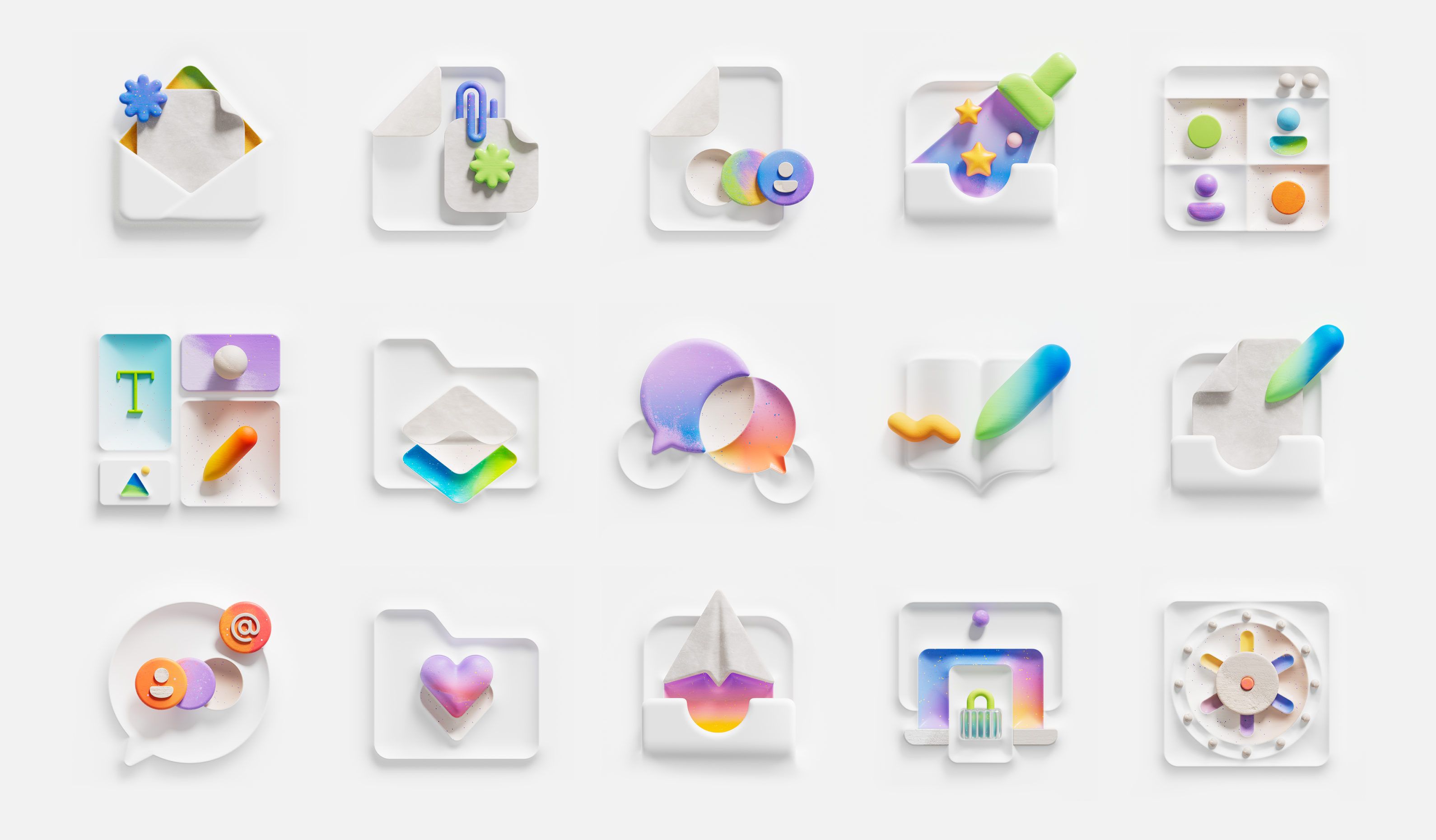
Evolving our Fluent illustrations meant enhancing our products’ personality and creating dynamic user experiences. With this in mind, we aimed to craft a library of illustrations that would reflect playfulness, collaboration, and inclusion, and evoke inspiration and connection. This approach led to five core guiding principles that drives our illustration work today.
1. Humanity
Shapes, colors, and symbols — all of which are embodied by illustrations — carry a wide array of cultural significances. Aligning to the principle of humanity called for us to create and practice inclusive design. By inviting the perspectives and experiences of our colleagues worldwide, we created illustrations that reflect Microsoft’s ideals and values by more accurately depicting humans everywhere. We transitioned from intricate portrayals of people occupied with specific professional scenarios to simplified symbols of human creativity and productivity that resonate with a broader spectrum of vocations and cultures. This shift avoids reinforcing stereotypes and instead promotes a message of collective human potential and unity, making our illustrations both timeless and accessible.

2. Color and gradients
Choosing the right color palette is critical given the notable impact of color on our moods and emotions. Certain colors evoke a sense of urgency or anxiety, while others exude calm and joy. The desaturated color palettes that were once unique to each product have transitioned to a vibrant, shared, Microsoft brand palette that is energizing and inspiring. Adopting our brand palette in our user experience allows us to create greater brand love, and fosters cohesion across our products. There’s also the added benefit of reducing redundant and repetitive workload within each product group.

3. Dimension
In the past, illustrations were approached more as an afterthought, as stickers or decorations that were placed on top of a user interface. But bringing our product experiences to life called for 3D shapes and figures as we designed our illustrations into the interface.

Fluent’s Elevation system acted as a guide to how we approached designing 3D within a 3D space. This included aligning elements like visual space, depth, elevation, and camera angles. Creating shapes that emerged from the surface added a human element and sense of tactility to our user experiences. Camera positioning and perspective within Fluent’s Elevation system grounds our 3D illustrations in a tangible surface, bringing dimension into experiences without distracting user interactions. Many concepts now also include a moment of action, change, or interactivity. Through overlapping forms, dynamic placement of objects, gradient trials, and textured brush strokes, we can depict connection in a way that is universally understood, reinforces movement, and emphasizes metaphors.
4. Sophistication
As our customers’ tastes and perceptions mature, our methods of engagement must also evolve. Rather than using an illustration style that echoed the purity and innocence of childhood stories, we now embrace a more sophisticated aesthetic. This new direction favors 3D renderings that exude depth and movement, capturing the complexity and richness of the adult imagination. Sophisticated renders invite contemplation and multiple interpretations, and evoke a spectrum of emotions that allows us to connect with our customers on a deeper level.

5. Playful
While sophistication is a cornerstone in our new direction, playfulness is just as vital. Microsoft’s brand resides at the intersection of these two themes, balancing elegance with a touch of lightheartedness. Our previous set of illustrations leaned towards sharp contours and more straightforward compositions, conveying a sober, literal quality. Moving towards fluid and expressive forms in our new set of illustrations brings a sense of rhythm and vitality. As we embrace organic shapes, curves, and asymmetries (elements that mirror the natural world), we can explore abstract ideas and break free from rigid constraints. But playfulness isn’t just about form; it is also about movement. Subtle hints of motion animate our visuals while dynamic elements spark curiosity, encouraging viewers to linger, explore, and discover.
Alleviating cognitive burden
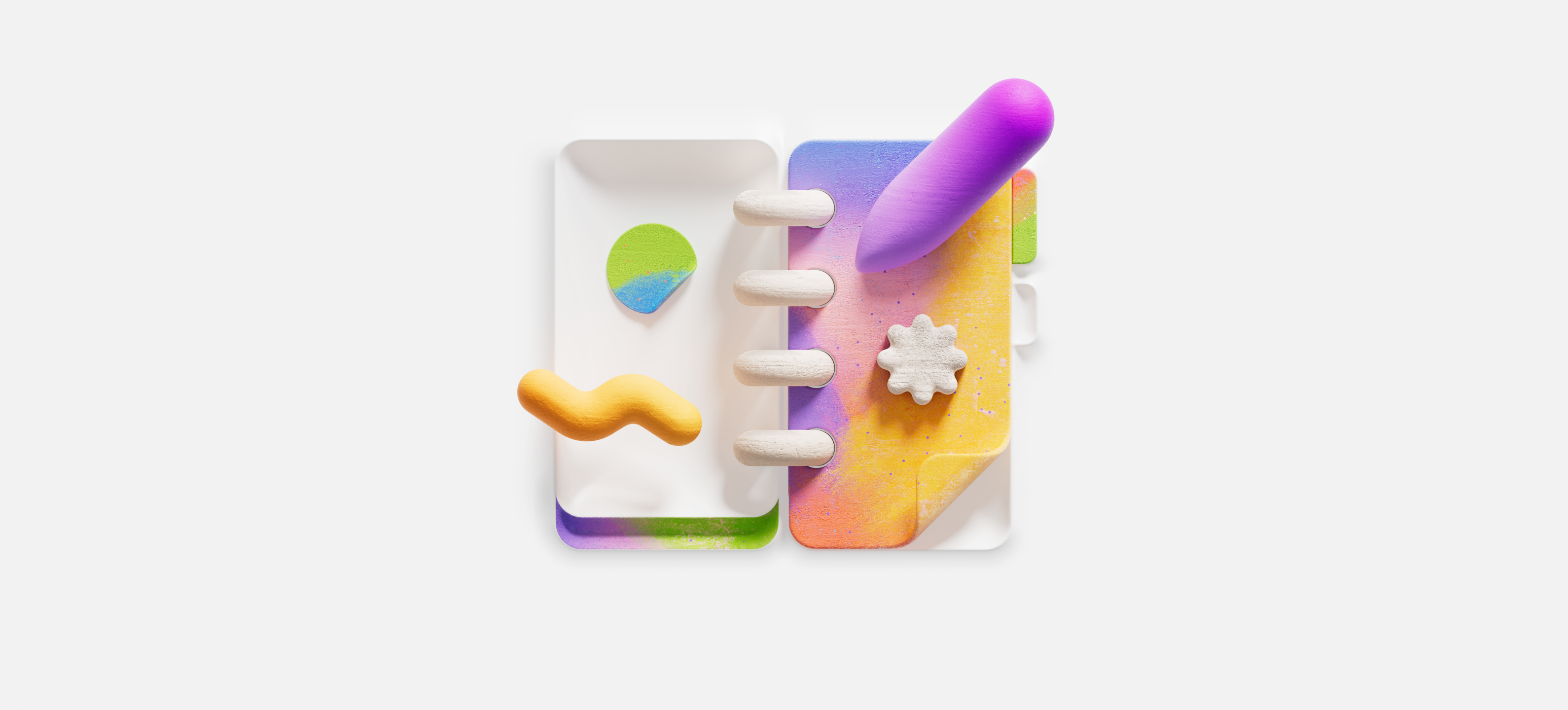
Evolving our Fluent Illustration library was just one part of elevating our customers’ experiences. To further add value, we recognized the need to address the cognitive overload our users faced. Our previous illustrations often duplicated accompanying written copy, creating unnecessary mental strain and occasional confusion. Being more intentional with how our illustrations harmonized with other elements within the user’s experience helped to alleviate this.
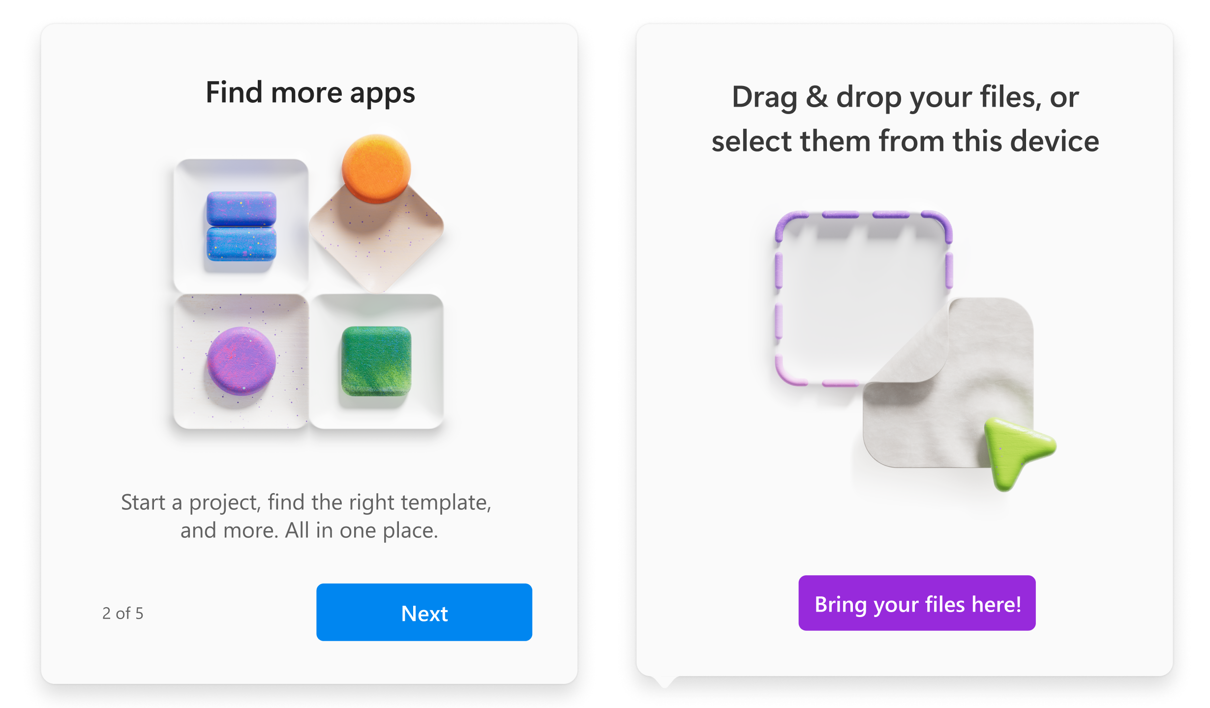
Through research into different learning styles, we explored how UI elements beyond illustrations, such as layout and copy placement, could lighten the cognitive load. We learned that images and other UI elements need to work together to enhance both efficiency and emotional impact for customers. By positioning headline text above an illustration and placing description text or buttons below it, we significantly reduced cognitive load and enhanced user comprehension. We also began embracing concepts that were more symbolic and universal through a singular metaphor, resulting in greater clarity.
When individual applications within a broader product ecosystem look and feel different, greater cognitive burden may result, because users have to context switch constantly as they move between applications. To address this, we pivoted towards more general-purpose illustrations across different applications, reducing the overall volume of bespoke illustrations, and enhancing design efficiency through a shared library. We also leveraged our Fluent iconography to repeat, reuse, and re-purpose a series of connected objects. This built a sense of familiarity for our customers around shapes, objects, and metaphors, enabling a more enjoyable, cohesive user experience and greater focus within a workflow.
Embracing the continuous voyage
Much like a forest, where each new season brings new growth and transformation, our illustrations reside in a perpetual state of evolution. There is no “end product.” Rather, each set of illustrations creates fertile ground for more refined work to grow from in the future. As our thoughts and perspectives evolve through customer feedback and engagement, so do our illustrations to reflect those learnings. This is the essence of evolution in design — a continuous flow of creativity within a community that breathes life into ideas, turning them into visuals that are not only aesthetically pleasing but also rich in meaning and emotion.
Special thanks to the amazing group of designers across Microsoft and Buck who came together to bring all of this to life.
Read more
To stay in the know with Microsoft Design, follow us on Twitter and Instagram, or join our Windows or Office Insider program. And if you are interested in working with us at Microsoft, head over to aka.ms/DesignCareers.
Proof and possibility
On becoming Microsoft’s first Chief Design Officer

Paper, please: The box that did more with less
How Microsoft reduced single-use plastic in packaging to just 0.07%

Outcomes over output: Designing shared cognition
How we are shaping systems that help people think better, not just type faster.

