Digital design is never done: Evolving Windows 10 mail and calendar
How our team made fan-loved functionality more Fluent
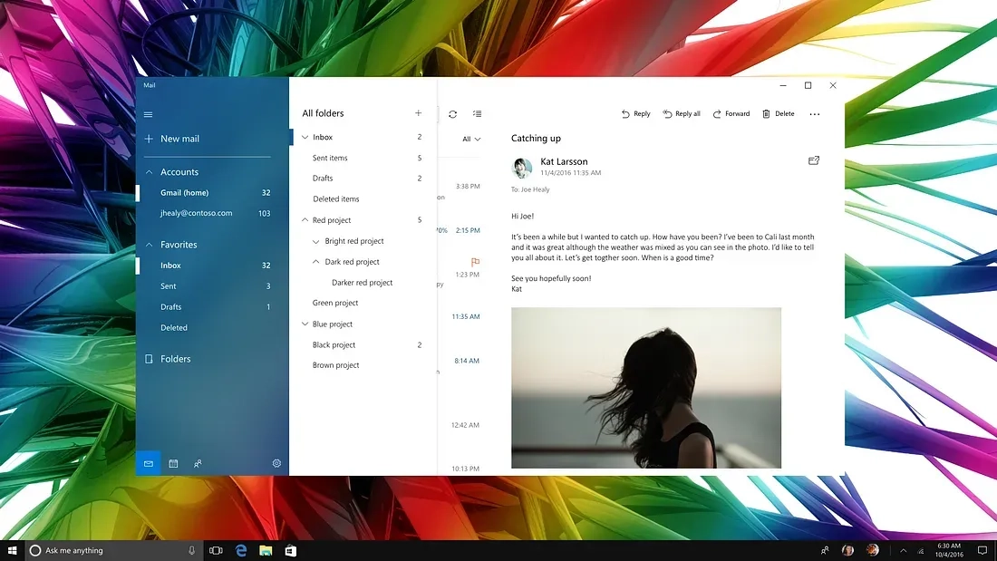
Two years ago we introduced completely rewritten and redesigned Mail and Calendar apps in Windows 10. (Not the screens pictured above.) While the apps were functional and modern looking, they still lacked a more refined and delightful look and feel. In the “software as a service” era, we’re able to improve our features and designs with a cadence that customers have come to expect. Even before the 2015 release, we began thinking about the next app iterations.
Our early redesign set the goals to visually align with Windows, reduce chrome, give the app a fresh, more refined, and beautiful look, while raising the bar of “craftsmanship” (the internal name for our efforts). The team established design guidelines grounded in a purposeful use of typography, color, and motion, to convey a delightful and highly functional app.
Timing plays a part in every story
It wasn’t until early 2017, engineering resources became available to work on our redesign. About the same time, the Fluent team (code named NEON) was launching, and actively driving adoption of the new Fluent Design System into Microsoft apps. That meant we had a refreshed design challenge; (Thank you Satya) rethinking what we kept, what we left behind, and how we became more Fluent going forward.
While the Fluent launch was exciting, our team remained mindful that we were redesigning apps that had millions of users and fans. Altering things they were used to—like title bar, ribbon, and key functionality—had to be carefully considered. Obviously, we didn’t want to alienate our users, and we were not interested in any backwards steps in usability.
Integrating fresh cues from early Fluent Design mail work with the aforementioned redesign ideas turned out to be fairly straightforward — as some of the overarching principles were already aligned. Even some of the Fluent design elements, namely “acrylic” with its translucent surface treatment, were already present in some form in our existing app (semi-transparent navigation pane).
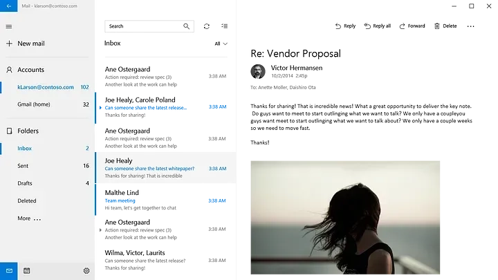
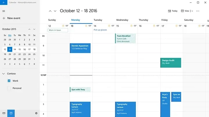
Fluent Design Elements Implemented with Mail & Calendar
The design explorations coming from the recently launched Fluent team didn’t meet all of the requirements we had for our apps in terms of workflow, personalization, localization, accessibility, etc. Our team examined each of those requirements, applying aspects of the Fluent Design System into our own explorations.
The first Fluent design elements we looked to implement were “acrylic” which is the translucent, glassy surface treatment for panels and “reveal”, the light effect that appears on hover to reveal actionable elements. Each of them presented their own set of challenges and we remained in close communication with Fluent and the other Office teams, learning what worked and what didn’t.
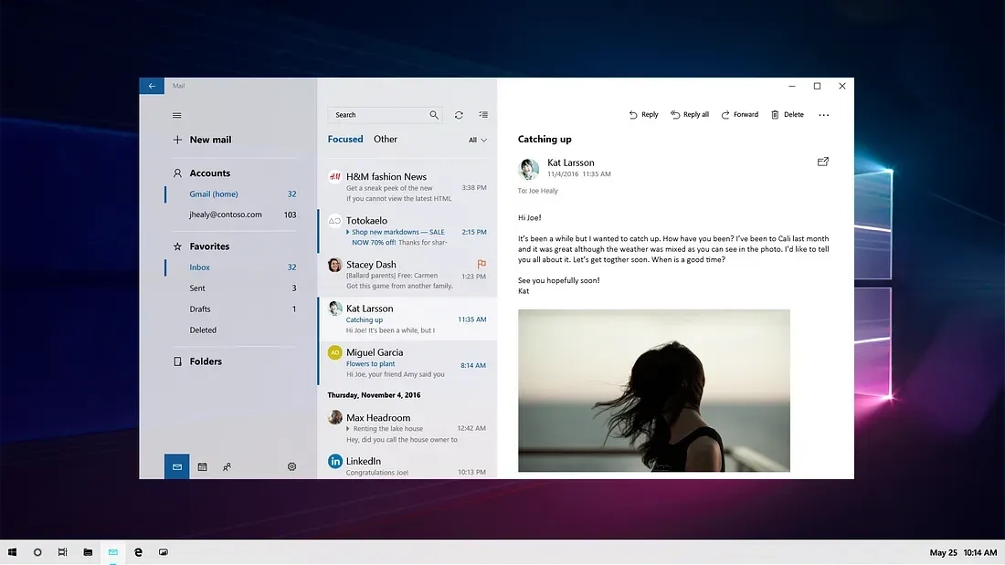
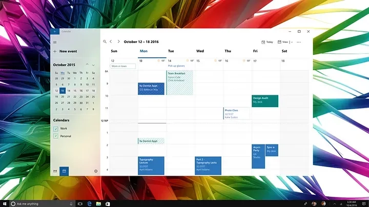
Acrylic — Background or no background, that is the question
Acrylic is a Fluent Design System component that allows incorporation of light, depth, motion, material, and scale into the UI. It adds a partially transparent texture (material) to certain UI elements like panes. With its introduction one natural question that arose was: “If I can see through it, what do I see? What is in the background?” Having already established a background picture as a default within our app we asked ourselves “Does our background clash with the desktop background? Are we going to get rid of our background picture in favor of the user’s desktop picture? What about other app windows in the background that might not look pretty? How does it work with (brand) colors?” This lead to an array of explorations.
Ultimately, we decided in favor of the in-app background photo because we knew it delighted our users. It also reduced visual background clutter in the empty state when no email is selected. (However, our users have the options of changing the picture or turning it off in personalization settings.)
To Reveal — or not to reveal?
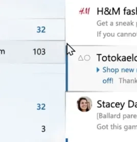
Reveal is a lighting effect that brings depth and focus to interactive elements. By showing borders of controls and buttons on hover it reveals actionable elements and helps understanding the UI. While the concept of reveal is great- the devil is always in the details. In the first iteration reveal not only exposed interactive elements, but also exposed the borders of controls in neighboring panels and brought attention to previously invisible different alignments of controls. For example, elements in the left navigation pane didn’t necessarily align to elements in the message list because they scroll differently. That, in turn, created sort of a brickwork-effect visible with reveal that added more visual noise to the app, something we actually wanted to get rid of. So in order to avoid all that we decided to turn off reveal in the message list- only apply it on the navigation pane and also turn off reveal on vertical lines in the folder list. With all that said, we know the Fluent design team is hard at work to improve reveal based on our feedback and we will reevaluate it’s use in other places in our app in the future.
“How do I move my window?”
A key part of the redesign was giving the user a clear information hierarchy and reducing visual clutter by removing the app window’s title bar. While not only aesthetically pleasing, it reduced the calls to action present on the screen and let the user focus on their content.
An obvious concern was that this change might cause confusion by removing users’ visual affordance for how to move the app window. Our design still allowed users to move the app by clicking and dragging the top 32 pixels, but we were worried that users might be confused if the visual affordance wasn’t present. We debated running a user study to determine the consequences of this change but realized that since other apps in Windows 10 had previously made similar changes, we could reach out to them and see if their users had experienced difficulty when their app’s title bar was removed.
What we discovered was very encouraging. The Edge team shared the experience they had using their app’s title bar exclusively to organize webpage tabs. They told us that initial user feedback was mixed, and while some users did initially have reservations, that feedback had dissipated quickly and overall opinion of the design choice was positive.
When Mail and Calendar instituted the change we saw virtually no feedback about the removal of the title bar. To the contrary, feedback referred to the app as ‘modern’ and ‘fresh’. It turned out that dragging the top of an app window was such a common pattern that our app remained completely usable without that legacy UI element.
Moments of truth in code
After we designed everything and handed off specifications and comps to our partner in engineering there came the critical “moments of truth in code.” There are often deltas when it comes to fonts, colors, transparency values etc. between designing in a design program and building in code. Applying and tweaking in the real thing becomes an essential part of the process working directly with the engineers to iron out all the little kinks.
Through the testing phase (called dogfood at Microsoft), we went through multiple iterations, either to address things we had obviously missed, or things that were accessibility related based on feedback. These issues included font color contrast on acrylic, selection color with actual acrylic in code, as well as testing with different background images.
(The background colors for selected items in the navigation pane were important as fallback solution in scenarios where Fluent is not supported due to hardware or software restrictions or if it is turned off by the user.)
Reminder: Designers are not the customers
A constant point of discussion had been the selected state for accounts and folder in the left navigation pane. Fluent Design controls use a small vertical selection indicator to the left of the selected item which appears not unlike the proven unread mail bar in the message list. Despite initial concerns that the similar appearances but different meanings might confuse users, and after multiple design iterations for the unread marker and the selected state, we went ahead and implemented and tested it in dogfood. Interestingly enough, there was very little feedback about this. Users did not have problems distinguishing the two.
User testing is always a good reminder that the things we designers perceive as inconsistencies might not be perceived as such by users. In one of the discussions with a user I heard “It’s a thing that is marked because it’s important.” We learned that when seen in use context, what we perceive as inconsistencies become less important and users quickly adapt.
Details: Lines in message list
A good example where we tried to adhere to Fluent Design principles by celebrating just the content and remove as much chrome as possible from the UI are the horizontal lines in the message list. Users found it difficult to distinguish between individual messages and, based on feedback, we had to gradually bring lines back to increase usability. It turned out that just using the spacing to separate messages from each other wasn’t clear enough, especially since we had introduced a new feature of small previews of attachments (photos) in the message list and messages with varying heights started to bleed into each other. Similarly, we reintroduced the line between message list and reading pane. Sometimes the eye needs those subtle visual cues not to stumble.
Designing an App is an Evolving Story
The design of the apps today is a snapshot in time. The design will constantly improve and evolve. We’re already working on fine-tuning with information density settings, Fluent connected animations and a light theme. Expect to see more evolution from Fluent Design and the Windows Mail and Calendar apps in the months and years to come!
These apps are just two chapters in a much larger story—where the Fluent Design provides intelligence and consistency across apps and devices from 0D to 4D. The cool thing to consider as a designer is this: whether you are chatting with Cortana on Invoke, using launcher on your Android phone, inking with Edge on your Surface, or creating with Paint 3D in your Cliff House with a head mounted display, Fluent Design ensures that you (and your users) will have consistently delightful experiences.
Fluent is a collaborative effort
Find out more about Fluent Design and join the diverse community of creators!
Check out #FluentFridays on twitter @MicrosoftDesign
Follow me on twitter
Thanks to the team
This story reflects the effort and dedication of a great number of teams and teammates. I took on adoption for Mail and the overall communication with the Fluent and Office teams for the framework and shared components while Hiroshi Tsukahara looked at it from the Calendar perspective. Chris Bimm, who also contributed to this article, drove the effort from the PM side. Andrew Falk helped with the motion design and Barry Li was a great dev collaborator with more patience than you can imagine! Also thanks to everyone on the PM, engineering and design team who is not mentioned here but without their contribution this wouldn’t have been possible. Last but not least, a special shout-out to March Rogers and Jason Blackheart, former colleagues who laid a lot of the groundwork for this.
Read more
To stay in the know with Microsoft Design, follow us on Twitter and Instagram, or join our Windows or Office Insider program. And if you are interested in working with us at Microsoft, head over to aka.ms/DesignCareers.

Design isn’t dying. It’s shifting left.
When the model is the new medium, shaping how it behaves in humanistic ways is design
From incubation to impact: Microsoft 365 Companion apps
How scrappy prototypes became polished apps—shipped on the taskbar, grounded in Fluent, and refined by research.
When AI joins the team: Three principles for responsible agent design
A practical guide to build agents that stay differentiated, intent-aligned, and bias-resistant
