Designing the new era of Teams
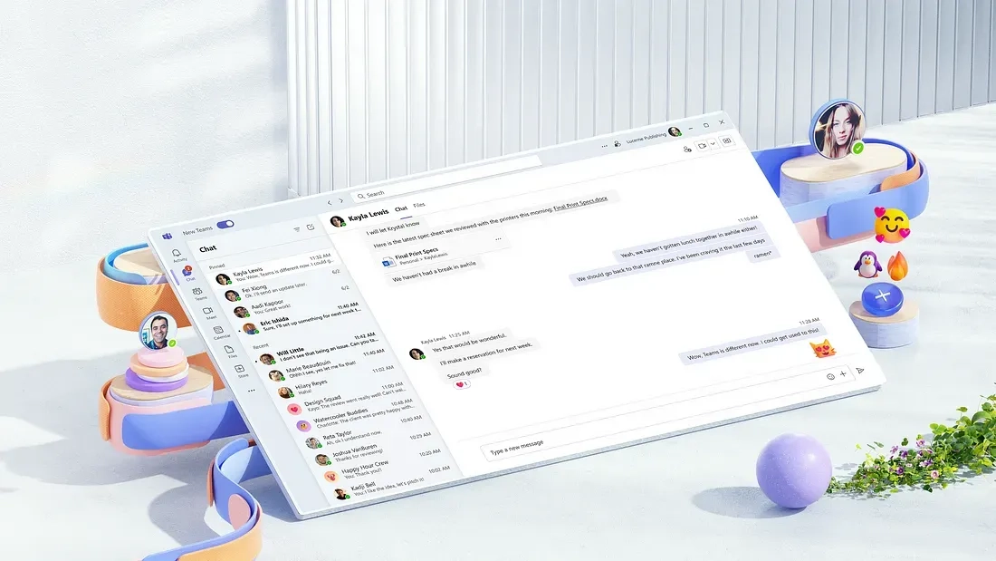
Today marks the debut of the new Microsoft Teams app, released in public preview for Windows customers. As one of our most customer and design-driven releases ever, it’s crafted from the ground up to be faster, simpler, and more flexible. It also reflects a multi-disciplinary journey of customer understanding — from redesigning channels and simplifying chats, to leveraging motion design and enhancing personalization options. Everything currently on view is the result of deep collaboration and iteration. While most features detailed here will be available this June, others will roll out between then and the end of the year.
Product-making is often a dance between responsive and proactive decisions. Responsively, we want to understand and address customer feedback. Proactively, we want to explore new territory and dream up future visions. To find the right balance, it’s important to embrace something rarely valued in today’s fast-paced world of product development: self-reflection. For Microsoft Teams, the app had such a meteoric rise since its 2017 launch that when envisioning its next chapter, it seemed vital to first look back. Essentially, did we get it all right the first time?
That question kickstarted ongoing conversations between PMs, design, research, and engineering. It prompted us to rethink foundational pieces like Teams channels, explore how to fully adopt Fluent Design System, and consider how to boost performance — a known customer pain point. We listened carefully to customer feedback, taking time to digest research insights to help us assess and validate blockers. And, driven by the conviction that people are inherently delightful, we wanted to iterate on new ways for people to personalize experiences, together.
It was only by dialing into what people were saying that we could affect meaningful change, which is what we hope you’ll see in our latest design. The public preview is currently available for Windows. General availability for new Teams on Windows, as well as a preview for Mac, is targeted for later this year. These are our first steps in an ongoing journey. We’re excited to share our work and gather feedback — so that we can continue iterating and rolling out these new features before the end of the year.
Simplified & streamlined
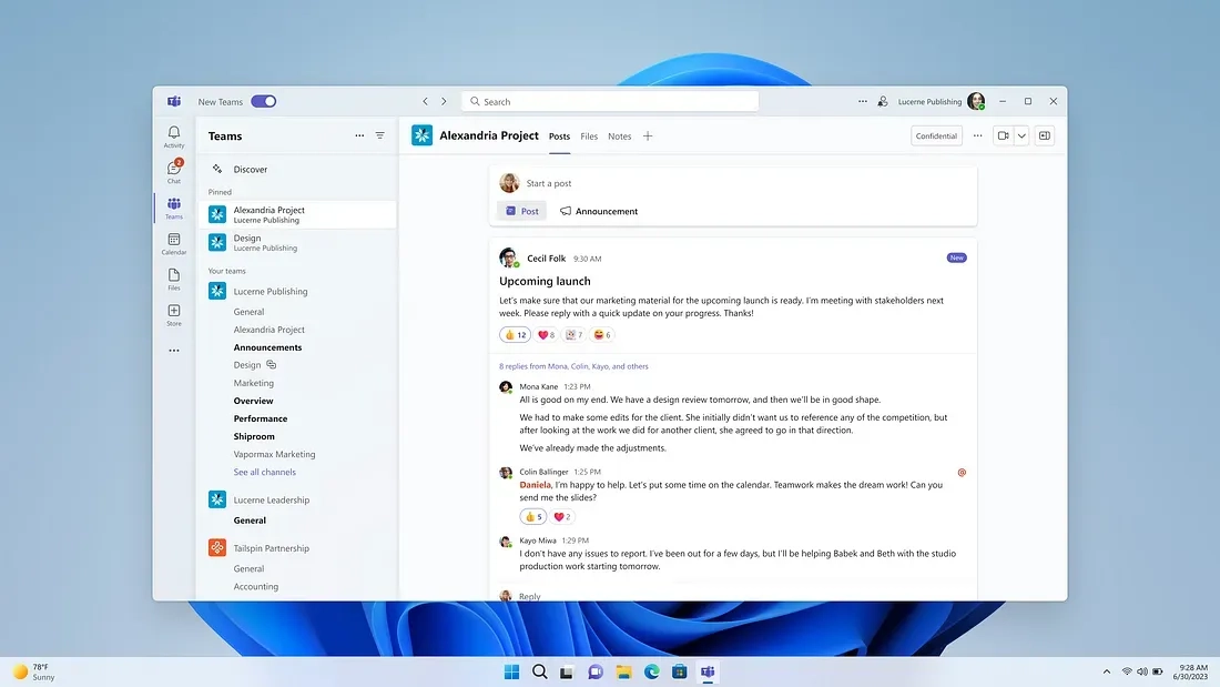
The newly designed channels experience is one of the biggest changes you’ll notice in the preview. A consistent source of customer confusion, many of the challenges people faced when using them were rooted in basic UX problems. Initially, channel posts followed a chat-like model, where new posts and comments came from the bottom-up. Threaded conversations like this were a unique differentiator for Teams. But this is where we needed to be humble and admit mistakes based on feedback. Differentiator or not — the model confused people. It looked like chat, but behaved like threads. In the new Teams, we adopted a more familiar post-and-reply experience, where people send and read new posts from the top. You can also enter threads and enjoy a chat-like experience when you navigate to an @ mention — helping you more easily navigate, communicate, and get up to speed. This view provides better focus and differs from the previous version, which only allowed the loading of ten items at a time, by offering infinite scrolling.
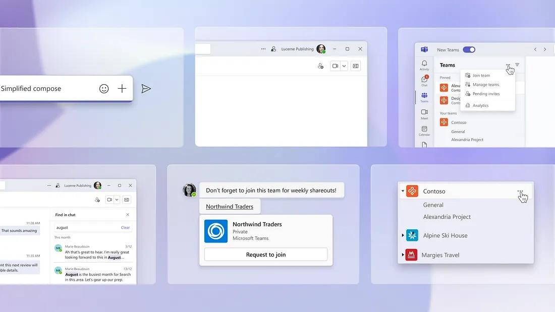
Beyond channels, we further reduced complexity and cognitive load by spending countless hours going screen by screen, moment by moment, surface by surface, to justify whether certain things really deserved to be there. This resulted in streamlined chat headers with fewer buttons and a simplified chat compose that reduces noise to make the feature more purposeful. As designers, we don’t see this as “hiding” features, but as putting them in their rightful place so you can stay in the flow.
To further keep you in the flow, we’ve also leveraged Microsoft Loop. Currently in public preview, Loop is a new app that uses components—portable pieces of content like lists, tables, or notes that sync across apps—to foster fast, dynamic collaboration. Within Teams chats, you can now work directly on a Loop component without ever leaving the app.
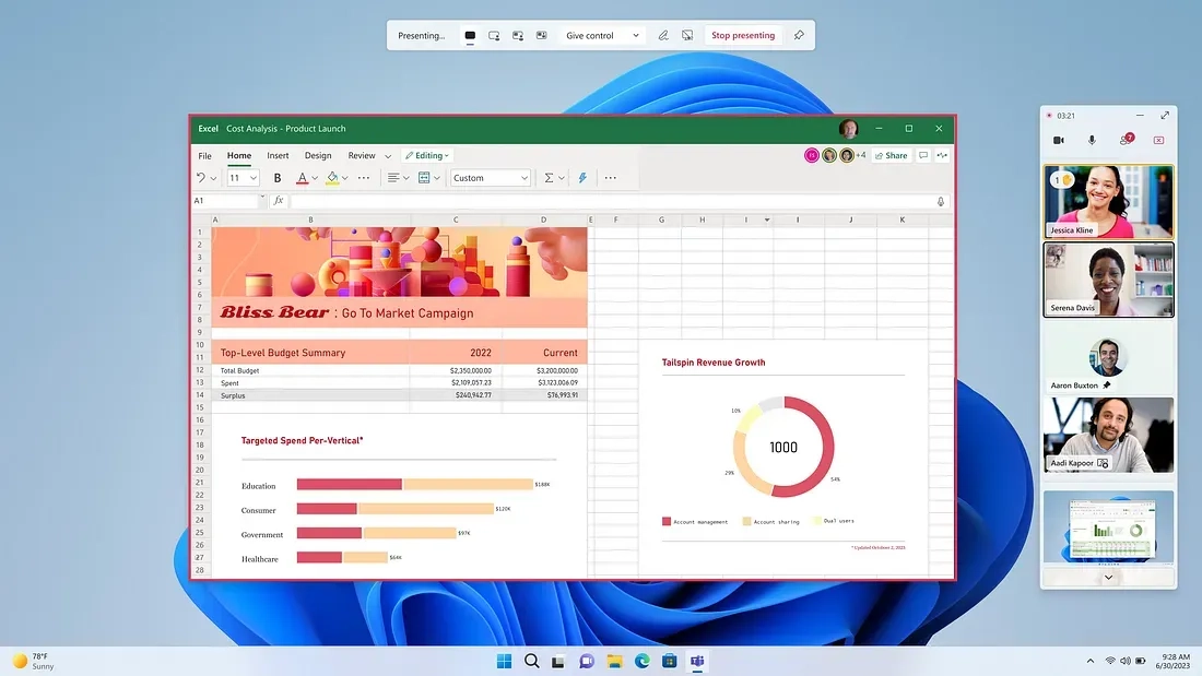
Finally, design enhancements for stage and presenter views (i.e., seeing other participants, raised hands, etc.) help improve meeting experiences. Whereas you couldn’t previously see the participants of a meeting while you were presenting, you’re now able to present and view your audience at the same time — giving you full context and control. Collectively, these changes refresh and redefine Teams to work more fluidly for you whether you’re in an office, at home, on the go, or any place in between.
A fresh new look
As a platform, Teams is a nexus of many apps and experiences with myriad integration points. It’s also a place where people express themselves. From a brand perspective, we wanted to step back and create more room for the experiences that you bring into Teams; your apps, personality, and expressions shouldn’t have to compete with our brand.
For the visual refresh, we chose native materials like Windows 11 Mica, the translucency of which helps Teams better blend into your workspace. On Windows, it now feels like a native Windows app. We also changed the canvas color from grey to white and dialed back the signature purple Teams color to be more purposeful in its use, such as when we want to draw attention to an action. We’re also ensuring that dark mode and high-contrast settings behave commonly across Microsoft 365. Rather than having to manually set this, the new Teams will automatically switch to those based on your system settings.
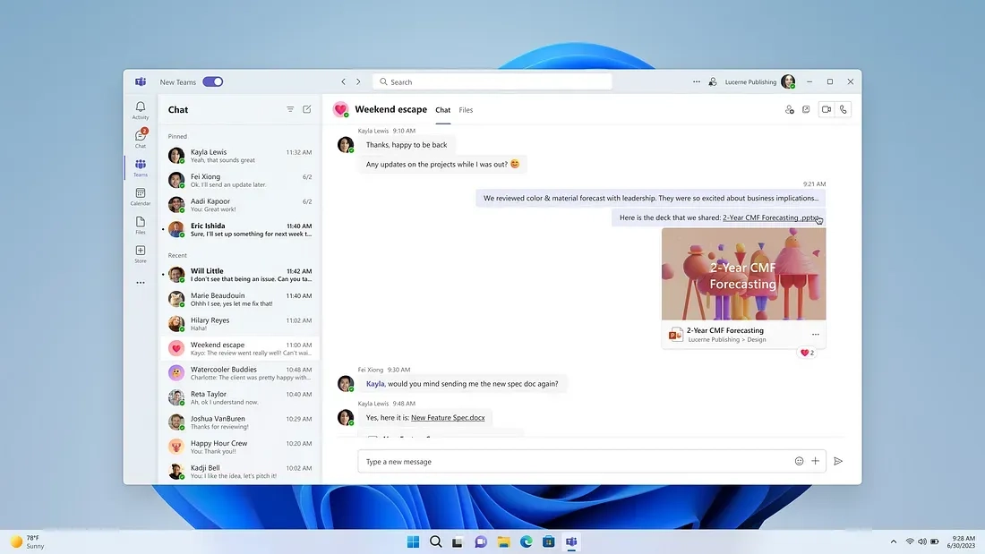
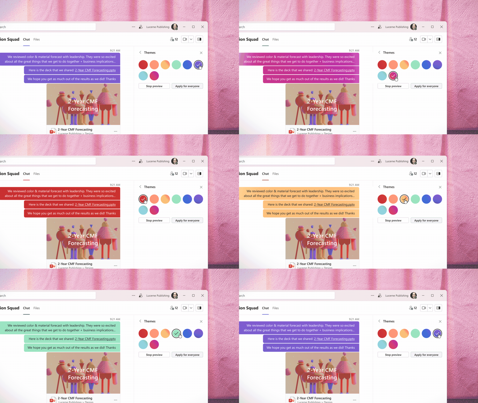
Another visual change you’ll notice is the addition of group profile pictures and group theming, further customizing Teams’ chat experience. As Principal Design Designer Daisy Geng explains, “to help create a sense of personal space within Teams, customers can set a profile picture for their groups in any group chat. They can also set a group to be a particular color theme, rather than just have everything be the default Teams purple. If you’re going through a long chat list, distinct avatars or colors make it easier to navigate and give personality to those groups that you interact with most.”
Motion-designed & Fluent-aligned
Performance improvements kicked this journey off in many ways, given that it was the most consistent and pervasive pain point for customers. But when we dug into the data, the issue wasn’t always the load time itself. Sometimes, it was the experience of the load time that could feel slow or broken. By honing in on the need to improve perceived performance, we were able to leverage motion design to create systemic improvements.
“Motion design isn’t just about fun animations, it’s a powerful tool for providing clarity, guiding customer focus, and aiding in the passage of time. In the context of loading, we use carefully orchestrated animated sequences to speed up our customers’ perception of time by keeping them focused and engaged during the process,” Principal Design Manager Casey Baker remarked. For perceived performance, much rests on the loading sequence itself and we leaned on our motion designers’ ability to orchestrate how UI elements appear.
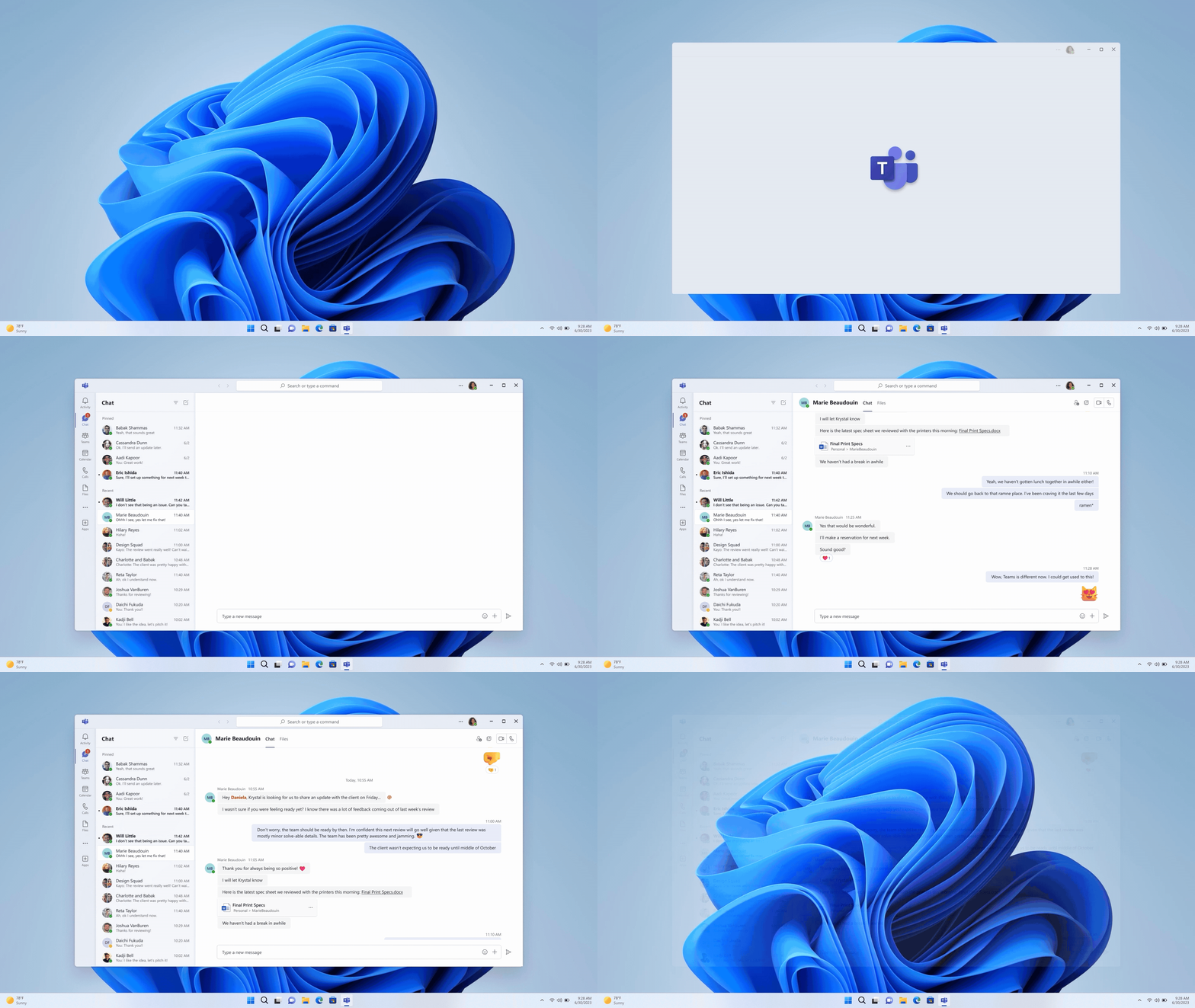
We applied it scenario-by-scenario, view-by-view, and if a loading sequence fell below a certain threshold, it was filed as a bug with the same level of importance as someone being unable to join a meeting or open Teams. That degree of prioritization and cross-disciplinary collaboration led to dramatic improvements in performance — both perceived and real — hallmark characteristics of the new Teams.
Beyond motion design, leveraging Fluent was also key in boosting performance, reducing complexity, and increasing coherence. We steadily re-platformed teams over the course of four years, so it’s now one hundred percent React — a complete end-to-end rewrite that also aligned with the progression of Fluent from Fluent UI React v9 to soon-to-be-released Fluent 2. “Our adoption of Fluent 2 was critical for this version of Teams which provides a range of benefits such as improved performance and accessibility. A robust theming system built with design tokens allows us to seamlessly integrate with other products built using Fluent 2 and enables us to make holistic design-language updates in an efficient and systematic way,” Principal Design Manager Kay Davis expressed.
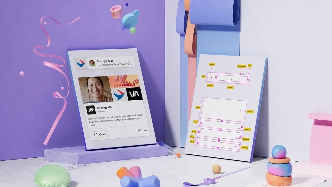
Through this process, we’ve written fourteen major components now integrated into Fluent. We’ve emerged as prominent contributors to the design system and have led the charge in adopting Fluent 2 at Microsoft.
More expressive
Emoji and reactions have always been beloved Teams features and when thinking about their evolution, we came up with new ways to connect the sentiments that are expressed by two or more people — making emoji more collaborative across Microsoft 365. As Principal Designer Sam Cundall said, “Microsoft is about collaboration and coming together, so how can we create better relationships or celebrate relationships between two people, or within a team?” The new Teams will include our “together emoji,” a dynamic form of expression which results in a playful animation when two people high-five each other — the first of many more sentiments to come.
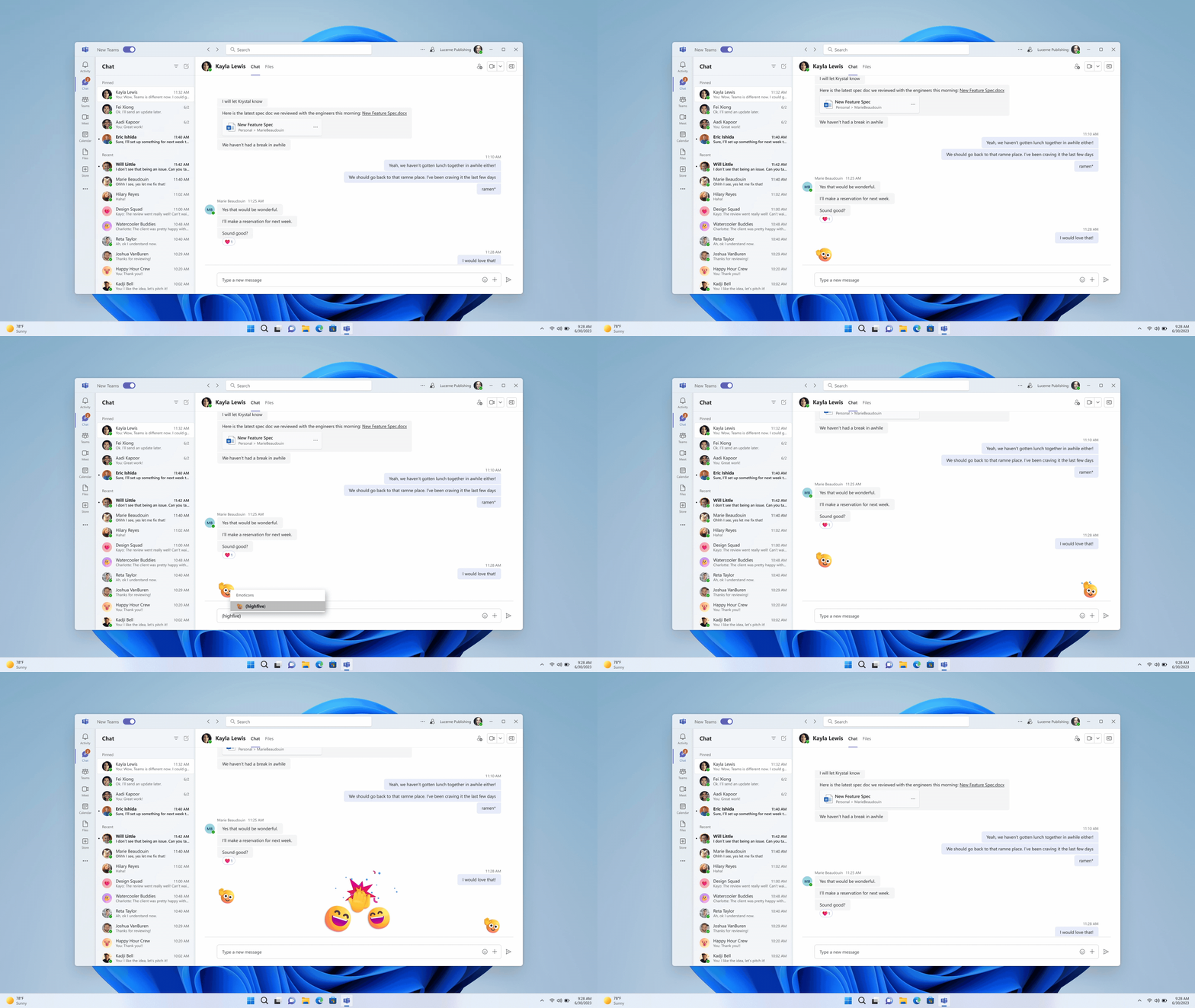
By the end of this year, we’ll also give you more ways to express yourself with new Teams backgrounds purposefully designed with unique customer needs in mind. Grouped into four distinct categories based on research around the emotional states people feel when joining meetings, the new backgrounds will soon give people the ability to express themselves with focused environments, aspirational and imaginary spaces, or out-of-this-world scenes that blend the familiar and surreal.
Designed for you
This iteration of Teams is a celebration of a design journey sparked by reflection — individually as designers and collectively as a multi-disciplinary product team — and sustained by a desire to truly meet human needs. It’s a thoughtful response to clear customer pain points and a creative exploration of new ways to delightfully facilitate human connection and collaboration. As the first step in an ongoing journey, we’re thrilled to share our designs with you today and welcome any and all thoughts in the comments below!
Read more
To stay in the know with Microsoft Design, follow us on Twitter and Instagram, or join our Windows or Office Insider program. And if you are interested in working with us at Microsoft, head over to aka.ms/DesignCareers.
From incubation to impact: Microsoft 365 Companion apps
How scrappy prototypes became polished apps—shipped on the taskbar, grounded in Fluent, and refined by research.
When AI joins the team: Three principles for responsible agent design
A practical guide to build agents that stay differentiated, intent-aligned, and bias-resistant
The new Microsoft 365 Copilot mobile experience
How we redesigned the Microsoft 365 Copilot mobile app to create a workspace built around conversation, dialogue, and discovery.

