


– The estimated reading time is 8 min.
Designing Michelangelus
Inside the making of a contemporary serif font inspired by one of history’s most influential visionaries.
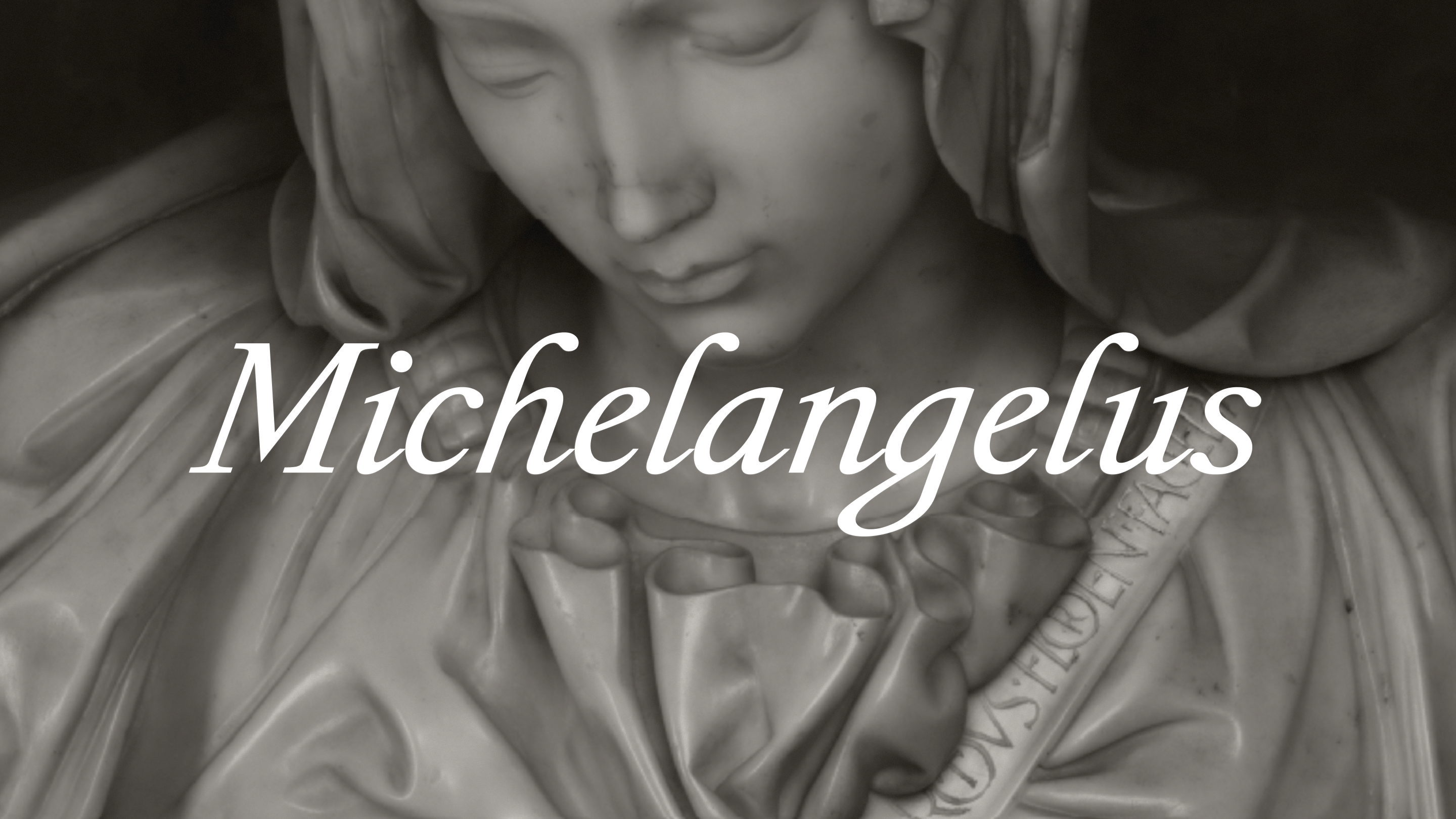
The unsung hero curved out of marble known as David, the awe-inspiring ceiling of the Sistine Chapel, Michelangelo was born in 1475, but his work seems to belong to a world that had not yet been invented. That is why we are proud to announce the release of the new serif font Michelangelus, inspired by the work and handwritten manuscripts of the great Italian Renaissance artist, architect, sculptor, and poet. While the font is now available for download, it will also be distributed to our hundreds of millions of customers through Microsoft 365 applications, including Word, PowerPoint, and Excel at the end of the year.
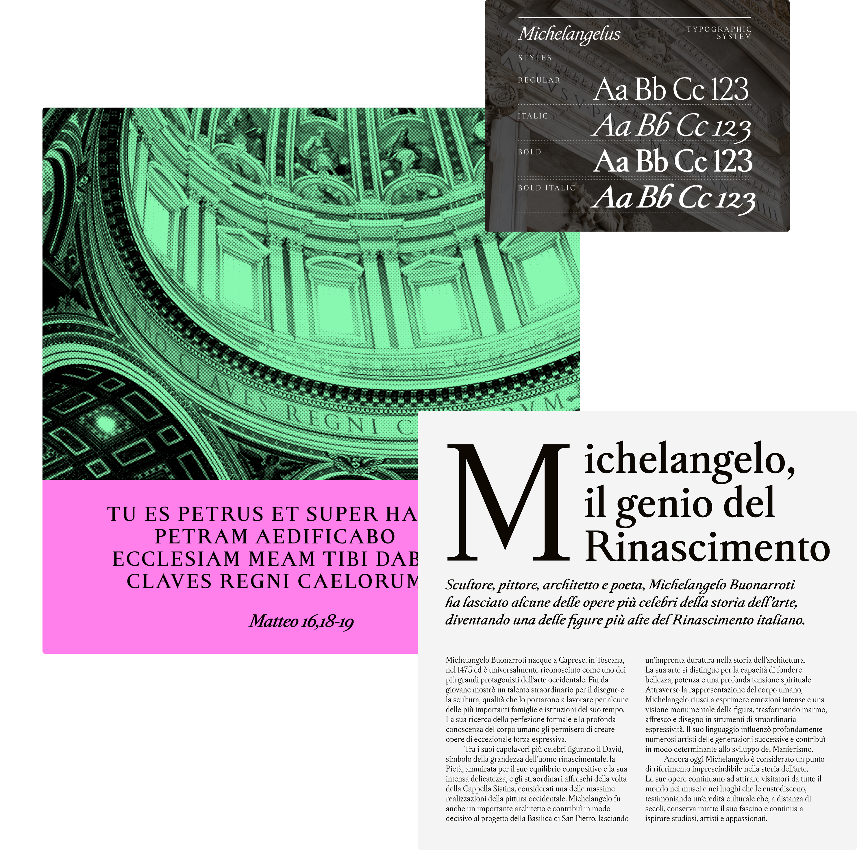
Michelangelus comprises more than 2,000 glyphs across four styles: regular, regular italic, bold, and bold italic. The high-quality font is a versatile typeface that can be used in a wide variety of purposes and contexts.
As the custodians of the manuscripts and artwork from which the typeface derived, the Fabbrica di San Pietro commissioned the font to mark the four hundredth anniversary of the consecration of St. Peter’s Basilica in Vatican City. The church is known for its famous gilded dome, designed by Michelangelo, which has been preserved by the Fabbrica for over five centuries. Although we worked with the Vatican on legal clearances, typographic and technical reviews to ensure that it met our shipping standards, the typeface was crafted by Studiogusto, an independent creative agency hailing from Italy and Germany. At the beginning of their process, their first design principle was to not create a calligraphic font imitating Michelangelo’s handwriting. “Our first decision, probably the most important one, was not to emulate and perfectly imitate Michelangelo’s handwriting,” said Stefano Calandro, founder, co-partner, and creative director of Studiogusto.
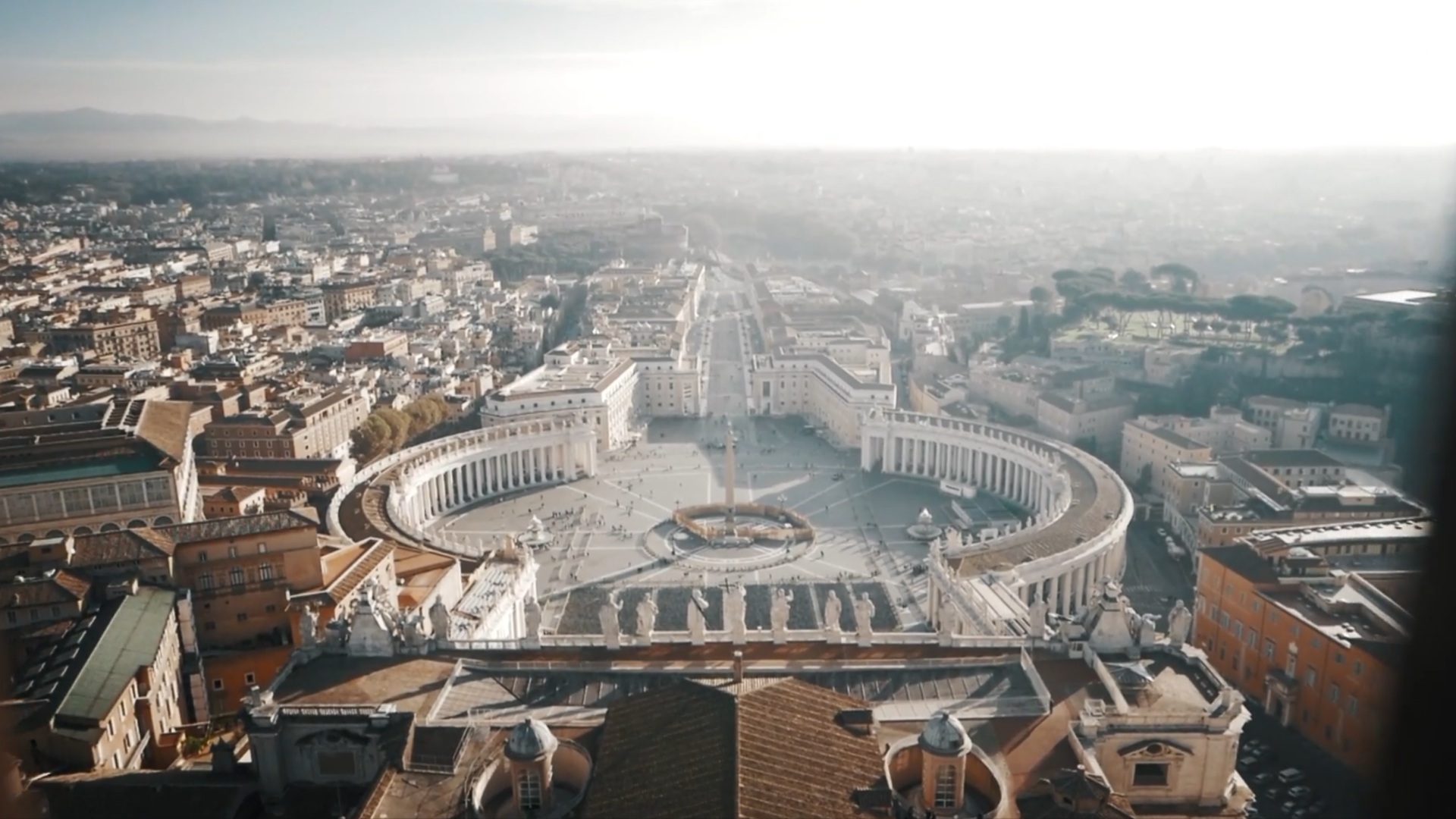
Commissioned by the Fabbrica di San Pietro to commemorate the 400th anniversary of the consecration of St. Peter’s Basilica, Michelangelus is a new font born out of the very church whose iconic dome was designed by the man himself.
Reading the artist’s hand
The principle emerged from reading a letter an elderly Michelangelo wrote to his nephew Lionardo in Florence. After getting frustrated trying to read Lionardo’s illegible letter, Michelangelo threw it in a fire and told his nephew not to write him until he improved his penmanship. From that, Studiogusto found insight into what Michelangelo valued. “The aesthetic side of the characters were super important to the master, but also the accessibility and readability,” said Stefano.
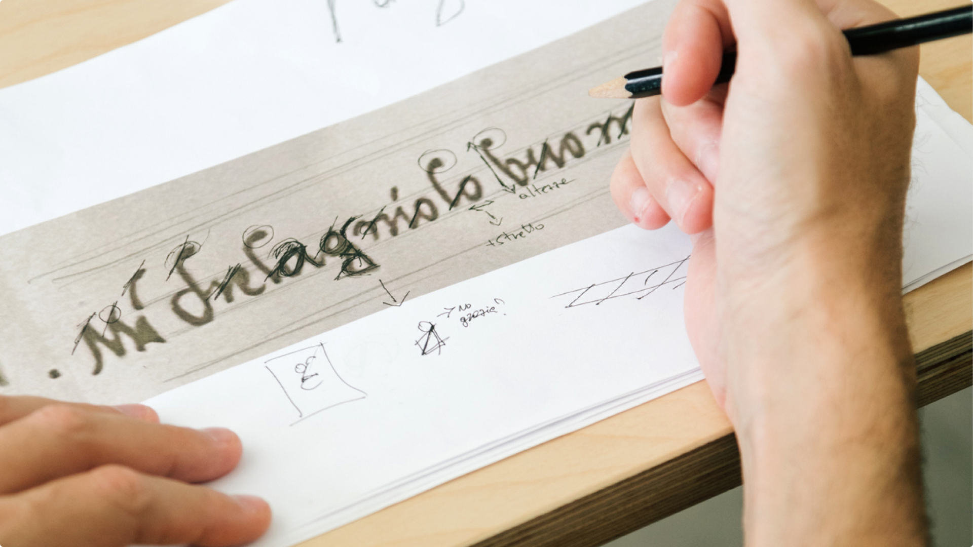
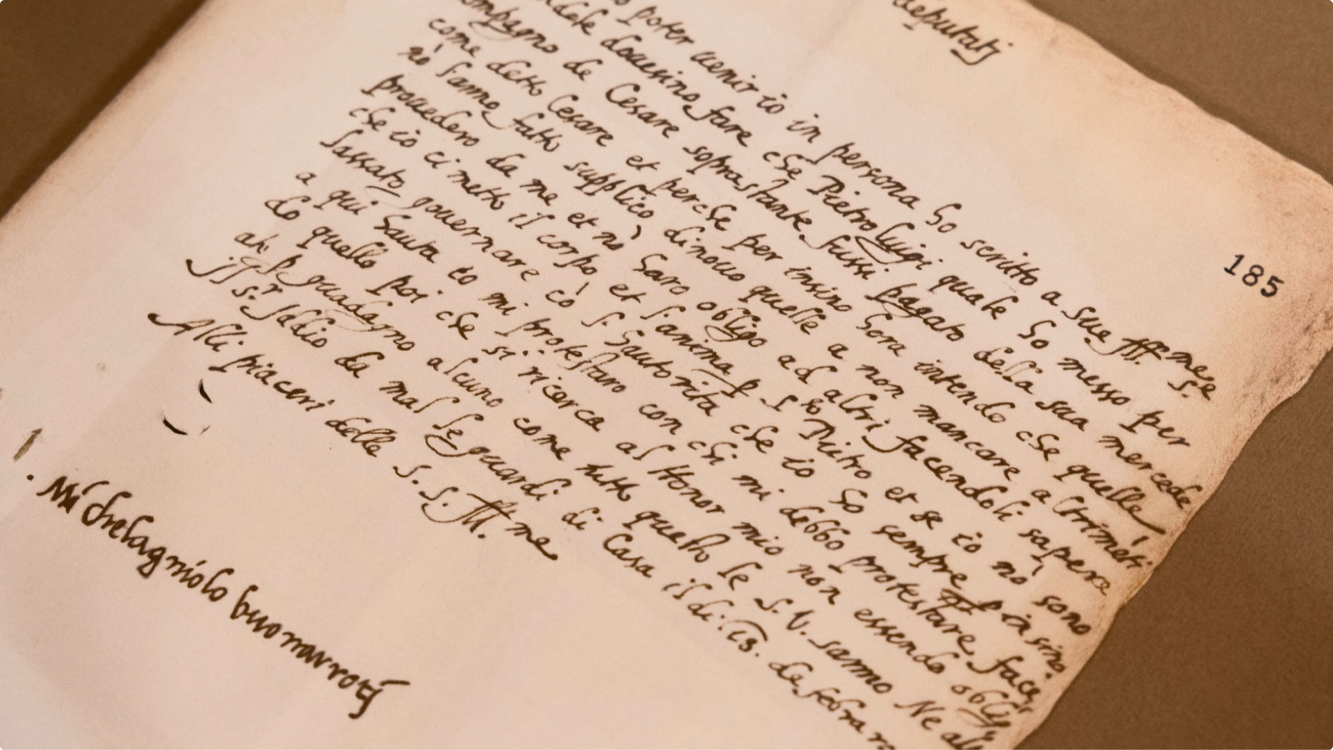
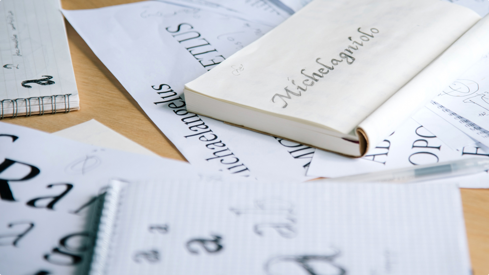
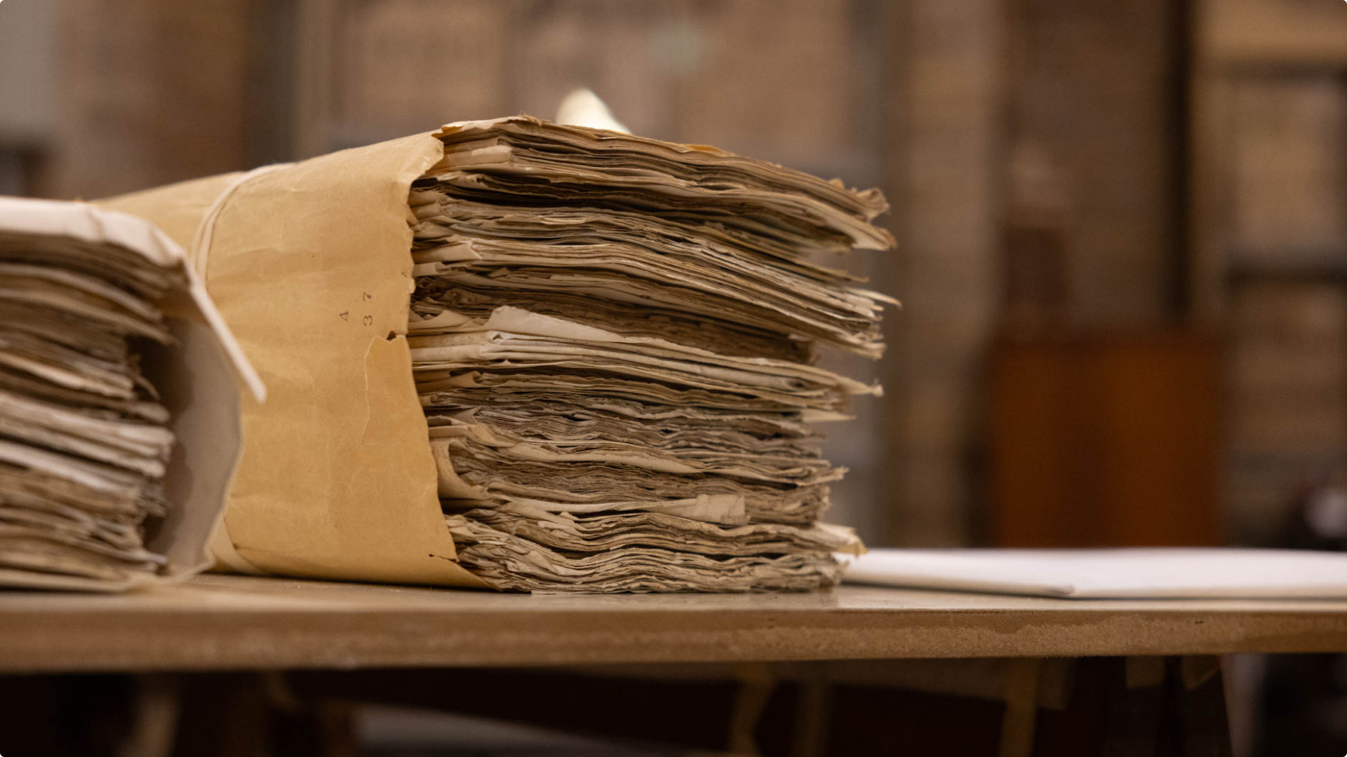
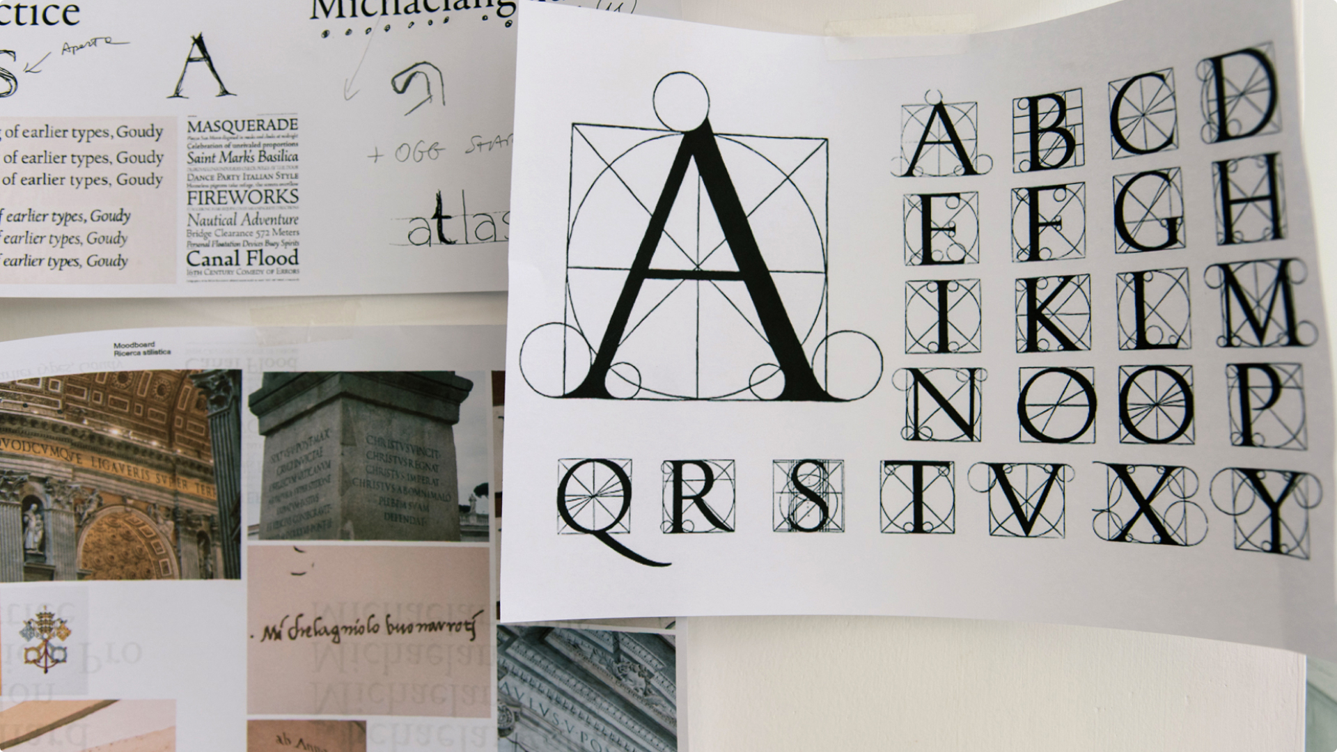
Stefano and his team immersed themselves in Michelangelo’s quill-inked manuscripts. Their objective was to interpret the artist’s writing, but how do you map Michelangelo’s visual logic? How do you synthesize his natural rhythm, harmony, and proportions into a contemporary typography system? “We chose to interpret Michelangelo’s writing in steps. The process started around italics. Usually, you start from the regular version of the font, but in this case, we started from the italic, because in that period, the only way of writing was a specific italic writing system,” said Alessandro Grandinetti, the studio’s project manager.
The aesthetic side of the characters were super important to the master, but also the accessibility and readability.
Italic types, designed by punch-cutter Francesco Griffo, were first introduced by printer Aldus Manutius in as a space-saving type style, its graceful slanted and flowing forms capturing the speed and movement of the written hand.
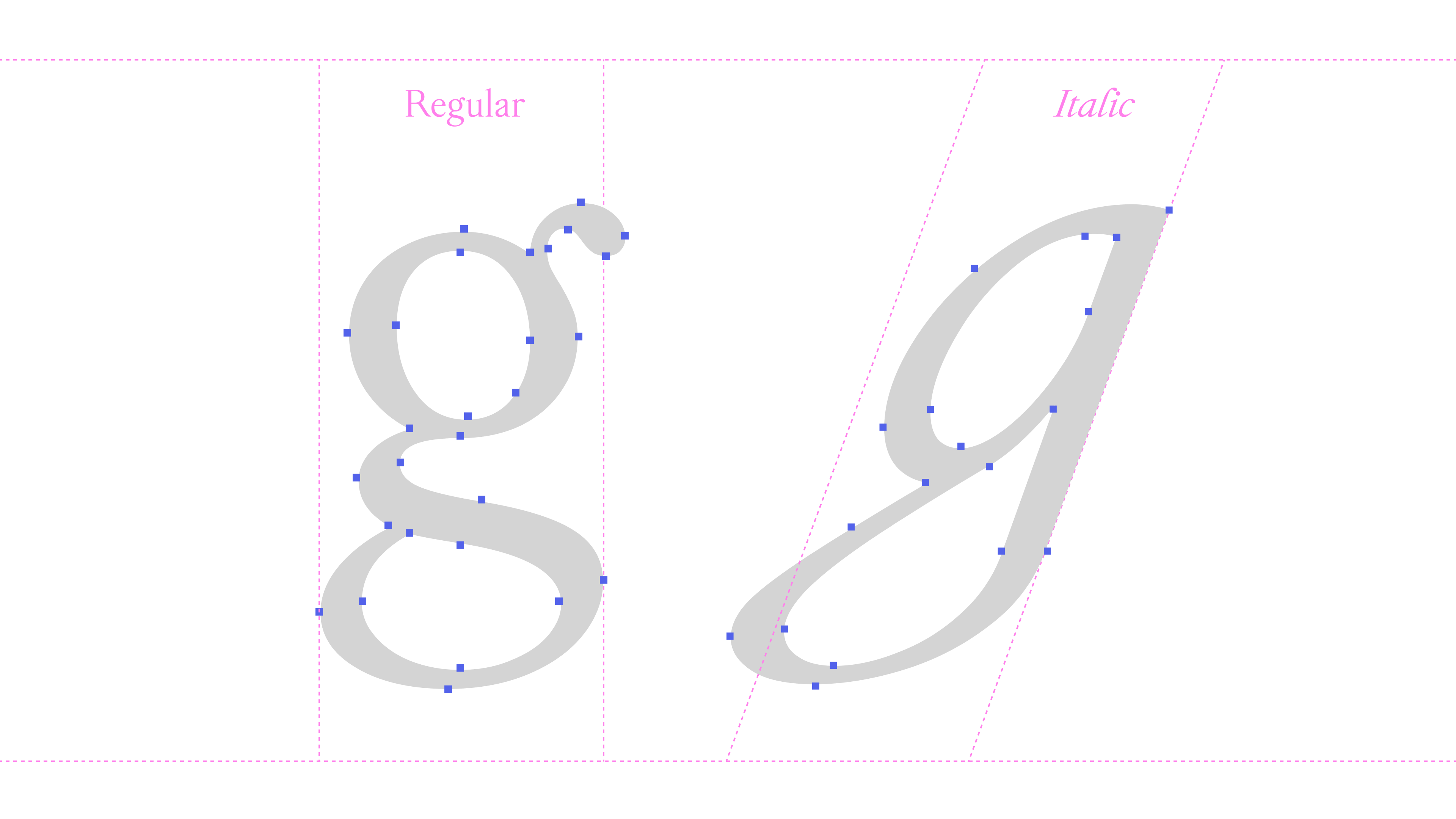
The design initially took shape from Michelangelo’s signature, with the lowercase “g” becoming one of its most important letterforms. Unlike a conventional “g,” its distinctive form carried something specific to the original handwriting. The designers spent a week refining that single character, searching for the balance between preserving its historical character and making it feel contemporary.
Discovering the presence of a hidden order
Michelangelus draws from a Florentine handwriting tradition used by artists and merchants amid the artist’s time. Letters followed a continuous rhythm along a consistent angle. Some of its historical conventions, however, don’t translate naturally to contemporary typography: the modern “j” was not in common use, while the “s” could extend below the baseline. That meant the designers had to design alternative letterforms, and recreate Michelangelo’s unique slanted angle for each letter. “But Michelangelo did something very interesting,” said Alessandra. To elevate the technique and clarity of his writing, he separated his letterforms. Unlike cursive where each character continuously flows from one to another, the artist lifts his hand to isolate each letterform. The effect emphasizes their distinct shape and position in relation to each other, thereby making them readable.
Unlike cursive where each character continuously flows from one to another, the artist lifts his hand to isolate each letterform.
For Studiogusto, this approach created a structured rhythm in the writing, where the intentional spacing and separation helped define the visual order of the text. The structure and repetition of every letter, “was very precise on every letter, every time,” said Alessandra. Above all, “what struck us deeply, was the presence of a hidden order,” said Stefano. There’s an invisible grid to the artist’s writing, revealing his architectural sensibilities. From that, another principle arose that connected Michelangelo’s sixteenth century hand styles to designing modern typography: treat letters like modular elements with clear boundaries, similar to how typefaces are constructed.
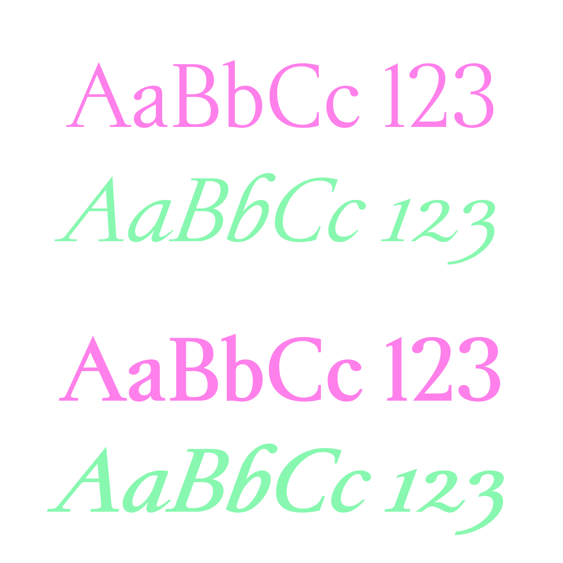
Without stripping the soul from the font, digitally transcribing it meant preserving the dynamic movement of Michelangelo’s proportions and visual harmony. Each letter ending with a coherent gestural flow rather than rigid construction. The influence of quill strokes show in the wide countered contour of the “o” and the ink drop in the “b.” Although the lowercase characters of Michelangelus draw from the artist’s hand styles, the uppercase letters are another story.
Each letter ending with a coherent gestural flow rather than rigid construction.
Carving a new alphabet
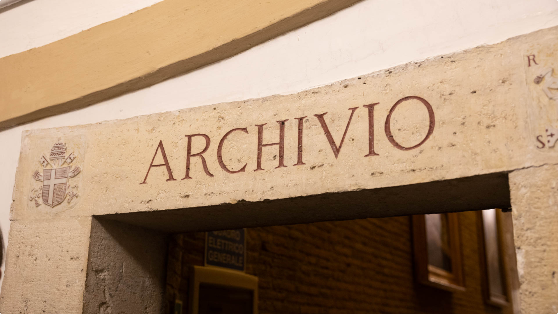
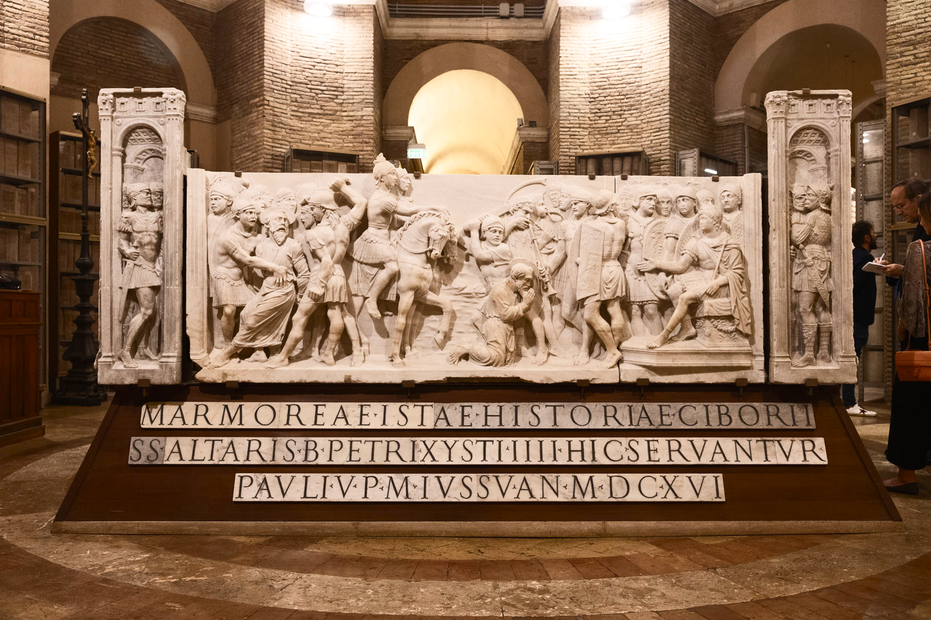
“We didn’t have a complete alphabet or set of numbers from Michelangelo. So we had to imagine how the missing characters might look in a modern typeface,” said Alessandra. The few examples of the artist’s upright characters were monumental inscriptions within an architectural context. The agency went to the Vatican, where they studied inscriptions, sculpture, and architectural details from different periods and mediums of his work, like the Roman capitals carved into the sash of the Pietà, the Latin inscriptions in St Peter’s Basilica, and the Sistine Chapel.
To the agency, their references suggested a narrower proportion that could distinguish Michelangelus from familiar serif traditions such as Garamond while still making it useful for any human that types text. “Technically, it’s not a condensed typeface,” Stefano said, “but you can feel there’s something condensed.”
The geometry of stone
Since the artist’s period was closely tied to carving practices, where shapes and proportions had to remain legible in stone, it influenced the contrast, angles, and tension within strokes, such as the interplay between wide billowing internal curves contrasting rigid diagonal or vertical structures. Letters like “B,” “D,” and “E” were designed as constructions with internal spatial pressure to reinforce their sculptural character.
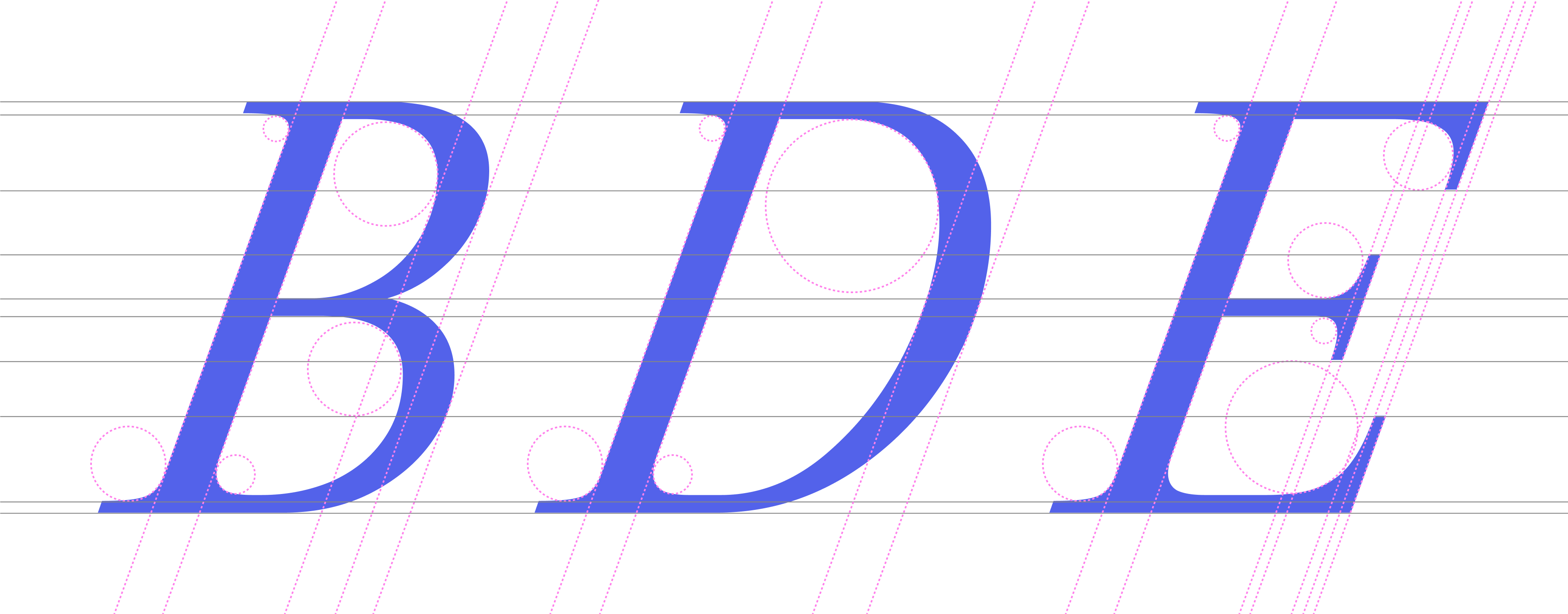
The uppercase design language combines Michelangelo’s expression and architecture. Geometric shapes slide into slopes. Carved thick strokes contrast their thin brethren. “T’s” crossbar is like the wings of an albatross in midflight. The “v” in the vertex of the “N” cuts through the baseline, and the vertex of “K’s” arm and leg just barely tap their vertical stem. What unites them is their matching gestures and specific finials at the end.
Michelangelus is a humanist serif font inspired by one of the greatest artist and architects in human history. We are humbled and hyped to offer this accessible, adaptable, and elegant font to our customers. Designed to bring Michelangelo’s distinctive voice and dimension into everyday communication, the typeface is equally at home in the everyday and the monumental. Look for Michelangelo in your favorite Microsoft 365 app coming at the end of the year. Until then, feel free to download and take it for a type.
Please note, the article is not in Michelangelus. Its actually our Segoe Serif with a lesser-known AI age backstory. Look out for that on a screen near you!