Designing dark mode
How we’re crafting Dark Mode experiences across Microsoft 365 that adapt to your daily flow

How we’re crafting Dark Mode experiences across Microsoft 365 that adapt to your daily flow
By Jon Friedman
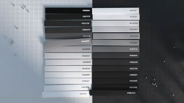
People often think of Dark Mode as a choice between a black or white screen, but this feature involves a wide spectrum of both grayscale and color gradients.
It’s an apt metaphor for why we love Dark Mode: human needs unfold across an equally broad spectrum. Whether you want to reduce eye strain, improve battery life, or it just has aesthetic appeal, Dark Mode exemplifies our ability to craft simple and powerful Microsoft 365 experiences that give you choice and flexibility.
Customer choice was why we first brought a darker UI theme to desktop apps in Office 2010, and we’ve brought it to more Microsoft experiences, like Teams, ever since due to its popularity.
A cross-company design collaboration propels us to seamlessly bring Dark Mode to the broader M365 product suite, and today marks the initial rollout of Dark Mode on Outlook for iOS and Android, as well as Office.com! The upcoming launch of iOS 13 will then extend this rollout to Word, Excel, OneNote, PowerPoint, SharePoint, OneDrive, Planner, and To-Do on mobile.
Designing Dark Mode for Outlook mobile and Office.com
Today’s fast and fluid world constantly blurs the lines between work and life, and we believe in meeting people where they are. Our tools are used to keep up to speed on everything from work communication, to personal events that include friends and family, to changes in shared documents. This often means viewing email, calendars, or files in places where the default white mode may be less suitable, like darkened airplanes, movie theaters, or in bed at night.
Our design research specifically focused on these contexts where folks would want to use Dark Mode, and the response was very positive. While some Dark Mode experiences can be neon or overly bright, people felt that Outlook mobile kept the kind of relaxed feeling you might want in a dimly lit living room or bedroom. They described the experience as comfortable, crisp, clear, and aesthetically pleasing, a nod to how Dark Mode can reduce eye strain.
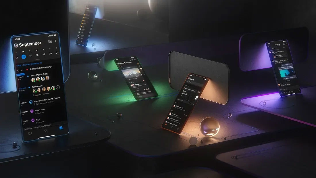
Dark Mode may also save battery life when you’re traveling or on the go for long stretches of time. We’re building in capabilities so following the next round of OS releases on iOS and Android, Outlook will automatically switch to Dark Mode depending on the preference you set. In the meantime, Outlook for Android automatically switches to Dark Mode when you choose Battery Saver. These perks all hold true for Dark Mode on Office.com.
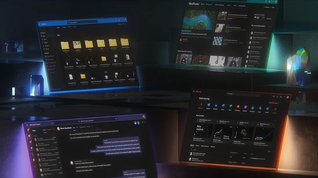
The seamlessness and flexibility that we’re building into Microsoft 365 design systems mirrors our own fluid creative process. We brought designers together from across the company to create a common Dark Mode experience for all our mobile and web apps. The creative energy that came from exchanging ideas and collaborating with new peers was one of the most fun parts of this entire effort.
Starting from the ground up and using the new gray palette for Fluent, our app teams began by aligning to the single palette. This included increasing contrast, brand color saturation, and consistency among details like how and when we use shadows when in Dark Mode.
Future rollout for Dark Mode in Microsoft 365 apps
We’re excited to bring Dark Mode to even more of the Microsoft 365 product suite, starting with additional mobile experiences. Dark Mode comes to Word, Excel, and PowerPoint for mobile with the launch of iOS 13, as well as iPad, where we know many people choose to use those apps. That same launch will also bring Dark Mode to SharePoint, OneDrive, OneNote, Planner, and To-Do on mobile.
There will be more experiences to follow — Dark Mode for all Outlook clients, Planner and OneDrive on web are coming down the pipe — so stay tuned for those rollout dates. Meanwhile, we’d love to hear your thoughts and feedback in the comments below!
Read more
To stay in the know with Microsoft Design, follow us on Twitter and Instagram, or join our Windows or Office Insider program. And if you are interested in working with us at Microsoft, head over to aka.ms/DesignCareers.

Design isn’t dying. It’s shifting left.
When the model is the new medium, shaping how it behaves in humanistic ways is design
From incubation to impact: Microsoft 365 Companion apps
How scrappy prototypes became polished apps—shipped on the taskbar, grounded in Fluent, and refined by research.
When AI joins the team: Three principles for responsible agent design
A practical guide to build agents that stay differentiated, intent-aligned, and bias-resistant
