Craft – Design Thinking, UX/UI
Creation at cloud scale
How we streamlined resource creation in Microsoft Azure to improve usability, consistency, and accessibility
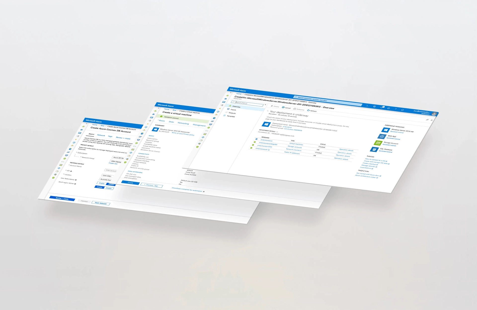
Microsoft Azure’s audience is broad and diverse, ranging from large organizations to hobbyists and students. Most customers use the Azure portal to acquire, manage, and monitor their services. Our challenge was to improve the resource creation processes, like creating a virtual machine instance, for hundreds of products impacting millions of customers.
During setup and initial configuration in Azure, customers decide what service they want to acquire and provide information to set up an instance of that service. Our team recently designed and released a new set of experiences and design patterns to simplify this task, reduce the learning curve, and improve usability.
Key improvements include:
- Improved information architecture and hierarchy, reducing cognitive load and learning curve
- Consistent content design to support the customer’s learning journey
- Differentiated paths for beginner and advanced users that enable complex or quick creation
- Increased sense of control during the setup process through contextual validation and confirmation
- Consistent workflow across products so customers can learn once and apply that knowledge across the platform
- Simplified overall experience to drive efficiency
The updates described in this article resulted in a 20 percent reduction of time on task and 15 percent increase in completion rates for virtual machine setup.
Our goal: Simple and consistent creation of cloud services
Given the breadth of the Microsoft cloud offering, we found that different resource types had different user experiences and different levels of complexity. We realized both a variety of different patterns for the same task and a lack of consistency in basic behaviors.
Solving these problems meant rethinking how we guide users through resource setup in the cloud. We wanted to provide a consistent set of interaction patterns and UX artifacts to delight our millions of customers and enable sustainable growth for a constantly evolving platform.
Data-driven design process
Resource creation is a high-impact user experience flow, so before making these changes we strove to fully validate them with our customers. We used multiple techniques and cohorts to ensure that we received feedback from groups as diverse as our audience. We ran usability and focus groups with industry customers at trade shows, visited universities, consulted with expert advisers, and offered this experience for several weeks internally before exposing it to the world. This combination of qualitative and quantitative feedback cycles provided a 360-degree view of the process and drove the right combination of updates for our customers and the business.
Improved information hierarchy
Our first initiative was designing a clear information architecture that accommodates different levels of complexity while capturing essential aspects of the platform in a consistent way.
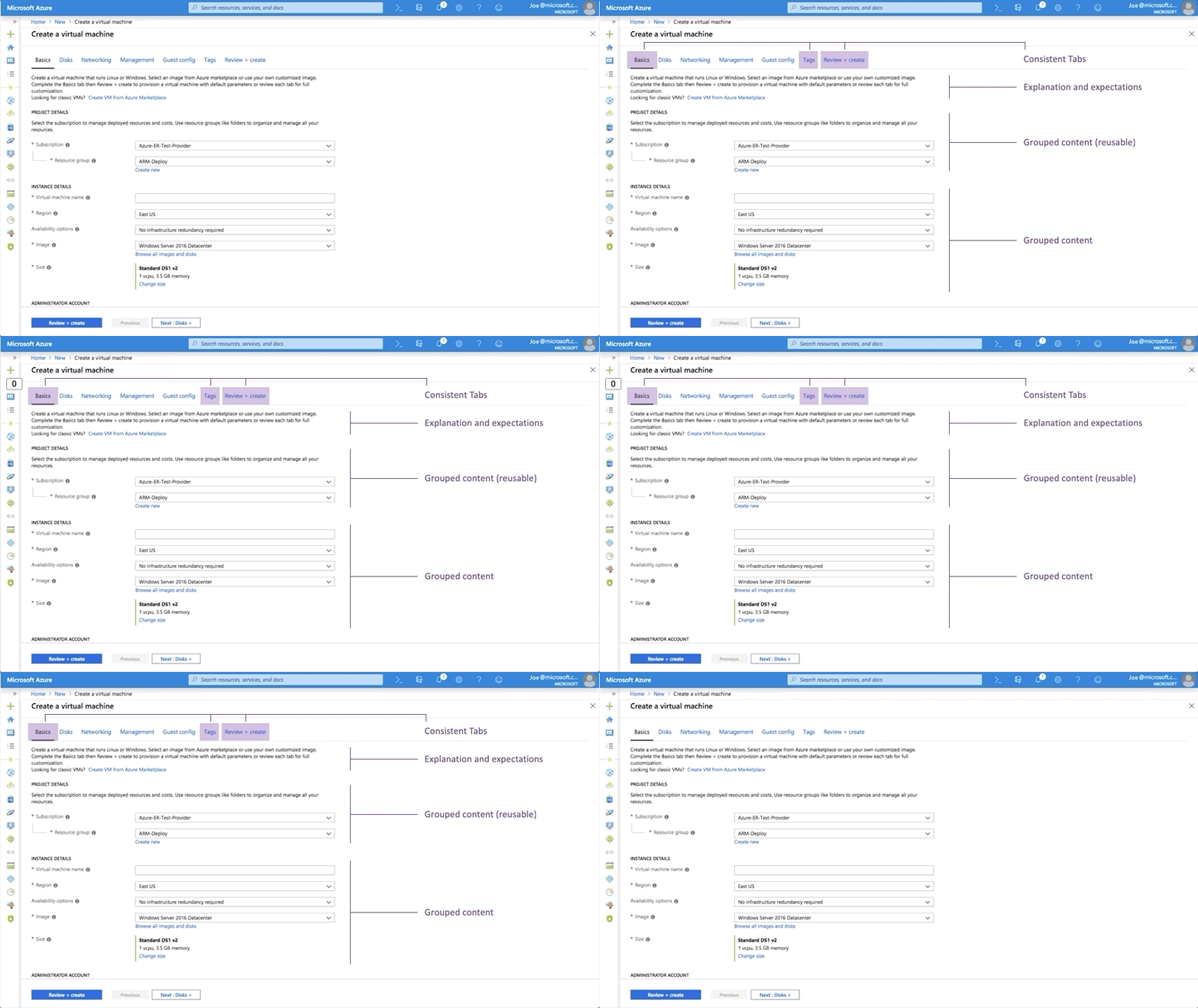
We introduced tabs at the top of the creation screen to clearly indicate the steps required to create a resource. We established a standard set of steps that are included in every setup process and displayed in the same the same location:
- Basics captures all the minimal required information to create the resource
- Tags allows users to add metadata for the resource
- Review + create summarizes the resource before completing the operation and starting deployment
The simplest creation and setup experiences only have these three tabs, while more complex experiences can add more. Customers can also navigate between tabs in any order to explore the flow.
Grouping simplifies the input process. All fields are distributed in groups that honor Miller’s Law (the magical number seven, plus or minus two), making them understandable at a glance.
The first group in the Basics tab, “Project Details,” only includes information about where the customer wants to store the resource in Azure. This grouping responds to years of customer feedback about the challenges of this part of resource creation.
We’ve also focused on providing the right content in the right places. Text at the top of every tab explains the step and links to documentation where customers can learn more. Our content strategy ensures this text is consistent in voice, tone, and placement.
Just-enough data entry
After a user completes the fields in the Basics tab, the resource instance is ready to create. We call this Quick Create, available for all resource types.
The image below shows how to fully configure a new virtual machine in less than one minute!
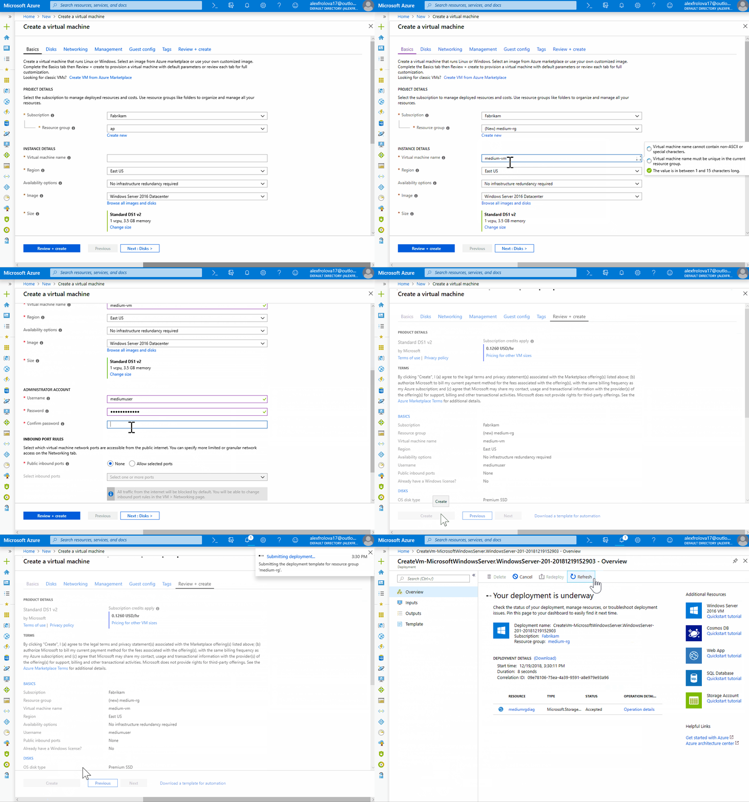
Customers who want more control can go through all the tabs to learn and configure the detailed options for a resource. Tinkerers and new users appreciate the seeing the details and learning about available features, while more experienced users often use Quick create.
Transparency and confidence
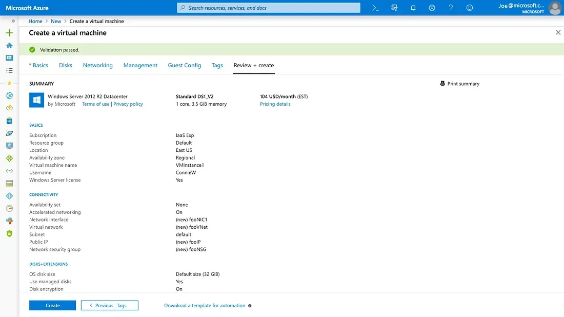
Resource creation is a complex task, but confidence in configuration decisions and clarity for billing purposes are key to customer satisfaction. Our Review + create tab shows the following information:
- Summary of the customer’s decisions
- Cost of the resource
- Validation errors when appropriate
- Link to download the Azure Resource Manager template for the resource to provide transparency about what the system is doing or to automate the creation process
- Call to action to start the deployment
The image below shows the Review + create tab:
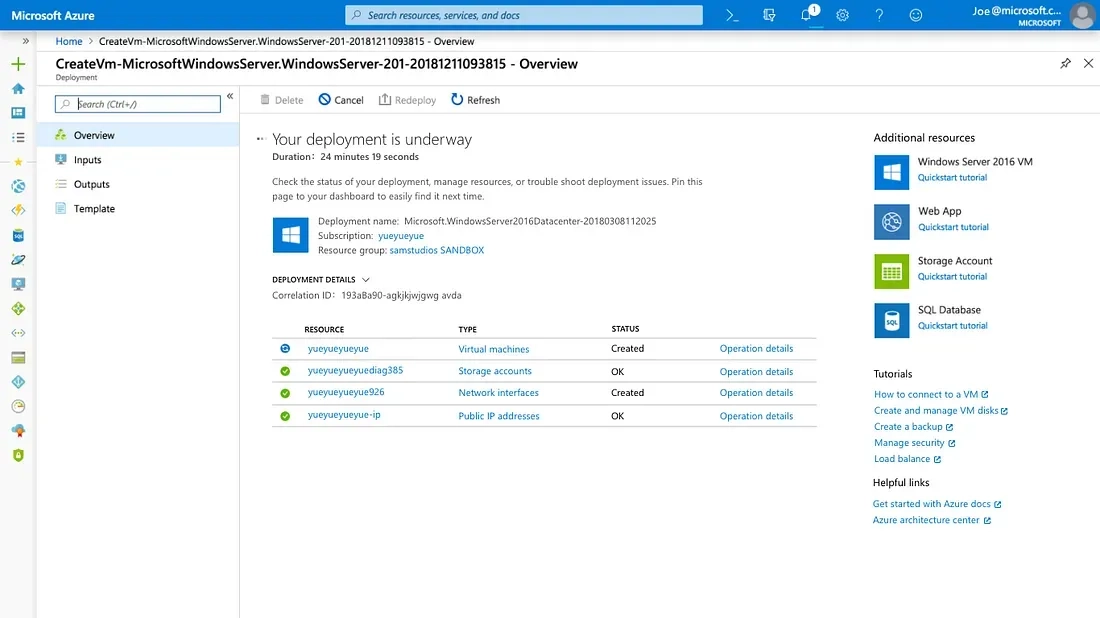
We also designed a post-creation experience that connects the creation workflow to finalized resources, showing near real-time details of the operations the system executes. This screen provides a consistent experience for tracking and troubleshooting all resource types.
Consistent resource creation: learn one, use all!
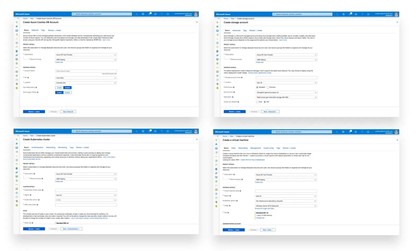
We have applied these patterns to multiple resource types across the platform, resulting in highly consistent experiences that enable our customers to develop expertise. Customers learn patterns when creating one resource and can apply those patterns to any other resource type.
Final thoughts
We are working to extend these patterns to the entire Azure platform. We look forward to hearing your thoughts in the comments below and hope you enjoy the updated experience as much as we enjoyed building it.
Read more
To stay in the know with Microsoft Design, follow us on Twitter and Instagram, or join our Windows or Office Insider program. And if you are interested in working with us at Microsoft, head over to aka.ms/DesignCareers.

Outcomes over output: Designing shared cognition
How we are shaping systems that help people think better, not just type faster.
We can all be friends: Times New Roman vs Calibri
Explore how typography decisions really affect readability, accessibility, and brand expression.
Designing loops, not paths
How cybernetic loops are helping us turn “human in the loop” from a catchphrase into a design practice
