
Craft – Typography, Design Thinking, Brand
Comic Sans and the art of imperfection
Comic Sans is the font that refuses to die. It’s been dragged, mocked, and meme-ified since the moment it became a household name. It’s been labeled childish, lazy, and unprofessional. Designers love to hate it. And yet, here we are, decades later, still talking about it. Comic Sans is still showing up in emails, on signs, in classrooms, and in protest posters. It’s survived countless waves of design trends and the court of public opinion. In a world obsessed with perfection, Comic Sans seems untouchable. Why? Because it’s fun. Because it’s flawed. Because it’s human.

Perfectly Imperfect by Design
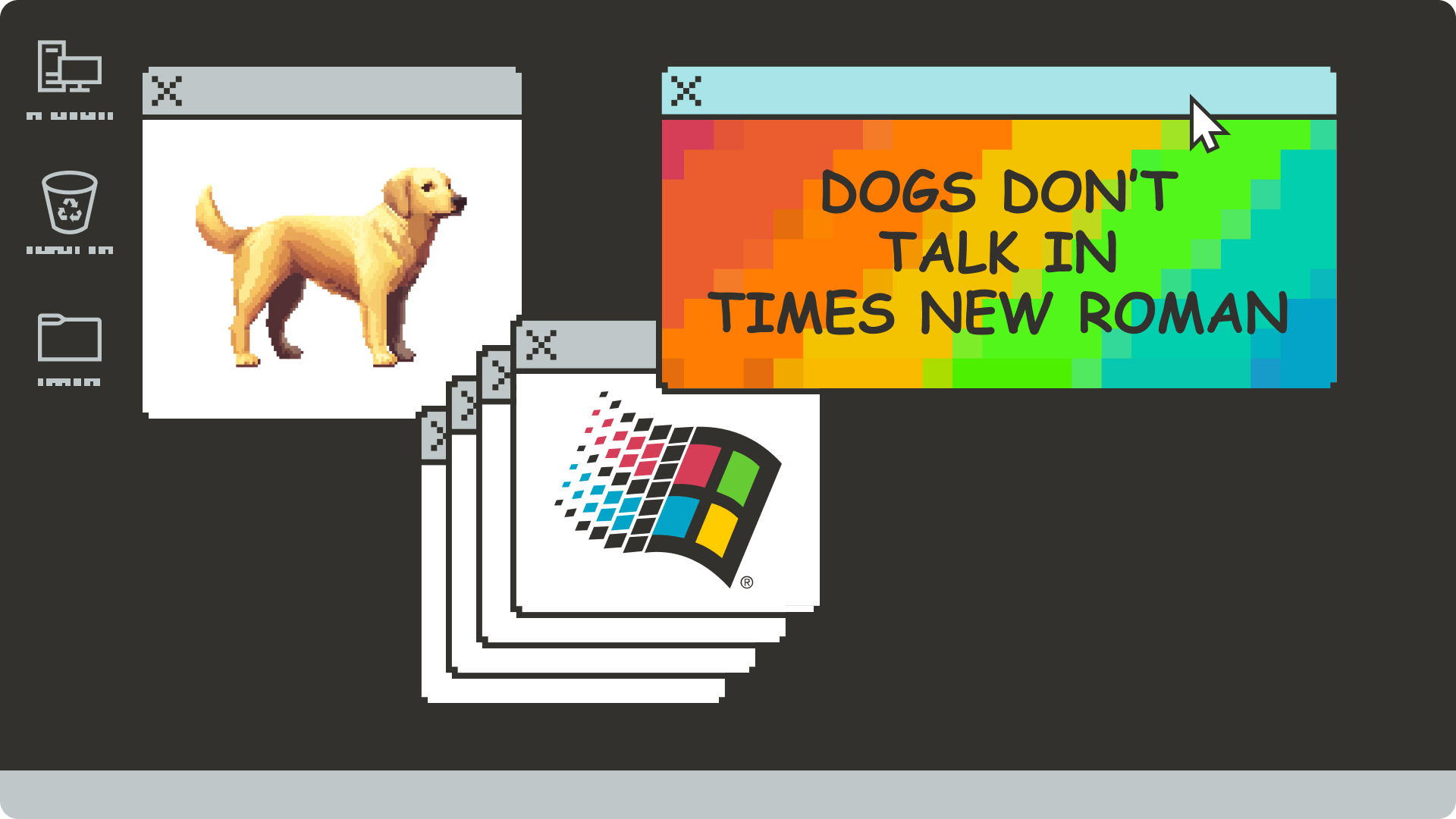
Comic Sans wasn’t supposed to be a revolution. It was created in 1994 by Vinnie Connare after seeing Times New Roman used in a speech bubble for Rover the dog in Microsoft Bob. Dogs don’t talk in Times New Roman, he thought. So he set out to design something casual, friendly, and hand-drawn. Something imperfect. Something human.
And that’s exactly why it worked.
At a time when digital interfaces were cold and text was rigid, Comic Sans offered warmth and approachability. It didn’t look like machine-made typography. It looked like someone picked up a marker and started writing. For a generation new to computers and the web, that mattered. It made technology feel less intimidating, more like home.
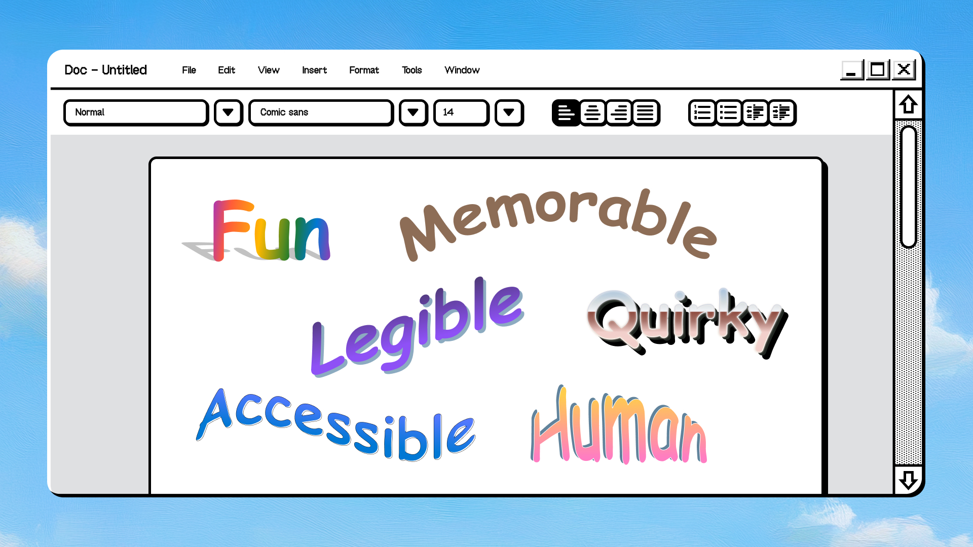
But there’s more to its success than just a friendly vibe. Comic Sans is intentionally designed with generous letter spacing and irregular shapes that make each character stand out. The result? It’s highly legible, even at small sizes and on low-resolution screens—exactly the kind we used in the ’90s.
This clarity makes it popular in classrooms, where young readers are still developing their literacy skills. The playful, informal letterforms mimic handwriting, helping children make the connection between printed letters and their own writing practice. It’s less intimidating than more formal typefaces and invites learning through play.
In short, Comic Sans does what good design should do: it works for people. And often, the people it works for aren’t the ones who care about design awards or critical acclaim. They’re kids learning to read. They’re people who need clarity over beauty. They’re users who just want to be understood.
An Important Chapter in Microsoft History
Comic Sans represents a pivotal moment in the story of Microsoft and personal computing. It arrived during a time of enormous change, when computers were shifting from tools for experts into everyday household objects. Windows 95 was poised to transform the personal computing experience, and with it came an explosion of new software, new design languages, and new ways of interacting with technology.
Tucked inside that revolution was Comic Sans: a font that refused to take itself too seriously. It was an early signal that computers could be fun, that the interface could smile back. It lived in the margins of the digital experience—in playful emails, in casual presentations, in the spaces where formal fonts felt stiff and out of place.
Comic Sans also arrived alongside the advent of web-safe fonts and early Internet Explorer, embedding itself in the DNA of the early internet. Back then, the web wasn’t sleek or standardized. It was messy, experimental, and joyfully weird. Comic Sans fit right in, and in many ways, it symbolizes that era of playful, democratized technology. Anyone could make a website. Anyone could use Comic Sans.

The Future Doesn’t Need to Be Flawless
As we march toward Artificial General Intelligence—machines that can do anything a human can—we’re obsessed with optimization and perfection. Clean lines. Flawless code. Infinite scale. But perfection doesn’t equal connection.
The things we love most about human-made art and design aren’t the flawless parts. They’re the quirks. The wobble in a line. The imperfection of a hand-drawn letter. The unexpected choices that spark delight or confusion or debate. Comic Sans has all of that. It’s imperfect, a little awkward, and unapologetically casual. And that’s why it stuck.
AGI might generate a million beautiful, hyper-efficient typefaces. But will they have the staying power of a font we collectively love to hate? Will they make us feel something beyond “well, that looks nice”? Perfection rarely does.
And now, after years of minimalist branding and sans-serif sameness, designers are rediscovering fun. Maximalism is back. Weird is back. Hand-drawn is back. And Comic Sans? It never left.
It’s the ultimate example of playful design, and its endurance proves that fun outlasts fashion. It speaks to something we crave in a world of slick surfaces and seamless experiences: authenticity. Even when we laugh at Comic Sans, we can’t ignore it. It refuses to blend in.
Flaws Make Legends
Comic Sans embodies the messiness of mass appeal. It was designed for everyone, not just designers. It became folk typography—taken up by the masses, used without permission or rules, sometimes badly, but always with enthusiasm. And that’s why it’s still here.
The lesson of Comic Sans is that what endures isn’t always what’s perfect. It’s what’s approachable, what’s memorable, what’s fun. It’s the thing that makes us smile (or groan) and keeps us coming back.
We might one day build an AGI that surpasses human intelligence. It might design more elegantly than we ever could. But it won’t be human. And it might never understand why Comic Sans, in all its goofy, derided glory, is still here. Maybe it’s our flaws that leave a lasting mark.
Comic Sans: the font that won’t fade quietly into history. And maybe that’s the most human thing of all.
Read more
To stay in the know with Microsoft Design, follow us on Twitter and Instagram, or join our Windows or Office Insider program. And if you are interested in working with us at Microsoft, head over to aka.ms/DesignCareers.

Outcomes over output: Designing shared cognition
How we are shaping systems that help people think better, not just type faster.
We can all be friends: Times New Roman vs Calibri
Explore how typography decisions really affect readability, accessibility, and brand expression.
Designing loops, not paths
How cybernetic loops are helping us turn “human in the loop” from a catchphrase into a design practice