Craft – Typography, Content Design
Behind the design: A deep dive into Aptos
Journey through the design process for our new default font
“Reading is a magical technology, the closest humans have come so far to inventing telepathy,” wrote the late great Bill Hill. He was one of the inventors of Microsoft’s ClearTypefont display technology and the former Director of Microsoft Advanced Reading Technologies. Hill said that by scratching marks on a shredded tree and using symbols to represent sounds, meanings, and ideas, we communicate across time and space. We share our thoughts with others who may never meet us. Those scratched marks, known as writing systems, are expressions of culture, identity, and creativity. They reflect our values and aesthetics.
When we decided to replace our default font, we knew taking all of this into account was vital. Like Calibri, the new default font would be our customers voice, brand, and personality, unless of course they chose one of the hundreds of other options we provide. Thats why we had to include you on our journey to find the right typeface. Out of the five font candidates, you choose the font now known as Aptos. But why? How did this humanist typeface disguised as a grotesque font capture the essence of our customers? And what about its companion serif and monospace fonts? This is a deep dive into the design of Aptos and how it came to be.
Co-creating typefaces
To pick the right typeface, we commissioned five leading typeface designers to develop five candidate font families, added all five as font options in some of our core Microsoft 365 apps like Word, PowerPoint, and Outlook, and let organic customer feedback choose the right direction. The goal for all five font candidates was to create a new original sans serif typeface family for body text, with six styles: regular, italic, bold, bold italic, display, and display italic. Each font would also need a companion serif family and monospace family to complement the sans.
A duel of typefaces: Sans serif vs. serif
The presence or absence of serifs is only one way to characterize typefaces, but it’s a common sorting system: is the typeface serif or sans?
Sans serif typefaces were first introduced in the early 19th century, when an explosion of popular advertising called for new forms of type that would draw attention to a poster or placard and stand out from the crowd of competing advertisements. They began to be called grotesque (or sometimes gothic) to distinguish them from the serif typefaces that had been the standard up to that point, and from some of the other new styles for advertising such as slab serif and fat face.
Serif typefaces themselves had undergone a great mutation over the course of 300 years, from the letters we now call “old style,” whose forms echoed the handwriting of Renaissance scribes, to the neoclassical typefaces, such as Didot and Bodoni, with their more severe, rigid, constructed appearance.
The first sans serif typefaces were very heavy as if they were meant to be the loudest, making a bold statement. Many of them consisted only of capital letters. But as the century went on, new styles of sans serif proliferated, including lighter weights, lowercase forms, and smaller sizes meant for setting short passages of text.
According to Ellen Lupton’s Thinking with Type, 15th-century French humanist and engraver Geoffroy Tory believed that a typeface should mirror the anatomy of the perfect ideal human body—think Leonardo da Vinci’s Vitruvian Man. Ends of letter stems swooped and curved with soft edges connecting thin lines hand drawn by a quill. Before the printing press, writing itself was a delicate and celebrated form of high art or intellectual pursuit, but the arrival of sans serif was seen as an attack on the latter.
Lupton writes about how purists pounced on sans serif as dehumanizing, calling it “a typographical monstrosity.” At the time, the popular novel Frankenstein (1818) drew parallels to a mechanical-like creature posing as human, but sans serif’s purpose met the demands of industrialization and mass consumption. Thick, bold, and stretched letterforms knew not of human imperfection, but the watery movement of wet ink pressed on blank paper.
Advertisements would be immediately recognized and easily read. As Lupton points out, the letters in relation to each other took precedence over the crafting of each individual character. The letters of the new sans serif typefaces sometimes looked crude and inelegant, but capturing the attention of a casual reader or passerby was most important. Getting the message across was everything.
Though sans serif embodied commercialism, the style would later serve the demands of artists, politicians, and blue-collar workers. In 1925, Bauhaus designers Herbert Bayer and Josef Albers constructed letters out of basic geometric shapes to create their own grotesque fonts in a rejection of tradition and the classical serif style. In the mid 20th century, in response to new ideas of modernism and industrial design, type designers created typefaces such as Helvetica and Univers that were called “neo-grotesque.” During the Civil Rights movement, Black sanitation workers famously carried signs saying “I AM A MAN” in block letters, demanding equality and safer working conditions. By the turn of the 21st century, neo-grotesque fonts in the “Swiss” or international style would dominate graphic design – and, as a result, global popular culture. Even the first Black president of the United States, Barack Obama, would employ a geometric sans serif typeface in his election campaign. Sans serif, with all its mechanical-like features, had become, as Bayer and Albers described, a “universal basic language.”
The challenge of designing a new original sans serif typeface for Microsoft 365 was to create a font that was not only legible, versatile, and adaptable, but that also balanced the influences of the past with the expectations of the present and future.
Designing the same style differently
The designers behind each of the five candidate font families had to make their designs unique while maintaining a sense of harmony and coherence. How could they infuse their fonts with some of their own personality and creativity while not compromising the clarity and functionality of the text? They had to appeal to a diverse and global audience who would use these fonts for different languages, contexts, and media. The designers behind the five font families knew that one of them would be the new default font across Microsoft 365 products. With customized variants in a range of weights, widths, and optical sizes, we were moving beyond the one-size-fits all model. Our intention was to encourage customers to think beyond simple “defaults” and select fonts that reflect their personal brand values or match the personality of their content. The goal was also tied to our new font picker, which pins high-quality workhorse typefaces at the top of the menu, making it easier to set a personal or organizational default font.
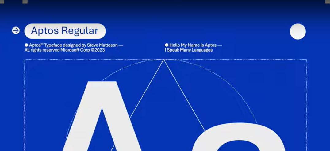
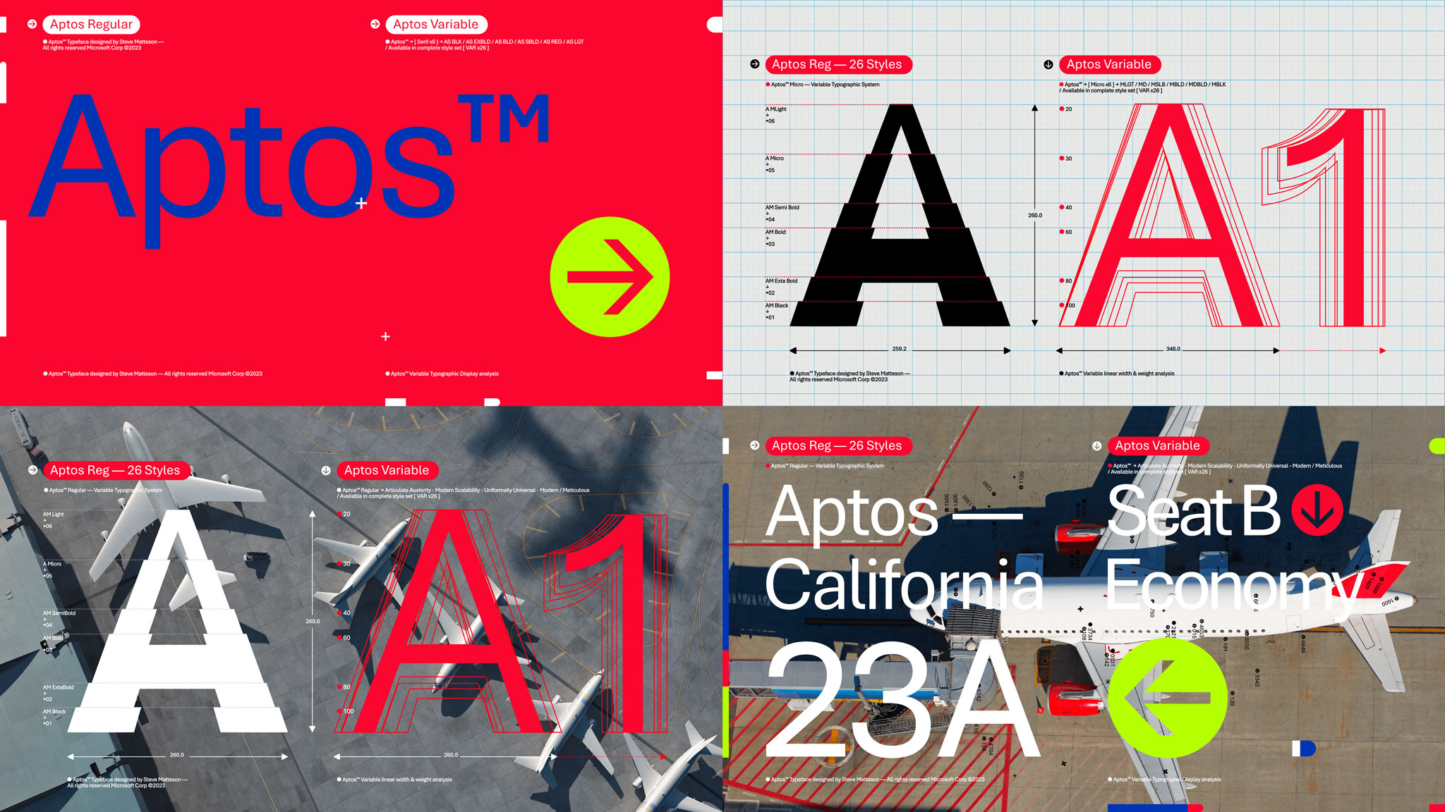
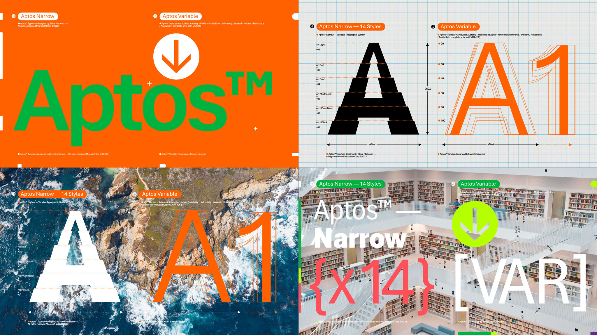
The five candidates showed a variety of approaches, from a rigid mechanical style to a more fluid and expressive one. Steve Matteson, the creator of Aptos (previously called Bierstadt), a typeface inspired by mid-20th-century Swiss typography, realized that to make his font stand out and appeal to customers, he had to incorporate some of his humanist flair into the design. If Aptos was too impersonal and machine-like, it would not be very relatable or usable. Steve looked at Microsoft’s Arial font. Knowing that Arial is one of our more notable neo-grotesque fonts, he tried to figure out how to similarly design Aptos but make it “quirkier,” he said. Though Steve wanted to implement 19th-century typeface styles that were imbued with unusual elements, he went more neutral. “I wanted Aptos to be used in many languages and tones, without confusing or distracting the reader,” Steve said.
As a typeface designer most closely associated with humanist serif designs, Steve prefers the swing of live drums and the off kilter feel of syncopated rhythms. Like music, to feel a font’s pulse, there must be some imperfection, unpredictability, and cadence. Developing a grotesque font prompted him to ask “how do you incorporate humanism into what are essentially block letters?” Because the nature of a grotesque font can be mechanical, almost geometric, the font could come off cold and rigid. Aptos needed some personality and warmth.
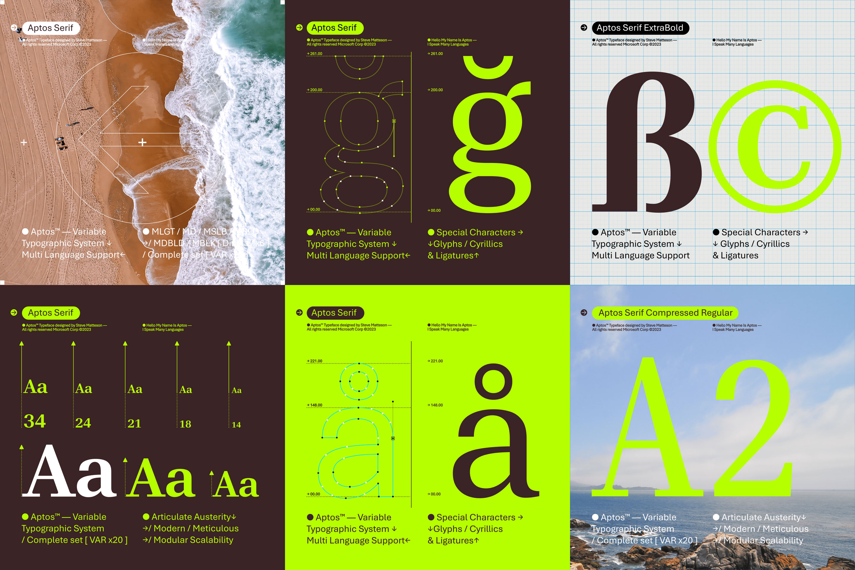
Steve felt his way through the typeface by hand, drawing each member of the font family from letters to numbers and symbols. His process was like walking along the hills and valleys of a natural terrain to get the lay of the land: mind, body, and earth dialoguing as if aligning with each other. Through his drawing process, Steve employed ever-so-slightly irregular shapes within the font’s capital “O,” “R,” and lowercase “a.” He gave wide contours to the lowercase “c,” “p,” and “b,” and to the capital “C,” to create high legibility. The tail of the lowercase “l” and “t,” and the left-pointing stem of the double-storied lowercase “g,” act as guides for the reader’s eyes, preventing them from dipping below the text line. In addition, Steve made the lowercase “l” distinctive from the uppercase “I.” This is especially useful for words like “Illinois,” “Illustration” or the French word for he, “Il.” ‘Steve balances the modernity of grotesque fonts with his hand-drawn shapes. Aptos, along with the other four candidates, represents a new direction for Microsoft 365 typography, offering more choices to our customers. But this asks the question: how did we even end up with a default font, let alone a sans serif?
A brief default font history
To understand how a sans serif became the default font in Microsoft 365 (formerly known as Office 365) applications, including Word, PowerPoint, Excel, and Outlook, we have to go back to the early days of Microsoft word processing. For a long time, Word used a serif font called Times New Roman as its default, following the convention of other early word processors. This font was first introduced in Office as a bitmap font named Times Roman, or TMS RMN, which matched the fonts on printers at that time. Bitmap fonts were not scalable or high-resolution, so they had to be mapped to printer fonts for better print quality. Meanwhile, PowerPoint and Excel used a sans serif font called Arial as their default, creating a contrast with Word. When we decided to replace these fonts with new ones, there were two main contenders: Cambria, a serif font, and Calibri, a sans serif font. The expectation was that Word would adopt Cambria as its default for text, while PowerPoint and Excel would switch to Calibri, maintaining the distinction between the apps. This was what happened on our Mac apps. However, on Windows, we chose Calibri for Word’s default font, which broke away from the tradition of using serif fonts in word processing. This significant shift changed the landscape of typography in Microsoft 365. Since new apps adopted Calibri as their default font, the typeface would become a dominant font across all Microsoft 365 apps, making serif fonts lose their prominence.
One might assume that such a drastic change from serif to sans serif would have provoked a lot of criticism, but there was hardly any opposition. This might be because people could easily switch away from the default font if they didn’t like Calibri or Arial. The appearance of serifs can vary greatly depending on a device’s display resolution. They can become either invisible or too thick, affecting the readability of the text. Therefore, a sans serif was a more adaptable and reliable choice for replacing Times New Roman. PowerPoint and Excel would also adopt the same typeface.
Historically, people mostly used one app for one purpose, such as writing a document in Word or creating a presentation in PowerPoint. Now people often work across different apps and platforms, sharing and integrating content from various sources. For example, people might copy and paste text from Word to Excel or PowerPoint, or insert charts and graphs that use the same Excel data in PowerPoint. Having a different font style in each app would create a mismatched and inconsistent effect, as if the text was cut out from different sources like a collage of letters. To avoid this, we wanted to have a font that could work well in any context and any app, creating a sense of harmony and continuity across the Microsoft 365 ecosystem. Though we opted to follow the Calibri legacy and use a sans serif as the default font, we also asked the typeface designers to propose a serif companion and a monospaced version for each of the five default font candidates.
For your alternative pleasures: serif and monospace fonts
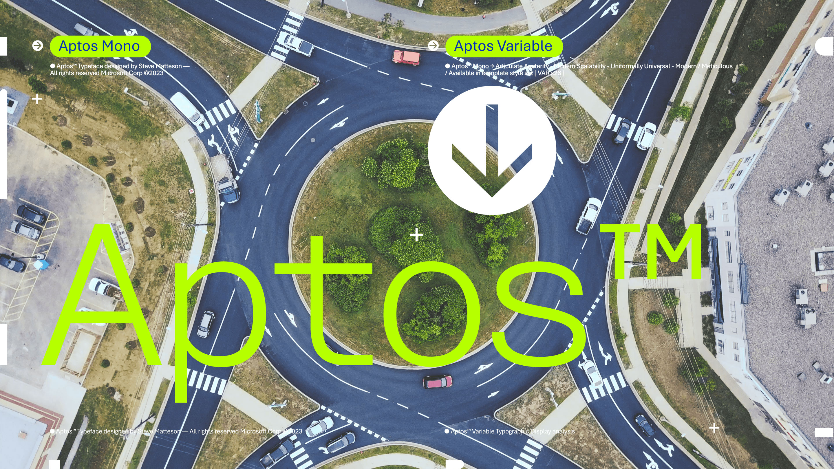
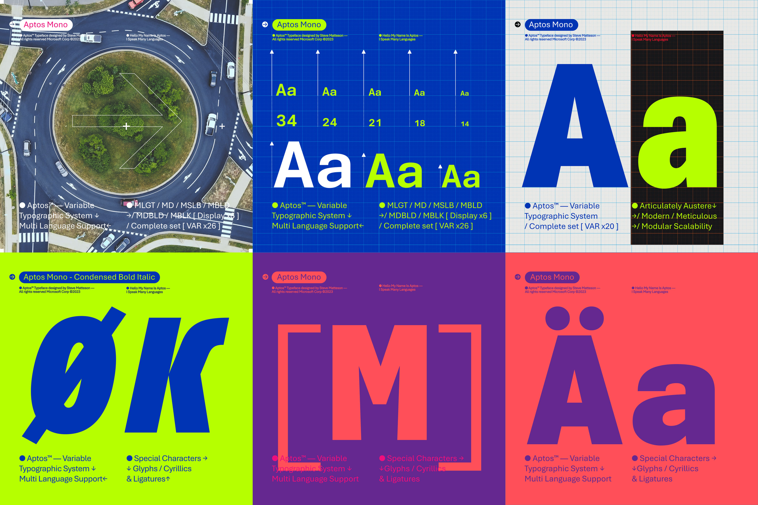
Creating companion serif and monospace fonts for whichever default customers chose would make it easy for people to switch between serif and sans serif without any issues. We had to consider the heights, widths, and line lengths of the fonts, because dimensions vary for different fonts and can affect how the text looks on the page. For example, if you change from Arial to Calibri or Arial to Times New Roman, you will notice not only a difference in the style of the letters, but also in the size, spacing, and thickness of the strokes. This makes switching fonts more difficult, because you have to adjust the font size and the line spacing to get a similar appearance. We wanted a monospace and serif font that felt like they belonged to the same family so people could easily switch between fonts without problems. That’s why we created the serif and monospace versions of the new default font and launched them at the same time as the sans serif version. Still, the process of incorporating a new default font across different apps required a series of what Steve described as “peeling back layers of an onion to figure out what the specific needs were.”
Making Aptos all things to all Microsoft 365 apps
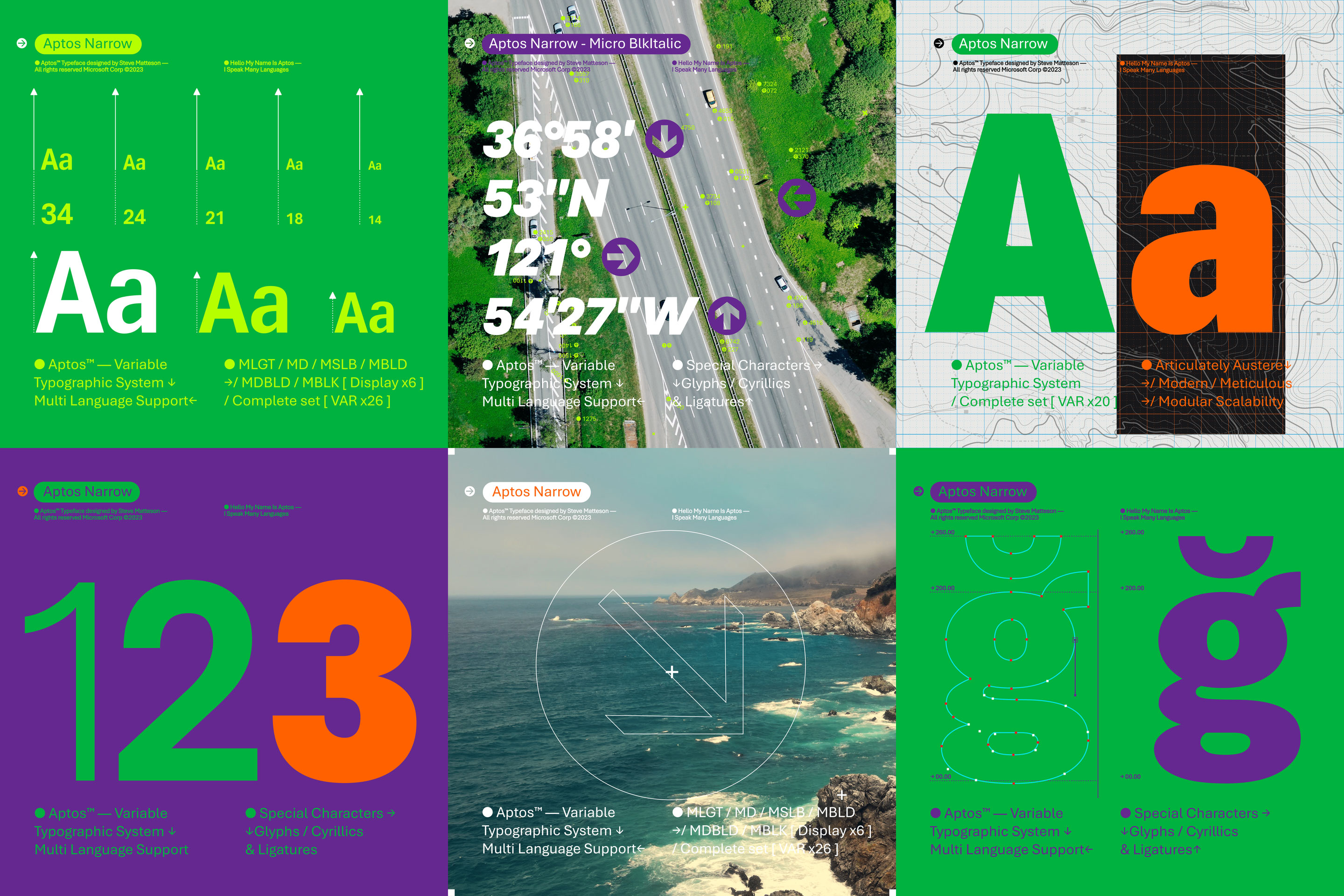
Designing Aptos to suit the different needs of various Microsoft 365 applications included rounds of ideation and iteration. For example, a spreadsheet and a presentation have very different demands about how the text should look and fit. A spreadsheet requires a typeface compatible with Calibri, the default font for Excel, because there are countless spreadsheets that use Calibri, and changing the font could disrupt the layout and formatting of the cells. To address this, Steve created a narrower version of Aptos that would behave similarly to Calibri and preserve the structure of the spreadsheets. However, this narrower font is not ideal for reading longer texts, as it is too compressed and lacks the natural flow of the letterforms. Most editorial platforms, like magazines and journals, use typefaces that are easily readable, with a style that represents their brand and content. It’s common for magazines to use serif fonts for their body text to project confidence, authority, elegance, and a sense of humanity. They often set headlines, subtitles, and pull quotes in sans serif to catch the eye.
Therefore, Steve had to balance the design of Aptos between consistency and adaptability. The typeface had to work well across different applications, platforms, and devices without compromising its identity and readability. Aptos had to behave in the same way as Calibri and Segoe UI, while maintaining its relative shape on different screen sizes and resolutions. We also had to account for the various languages and scripts that Microsoft 365 supports, ensuring that Aptos could accommodate them without losing its distinctive features. The result of integrating Aptos into Microsoft 365 was that of multiple orchestral instruments playing together, sounding like one. We knew working with Steve would produce timeless work.
Steve Matteson: The humanist behind the grotesque
One of the few master craftspeople in the world of font design, Steve is a renowned type designer whose work spans more than three decades and includes some of the most widely used fonts in the world. As a young man, Steve was fascinated by the printing press and the way ink sat on paper, making variable shapes around embossed letters. Every printed copy of paper gave the eyes of readers a different experience. He grew up at a time when abstract expressionism was at its peak. “I was going to be a commercial printer, and when I went away to college, that was the goal. I was learning about all the different printing techniques, whether it’s the speed of the press, quality of the paper, or the quality of the ink. All of that is parallel to digital,” he said, comparing the behavior of printed text to the sharpness of a typeface on a screen.
His early work involved engineering early digital fonts like Courier New, Times New Roman, and Arial. Over time, that experience refined his talent, and he began designing fonts that expressed the stories and ideas of students, teachers, journalists, and authors. He’s the designer of Microsoft’s Segoe UI font and various other notable typefaces on highly visible platforms. Drawing inspiration from handwriting, calligraphy, signage, and art, he has a deep understanding of the history and culture of writing systems. Printing is an over-500-year-old technology, and for almost five decades, we have been devoted to developing it for on-screen reading.
Aptos, like its default font predecessors, is optimized for the technology of its time. In the age of digital reading, it helps people comfortably read text on screens for extended periods of time, but it also looks immaculate in print. The process of co-designing with our customers has been an insightful and fulfilling experience. Aptos, along with the other four default font contenders—Tenorite, Skeena, Seaford, and Grandview—are all now available. We hope you enjoy the variety of fonts to choose from and the font picker to choose them with.
Ever wonder how a font interacts with the mind? Read The hidden power of typography.
Read more
To stay in the know with Microsoft Design, follow us on Twitter and Instagram, or join our Windows or Office Insider program. And if you are interested in working with us at Microsoft, head over to aka.ms/DesignCareers.

Outcomes over output: Designing shared cognition
How we are shaping systems that help people think better, not just type faster.
We can all be friends: Times New Roman vs Calibri
Explore how typography decisions really affect readability, accessibility, and brand expression.
Designing loops, not paths
How cybernetic loops are helping us turn “human in the loop” from a catchphrase into a design practice

