An ethos for innovation
The unique ethos that sparked Surface’s pioneering 2-in-1 design, from the seminal Surface Pro to the new Surface Laptop Studio 2
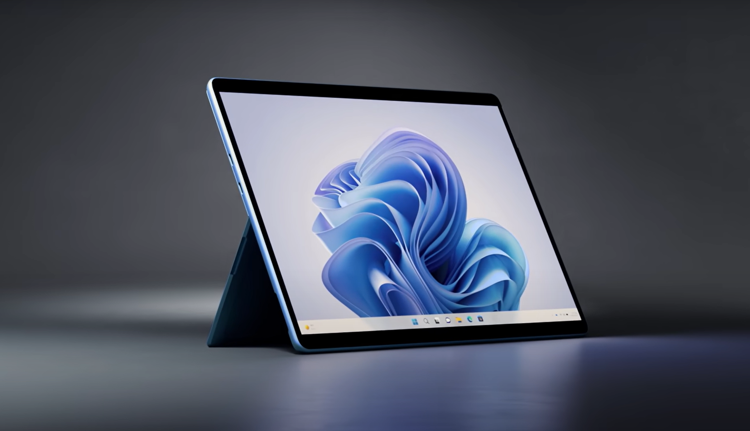
In 2012, a laptop was a laptop, and a tablet was a tablet. The form factors for both were fairly hard-coded and those wanting to innovate or enter the market iterated on the same object repeatedly. Laptops and tablets also lived in separate conceptual spheres. PCs were seen as ways to meet computing needs while seated, while tablets were designed to support people on-the-go. Life, however, seldom has clear divides and some of our most brilliant creative sparks happen amid the lesser defined, in-between spaces.
Designing for ambiguous and challenging spaces—in part by eschewing traditional forms—is baked into Microsoft hardware design culture, dating back to the first Windows Phone (a true ifykyk scenario). From the release of the first Surface Pro in 2012, the first 2-in-1 PC, to this year’s debut of the Surface Laptop Studio 2, let’s take a deeper look at how the Surface design team breaks the literal and metaphorical mold––including the invention of entirely new device categories…
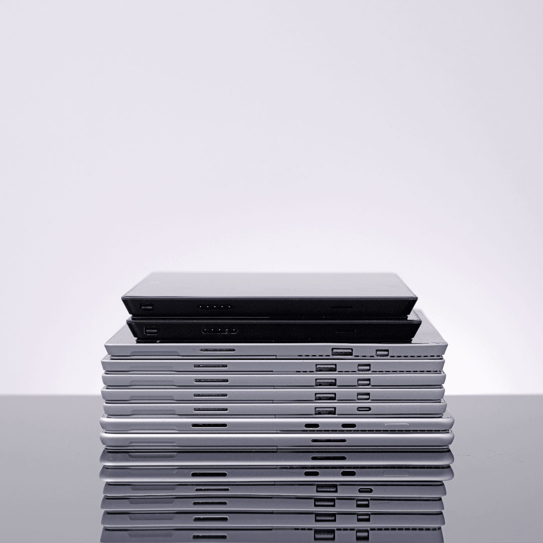
What makes a Surface a Surface?
Consistent innovation isn’t a fluke, it’s the result of philosophies and processes that center human needs and foster creative thinking. When it comes to a design language, which is often seen as the heart of any product, the Surface team is unique in its lack of one. Led by Ralf Groene, the Surface design team doesn’t follow a set design language. Instead, they lean into new possibilities by abandoning traditional archetypes and their blueprints and their blueprints. It’s often in the negative spaces that innovation flourishes and the absence of a set design language creates room to imagine.
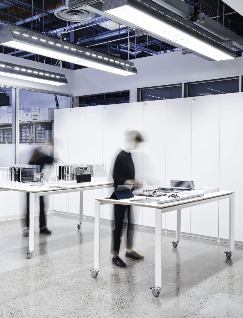
In terms of process, rather than focusing on presentations and digital visuals of hardware, the team gets right into the physical making of the objects to quickly prove their value as both attractive and functional objects. Brainstorming or sharing sessions bring an array to the literal and metaphoric table, from sheets of materials to objects taped together to communicate an idea . This all unfolds in Building 87, a world-class design studio on Microsoft’s campus. It houses everything from an anechoic chamber––that boasts the title of the quietest place on earth––to the Human Factors group lab where designers explore the biomechanics that fuse their human-centered design thinking.

When it comes to both product and process, another unique aspect of Surface design is their holistic approach to hardware across Microsoft’s devices portfolio. Whether it’s an Xbox console that runs games at overclocked speeds, a controller that is held for hours at a time, or the future of spatial computing with Hololens, the Surface design team goes deep in many experience paradigms. By exploring these diverse experiences and their manifestation into a physical device, they glean inspiration and free themselves from any limits of a given experience, especially PCs. As Principal Designer Elliott Hsu says, “When we began to understand different avenues of experiences and where they can meet and intersect, or where one innovation or one normal aspect in one section can become a unique experience in a different paradigm, it allows us to design more holistically.”
Evolving with each generation
With a hunger for innovation baked into their ethos, the Surface design team actively seeks out opportunities for improvement with each generation—particularly around mobility and connection.
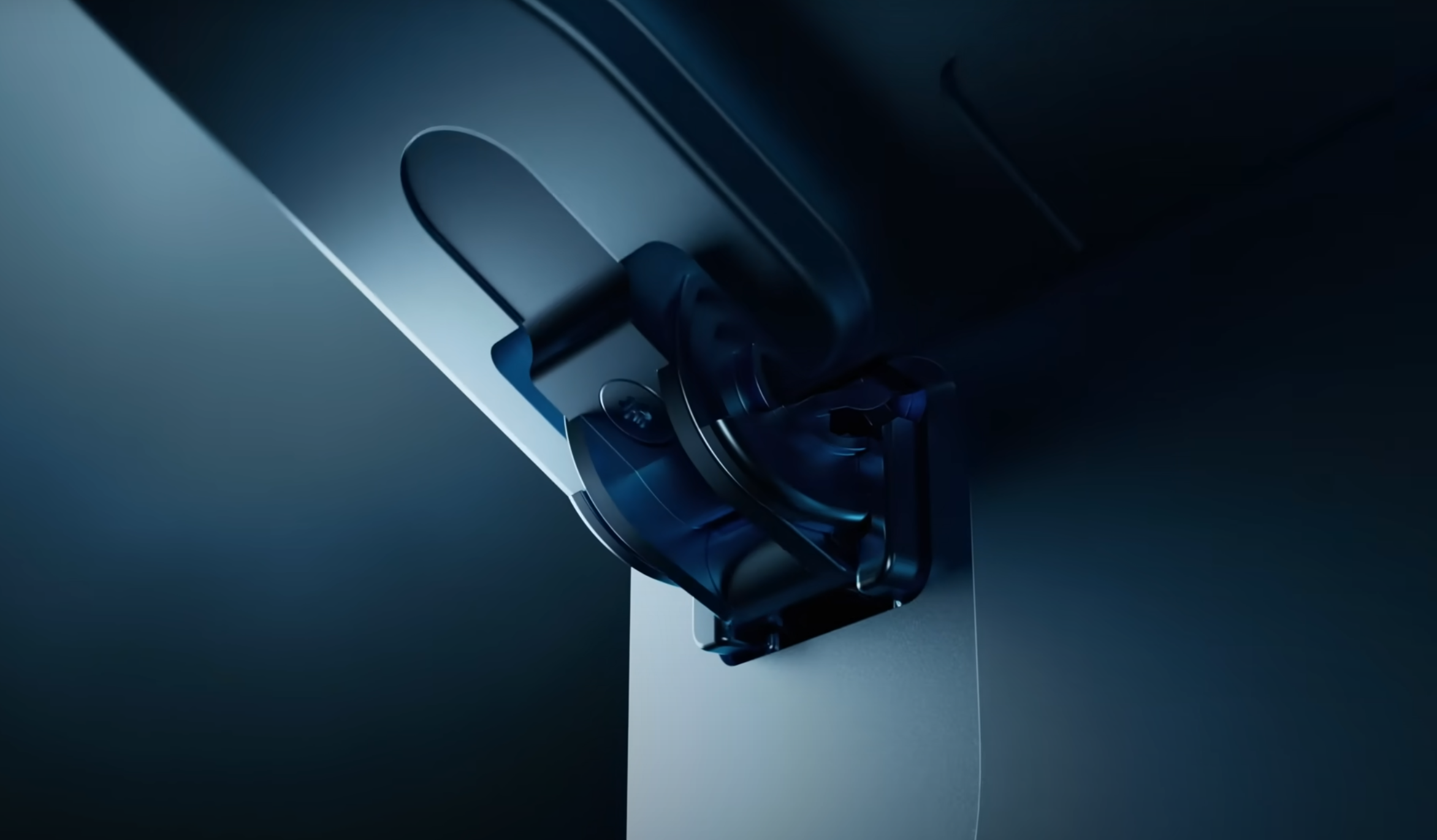
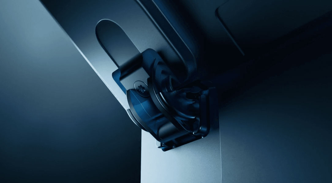
The Surface Pro product line was the first formal evolution of our Surface PC that considered mobility while running Windows, particularly with the first iteration on the 2-in-1 hinge. Each generation, the team has continued to expand the range of the hinge and its postures to allow for more adaptability for user needs. Each generation, the team has continued to expand the range of the hinge and its postures to allow for more adaptability for user needs. Our latest generation has truly dynamic posturing that reaches almost 180 degrees, a result of having changed the hinge to injection molded material to create a frictionless mechanism.
To better address connection—an aspect that usually remains under the hood—our design teams saw an opportunity to both increase functionality and improve the design. While the goal of our 2-in-1 has always been portability for the in-betweens, we needed connection outside of Wi-Fi to truly bridge that gap. That inspired us to add 5G into our Pro offering, but 5G isn’t just a switch you turn on and off or enable. Hardware has to be designed around it and the antennas needed to fuel the technology. The antennas that allow 5G are made of plastic, but as a premium product, we couldn’t just deliver a device with visible plastic antennas all over it. The team’s design solution was rather ingenious; if you grab your closest Surface Pro 9, you’ll see tiny white lines disguised as parts of antennas that allow the Surface Pro 9 to connect to the 5G network. Made possible by a process called nano molding (casting plastic inside of aluminum), those lines are a visible sliver of what’s underneath the metal.
Communicating with color
The holistic, iterative, and free-range thinking that the design team embraces shows up in Surface’s approach to color and materiality—transformative mediums that can change a cold and utilitarian tool into an object of love and vibrant form of self-expression. But bringing color to a device (let alone one with three different materials) in a way that respects material’s integrity is a complex process.
Just ask Quan Jasinski, who’s been developing the Surface color portfolio for the past 7 years across devices, from headphones to PC’s. In developing color, she and a CMF (Color, Materials, and Finishes) team deeply consider global movements––researching not just where society currently is, but where we’re headed. Take the Forest color in our Pro line. Developed around the time of COVID, the team knew that after a global pandemic and isolation, getting out into nature would be a much-needed balm. Nature is a wonderful source of design inspiration, from subtle tinges of blue at sunset to the way that shades of green shift when seen through a water droplet on a leaf.
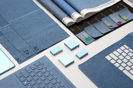
These inspirational moments are then refined from materials testing; understanding how color is reflected on Surface’s materials like aluminum and Alcantara and more importantly making sure to respect material integrity–– a key principle for the Surface design team.
After color has been preliminarily defined, the true magic of getting the color on the device takes place. It starts from a back and forth with color vendors to perfect the color on the materials, considering processes like anodization and coatings that must be done to the final substrates to deliver premium materials. After all, color appearing one way on a screen or swatch can drastically change when applied to metal, key caps, and especially the Alcantara fabric of the keyboards. In doing so, Jasinski also aims to bridge lifestyle and technology into a seamless experience––allowing consumers to celebrate colors and connect to their identity. The aim is to be visible but not polarizing; its not about being the loudest object in the room, but rather the perfect complement to get you in flow.
While a PC’s geometry plays less of a factor than an object like a car, which requires designers to consider hundreds of curvatures, different angles of a laptop present different views and a consistent perception of both object and material is key. Once materials are defined, the Surface design team constructs prototypes and tests the harmony of color across materials.
Today, the Surface Pro and Laptop lines have 4 colors available—Platinum, Sapphire, Forest, and Graphite—but the color story is never static. Nor is the broader design story of Surface, particularly as the team continues exploring ways to meet sustainability goals and further complement Windows.
Read more
To stay in the know with Microsoft Design, follow us on Twitter and Instagram, or join our Windows or Office Insider program. And if you are interested in working with us at Microsoft, head over to aka.ms/DesignCareers.

Design isn’t dying. It’s shifting left.
When the model is the new medium, shaping how it behaves in humanistic ways is design
From incubation to impact: Microsoft 365 Companion apps
How scrappy prototypes became polished apps—shipped on the taskbar, grounded in Fluent, and refined by research.
When AI joins the team: Three principles for responsible agent design
A practical guide to build agents that stay differentiated, intent-aligned, and bias-resistant

