
A cloud for everyone
Tailoring complex experiences for every user level
Microsoft Azure is an ever-expanding set of cloud computing services that are used by millions of people around the world. The Azure portal is an entry point — a place where one can explore, learn, acquire, manage, and operate Azure applications, services, and infrastructures. With hundreds of services and over a thousand capabilities, the portal attracts a broad range of user profiles.
For those just getting started (evaluator, beginner, and intermediate users), the concepts, terminology, and workflows can seem complex and intimidating. For experienced IT professionals (expert or power user), the “cloud” is relatively straightforward and understandable. Outside of the concepts, the scale of the offerings brings unique challenges that can be summarized in one question: how do we introduce an expanding experience to a broad set of customers with different backgrounds and needs?
This article takes us on a design journey that starts with enabling evaluators and beginners to get started, helping intermediate users discover offerings, and assisting advanced and power users just enough so they feel in complete control of their productivity, all with the same tool.
Accomplish more with less
Microsoft has hundreds of employees building hundreds of services offered via the Azure portal. As with any large-scale software project, deciding what content makes a meaningful home page can be challenging.
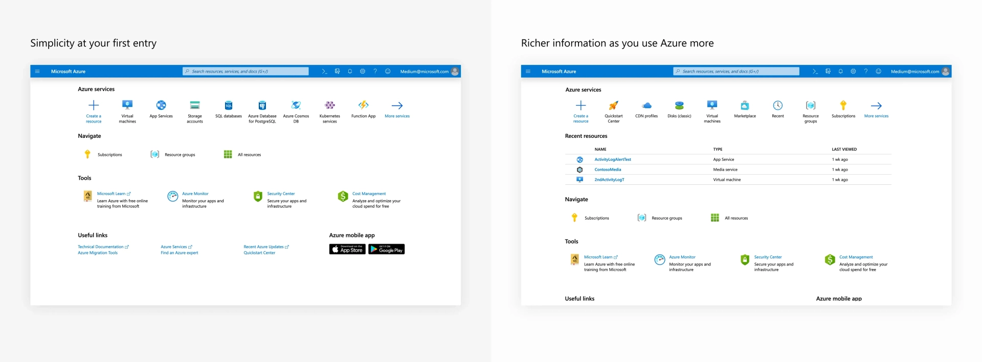
Leveraging customer feedback, telemetry analysis, and our iterative design and research processes, we simplified the home page by reducing clickable targets by over 25% when used for the first time. Although the new design affords less choice, we maintained the conceptual layout, reduced the learning curve, and received unanimously positive feedback about the visual appeal and simplicity of the updated experience.
Biasing towards importance without customization
When comparing customer asks versus customer behavior, we discovered that although customers like the idea of customization, they rarely leverage the capability. For our home page, we developed an adaptable design that is based on customer usage, without any explicit action from the customer.
At the top of the page, we present a collection of recently used services. This list builds on the design patterns from Office.com and is initially populated with some of Azure’s most popular services. It will adjust once the customer starts using a service. Although seemingly simple, this adaption reduces search and navigation times, improves time-on-task scores, and speeds up the customers most common workflows.
Analyzing customer behavior also revealed key patterns for common navigation entry points. The Navigate section identifies those entry points, providing users quick access to those common flows. We used a combination of telemetry data (looking for most common customer journeys), focus groups, product knowledge, and usability studies to select the items in that list.

Important information displayed in-context and front and center
As a customer uses the portal — creating an instance, browsing, and accessing a recent instance to name a few — common workflows start to develop and become habit.
We’ve introduced “hover cards” throughout our experience that present contextual information relevant to each service. Building on the design patterns for identity cards used in Microsoft Outlook, this greatly improved exploration and discoverability.

Microsoft Learn is Microsoft’s platform to provide free specialized training for Microsoft technologies. We have integrated Microsoft Learn in multiple places to enable every user to become an expert. The offered trainings are always contextual and curated based on usage data and feedback.
We simplified the Azure experience using a combination of design, research, customer feedback, and product data. This was a multi-discipline journey that resulted in providing a simpler and cleaner experience to our customer that has less to do more and that adapts to their needs as they use the product.
Read more
To stay in the know with Microsoft Design, follow us on Twitter and Instagram, or join our Windows or Office Insider program. And if you are interested in working with us at Microsoft, head over to aka.ms/DesignCareers.
From incubation to impact: Microsoft 365 Companion apps
How scrappy prototypes became polished apps—shipped on the taskbar, grounded in Fluent, and refined by research.
When AI joins the team: Three principles for responsible agent design
A practical guide to build agents that stay differentiated, intent-aligned, and bias-resistant
The new Microsoft 365 Copilot mobile experience
How we redesigned the Microsoft 365 Copilot mobile app to create a workspace built around conversation, dialogue, and discovery.